Muzammil Younas's Work | ContraWork by Muzammil Younas
Muzammil Younas

Muzammil Younas

Webflow Developer | Framer Expert | Figma | SEO, GEO, AEO

Ready for work

Muzammil is ready for their next project!

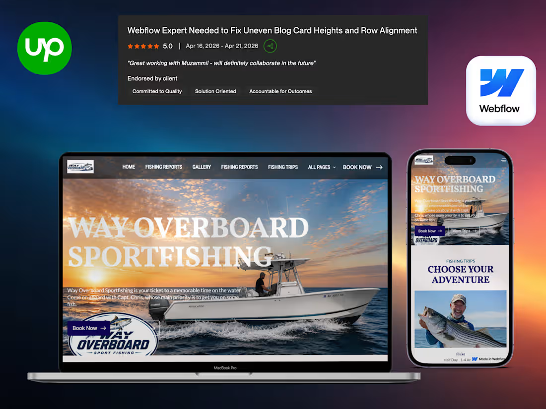
Cover image for Way Overboard Sportfishing | Webflow
Way Overboard Sportfishing | Webflow Charter Booking Platform | NJ Sportfishing Trips | Captain-Led Adventures & Fishing Reports My Role: Webflow Developer & UX/UI Specialist For Way Overboard Sportfishing, I designed a vibrant, adventurous, and easy-to-use Webflow website that showcases Captain Chris’s charter trips and converts fishing enthusiasts into booked adventures. The design captures the thrill of the ocean while making booking simple and trustworthy. About the Project: Way Overboard Sportfishing offers half-day and full-day fishing charters off the coast of New Jersey, targeting species like Fluke, Striped Bass, Tuna, Shark, and more. I built a complete modern website featuring trip options, captain bio, latest fishing reports, angler testimonials, and clear booking flows. The Challenge: The old website (or lack of professional online presence) didn’t reflect the quality of the experience, made it hard to see available trips, and failed to build excitement or trust for potential customers. Strategic Approach: "Adventure + Trust" approach using bold ocean imagery, clear trip cards, real fishing reports, and Captain Chris’s personal story to create excitement while removing booking friction. The Solution: Dynamic & Energetic Design: Ocean-inspired visuals, clean typography, and mobile-friendly layout that feels adventurous yet professional. Trip Showcase: Easy-to-understand cards for different species (Fluke, Tuna, Striped Bass, Shark, Bottom Fishing) with duration and angler capacity. Personal Connection: Dedicated “Meet the Captain” section highlighting Captain Chris’s experience and passion. Social Proof & Fresh Content: Customer testimonials and regular “Latest Fishing Report” updates to build credibility and urgency. Strong CTA Flow: Prominent “Book Your Adventure” buttons and simple inquiry process. Result: A high-converting, engaging platform that makes booking a fishing trip with Captain Chris exciting and effortless. The website effectively attracts both experienced anglers and beginners, increasing inquiries and filled charters while strengthening the brand’s reputation on the water.
0
240
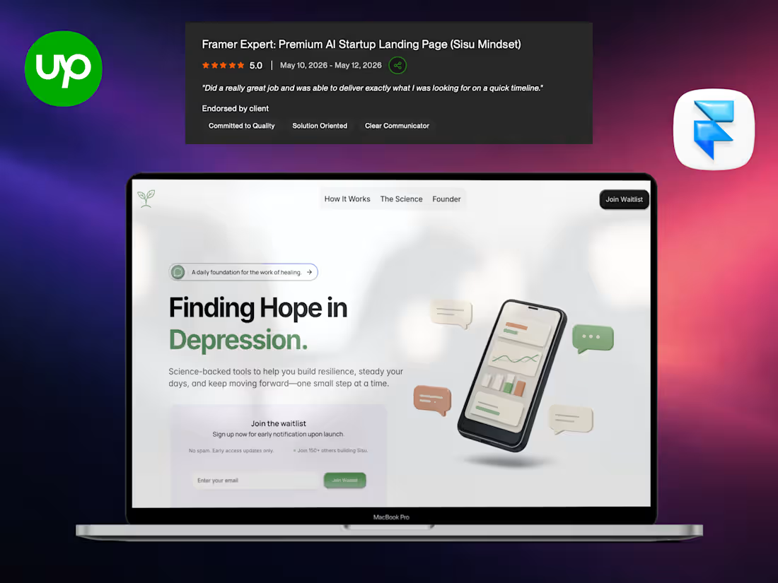
Cover image for Sisu — Framer Mental Wellness
Sisu — Framer Mental Wellness Platform | Daily Resilience Support via SMS | Science-Backed Mental Health Tools My Role: Framer Developer & UX/UI Specialist For Sisu by Thesis U Mindset, I designed a calm, hopeful, and modern Framer website that reflects the product’s purpose — providing daily mental resilience support through simple SMS check-ins. The design feels supportive, approachable, and grounded in science. About the Project: Sisu is a daily mental health companion that delivers calm check-ins, science-backed prompts, and real-time support directly via SMS. No apps to download — just gentle, consistent guidance to help users build resilience and navigate depression, stress, and daily challenges. The Challenge: Traditional mental health tools often feel overwhelming, static, or disconnected from real daily life. Users needed something simple, always accessible, and adaptive to their current state. Strategic Approach: "Hope + Simplicity" approach — using soft, soothing visuals, empathetic language, and clear focus on daily practice to make mental wellness feel achievable and supportive rather than clinical. The Solution: Calm & Empathetic Design: Soft color palette, clean typography, and gentle visuals that evoke hope and stability. Product Clarity: Strong explanation of the SMS-based experience with examples of morning check-ins, prompts, and real-time support. Science-Backed Positioning: Highlights psychology, nutrition, gut health, habits, mindfulness, and other evidence-based foundations. Founder Story: Personal and relatable founder’s note that builds deep emotional connection. Clear User Journey: Shows how Sisu fits into daily life without adding complexity. Result: A beautiful, trust-building Framer website that effectively communicates Sisu’s unique value. The site creates an emotional connection with people struggling with mental health and clearly explains how daily SMS support can create real, sustainable change.
0
276
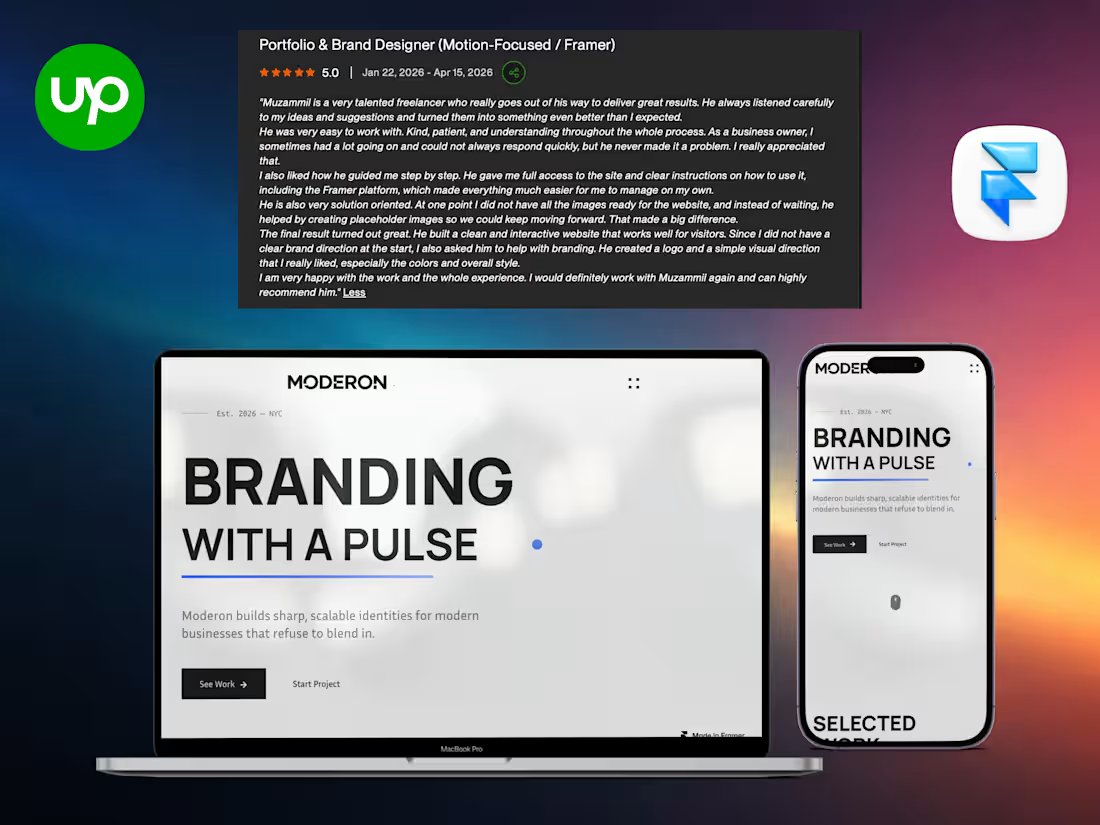
Cover image for Moderon | Framer Branding Studio
Moderon | Framer Branding Studio Website | Brand Strategy & Visual Identity | Modern Business Branding My Role: Framer Developer & UX/UI Specialist For Moderon, I created a sharp, bold, and energetic Framer website that perfectly captures their “Branding with a Pulse” philosophy. The design feels modern, confident, and full of life exactly what a premium branding studio needs. About the Project: Moderon is a branding studio based in NYC (est. 2026) that builds sharp, scalable identities for modern businesses. I designed and developed their complete Framer website featuring selected work, clear expertise areas (Brand Strategy, Visual Identity, Web Design), process, and strong client testimonials. The Challenge: New branding studios often struggle to stand out. The website needed to instantly communicate creativity, professionalism, and personality while showcasing work and attracting ambitious clients.
1
306
Cover image for 𝐆𝐨𝐥𝐝𝐢𝐥𝐨𝐜𝐤𝐬 𝐆𝐥𝐨𝐛𝐚𝐥 𝐁𝐚𝐧𝐤𝐢𝐧𝐠 𝐍𝐞𝐰𝐬 |
𝐆𝐨𝐥𝐝𝐢𝐥𝐨𝐜𝐤𝐬 𝐆𝐥𝐨𝐛𝐚𝐥 𝐁𝐚𝐧𝐤𝐢𝐧𝐠 𝐍𝐞𝐰𝐬 | 𝐅𝐫𝐚𝐦𝐞𝐫 𝐖𝐞𝐛𝐬𝐢𝐭𝐞 𝐰𝐢𝐭𝐡 𝐑𝐞𝐚𝐥-𝐓𝐢𝐦𝐞 𝐘𝐨𝐮𝐓𝐮𝐛𝐞 𝐈𝐧𝐭𝐞𝐠𝐫𝐚𝐭𝐢𝐨𝐧 & 𝐏𝐫𝐨𝐭𝐞𝐜𝐭𝐞𝐝 𝐂𝐌𝐒 𝐌𝐲 𝐑𝐨𝐥𝐞: Framer Developer & UX/UI Specialist Built a sleek, professional, and highly functional Framer website for Goldilocks Global Banking News. The platform delivers independent macro-financial analysis with real-time YouTube video syncing, automated content updates, and protected member pages powered by a custom CMS. 𝐀𝐛𝐨𝐮𝐭 𝐭𝐡𝐞 𝐏𝐫𝐨𝐣𝐞𝐜𝐭: Goldilocks Global Banking News is an independent macro-financial analysis platform focused on RV/GCR, global banking shifts, currencies, emerging markets, and the structural changes shaping the international monetary system. I developed the complete marketing website from concept to launch, creating a modern hub that combines clean design with powerful automation. 𝐓𝐡𝐞 𝐂𝐡𝐚𝐥𝐥𝐞𝐧𝐠𝐞: The client needed a professional online presence that not only looked trustworthy and premium but also kept content fresh automatically. Manually uploading videos and managing member-only content was time-consuming and inefficient. 𝐒𝐭𝐫𝐚𝐭𝐞𝐠𝐢𝐜 𝐀𝐩𝐩𝐫𝐨𝐚𝐜𝐡: "Clarity + Automation" Designed a clean, dark-mode, finance-focused aesthetic while integrating real-time automation to eliminate manual work and deliver instant value to the audience. 𝐓𝐡𝐞 𝐒𝐨𝐥𝐮𝐭𝐢𝐨𝐧: Modern & Trustworthy Design: Premium dark theme with strong hero section, professional typography, and benefit-driven layout that builds instant credibility in the financial niche. Real-Time YouTube Sync: Fully automated integration whenever a new video is uploaded on the associated YouTube channel, it automatically appears on the website in real-time. Protected Pages & CMS: Built secure, password-protected member areas with a custom CMS so exclusive content remains accessible only to subscribers. Content Showcase: Clean presentation of macro-financial analysis, latest updates, and key insights with excellent readability. Strong Navigation & Social Proof: Intuitive menu (Home, Founders, Contact), social integration, and professional footer.
1
310
Cover image for 𝐈𝐧𝐯𝐞𝐬𝐭𝐨𝐫𝐁𝐨𝐨𝐭𝐳 | 𝐅𝐫𝐚𝐦𝐞𝐫 𝐑𝐞𝐚𝐥 𝐄𝐬𝐭𝐚𝐭𝐞
𝐈𝐧𝐯𝐞𝐬𝐭𝐨𝐫𝐁𝐨𝐨𝐭𝐳 | 𝐅𝐫𝐚𝐦𝐞𝐫 𝐑𝐞𝐚𝐥 𝐄𝐬𝐭𝐚𝐭𝐞 𝐏𝐥𝐚𝐭𝐟𝐨𝐫𝐦 | 𝐍𝐚𝐭𝐢𝐨𝐧𝐰𝐢𝐝𝐞 𝐎𝐧𝐬𝐢𝐭𝐞 𝐒𝐞𝐫𝐯𝐢𝐜𝐞𝐬 𝐟𝐨𝐫 𝐈𝐧𝐯𝐞𝐬𝐭𝐨𝐫𝐬 | 𝐏𝐫𝐨𝐩𝐞𝐫𝐭𝐲 𝐓𝐚𝐬𝐤 𝐌𝐚𝐧𝐚𝐠𝐞𝐦𝐞𝐧𝐭 𝐌𝐲 𝐑𝐨𝐥𝐞: Framer Developer & UX/UI Specialist For InvestorBootz, I built a clean, professional, and highly functional Framer website that simplifies nationwide property management for real estate investors. The platform-focused design emphasizes speed, transparency, and convenience. 𝐀𝐛𝐨𝐮𝐭 𝐭𝐡𝐞 𝐏𝐫𝐨𝐣𝐞𝐜𝐭: InvestorBootz provides a centralized platform for real estate investors to order onsite services (photography, notarization, lockbox installation, repairs, trash-outs, etc.) across the United States. I developed the complete marketing website with clear service offerings, step-by-step process, testimonials, and strong calls-to-action. 𝐓𝐡𝐞 𝐂𝐡𝐚𝐥𝐥𝐞𝐧𝐠𝐞: Real estate investors and wholesalers were struggling to coordinate local vendors across multiple markets. It was time-consuming, disorganized, and slowed down their operations. Strategic Approach: "Centralized Simplicity" approach — highlighting one platform for all onsite needs with clear benefits like time-saving, nationwide reach, and full visibility to make investors’ lives easier. 𝐓𝐡𝐞 𝐒𝐨𝐥𝐮𝐭𝐢𝐨𝐧: Modern & Trustworthy Design: Clean layout with strong hero messaging and benefit-focused visuals. Service Showcase: Comprehensive categories including Photography, Notarization, Lockboxes, Handyman, Trash-outs, and more. Simple Process: Easy 3-step flow Submit Request → Track Progress → Receive Deliverables. Social Proof: Real investor testimonials emphasizing speed and reliability. Nationwide Focus: Clear messaging about operating across all markets through a network of local providers.
1
344
Cover image for Advera | Figma to 100%
Advera | Figma to 100% pixel perfect Webflow website | 3D animations | Lottie | Webflow E-commerce Platform | High-Converting Funnels & Performance Systems My Role: Webflow Developer & Conversion Specialist For Advera, I transformed a standard agency site into a premium, conversion-focused digital platform that perfectly reflects their high-performance e-commerce growth expertise. Built with custom Webflow interactions, clean typography, and strategic CTAs, the new site drives qualified strategy call bookings while communicating authority and results. About the Project: Advera is a strategic growth partner for e-commerce brands, helping them scale through proven ad systems, content strategy, and conversion optimization. The goal was to redesign their website from generic to a high-end, trust-building platform that mirrors the premium, results-driven experience they deliver to clients. The Challenge: The previous site felt generic, lacked strong visual hierarchy, and failed to convert visitors into strategy calls. Key issues included weak storytelling, cluttered service presentation, and absence of premium motion/animations that high-ticket clients expect. Strategic Approach: I adopted a "Results-First, Authority-Driven" design strategy — pairing bold, confident visuals with clear ROI storytelling and frictionless user flow toward booking calls. The Solution: Premium Webflow Experience: Built a modern, fast-loading site with sophisticated scroll animations and micro-interactions. Conversion-Optimized Funnels: Strategic placement of "Book A Strategy Call" CTAs with clear value propositions. Services & Results Showcase: Clean, scannable service cards with compelling case studies and metrics. Dynamic & Scalable CMS: Easy content updates for the Advera team. Result: Professional, high-converting platform ready to attract serious e-commerce brands.
1
353
Cover image for Full Credit Sweep | Framer
Full Credit Sweep | Framer Client Dashboard | Credit Repair SaaS | Professional Client Portal
1
375