
Mustapha Abdus-Satar
Interior layout Design, eBook formatting, Print formatting
New to Contra
Mustapha is building their profile!
Every creative has a core AI workflow. Here's mine:
Kimi AI, my thinking partner, editor, and late-night strategist.
What I use it for:
• Brainstorming book layout concepts when I'm stuck
• Refining client outreach messages (like the ones that actually get replies)
• Writing portfolio descriptions that don't sound like everyone else's
• Structuring my thoughts before I even open InDesign
Strengths: It actually listens, remembers context, adapts tone, and doesn't give me generic fluff. I can go back and forth 10 times refining one sentence and it keeps up. Plus it helps me think through problems instead of just spitting answers.
Weaknesses: It can't format a book (yet 😄). It doesn't replace my eye for typography or my obsession with baseline grids. And sometimes I have to remind myself to stop iterating and just ship the work.
The real magic? AI + human taste. Kimi gets me 80% there. The last 20%, the drop cap placement, the margin tension, the moment a client opens their proof copy, that's still me.
What's in your AI stack? Drop your essentials below 👇
#FreelancerLife · AI workflow · Book formatting · Creative tools · Kimi AI
1
13
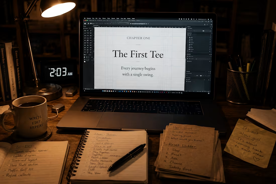
Me at 2 AM: still adjusting baseline grids because the chapter opener felt "half a millimeter off."
Client at 9 AM: "I opened the PDF and literally gasped. This looks like a real book."
Me: worth every sleepless hour
That's freelancer life. That's also why I do what I do — book formatting and interior layout design for indie authors who refuse to look self-published.
Print-ready PDFs. Clean EPUBs. Interiors that belong on shelves, not in "I'll fix it later" folders.
Who else is polishing invisible details at ungodly hours? Drop a ☕ if you've been here.
#FreelancerLife · Book formatting · Interior design · Indie publishing
1
9
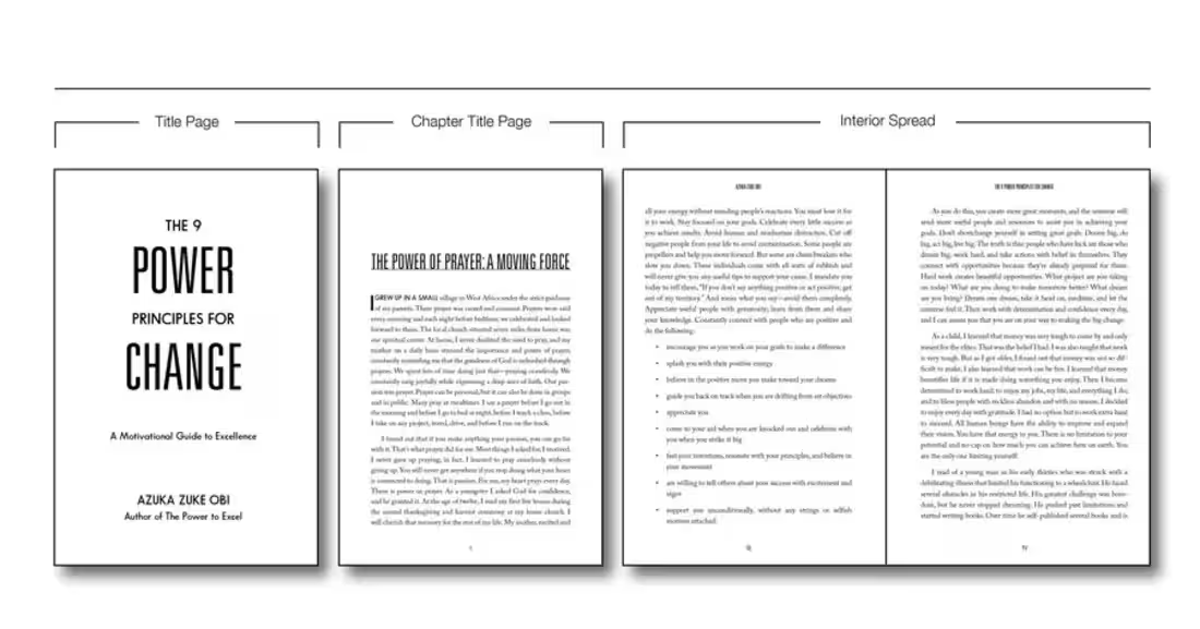
This indie author told me their last book got rejected by KDP three times for "font not embedded" errors.
I rebuilt their file from scratch — proper font subsetting, print-bleed margins, and a reflowable EPUB that passed validation on the first upload.
Their words: "I didn't know it could look this professional."
That's why I do this.
Book formatting · KDP · IngramSpark · EPUB conversion
1
12
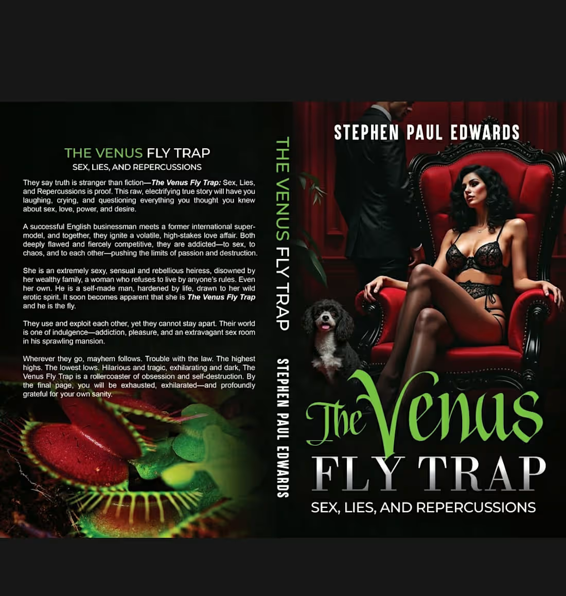
Designed the cover for a debut psychological thriller targeting the domestic noir market. Built three distinct visual directions — typography-driven, photographic, and illustrative — then refined the chosen concept through competitive title analysis and spine-visibility testing at thumbnail scale. Final cover features a custom-graded image, hand-tensioned type, and a matte laminate + spot gloss finish spec. The author secured a BookBub Featured Deal within two months of launch and credited the cover's "instant genre recognition" for their 4.7-star average on launch week reviews.
0
5
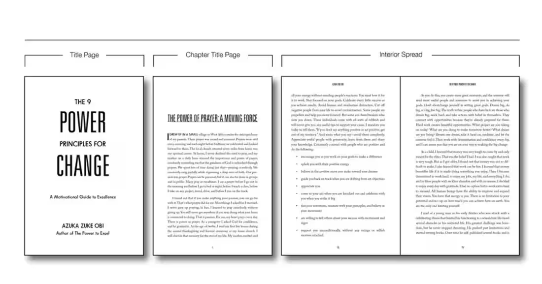
Commissioned by a literary fiction author for a 320-page novel with exacting standards. I developed a refined interior system — custom chapter opener spreads with drop caps, running headers in a discreet sans-serif, and a baseline grid tuned for comfortable long-form reading. Specified and print-proofed for 5.5x8.5" cream uncoated stock via offset. The author reported that a Kirkus reviewer specifically noted the "elegant, publisher-grade interior" in their feature.
0
6
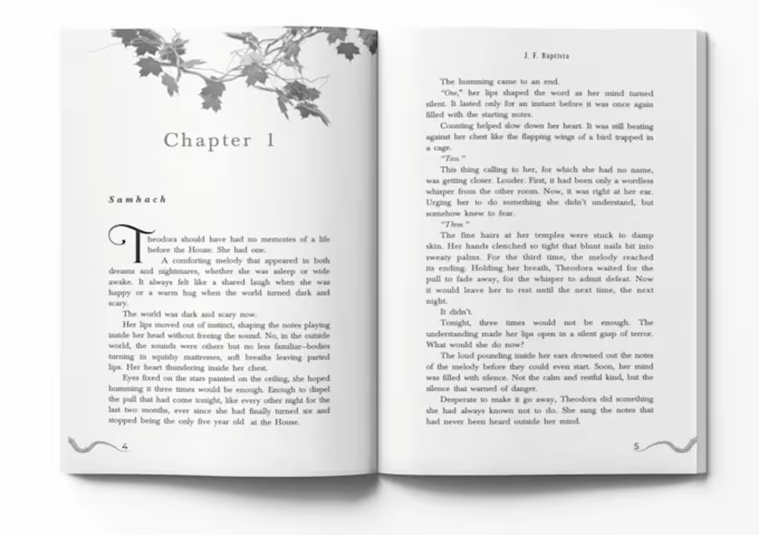
Problem: Manuscript looked amateur — inconsistent headings, broken paragraphs, generic styling.
Solution: Built a custom layout system from scratch — font pairing, baseline grid, running headers, and ornamental break ornaments matched to the book's tone.
Result: Client landed a local bookstore stocking deal after the owner praised the interior quality.
0
6
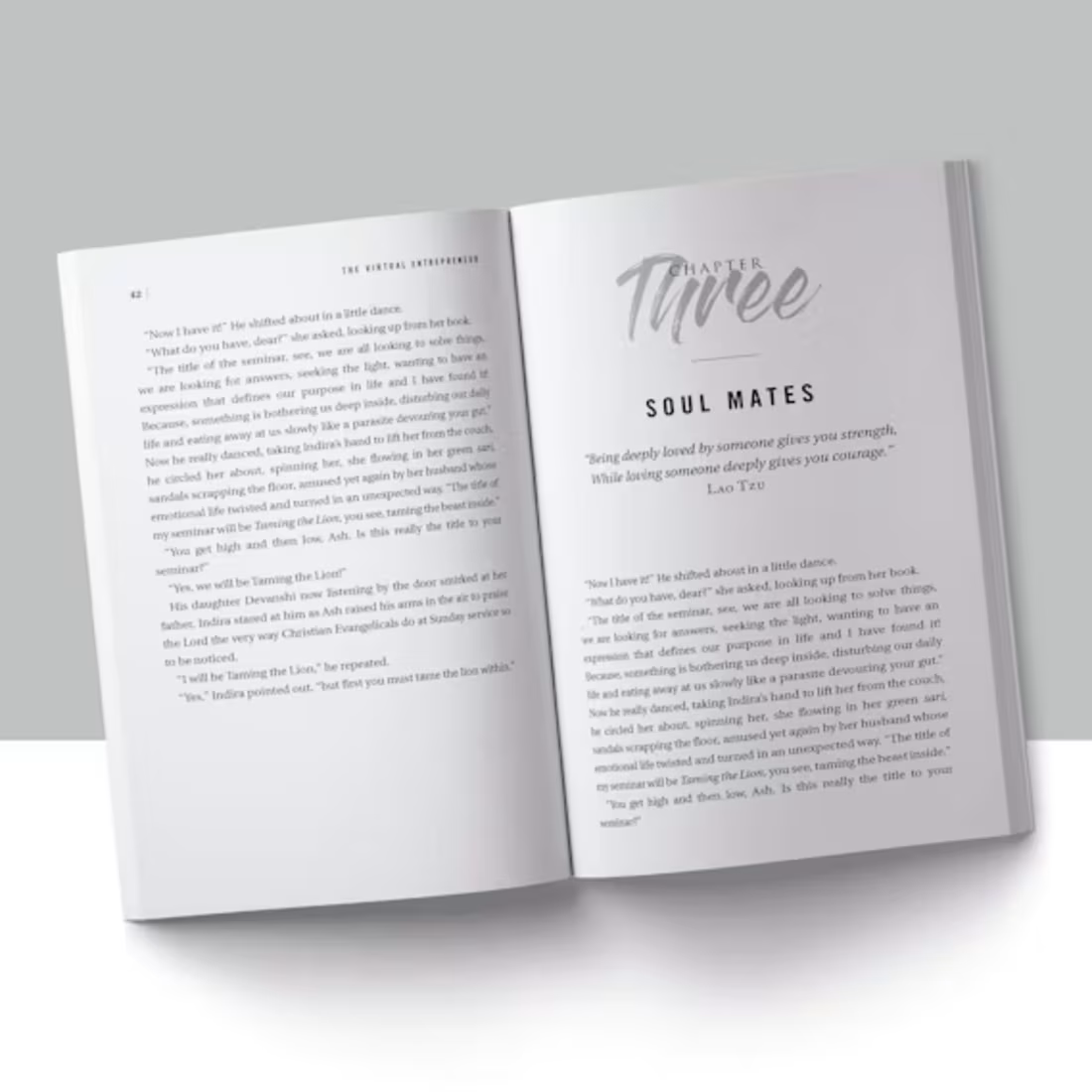
This indie author had a 90,000-word fantasy manuscript in a messy Word doc with inconsistent chapter headings and no proper page breaks. I designed a clean, genre-appropriate interior layout for both print (6x9 trim) and ebook (EPUB/MOBI), handling drop caps, running headers, and a clickable table of contents. The author launched on Amazon KDP and IngramSpark with zero formatting rejections, and the print proof came back flawless on the first try.
0
8