
Mustafa can Karaçar
Graphic Designer creating clean, strategic visuals
New to Contra
Mustafa can is ready for their next project!
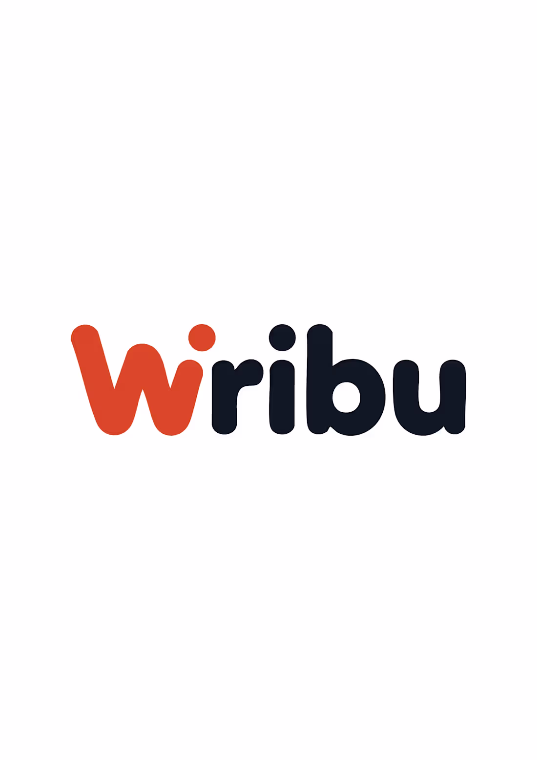
Wribu is a modern digital-first brand built for scalability and simplicity.
The objective was to create a clean, memorable logo that feels friendly yet tech-oriented.
The challenge was balancing approachability with modern startup aesthetics.
The solution focused on:
• Custom rounded typography for a soft, accessible feel
• A bold accent color to increase memorability
• Strong readability across mobile interfaces
• Scalable logo structure for app icons and digital environments
The final identity delivers clarity, flexibility, and strong brand recognition — making Wribu suitable for digital platforms, mobile applications, and tech ecosystems.
0
32
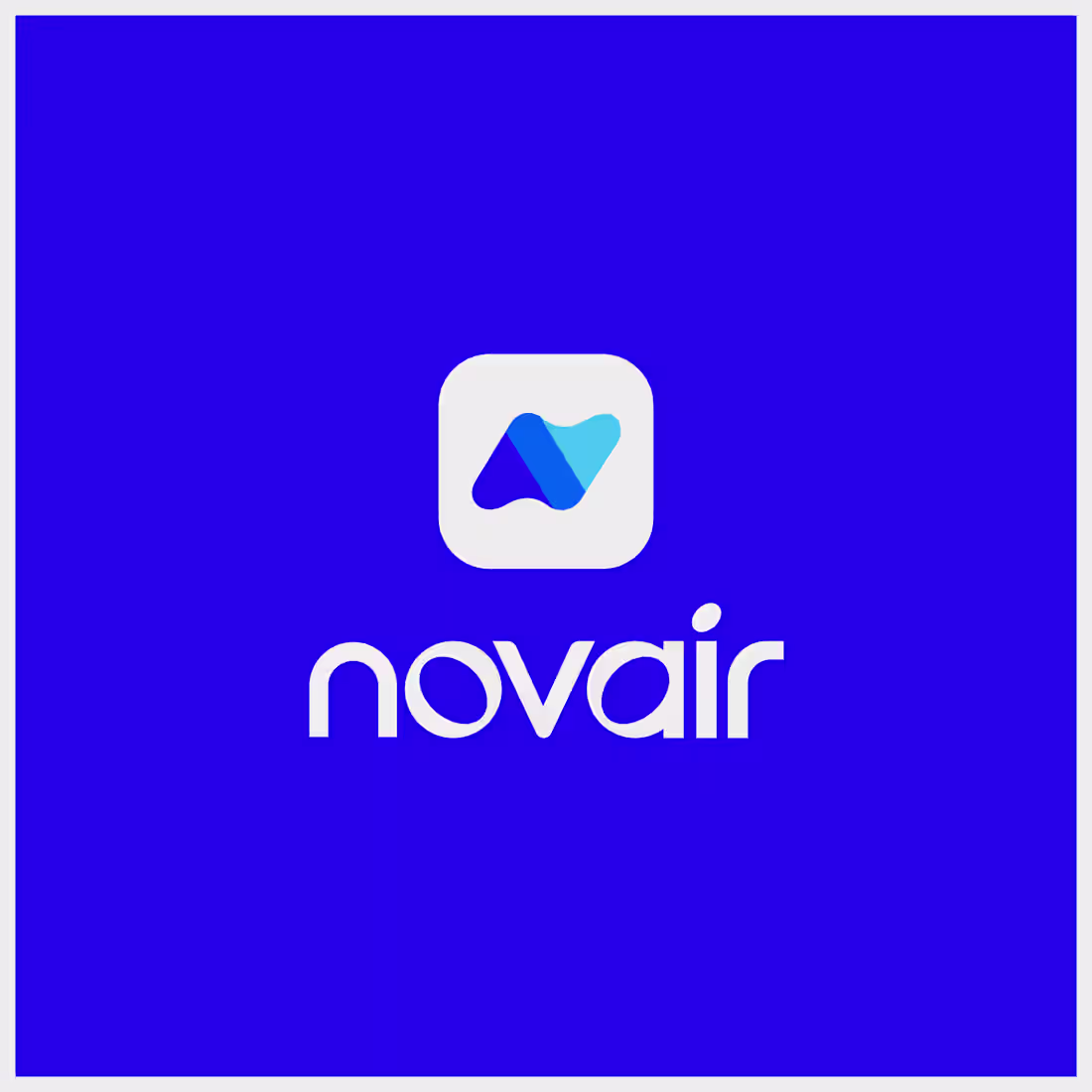
Novair – Corporate Brand Identity
This project focused on building a modern and structured brand identity for a digital infrastructure company.
The objective was to create a clean, technology-driven visual system that communicates reliability, innovation and clarity. The identity was designed to work seamlessly across digital interfaces, corporate materials and environmental branding.
The visual direction emphasizes minimal structure, scalability and strong brand recognition in both online and offline applications.
0
57
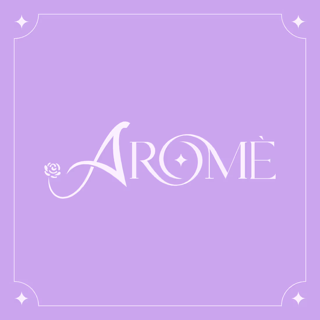
Arome – Cosmetic Brand Identity
This project focused on developing a soft, elegant and feminine brand identity for a cosmetic brand.
The goal was to create a refined visual language that communicates beauty, purity and sophistication. The logo design combines delicate typography with subtle ornamental details to reflect a premium skincare positioning.
The color palette and visual system were carefully designed to ensure consistency across packaging, social media and print applications.
0
65
Monobe Motion Studio – Brand Identity
This project focused on building a strong and modern brand identity for a motion production studio.
The objective was to create a bold visual mark that reflects creativity, movement and cinematic storytelling. The logo system was designed to remain impactful across digital media, apparel and production equipment branding.
The visual direction emphasizes contrast, scalability and brand recognition in both studio and on-set environments.
0
51
UpShift – International Logistics Brand Identity
This project focused on building a modern and dynamic brand identity for an international logistics company.
The objective was to create a strong visual system that communicates speed, reliability and global connectivity. The logo and visual elements were designed to work seamlessly across vehicle branding, packaging, digital platforms and corporate materials.
The brand direction emphasizes movement, precision and scalability — reflecting the fast-paced nature of international logistics operations.
0
29
Shining Star – Luxury Brand Identity
Shining Star required a modern and elegant brand identity that reflects premium quality and refined aesthetics.
The objective was to design a distinctive monogram symbol that conveys sophistication while maintaining strong recognizability across digital and physical touchpoints.
The logo mark was developed using clean curves and balanced geometry to create a timeless emblem. The visual system was crafted to adapt seamlessly to:
• Mobile applications
• Product packaging
• Smart devices
• Luxury lifestyle mockups
A minimal color palette and high-contrast presentation were used to reinforce the premium positioning of the brand.
The final identity establishes Shining Star as a confident, modern, and luxury-oriented brand ready to scale internationally.
0
18
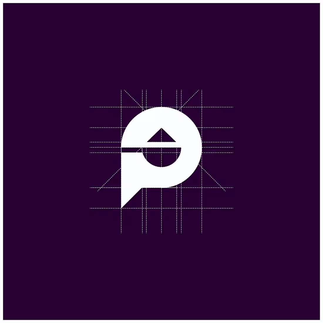
Pigma – Industrial Paint Brand Identity
This project focused on developing a strong and reliable brand identity for an industrial paint company.
The objective was to create a bold and memorable visual mark that reflects durability, quality and technical expertise. The logo system was designed to be adaptable across packaging, workwear, signage and digital platforms.
The visual direction emphasizes clarity, contrast and brand strength to ensure high recognition in competitive industrial markets.
0
28
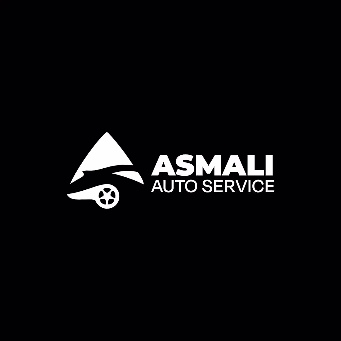
Asmali Auto Service – Brand Identity Design
Asmali Auto Service needed a bold and trustworthy brand identity that reflects technical expertise and reliability.
The goal was to create a strong visual system that communicates precision, mechanical strength, and professionalism while remaining modern and clean.
I developed:
• A custom logo mark inspired by mechanical forms and movement
• A bold typographic system for maximum readability
• A minimal black & white primary identity for strong contrast
• Packaging and branded materials mockups for real-world application
The final identity positions Asmali Auto Service as a confident and professional automotive brand ready to stand out in a competitive market.
0
18
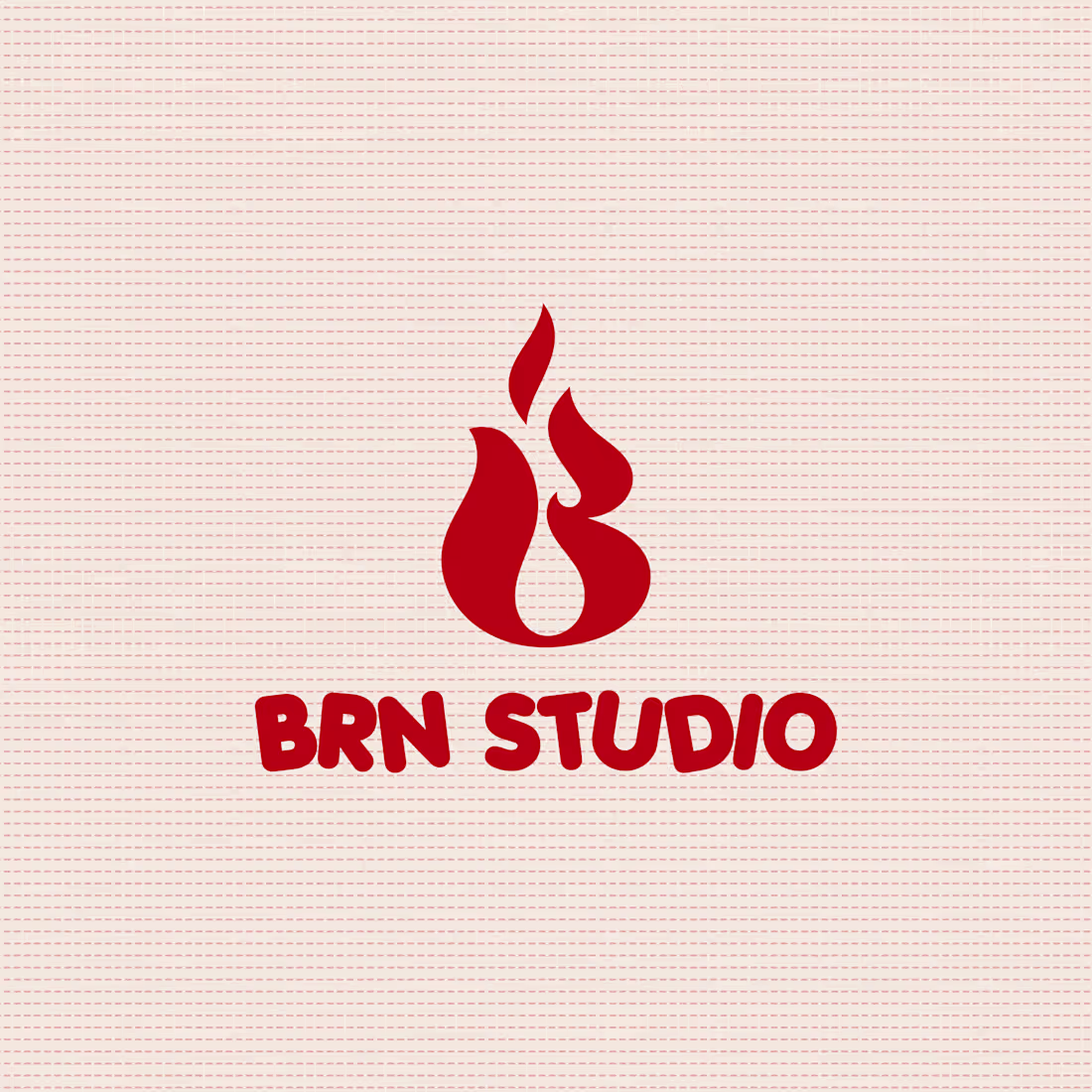
BRN Studio – Brand Identity & Visual System
This project focused on creating a bold and modern brand identity for a creative studio.
The goal was to design a strong visual presence that works across digital and physical applications.
I developed a clean logotype with a dynamic flame symbol, designed to be scalable and adaptable for merchandise, social media and mobile platforms.
The visual direction emphasizes clarity, contrast and brand consistency.
0
35