
Mustafa Aboalazm
Bilingual AR/EN brand systems for founders & MENA brands
New to Contra
Mustafa is ready for their next project!
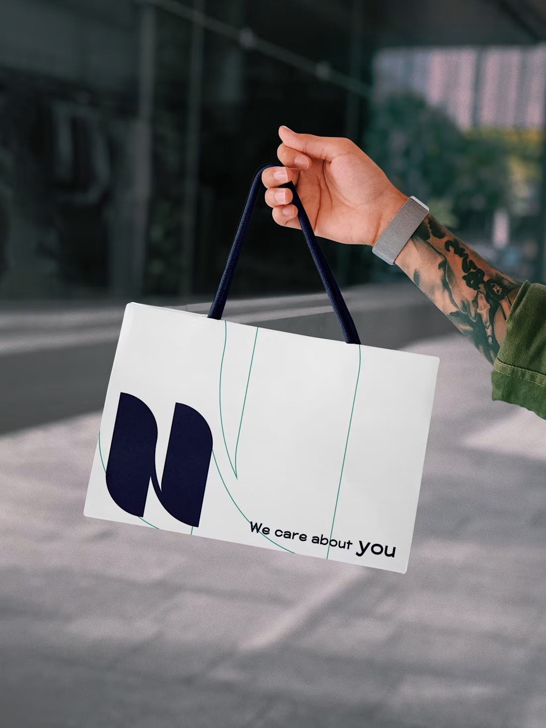
A pharma and food-supplements company operating with no visual identity at all — no logo system, no palette, no templates, no website. Every sales document, label, and post was improvised, and in a regulated sector, improvisation reads as risk.
0
37
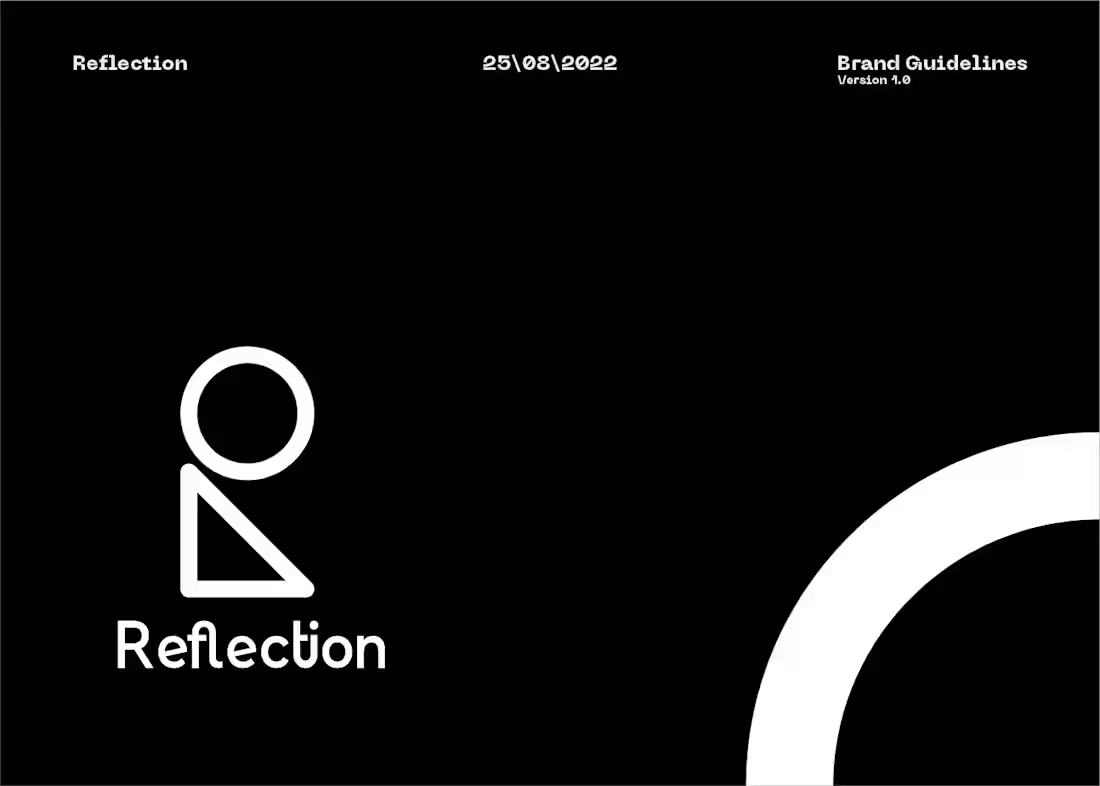
A premium art and print studio needing an identity that positioned it apart from mass-market poster shops — something that felt considered, gallery-adjacent, and collectable, while remaining legible and functional across both digital and physical surfaces.
0
37
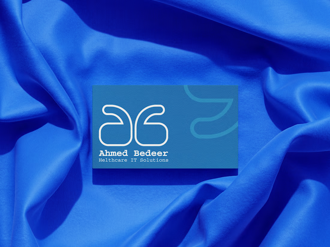
A senior Healthcare IT consultant operating without any personal brand presence — no visual identity, no unified digital positioning, no system connecting his international credentials to his professional narrative. In a sector where trust is the product, invisibility is a liability.
0
44
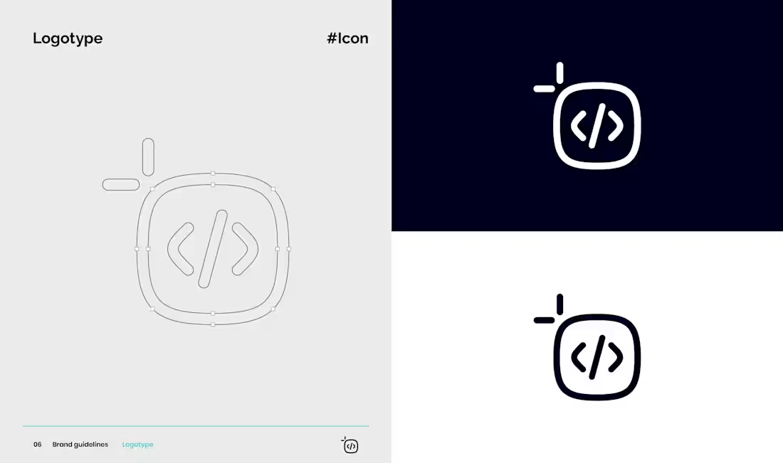
Code & Canvas is the studio I co-founded — and its identity had to do something most agency brands skip: prove the promise before a client ever asks. The name signals a duality (design + engineering, one hand), so the system had to hold both without favoring either side.
I built a two-tone gradient system — a creative purple bleeding into a technical teal — that runs through everything from the squircle mark to UI screens, standing in for where brand strategy and code actually meet in our process. The squircle softens a rigid grid just enough to read as approachable rather than corporate, while staying structured enough to feel engineered. The full palette extends outward from there to cover the range a bilingual (AR/EN) studio serving Egyptian and regional clients actually needs across a project.
The result works as its own case study: every client conversation opens with an identity that's already demonstrating the exact bilingual, brand-to-build capability we're pitching.
0
56