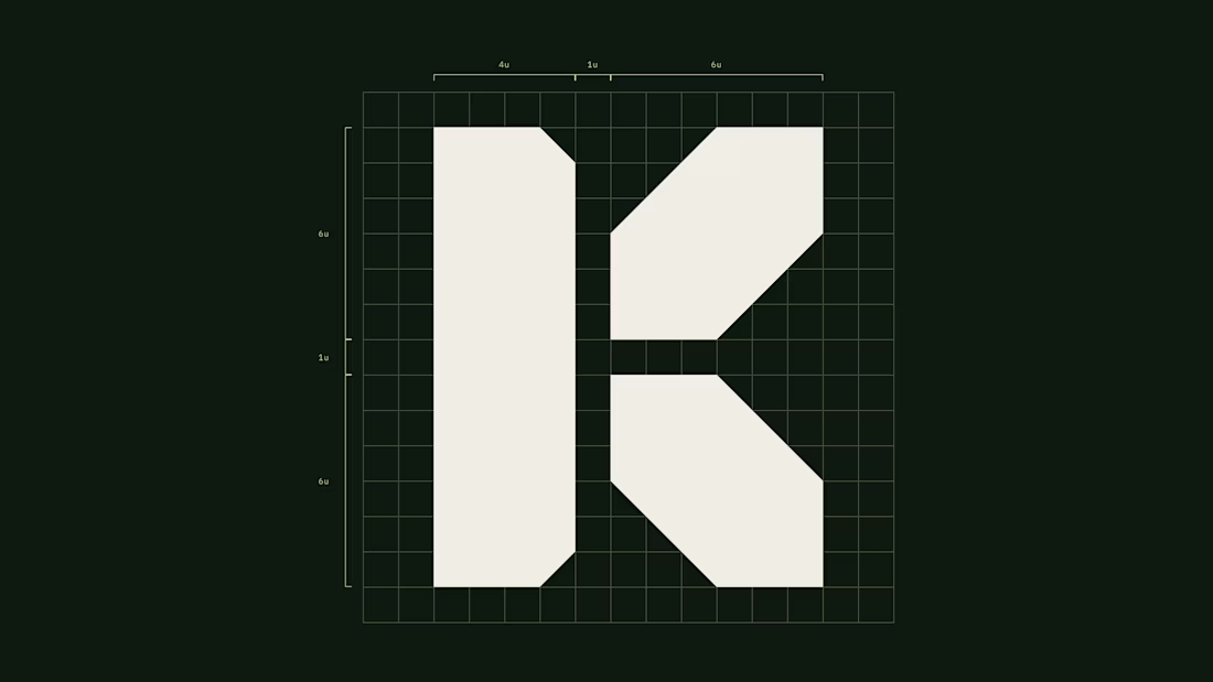




A mark for a financial app spends most of its life very small: an app icon, a tab, a notification.
So the Keystone K is drawn on a strict grid, as one solid shape with no thin details to lose. It holds on a billboard and still reads at app-icon size.
Do you design the small version first, or the big one?