Muhammad Shariq's Work | ContraWork by Muhammad Shariq
Muhammad Shariq

Muhammad Shariq

Graphics & UI/UX Designer

New to Contra

Muhammad is ready for their next project!
Cover image for This Vogue-inspired poster blends timeless
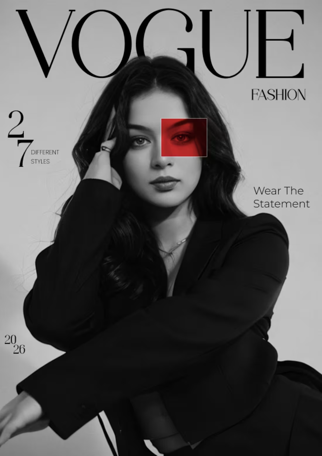
This Vogue-inspired poster blends timeless elegance with modern visual storytelling. The black-and-white portrait creates a sophisticated and luxurious feel, while the bold red overlay adds contrast, instantly drawing attention to the subject's eye. Using color theory, the red accent symbolizes confidence, passion, and individuality, creating a powerful focal point against the monochrome composition. The clean typography and minimal layout reinforce the high-fashion editorial aesthetic, allowing the imagery to take center stage. Together, these elements communicate a bold statement: fashion is not just about appearance, but about identity, confidence, and self-expression.
1
30
Cover image for DESIGNOGRAPHY - From Pixels to
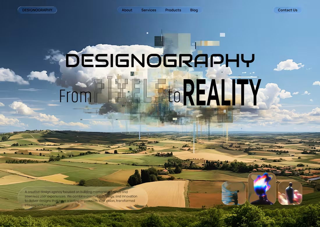
DESIGNOGRAPHY - From Pixels to Reality This hero section visually represents the journey of transforming imagination into reality. The floating digital cloud made of fragmented pixels symbolizes raw ideas, creativity, and limitless possibilities, while the vast landscape beneath represents the real world where those ideas take shape. The transition from abstract pixel formations to structured visuals reflects Designography's process of turning concepts into impactful designs, brands, and digital experiences. The tagline "From Pixels to Reality" reinforces this vision by highlighting how every successful project begins as a simple idea and evolves into something tangible and meaningful. The futuristic aesthetic, combined with the blend of technology and nature, showcases the agency's ability to merge creativity, innovation, and strategic thinking to create designs that leave a lasting impression. At its core, this visual tells a story of transformation, where creativity meets execution, and imagination becomes reality through design.
0
26
Cover image for A minimal poster with a
A minimal poster with a bold artistic twist, showcasing how subtle effects and thoughtful composition can transform a simple design into something visually striking. The torn paper effect symbolizes two separate worlds existing within a single canvas, creating contrast, depth, and curiosity while maintaining a clean editorial aesthetic.:
0
61
Cover image for The Takeaway Spot is a
The Takeaway Spot is a fast food concept built specifically for quick and convenient pickups. The logo is designed to clearly communicate location, purpose, and offering through bold yet simple visuals and thoughtful color contrast. With clean variations and adaptable concepts, the identity is flexible enough to work seamlessly across different touchpoints while maintaining a strong and recognizable presence.
0
75
Cover image for Grafikos Logo is a design
Grafikos Logo is a design agency dedicated to redefining the fundamentals of design, marketing, and Excel-based solutions. We focus on delivering clean, minimal, and thoughtfully crafted visuals that highlight the power of simplicity and soft aesthetics. Our approach emphasizes clarity, precision, and impact, proving that refined design can create a lasting and meaningful impression.
0
71
Cover image for A mobile view of a
A mobile view of a website called Fintech. A sleek, modern mobile view of a Fintech website that demonstrates how a premium digital experience can seamlessly adapt to smaller screens while maintaining elegance, clarity, and effortless usability without compromising design or user interaction.
0
78
Cover image for A clean modern Contact Us
A clean modern Contact Us Page UI A clean, modern Contact Us page that showcases how thoughtful design can elevate even the simplest interactions. Built on user-centered principles, it features a structured layout, subtle effects, and refined typography to create a smooth and intuitive experience. Every element is purposeful making the page not just functional, but visually engaging and easy to navigate.
0
96
Cover image for Tech Website Landing Page UI
Tech Website Landing Page UI Design A modern, purple-themed landing page for Simform that highlights its engineering and digital transformation services. It features a bold hero section with a clear call-to-action, followed by service offerings, client success stories, testimonials, and case studies. The design emphasizes credibility with partner badges, company logos, and Microsoft recognition, while maintaining a clean, user-focused layout with strong visual hierarchy and smooth card-based sections.
0
96
Cover image for G502 Wireless Webpage UI Design
A
G502 Wireless Webpage UI Design A premium website concept that demonstrates how a modern product-focused webpage should look. It is not about what you are selling, but how effectively you present it. This design features a clean layout, user-centered structure, and a bold dark theme that works perfectly for tech and gaming products. It uses well-organized cards, smooth spacing, and intuitive buttons that clearly guide user interaction.
0
91
Cover image for Coffee Shop Landing Page UI
A
Coffee Shop Landing Page UI A premium coffee shop landing page designed with a modern, clean UI that shows how good design can improve a simple website. Instead of only images, text, and buttons, it focuses on clear layout, spacing, and readability. The design uses simple typography, warm colors, and smooth interactions to match the coffee brand and create a better user experience. Unlike basic layouts, this modern UI makes the website more engaging, memorable, and visually strong.
0
93