
Muhammad Mohtashim
Strategic Brand Identity Designer | Helping Businesses Turn
New to Contra
Muhammad is ready for their next project!

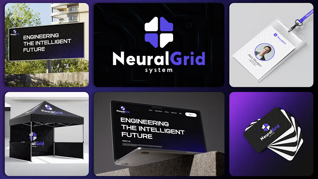
NeuralGrid Systems is an enterprise technology company that transforms fragmented operational data into unified, predictive intelligence. By integrating disconnected systems across an organization, the platform enables leaders to make faster, more informed decisions with greater confidence. Built for mid-size and enterprise organizations, NeuralGrid Systems replaces complexity with structured clarity. Its infrastructure is designed to create a single, trusted operational framework where data becomes actionable insight, helping businesses improve efficiency, reduce uncertainty, and scale with confidence. Rather than adding another layer of technology, NeuralGrid Systems serves as the intelligence layer that connects existing systems into one cohesive decision platform. The result is a resilient, enterprise-grade foundation that supports long-term growth, operational stability, and strategic execution. NeuralGrid Systems stands for structured intelligence, trusted infrastructure,
4
5
77
Leafmark is a Beauty & Wellbeing brand dedicated to delivering premium-quality products inspired by nature and science. We focus on purity, performance, and thoughtful formulation to support everyday self-care. Each product is crafted to enhance natural beauty while promoting holistic wellbeing. If you want a more luxurious, minimal, or eco-conscious tone, I can refine it further.
1
11
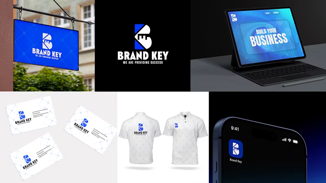
This logo for BRAND KEY is a modern, minimalistic identity built around the concept of “unlocking success.”
The central symbol forms a stylized “B”, representing the brand itself. Within its structure, geometric precision is used to construct the letter through clean negative space and solid forms, giving it a strong and professional presence.
Two diagonal cuts run through the design, subtly shaping the impression of a key while also forming the visual essence of the letter “K”. These intersecting angles reinforce the idea of access, unlocking potential, and opening pathways to success.
Overall, the mark combines symbolism and typography into a single unified concept, where the “B” stands for Brand, the “K” for Key, and the entire structure communicates the core message: unlocking success through strategic branding.
1
38
The logo combines the first and last letters of “Urban” — U and N — into a unified, modern mark. Rounded forms inspired by puzzle connections and tech lines represent creativity, innovation, and smart problem-solving. The seamless connection of the letters conveys the idea that innovation is born from linking ideas together. Its minimalist, elegant design ensures strong memorability and versatility across digital and branding applications
3
63