
spent a month building the most complete brand studio template on Framer
10 pages. full CMS. motion-first. dark aesthetic.Use for free on the framer marketplace https://www.framer.com/community/marketplace/templates/nysa-studio/
2
5
129
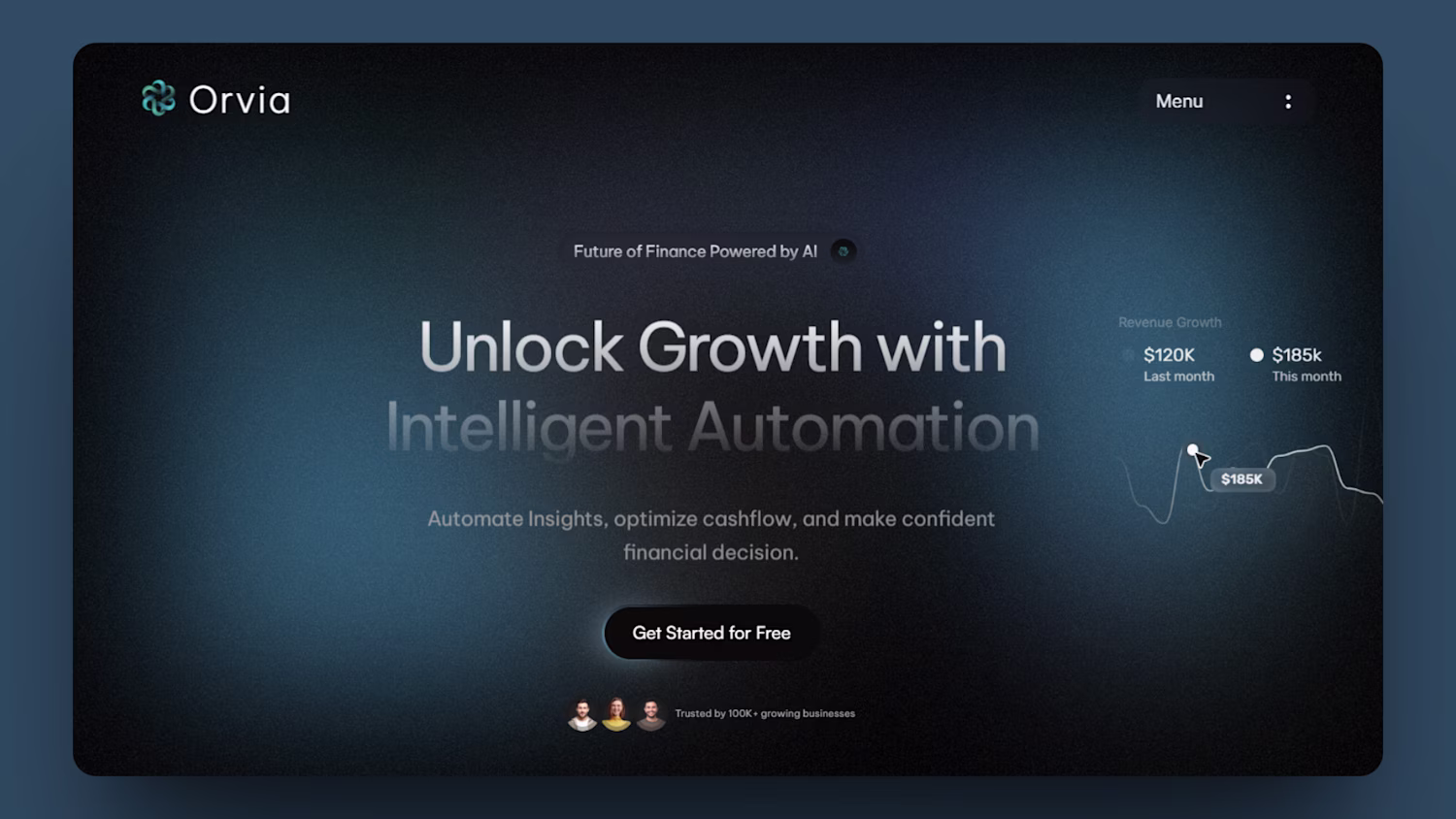
Working on two Framer templates — Origin and Orvia AI.
Designed these hero sections last year, now bringing them to life as fully functional templates on Framer.
Follow to get early free access.
2
98
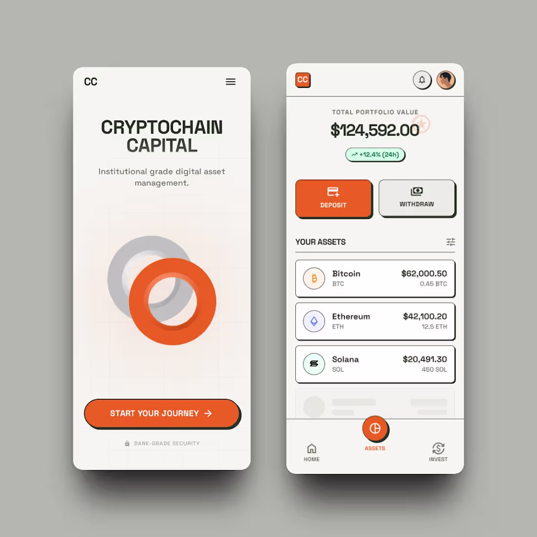
Designed this Web3 website some time ago. Old project, but the work still speaks.
2
2
129
Designed this portfolio concept for an African cinematographer — a digital space where visual storytelling takes center stage.
2
3
114
Design isn’t always about standing out.
For Vineyard of Hope Counseling, it was about creating something quiet, clear, and comforting.
Sometimes the best design simply helps people feel understood.
2
1
105
Not every website needs to follow the “overdesigned SaaS” trend.
For Cartalyst AI, the client wanted clarity over complexity.
A simple landing page.
Focused messaging.
Nothing distracting from the product.
Sometimes simplicity is the real sophistication.
2
94
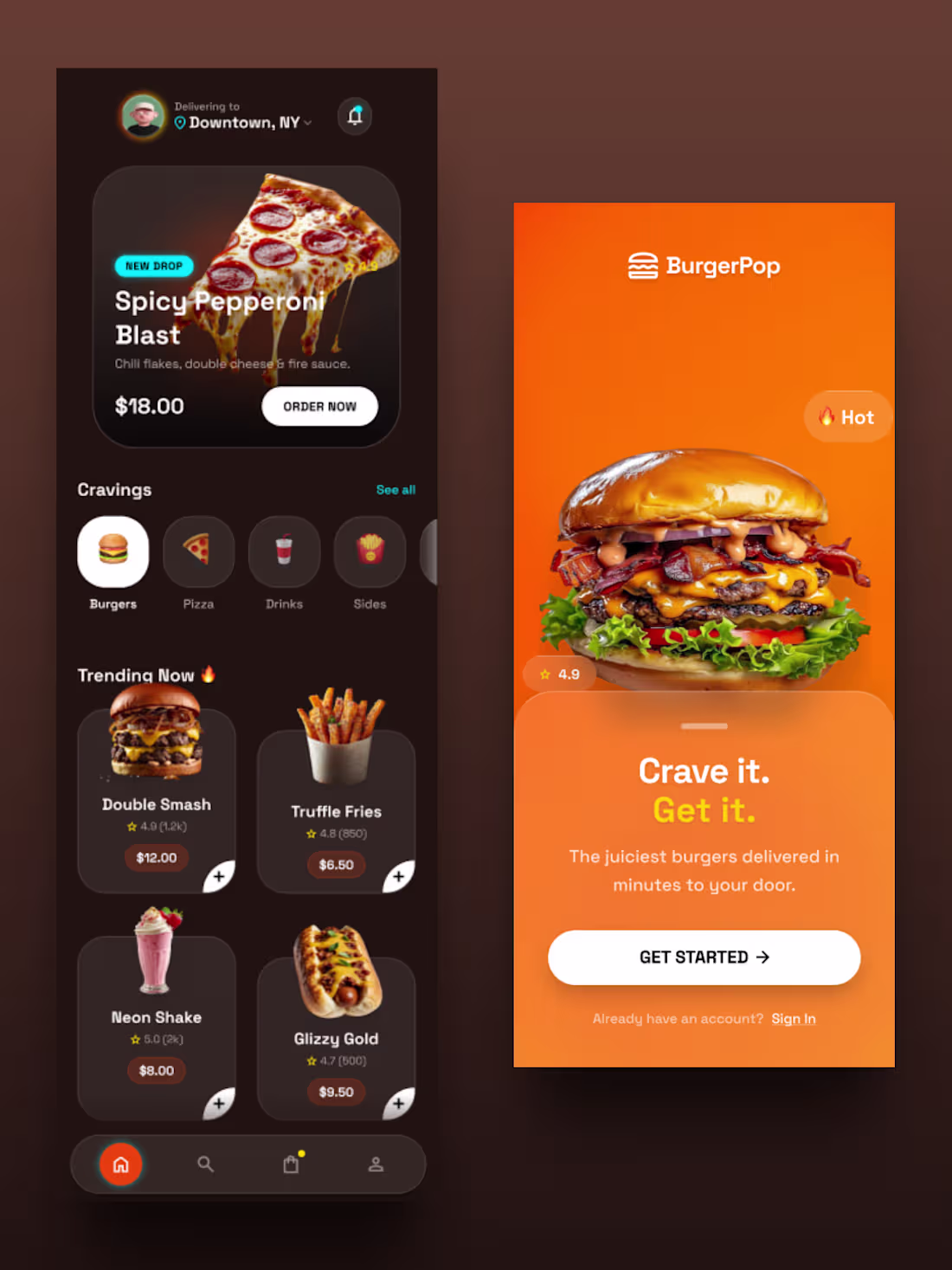
Not an app. Just good design.
Why shouldn’t a restaurant UI look this good, even without a full app budget?
Make it easy. Make it crave-worthy.
People will come back hungry every time. haha!😂
1
111
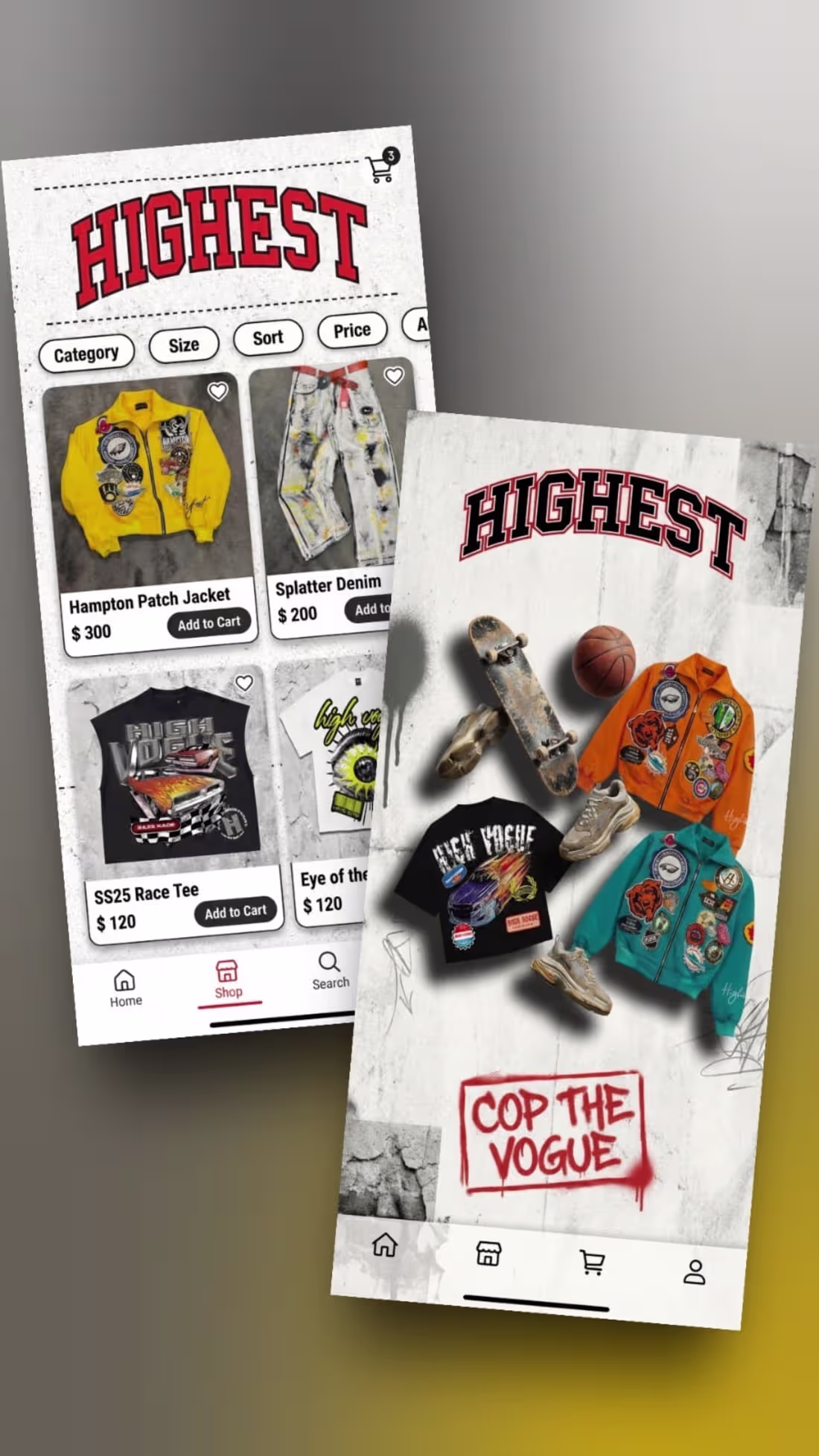
When the design matches the culture, everything clicks.
3
4
142
Project Title: Titan Performance – Digital Command Center
The Brief:
Titan Performance is Abuja’s premier automotive engineering workshop, specializing in drift builds and custom "Deathkarts." They needed a digital presence that matched the rugged, high-stakes nature of their workshop moving away from generic layouts toward a clinical, "Technical Data Sheet" aesthetic.
The Solution:
Engineering-First UI: Swapped traditional marketing fluff for a "Mission Control" interface, prioritizing technical specs and performance protocols.
High-Octane Visuals: Optimized heavy automotive media for lightning-fast mobile performance (essential for track-side viewing).
Interactive Divisions: Developed a custom 6-division grid featuring "Blueprint-to-Outcome" technical overlays for Stage 1-3 Tuning, Fabrication, and Drift builds.
1
132
Designed this mobile app experience with clarity, speed, and real users in mind 4 fully structured screens in under 2 hours.
In a space where many products feel complex or overwhelming, this concept focuses on what actually matters:
clean hierarchy, tech-savvy interactions, and navigation that feels effortless from the first tap.
Standing out in today’s marketplace isn’t just about looking modern.
It’s about building experiences people instantly understand and trust.
1
2
127
Too many modern websites prioritize mood over meaning shipping dark, visually impressive interfaces that users struggle to read, navigate, or understand.
Great design should feel effortless. Clear structure, intentional contrast, and thoughtful UX always outperform surface-level trends.
As a designer, my focus is simple: craft digital experiences that look premium, communicate clearly, and move your brand forward.
3
4
147
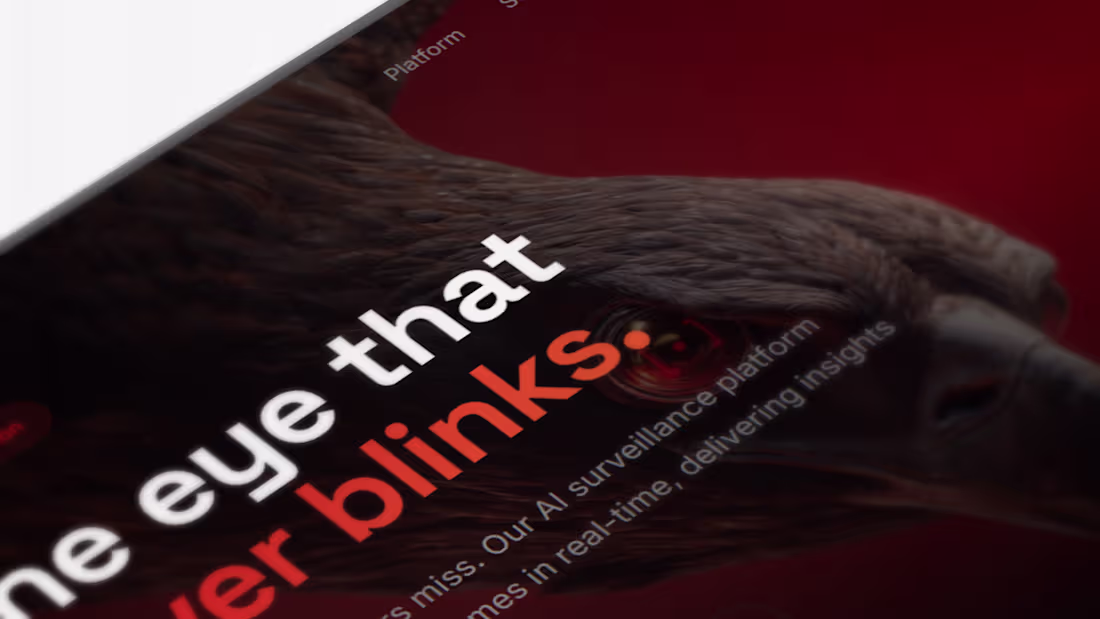
A concept study in intelligent surveillance—imagining an AI vision system that anticipates threats, learns continuously, and delivers real-time clarity without interruption.
Not a product. A glimpse of what’s next.
5
149

An exploration of simplicity in digital design.
By reducing noise and emphasizing structure, typography, and space, the message becomes immediate: fast, reliable global cargo solutions.
When design is clear, understanding becomes natural.
1
100

These three concepts explore how web design should be pleasing not just to the eyes, but to the brain. From soft color psychology and balanced layouts to intentional spacing and visual hierarchy, every element is crafted to guide attention, evoke emotion, and build trust.
Great design isn’t decoration it’s strategy. When visuals align with human psychology, users feel clarity, confidence, and connection. That’s how brands turn visitors into loyal customers.
Made with Framer.
2
2
107
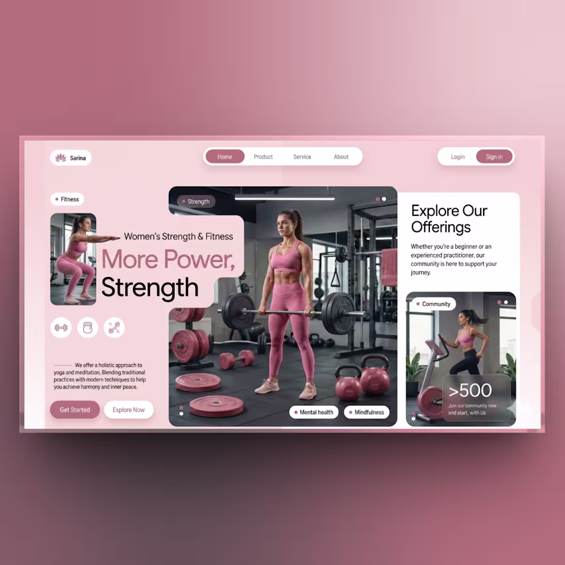
This project explores the intersection of visual elegance and user psychology in modern web design.
The goal was to create a fitness and wellness landing page that feels strong yet calming — blending empowering tones with a clean layout that guides users naturally. Every decision, from color palette to typography and spacing, was intentional.
The warm hues evoke energy and confidence, while the structured grid and generous white space create clarity and focus. The hero builds emotional connection, then transitions into community and offerings to strengthen trust.
This work reflects my approach: visual hierarchy, color psychology, balanced aesthetics, and usability.
Built in Framer, this concept shows how thoughtful UI can elevate a brand’s story while driving an intuitive, conversion-focused experience.
2
87
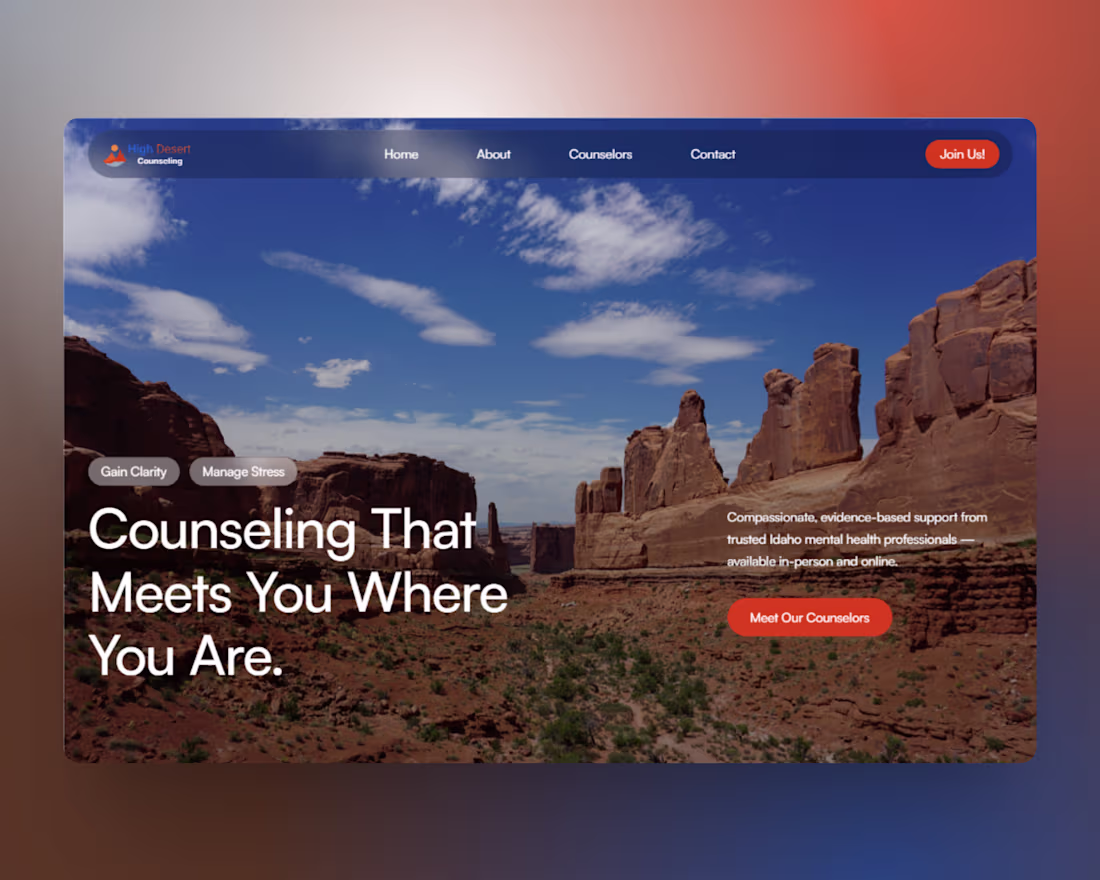
Project Description:
High Desert Counseling needed a website that reflected their compassionate approach to mental health while making the barrier to entry as low as possible for new clients. My goal was to build a site that felt safe, professional, and easy to navigate.
I designed and developed a fully responsive website that prioritizes user experience (UX). Recognizing that visitors might be in a state of distress, we stripped away clutter and focused on clear, calming visuals and an intuitive path to booking an appointment.
Key Deliverables:
Complete UI/UX Design & Development
Mobile-responsive layout
CMS for easy content updates
SEO optimization for local search
Built on: FRAMER
3
105
I designed and developed a modern, high-end website for DeRossy Skin Aesthetician, focused on communicating trust, luxury, and clinical professionalism. The goal was to create a calming digital experience that reflects the precision and care of advanced skincare treatments while guiding visitors smoothly toward booking services.
The project included full UI/UX design, visual direction, typography selection, and layout structure tailored to the beauty and wellness industry. I used soft spacing, refined color balance, and elegant imagery to establish a premium aesthetic, while ensuring the interface remained intuitive, responsive, and conversion-focused.
The final result is a clean, sophisticated website that strengthens brand credibility, highlights treatment offerings clearly, and improves the overall client booking journey.
2
96