
Muhammad Arslan Aslam
Product designer for the modern AI-native stack.
New to Contra
Muhammad Arslan is ready for their next project!
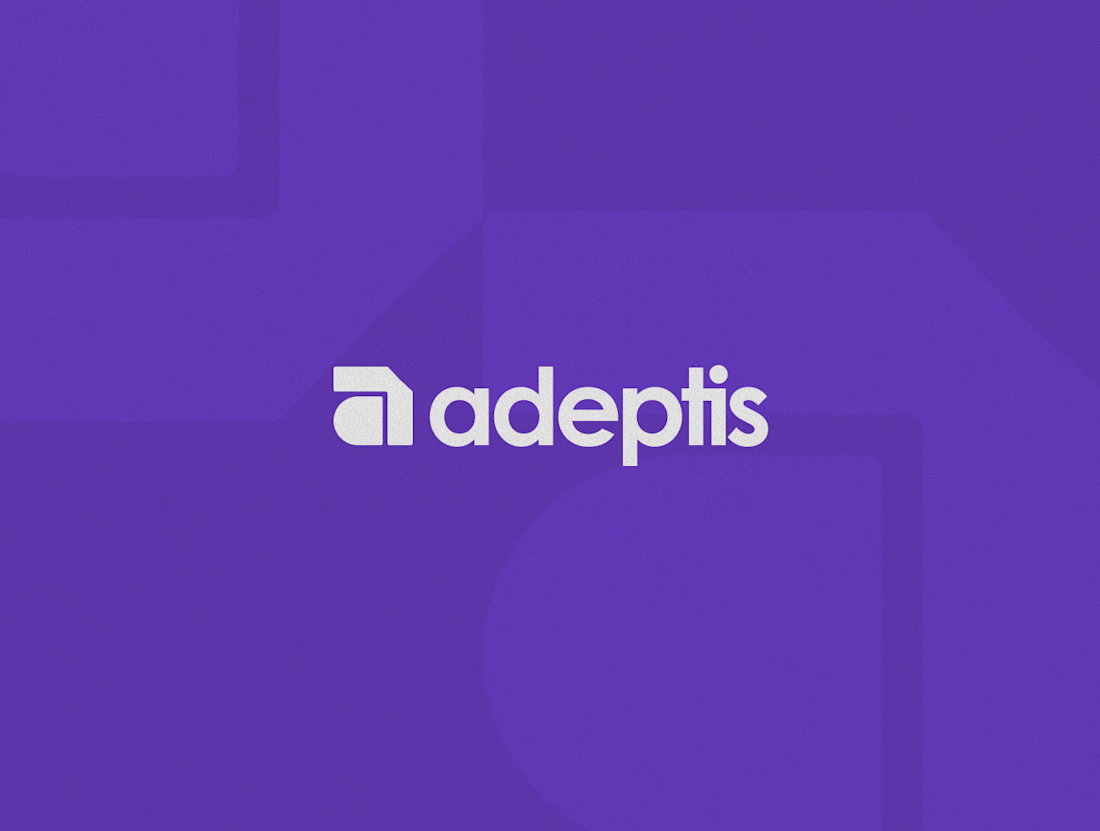
This is one of the most simplest logo design I have done and by far one of the fun ones.
I went from some really complex and random marks to just this basic simple letter "a" that I saw while scrolling through a logo design book at the bookstore this past weekend (I regret not buying it at the time lol).
I love it thought. Seems very on the point and what I have in mind for the overall design for this project.
What do you guys think?
1
3
10
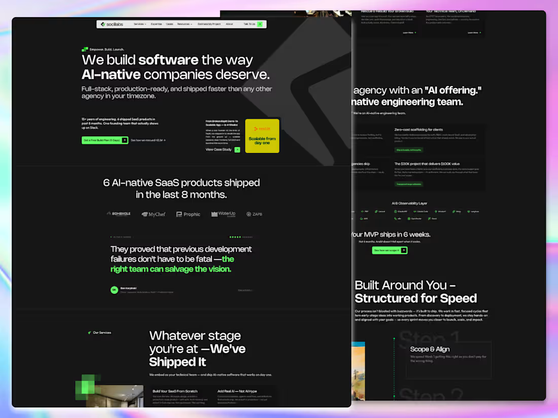
sociilabs.com (https://sociilabs.com) - Website Design & Development
0
24
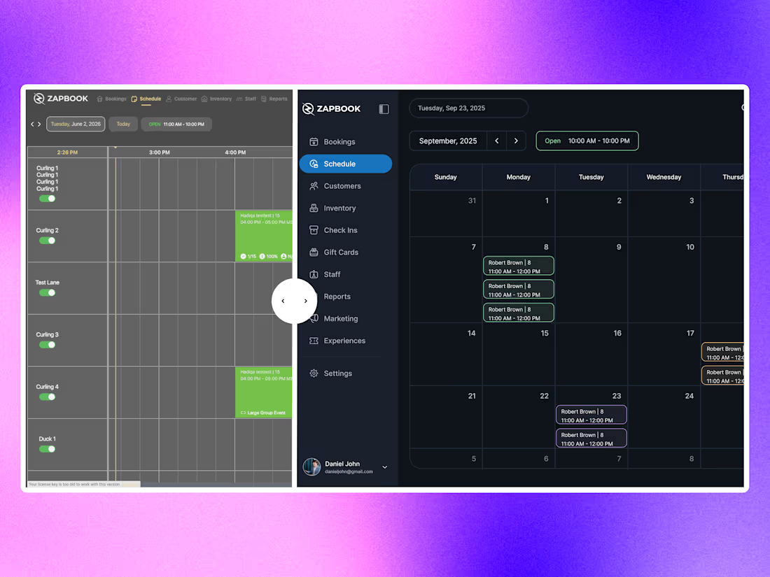
ZapBook - Full Platform Redesign & Development
0
41
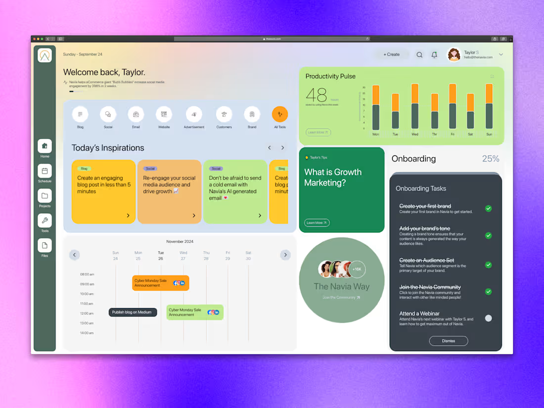
Navia - AI Powered Content & Productivity Assistant
0
48
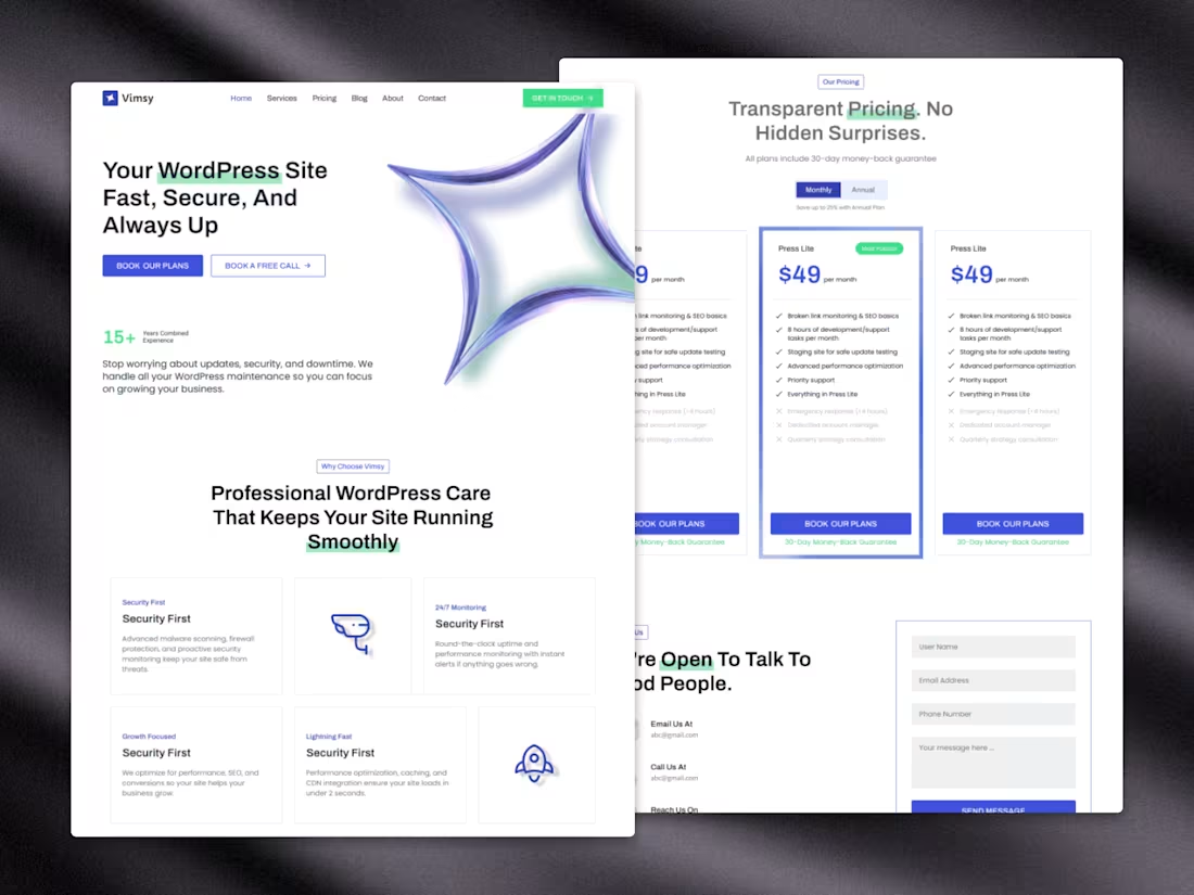
Vimsy.io (https://Vimsy.io) Re-design
0
48