Muhammad Ahmad
Brand identity, streetwear graphics & digital design
New to Contra
Muhammad is ready for their next project!

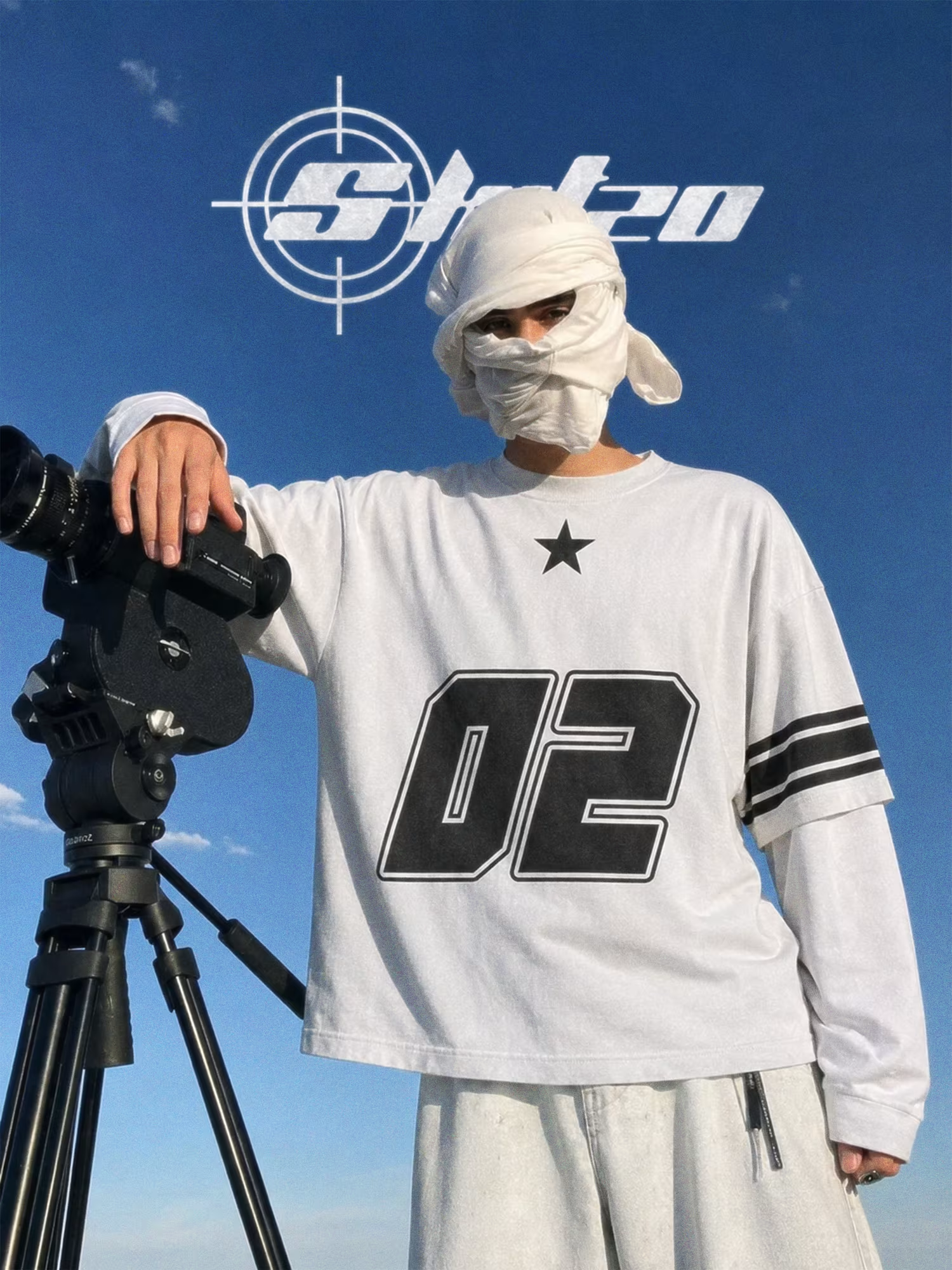

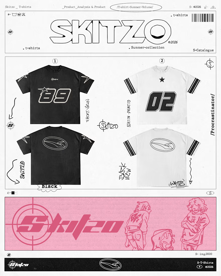
SKITZO — Summer ‘26
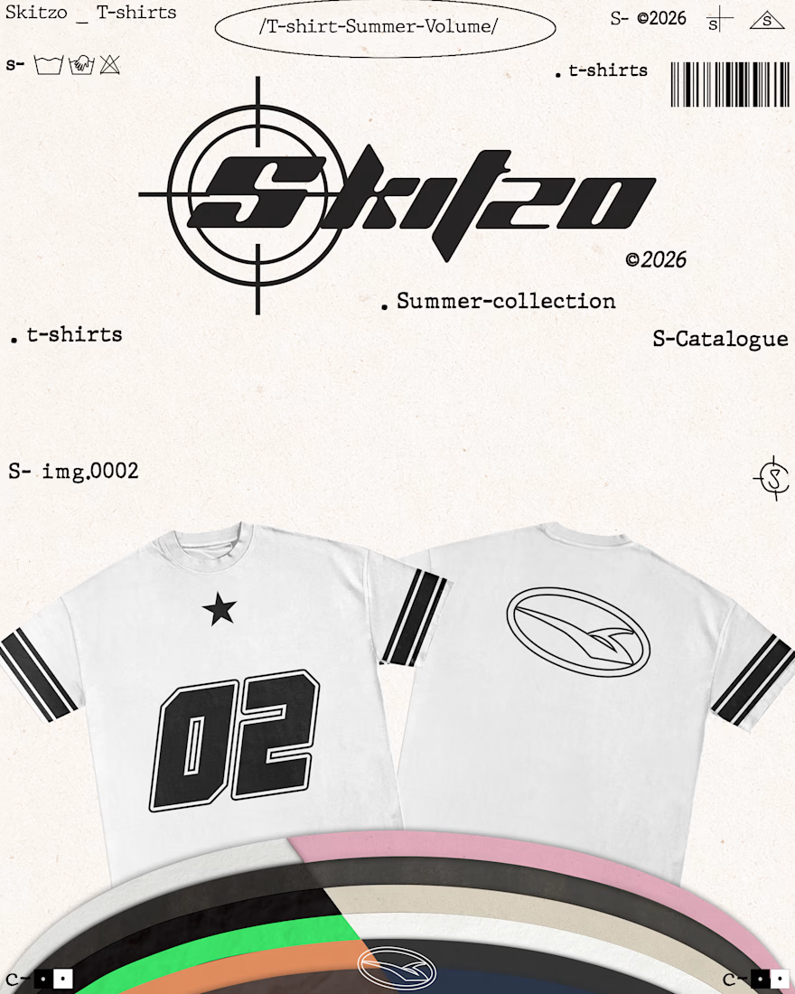
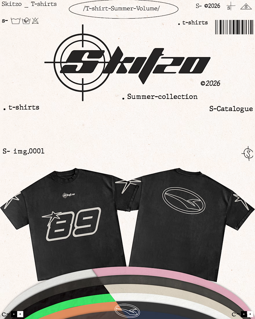
T-shirt graphics and visual direction for SKITZO’s latest summer collection.
Built around typography, technical marks, raw print textures, and catalogue style layouts — extending the SKITZO identity from the garments into the way the collection is presented.
...

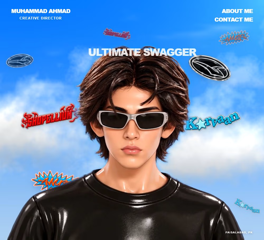
An interactive portfolio with character movement, clickable brand showcases, and a contact panel. Explore the full site: https://ultimateswagger.github.io/portfolio/

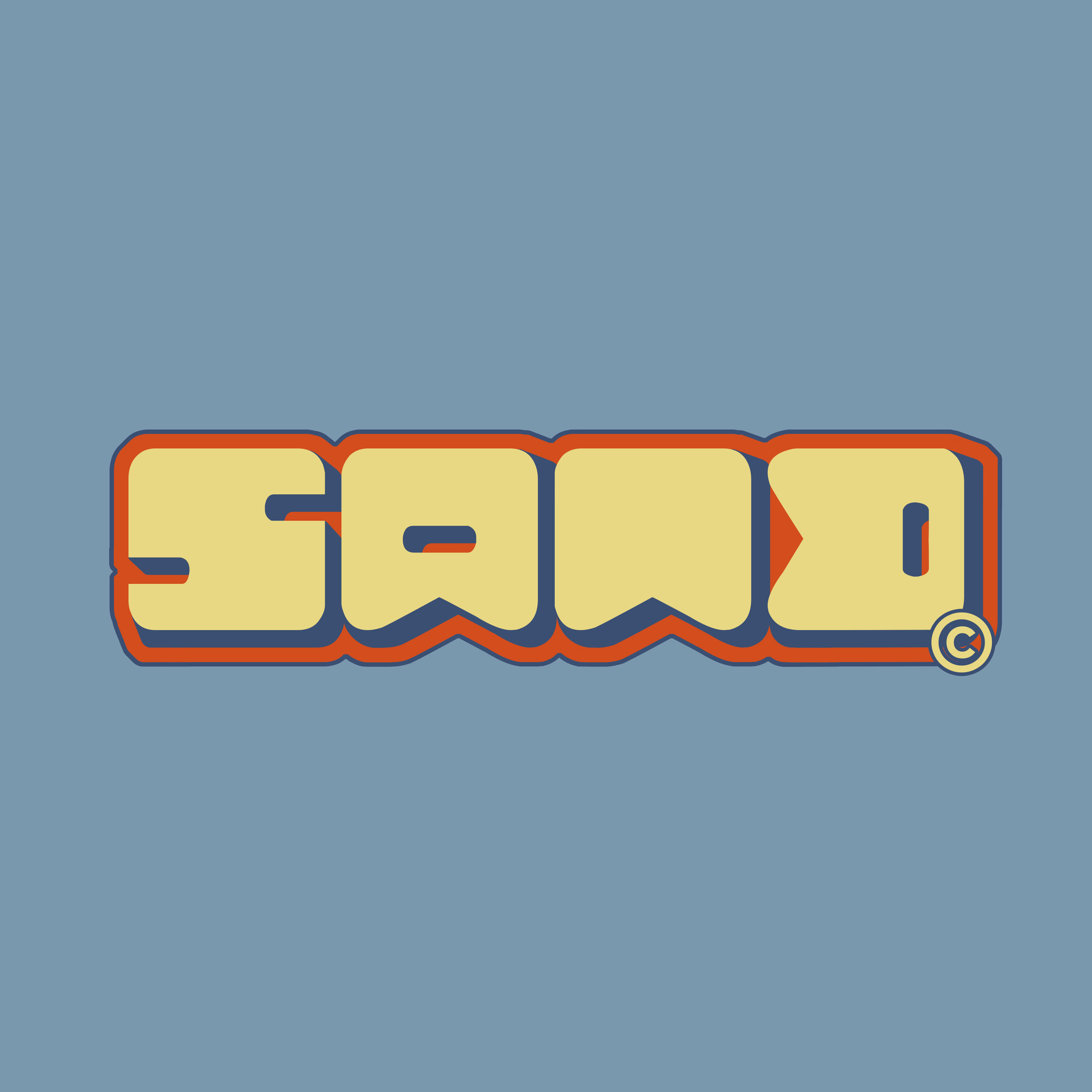
Designed this logo last year for SAND, a local skincare brand.
The idea was to move away from the typical minimal skincare aesthetic and give SAND something with more personality, a bold, retro-inspired wordmark built around chunky forms, warm tones, and playful details.
Simple...

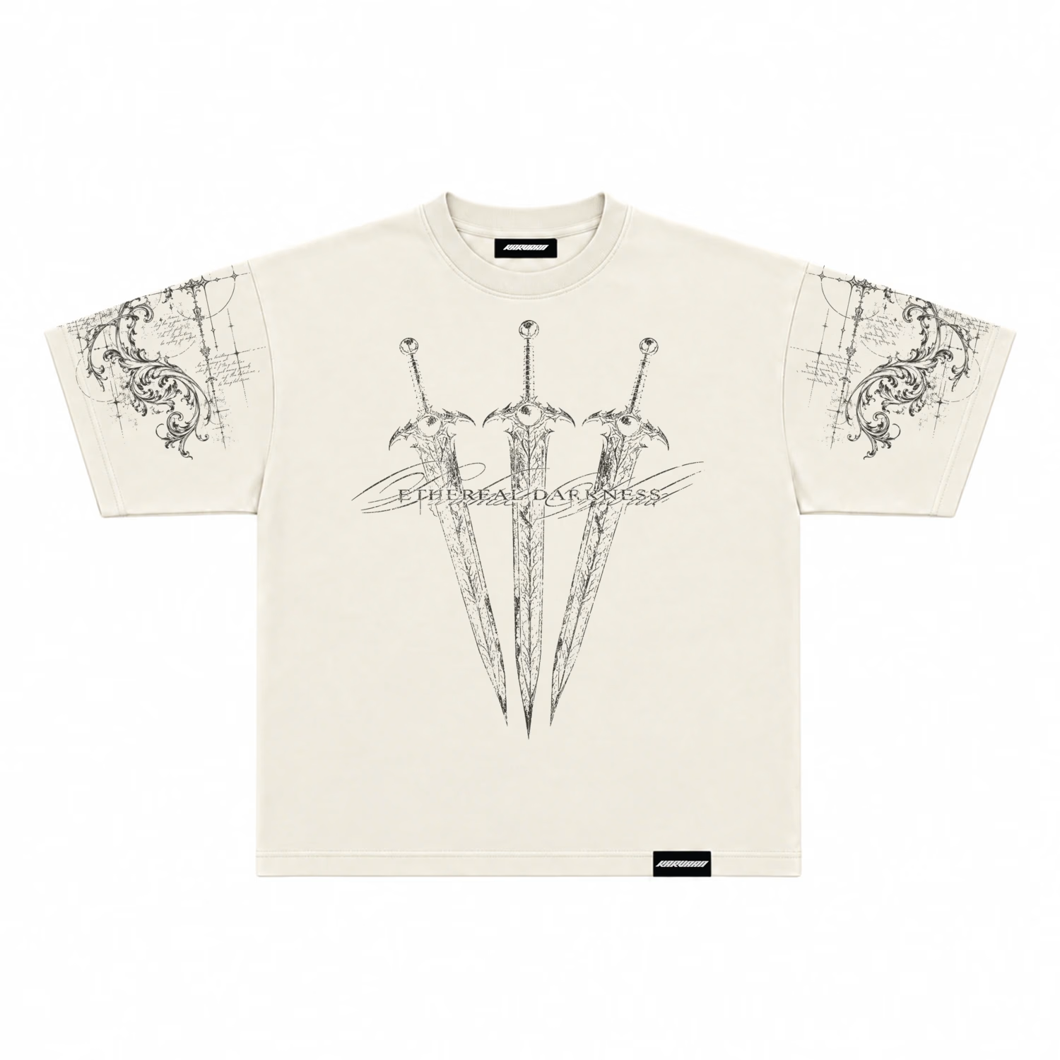
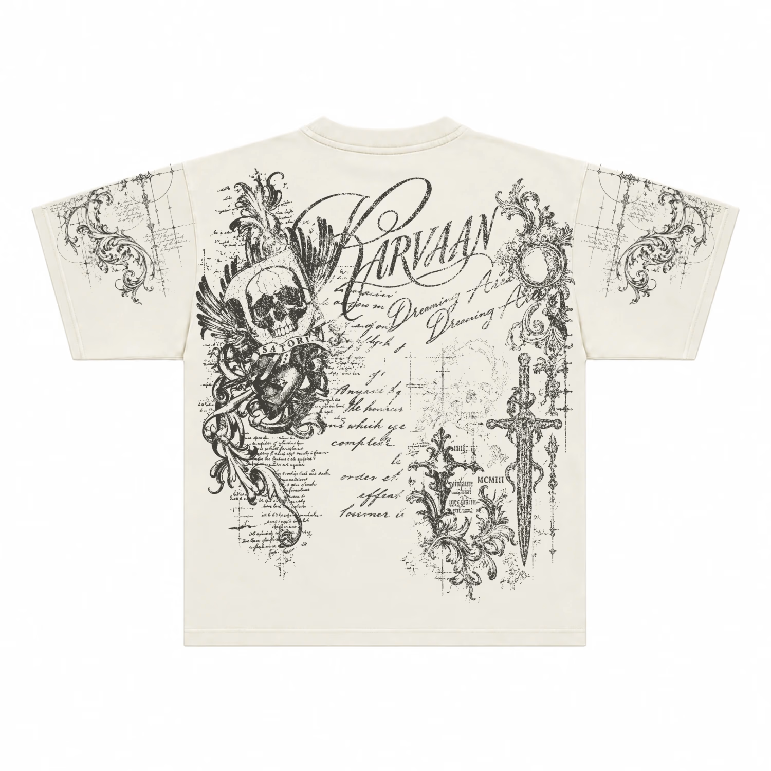
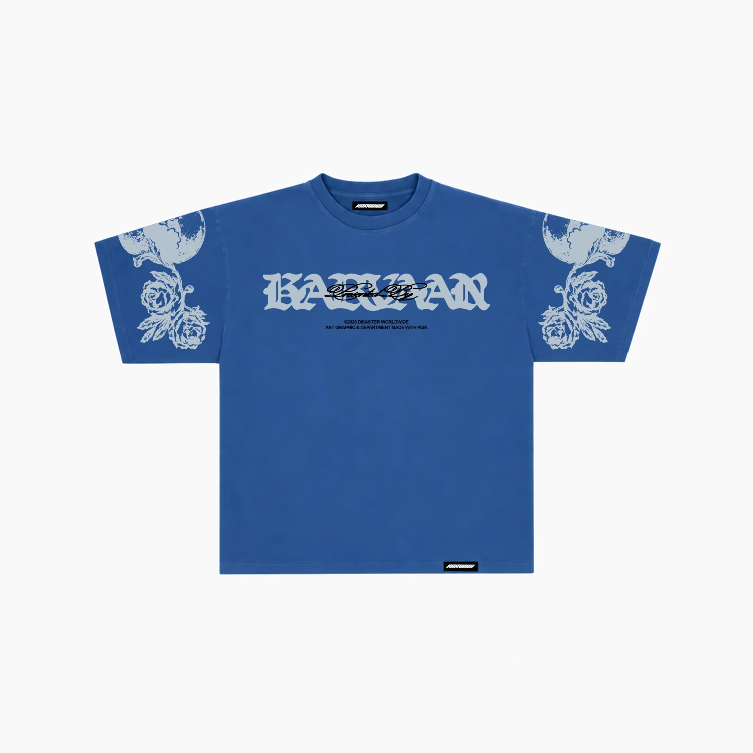
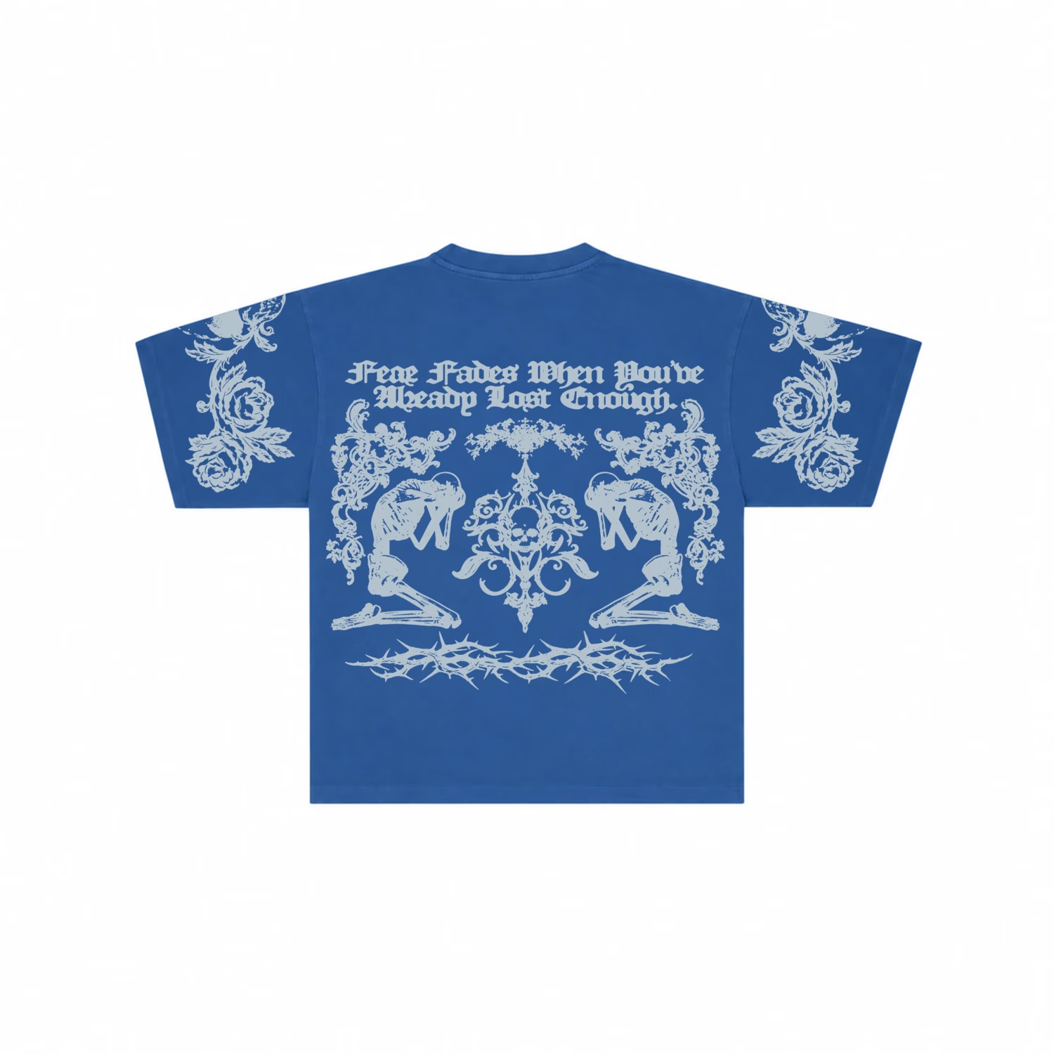
Karvaan — graphic T-shirt designs in cream and blue, shown from the front and back.
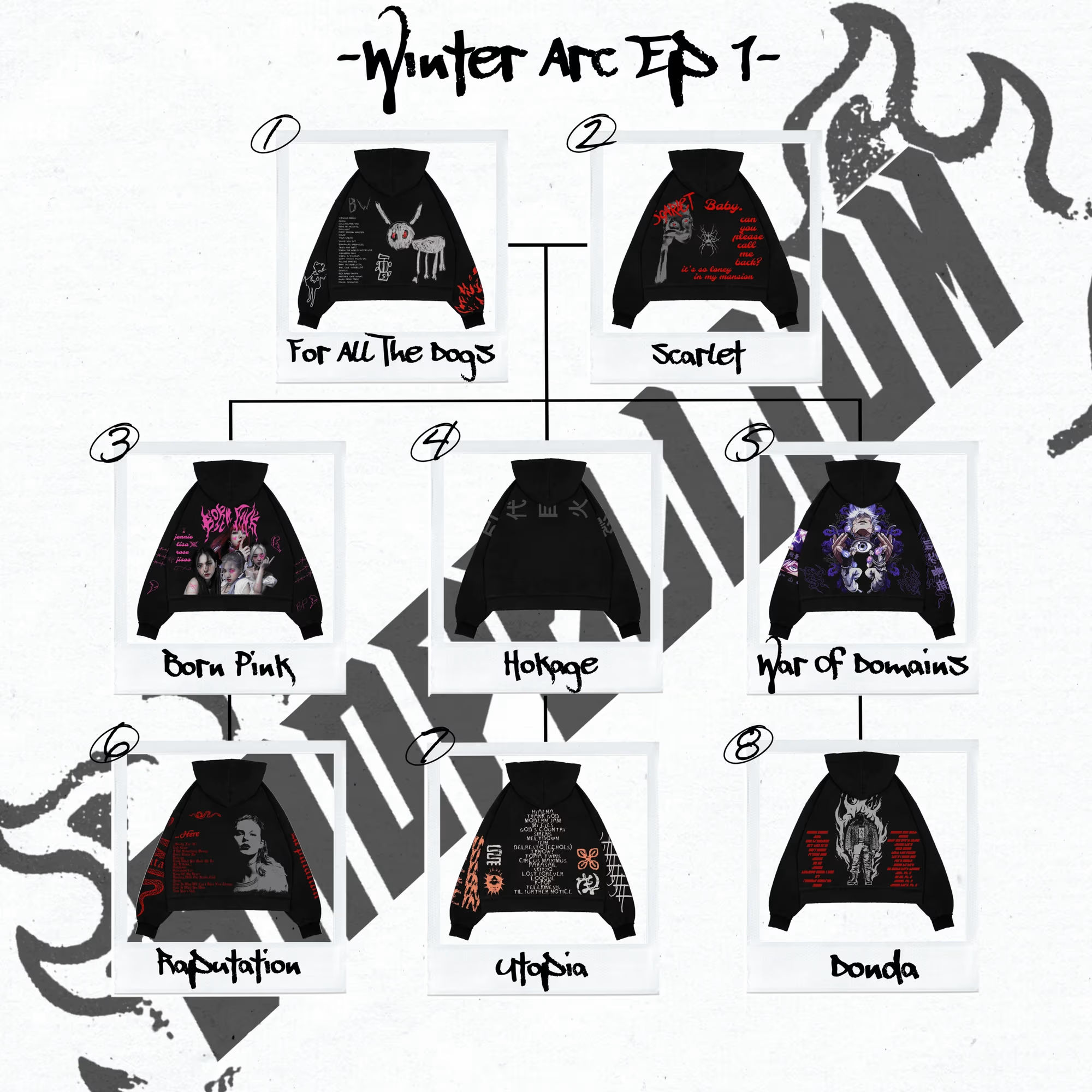
Shopellium — Winter Arc, Episode 1. A streetwear hoodie collection shaped by hand-drawn character art, bold typography, and a dark graphic direction.