
aj iT
Web Designer & Digital Architect, Brand Identity/Aesthetics
New to Contra
aj is ready for their next project!
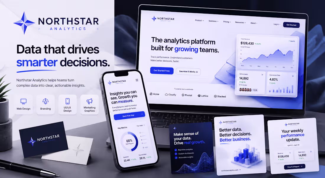
Brand & Website Redesign
Scope Expanded From Logo Design to Full Brand Experience
The project started with a request for a logo.
The client wanted a modern identity for a growing analytics company and needed a mark that communicated trust, precision, and innovation.
After completing the branding direction, we realized the existing website no longer reflected the quality of the new identity.
The scope expanded into a complete redesign, including desktop and mobile experiences, marketing assets, and a unified visual system.
Deliverables
• Logo Design
• Brand Identity
• Website UI/UX Design
• Mobile Design
• Marketing Graphics
• Brand Assets
Outcome
A cohesive brand experience that transformed Northstar Analytics from a simple startup concept into a polished, enterprise-ready digital product.
This project is a great example of how strategic branding can influence every touchpoint of a business, not just the logo itself.
1
24
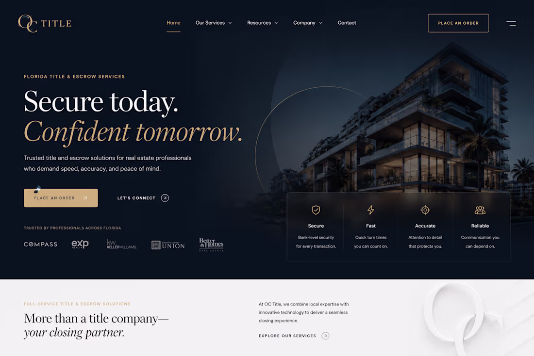
Brand Identity & Web Design
The Project Story
A real estate title company approached me with a challenge that most businesses in the industry struggle with: trust.
The title and escrow space is crowded with websites that all look and feel the same—generic stock photos, outdated layouts, and corporate templates that do little to inspire confidence. The goal wasn’t simply to create another title company website. The goal was to position the company as a premium, technology-forward closing partner that professionals could trust with high-value transactions.
Every design decision had to reinforce credibility, professionalism, and precision while avoiding the cold, impersonal feel that often dominates the industry.
The website needed to appeal to real estate agents, investors, wholesalers, lenders, and homebuyers alike, creating an experience that felt sophisticated, modern, and dependable from the very first interaction.
Building Trust Through Design
• Luxury-Inspired Professionalism: Rather than relying on traditional corporate design patterns, I created a refined visual system built around deep navy tones, elegant gold accents, and premium typography. The result feels more like a high-end financial institution than a generic title office.
• Confidence-Driven Messaging: The hero section was designed to immediately communicate reliability and expertise. Strong headlines, concise supporting copy, and strategically placed calls-to-action guide users toward placing orders and initiating transactions without friction.
• High-End Real Estate Imagery: I incorporated upscale architectural visuals to align the company with premium real estate transactions. These visuals help establish authority while creating an aspirational brand presence.
• Trust Indicators & Credibility Systems: Security, speed, accuracy, and reliability were showcased through dedicated visual elements and supporting content to reinforce confidence throughout the user journey.
• Streamlined Mobile Experience: Since many real estate professionals operate on the go, the mobile experience was carefully designed to prioritize quick navigation, service discovery, and immediate contact opportunities.
In an industry built entirely on trust, the website itself became a trust-building tool—transforming a traditionally overlooked service into a polished digital experience that reflects the professionalism of the company behind it.
0
23
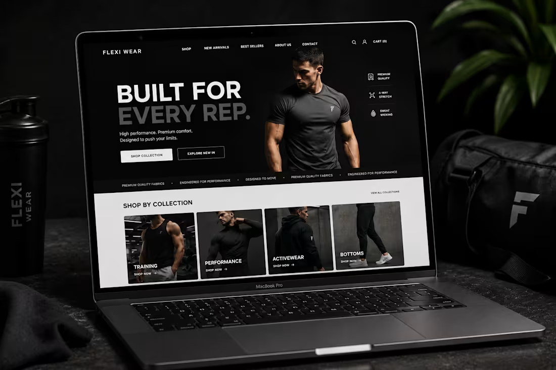
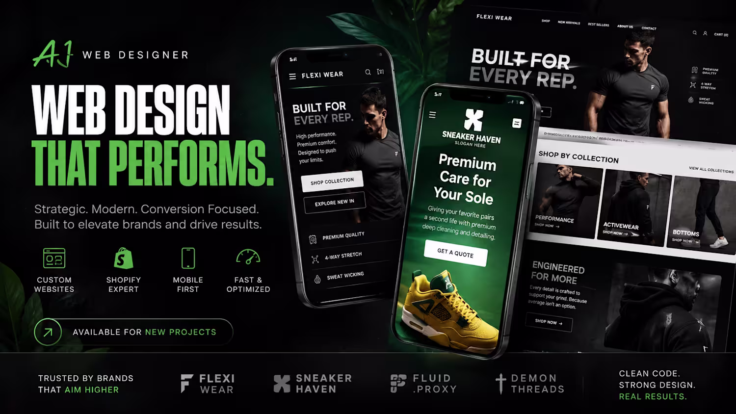
FLEXI WEAR — Brand Identity & E-Commerce Web Design
The Project Story
The fitness apparel market is saturated with brands competing for attention. Most websites rely on the same formulas: bright colors, overcrowded layouts, and generic fitness imagery.
Flexi Wear needed to feel different.
The vision was to create a premium athletic brand experience that communicated strength, performance, and confidence without relying on visual noise. The brand wasn’t selling clothing alone—it was selling discipline, consistency, and the mindset behind athletic performance.
Every element of the website needed to reinforce that philosophy.
The challenge was creating an experience that felt powerful and high-performance while remaining clean, modern, and easy to navigate across every device.
Bringing the Brand to Life
• Performance-First Visual Direction: I built the design around a dark, high-contrast aesthetic that immediately communicates focus and intensity. The restrained color palette allows the products and messaging to take center stage.
• Bold, Motivational Messaging: Large-scale typography and strong headlines were used throughout the experience to mirror the mindset of athletes and fitness enthusiasts. Every section reinforces the brand’s commitment to performance.
• Premium Product Presentation: Product categories and featured collections were designed using immersive imagery and clean layouts that elevate the perception of the apparel while maintaining a streamlined shopping experience.
• Structured User Journey: Clear calls-to-action, simplified navigation, and intentional content hierarchy guide visitors naturally through the buying process without distractions.
• Mobile-Optimized Shopping Experience: The mobile version maintains the same visual impact as the desktop design while ensuring seamless browsing, category exploration, and product discovery on smaller screens.
The final result is an e-commerce experience that feels confident, focused, and premium—capturing the energy of modern athletic culture while providing the functionality users expect from a high-performance online store.
0
14
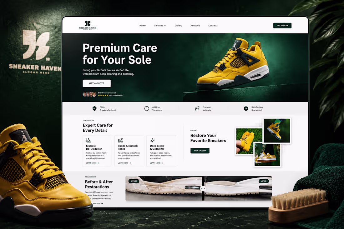
Shopify Website Design & Development
Overview
Sneaker Haven is a sneaker restoration and cleaning brand focused on bringing worn footwear back to life through premium cleaning, detailing, and restoration services.
The goal of this project was to create a modern Shopify website that communicates professionalism, trust, and quality while making it easy for customers to explore services and request quotes.
The Challenge
The brand needed a website that felt premium and credible without losing the personality of sneaker culture. The experience had to showcase restoration services clearly, build customer confidence, and work seamlessly across desktop and mobile devices.
My Approach
I designed and developed a clean, conversion-focused Shopify experience centered around the brand’s visual identity.
Key priorities included:
Mobile-first responsive design
Clear service presentation
Strong visual hierarchy
Premium product-focused imagery
Trust-building sections and social proof
Streamlined quote request experience
Consistent branding across all pages
Design Direction
The visual direction was inspired by modern sneaker brands and premium e-commerce experiences. A combination of deep greens, clean whites, and vibrant yellow accents helped create a distinctive identity while keeping the interface polished and professional.
The layout balances bold imagery with clear content sections to guide users through the brand story, services, and customer journey.
Deliverables
Shopify website design
Responsive desktop and mobile layouts
Homepage design
Service showcase sections
Gallery integration
Brand-aligned UI system
Conversion-focused user experience
Outcome
The final result is a modern Shopify website that positions Sneaker Haven as a premium sneaker care brand while providing a smooth experience for customers across all devices.
1
1
35
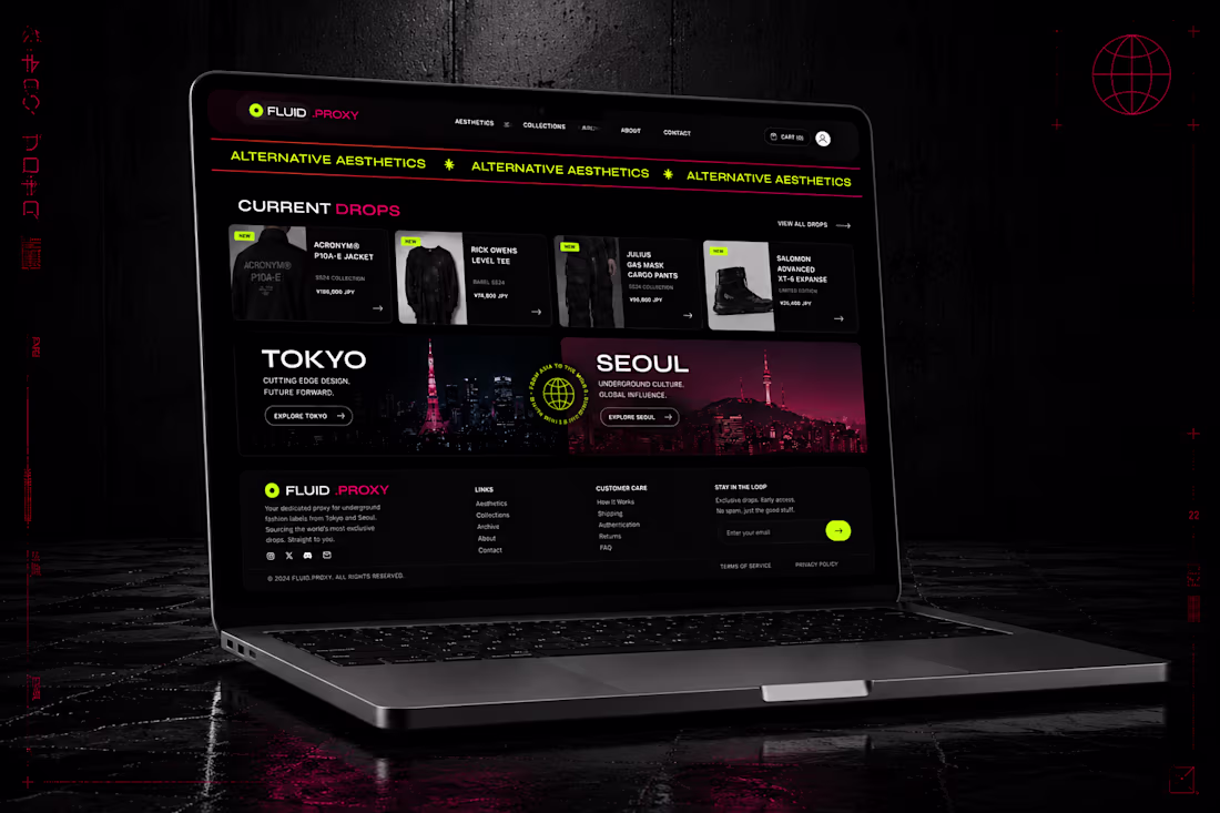
FLUID .PROXY — Brand Identity & Web Design
The Project Story
A while back, a client came to me with a very clear, uncompromising mandate: they wanted an e-commerce platform that felt less like a generic shopping cart and more like walking through the neon-drenched, gritty backstreets of Shibuya or Hongdae at midnight. They are sourcing exclusive, underground alternative fashion drops from Tokyo and Seoul, so standard, clean-cut corporate templates were completely out of the question.
They heavily emphasized that the brand's identity had to dominate the entire website. They demanded grit, a visually striking presence, and a hyper-modern edge that speaks directly to subcultural fashion heads without sacrificing basic usability.
Bringing the Vibe to Life
• Uncompromising Grit: I anchored the look with heavy midnight dark mode tones, then slashed through the dark with high-octane magenta, hot pink, and sharp acid-green accents. It’s loud, it's intense, and it immediately sets the mood the second the page loads.
• Flawless Visual Identity: To make sure the brand's identity felt completely integrated into the layout, I used stylized, rounded container cards to hold the imagery. This keeps the editorial, underground aesthetic alive while giving the site a clean, modern framework.
• High-Impact Typography & Elements: I ran a continuous text marquee banner ("ALTERNATIVE AESTHETICS") across the layouts as a structural design anchor, giving it that raw, indie-magazine feel the client was looking for.
• Seamless Mobile Navigation: The mobile layout features a striking floating header and ultra-clean, full-pill call-to-action buttons (Start Proxy Order / How It Works) so the user journey feels effortless even amidst the heavy visual styling.
Standard design rules say play it safe. We didn't play it safe. We built something that hits hard visuals first, backed up by clean, modern functionality.
I’m honestly still so proud of how this turned out, it was such a fun project to work on and interacting with the clients was very nice and respectful, and it was right up my alley because I myself am alternative. All around a great experience!!
1
25