
Mohammed Shaibaaz Uddin
Frontend developer for fast, responsive websites
New to Contra
Mohammed Shaibaaz is ready for their next project!
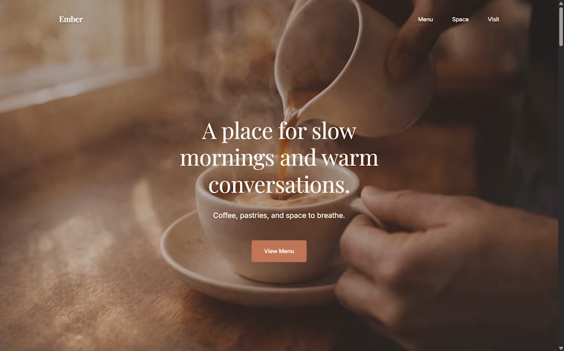
EMBER
Café & Lifestyle Website
Overview
A website concept for a neighborhood café, designed to feel warm, unhurried, and inviting. The goal was to reflect the atmosphere of a physical space through tone, imagery, and pacing rather than heavy visual effects.
Approach
The layout focuses on simplicity and balance, allowing photography and typography to carry the experience. Content is kept minimal, with generous spacing to create a relaxed rhythm and an easy reading flow across devices.
Result
A clean, approachable website that communicates mood and identity with restraint — showing how thoughtful layout and spacing can translate real-world ambiance into a digital experience.
1
286
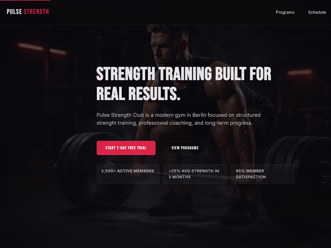
PULSE STRENGTH
Fitness Website & Dashboard UI
Overview
A fitness-focused website with supporting dashboard-style interfaces, designed to present programs, schedules, and actions in a clear and structured way. The emphasis was on usability, hierarchy, and responsiveness rather than visual noise.
Approach
Layouts were built with a strong grid system and deliberate spacing to keep information easy to scan. Primary actions are clearly separated from secondary content, ensuring the interface remains predictable and intuitive across devices.
Result
A clean, functional interface that demonstrates how structured UI decisions can simplify operational flows while maintaining a focused, modern visual identity.
1
249
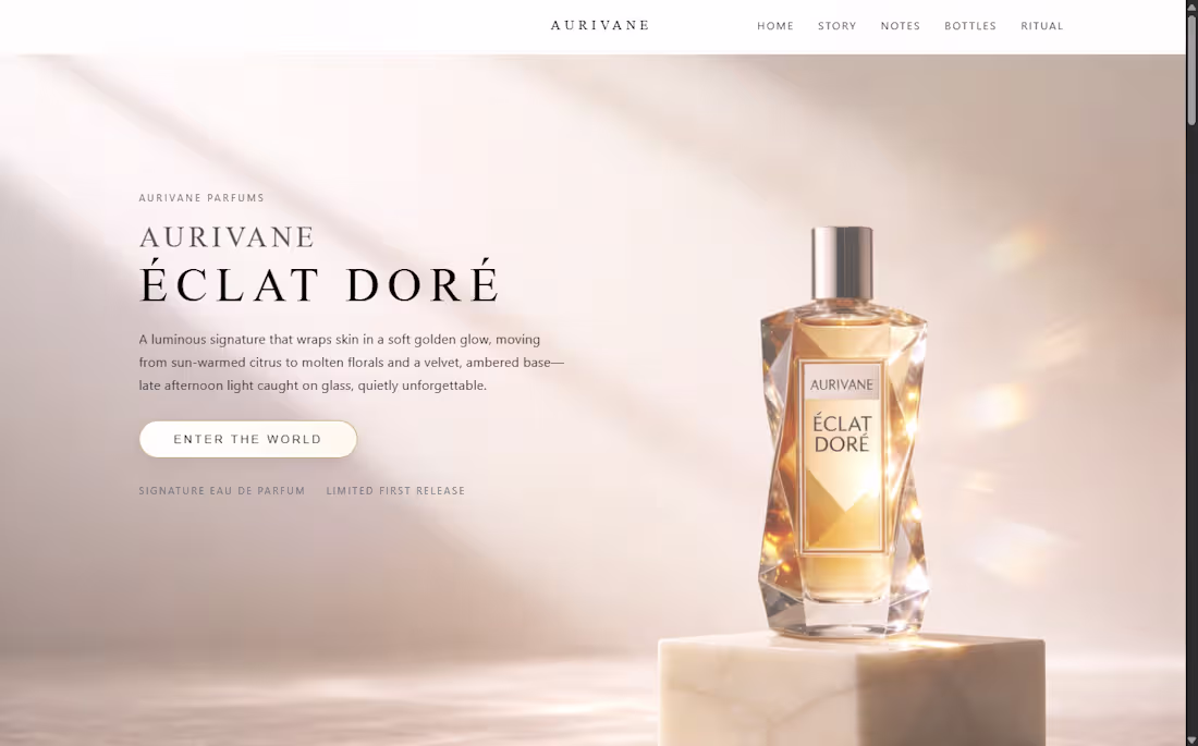
Aurivane — Editorial Fragrance Website
Overview
An editorial-style website designed for a premium fragrance brand. The focus was on storytelling, pacing, and visual rhythm — creating an experience that feels more like a magazine than a traditional product page.
Approach
Typography, spacing, and imagery work together to create a soft, refined flow. Content is revealed gradually, allowing the brand narrative to unfold without pressure. The interface stays subtle so the product and mood remain central.
Result
A clean, atmospheric website that balances aesthetics with clarity — showing how editorial structure can elevate brand presence without overwhelming the user.
1
208
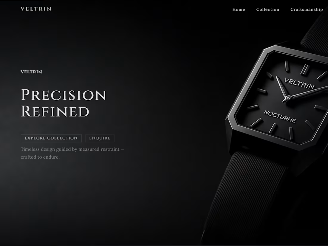
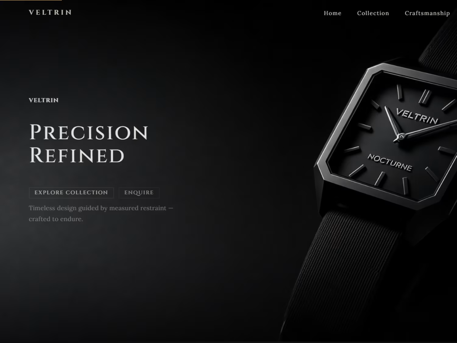
VELTRIN
Luxury Watch Brand Website
Overview
A concept website for a luxury watch brand, focused on restraint, material presence, and visual balance. The goal was to create a digital experience that feels quiet, precise, and intentional — mirroring the values of high-end mechanical craftsmanship.
Approach
The layout prioritizes negative space, controlled typography, and strong contrast. Visuals are allowed to breathe, with minimal interface elements competing for attention. Every section is designed to guide the eye rather than demand it.
Result
A composed, brand-forward website that communicates quality through structure and detail rather than excess — demonstrating how design choices alone can shape perception and trust.
0
197