
Success Momodu
I design thoughtful products that align with users needs
Profile in progress
Success is building their profile!
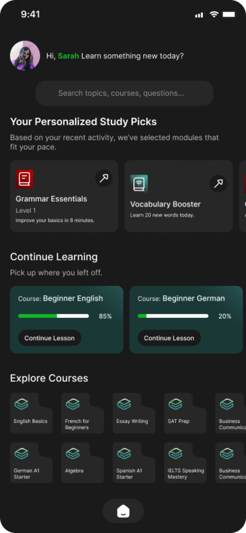
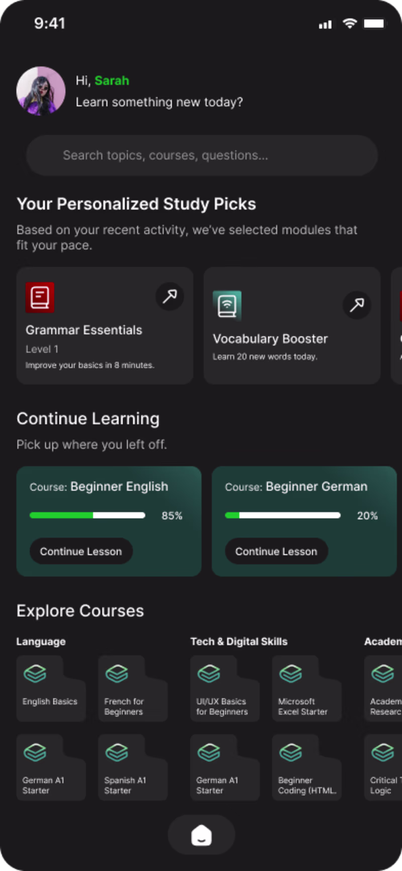
I need help validating my Home Page UI for an AI-powered learning platform.
Which option communicates value faster and feels more actionable for students?
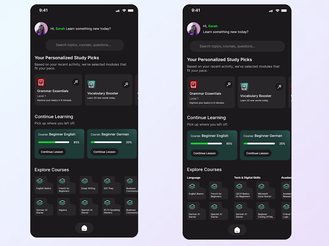
Designers, I need your eyes!
I'm working on the Home Screen for an AI Learning App that adapts to each user’s study journey.
Between these concepts, which layout delivers:
✔ Clear recommendations
✔ Smooth hierarchy
✔ Strong first impression
Vote A or B and tell me why!
0 voted
1%
0 voted
1%
0 votes
Closed