


🚀 Introducing the New MZI Studio - Built to Make an Impression.
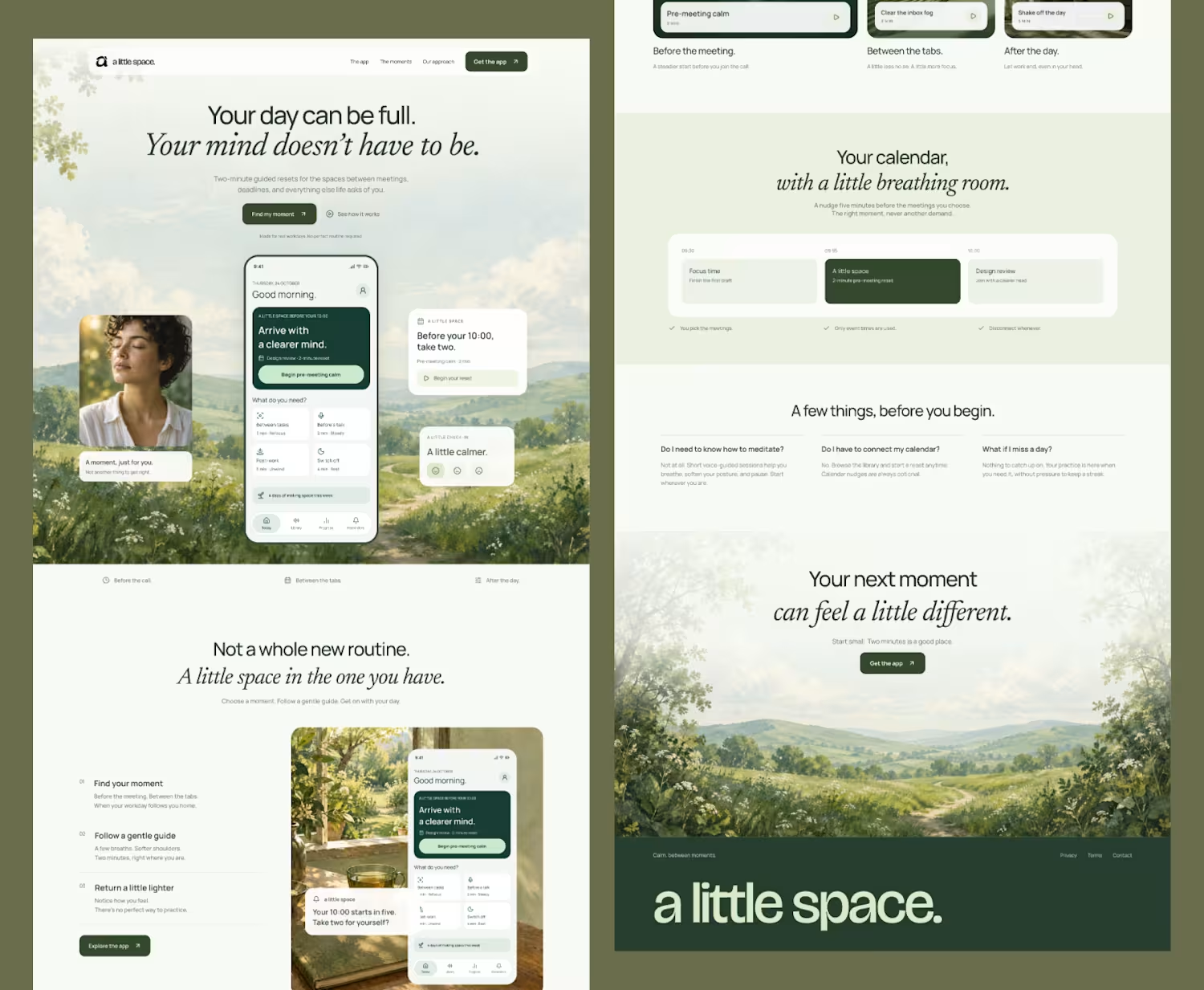
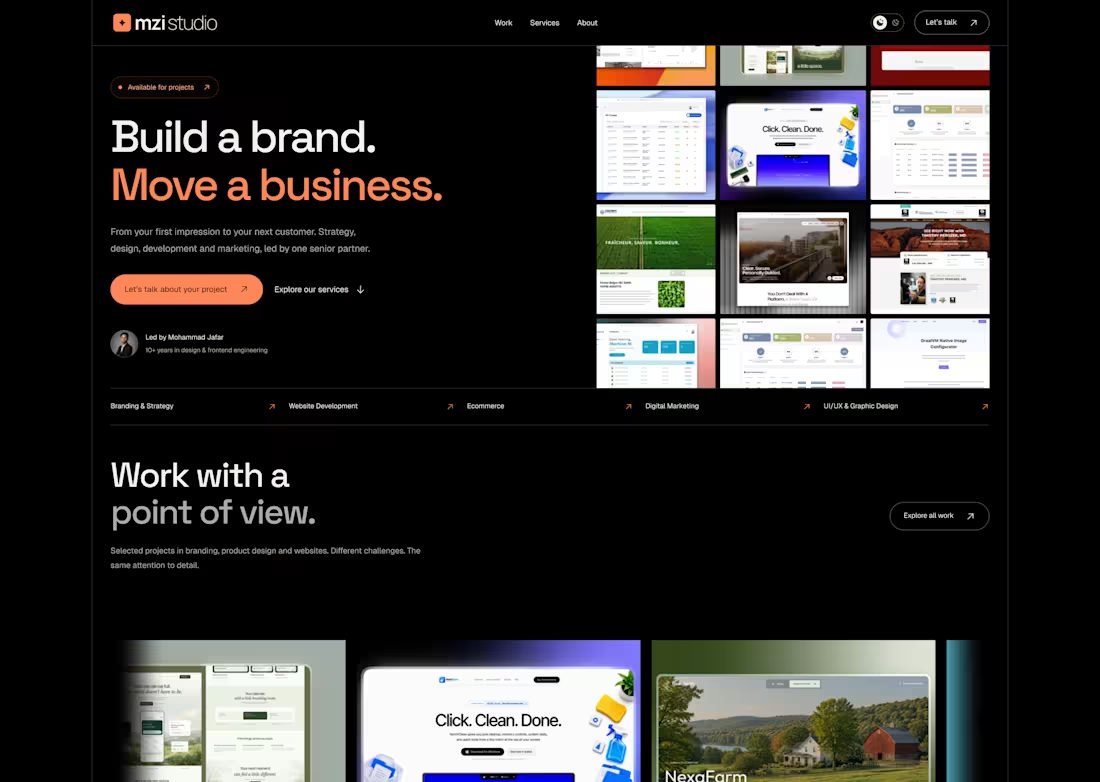
Excited to share the latest version of my portfolio website, MZI Studio - a digital space that brings together my passion for design, frontend development, and creative problem-solving.
The goal was simple: create a bold, minimal, and memorable digital experience that reflects my approach to building modern brands and high-performing websites.
✨ Design Highlights
Bold typography with a distinctive black and coral visual identity
Clean, minimal layouts with a strong visual hierarchy
Modern portfolio showcase highlighting selected projects
Responsive, user-focused design
Clear navigation and conversion-focused calls to action
Custom-designed hero section and oversized branded footer
💡 My Approach
Every detail was designed with purpose - from the first impression to the final interaction. I wanted the website to feel modern, confident, and intuitive while keeping performance and usability at the center.
My Role: Creative Direction, UI/UX Design & Frontend Development
🌐 Explore the live website: https://mzistudio.com/
I'd love to hear your thoughts!
#PortfolioWebsite #WebDesign #FrontendDevelopment #UIUXDesign #CreativePortfolio #MZIStudio
0
35
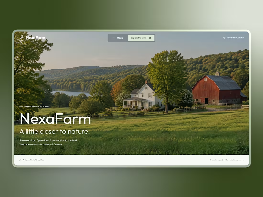
NexaFarm - A Little Closer to Nature
2
2
118
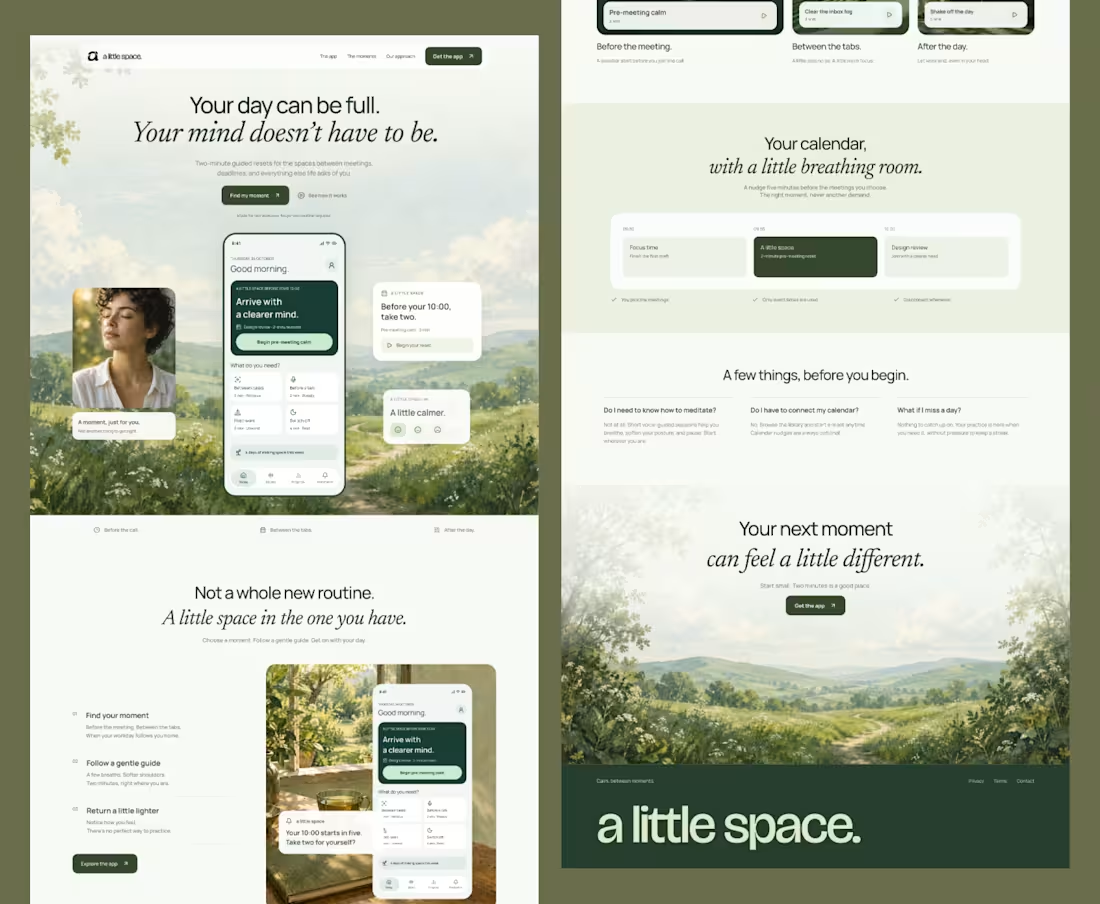
Minimal Design - App Landing Page
1
2
143
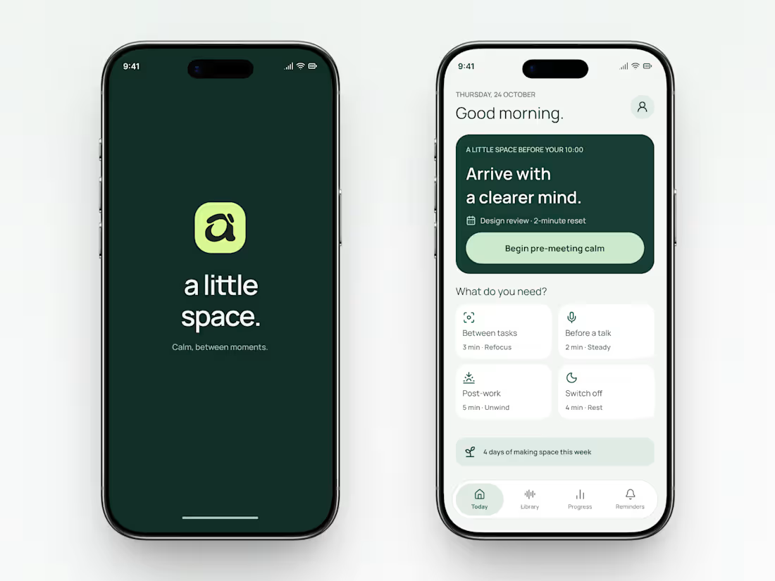
A Little Space - Mindfulness App UI Design
A mobile app concept that makes room for small moments of calm throughout a busy day.
The interface presents short, context-specific sessions: refocusing between tasks, preparing for a conversation, unwinding after work, and switching off for rest. A prominent pre-meeting reset gives users a clear starting point.
The visual direction combines deep forest green, soft mint, rounded cards, and spacious typography. Gentle language and a subtle weekly progress indicator support a reassuring experience.
Featured screens
Branded splash screen
Home dashboard with a suggested session
Quick-access cards for everyday moments
Weekly activity indicator and bottom navigation
#appdesign #design #UI/UX
0
76