Miranda Vos
Crafting Elegant, Custom Brand Identities
New to Contra
Miranda is ready for their next project!
Real Client: Endodontist Logo
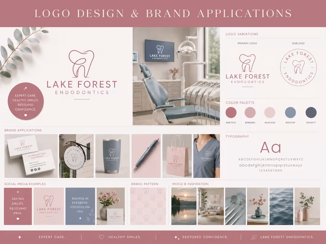
Lake Forest Endodontics is a modern dental practice dedicated to providing compassionate, expert endodontic care in a calm and welcoming environment. The client wanted a sophisticated brand identity that felt approachable, trustworthy, and professional while standing out from the traditional look often associated with dental practices.
I collaborated with the client to create a clean, contemporary visual identity centered around a custom monoline tooth icon. The logo features flowing, continuous linework that conveys precision, care, and confidence while maintaining a refined, modern aesthetic. A carefully selected palette of muted rose, soft blush, and calming blue-gray tones helps create a welcoming patient experience, balancing professionalism with warmth and comfort.
The complete identity was designed for office signage, stationery, uniforms, promotional materials, social media, and branded merchandise. Every element works together to reinforce the practice's commitment to exceptional patient care and a comfortable clinical experience.
Project Deliverables
- Custom primary logo
- Secondary logo/submark
- Color palette & typography
- Brand guidelines
- Social media concepts
- Mockups & brand applications
Client Review
⭐⭐⭐⭐⭐
"Working with Miranda was a pleasure! She was quick, patient, and I love the final product."
0
3
Real Client Project: Quilting Logo
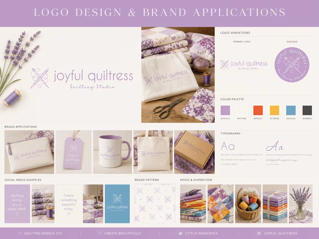
Joyful Quiltress is a quilting studio dedicated to celebrating creativity, craftsmanship, and the joy of handmade quilts. The client wanted a brand identity that felt cheerful, welcoming, and artistic while honoring the tradition of quilting with a modern, memorable visual style.
I collaborated closely with the client to create a complete visual identity inspired by the tools and artistry of quilting. The custom logo features crossed quilting needles intertwined with thread that symbolizes creativity, connection, and the love poured into every handmade piece. Soft lavender tones paired with warm neutrals and bold blue and orange create a friendly, approachable aesthetic while allowing the brand to feel both elegant and playful.
The completed brand identity was designed to provide consistency across every customer touchpoint, including product packaging, branded merchandise, social media, stationery, and marketing materials. Every element works together to create a cohesive brand experience that reflects the client's passion for quilting and handmade craftsmanship.
Project Deliverables
- Custom primary logo
- Secondary logo/submark
- Color palette & typography
- Brand guidelines
- Social media concepts
- Mockups & brand applications
⭐⭐⭐⭐⭐
"Working with Miranda was exceptional. She applied her expert creativity and turned my ideas into a visually appealing brand package. The logos are beautiful and represent exactly the unique nature of my business. Her communication was fast and thorough. Plus, the order was delivered well before the deadline."
0
6
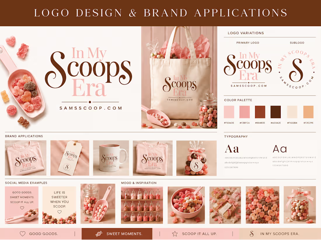
Real Client Project: Scoops Typography Logo
In My Scoops Era is a playful brand created to bring joy, nostalgia, and fun to every customer experience. The client wanted a bold, memorable identity that felt modern, cheerful, and highly recognizable while appealing to both children and adults. The goal was to create branding that would stand out across packaging, merchandise, social media, and retail displays while capturing the excitement of choosing your favorite sweets.
Working closely with the client, I developed a complete visual identity centered around expressive typography and a vibrant color palette. The oversized lettering creates a confident, eye-catching focal point, while the soft pinks, warm browns, and creamy neutrals evoke classic colors and create a fun yet polished aesthetic. The identity was designed to be flexible across a wide range of branded applications, from apparel and gift packaging to promotional graphics and digital marketing.
Every element was created with consistency in mind, helping establish a cohesive visual presence that customers can instantly recognize. The result is a brand that feels energetic, approachable, and memorable while supporting future business growth across multiple products and marketing channels.
Project Deliverables
- Custom primary logo
- Secondary logo/submark
- Color palette & typography
- Brand guidelines
- Social media concepts
- Mockups & brand applications
⭐⭐⭐⭐⭐
"Miranda did an amazing job on my logo! Her design matched my brand exactly and was delivered incredibly fast! I absolutely would recommend her and will reach out to her for future projects!"
0
14
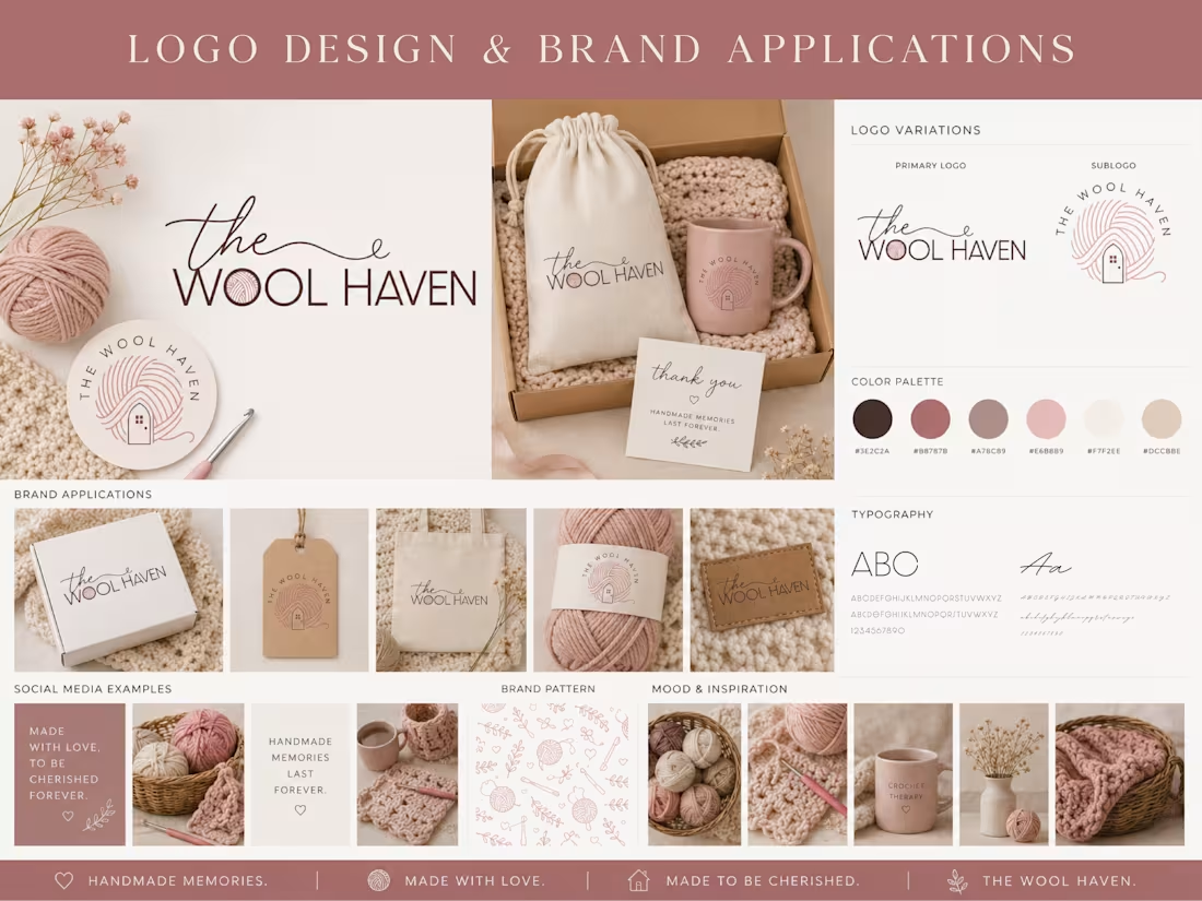
Real Client Project: Wool Logo
The Wool Haven is a handcrafted fiber arts brand specializing in yarn, crochet, knitting, and handmade creations. The client wanted a warm, inviting brand identity that reflected the comfort, creativity, and craftsmanship behind handmade goods while feeling modern, feminine, and memorable.
Working closely with the client, I developed a complete visual identity inspired by the textures and traditions of fiber arts. The custom logo incorporates a ball of yarn that forms the outline of a cozy home, symbolizing creativity, comfort, and the feeling of home found in handmade pieces. Soft blush pinks, warm neutrals, and rich brown tones create a welcoming, handcrafted aesthetic that feels timeless while remaining versatile across both print and digital applications.
Every element was thoughtfully developed to help establish a recognizable and professional brand while preserving the warmth and personality of the business.
Project Deliverables
• Primary logo
• Secondary logo/submark
• Custom color palette
• Typography selection
• Brand guidelines
• Product packaging concepts
• Social media graphics
• Brand applications & mockups
Client Review
⭐⭐⭐⭐⭐
"Working with Miranda was a pleasure! She was quick, patient, and I love the final product."
0
17
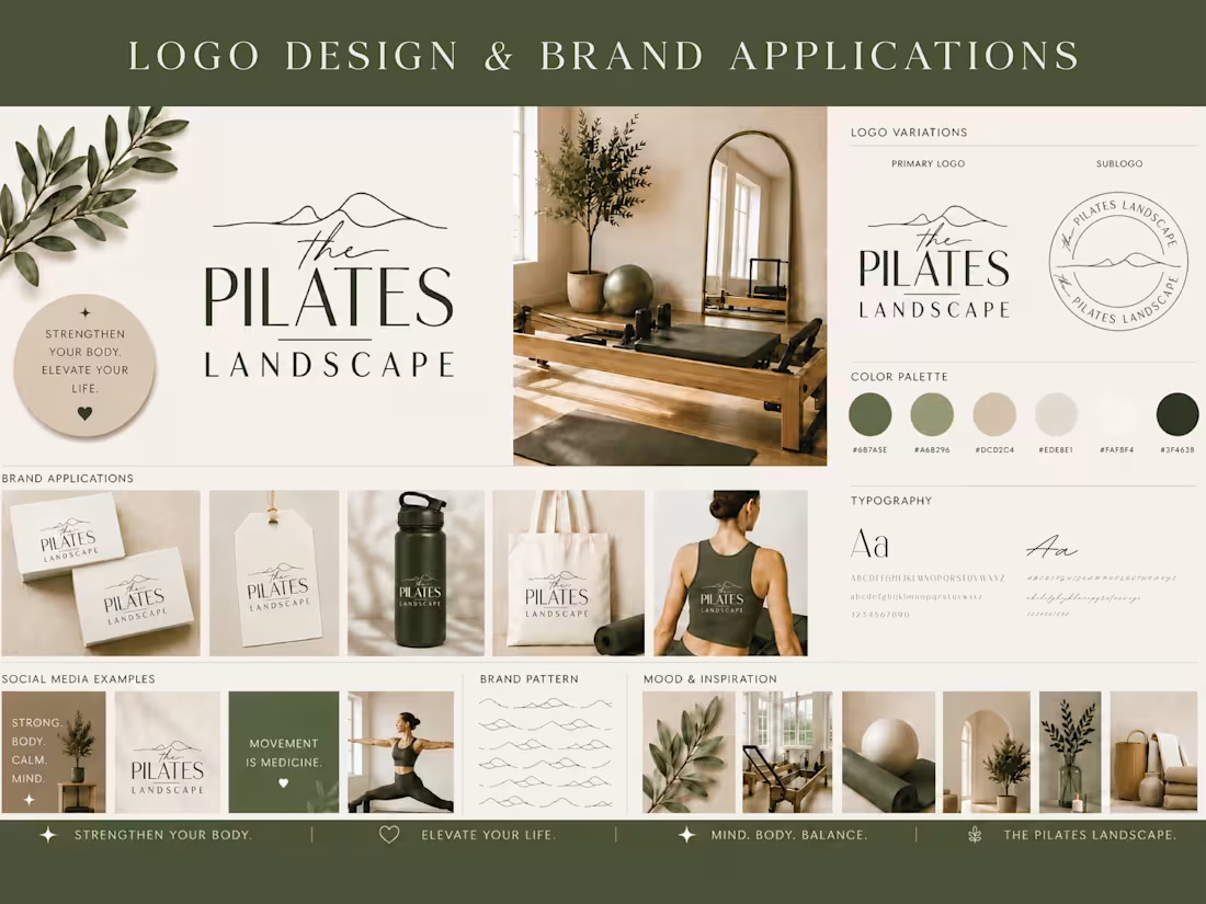
Real Client Project: Pilates Logo
The Pilates Landscape is a wellness brand focused on mindful movement, strength, and balance. The client wanted a modern, elevated brand identity that reflected the calm, restorative nature of Pilates while remaining professional, memorable, and versatile across both digital and print applications.
I collaborated with the client throughout the design process to develop a cohesive visual identity that captured the essence of the brand. Inspired by natural landscapes and the flowing movement of Pilates, the logo combines minimalist mountain-inspired linework with refined typography to create a clean, sophisticated mark. The earthy green and neutral color palette reinforces a sense of balance, wellness, and connection to nature while providing flexibility across marketing materials and branded merchandise.
The completed brand identity was designed to create a consistent brand experience, from studio signage and apparel to packaging, social media, and promotional materials.
Project Deliverables
• Primary logo
• Secondary logo/submark
• Custom color palette
• Typography selection
• Brand guidelines
• Social media graphics
• Brand applications & mockups
• Merchandise concepts
Client Review
⭐⭐⭐⭐⭐
"Miranda did a fantastic job. Very thorough, professional, and exceeded delivery time with beautiful options. I highly recommend her and I will gladly use her again!"
0
39
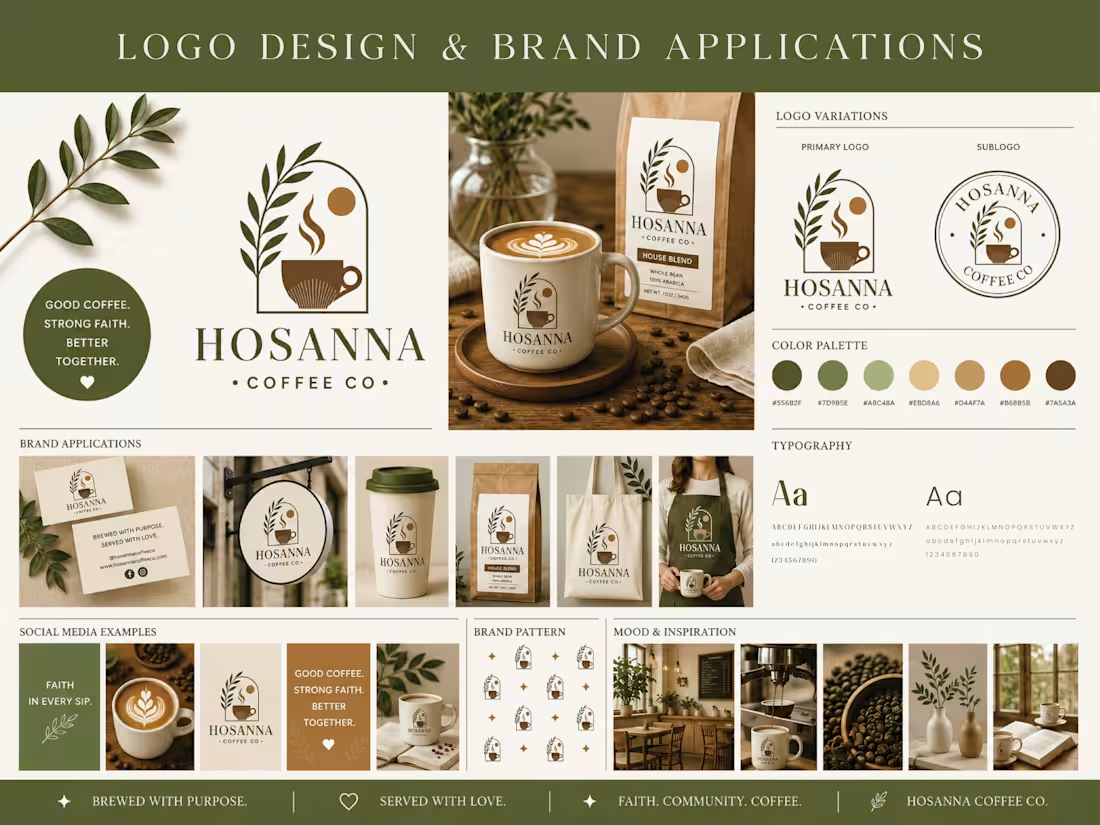
Real Client Project: Coffee Logo
Hosanna Coffee Co. is a specialty coffee brand built around faith, community, and meaningful connection. The client wanted a brand identity that felt warm, inviting, and timeless while subtly incorporating elements of coffee and faith into a clean, modern design.
I worked closely with the client to develop a complete visual identity that would translate seamlessly across packaging, signage, merchandise, social media, and print materials. The final brand system includes a custom logo suite, carefully selected typography, a cohesive color palette, branded applications, and supporting visual elements designed to create a recognizable and consistent customer experience.
The logo combines organic botanical elements, a coffee cup, rising steam, and an architectural arch to create a simple yet memorable mark that communicates warmth, hospitality, growth, and faith. Earthy greens, warm browns, and soft gold tones reinforce the brand's welcoming atmosphere while reflecting the natural origins of coffee.
Project Deliverables
• Primary logo
• Secondary logo/submark
• Custom color palette
• Typography selection
• Brand guidelines
• Packaging concepts
• Social media graphics
• Brand applications & mockups
Client Review
⭐⭐⭐⭐⭐
"Miranda is awesome!! She carefully crafted a logo that was everything I had in mind. Her attention to detail, communication, and professionalism was all 10/10. I am so happy with my final product and highly recommend Miranda's work!!"
0
40
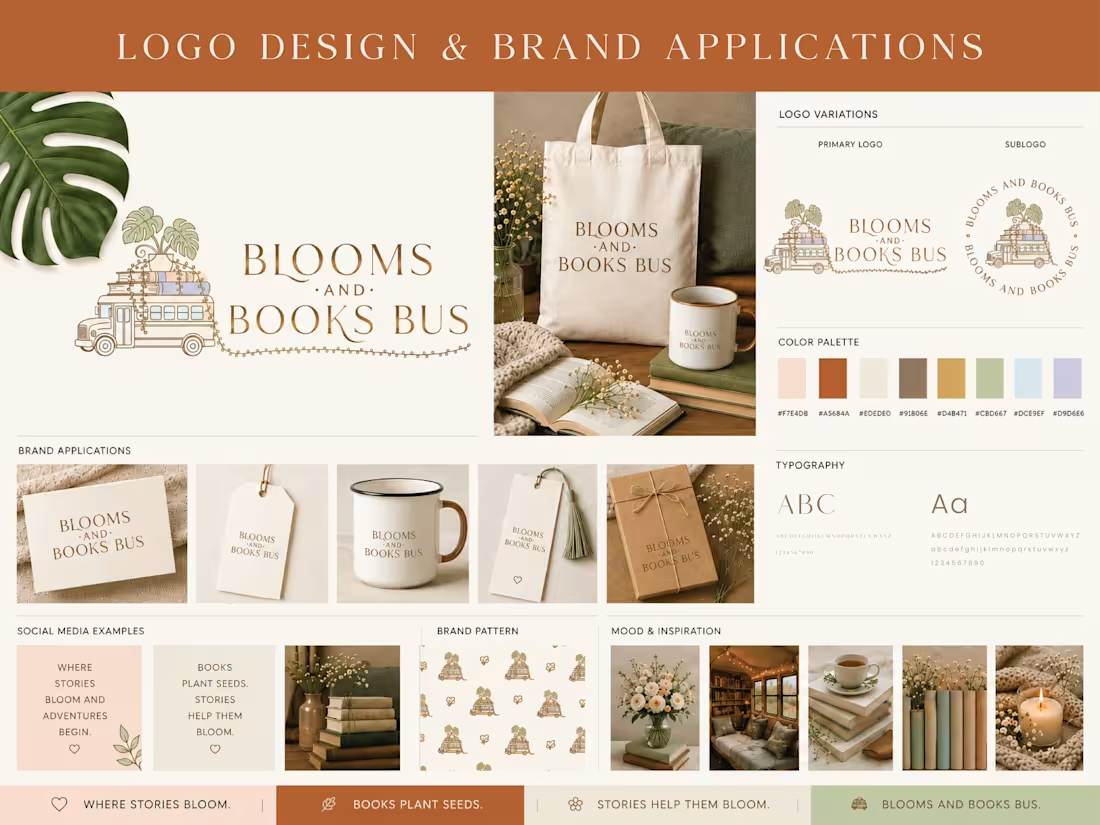
Real Client Project: Plants and Bus Logo
Blooms & Books Bus is a mobile bookstore that brings books, plants, and community together through pop-up events and local outreach. The client wanted a brand identity that felt warm, inviting, and whimsical while maintaining a polished, professional look that would work across print and digital marketing.
I collaborated closely with the client to develop a complete visual identity, including a custom logo system, color palette, typography, brand pattern, marketing materials, and branded mockups.
Project Deliverables
- Custom primary logo
- Secondary logo/submark
- Color palette & typography
- Brand guidelines
- Social media concepts
- Mockups & brand applications
Client Review
⭐⭐⭐⭐⭐
"Loved working with her. She asked all the right questions to bring my vision to reality. She asked all the questions that I didn't think of to get the look that I had in my head!"
0
47
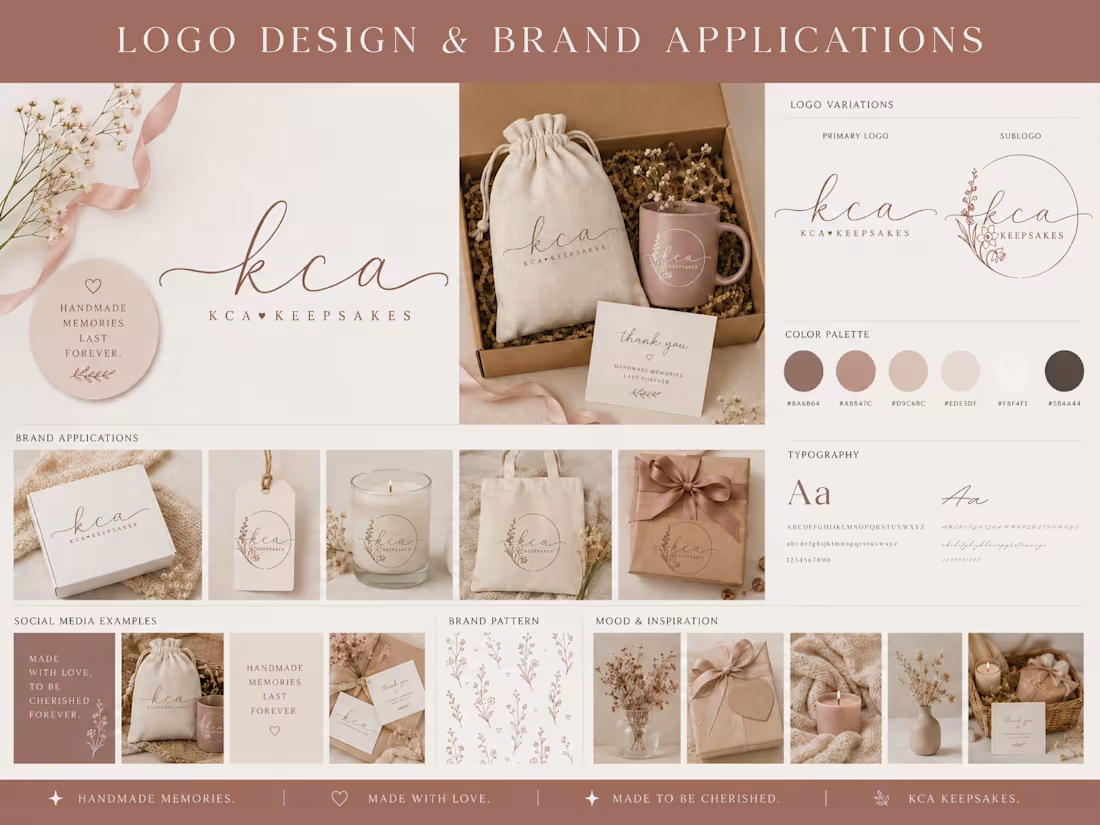
Real Client Project: Keepsake Logo with Floral Submark
KCA Keepsakes is a handmade business specializing in meaningful, personalized keepsakes designed to celebrate life's most treasured moments. The client wanted a brand identity that felt elegant, feminine, and timeless while reflecting the care, craftsmanship, and heartfelt nature of their products.
We began with an in-depth discovery process, discussing the client's vision, preferred styles, color inspiration, and long-term business goals. Throughout the project, I presented concepts, gathered feedback, and refined each element until the final identity perfectly reflected the client's brand and vision.
The completed brand identity included a custom logo system, carefully selected typography, a cohesive color palette, comprehensive brand guidelines, and other brand assets that the client could confidently use across marketing materials, packaging, and social media. My goal was to create a flexible visual identity that would remain consistent and recognizable across every customer touchpoint while allowing the brand to grow over time.
Deliverables
• Custom primary logo
• Secondary logo/submark
• Color palette
• Typography recommendations
• Brand guidelines
• Mockups and branded applications
Client Review
⭐⭐⭐⭐⭐
"I wasn’t sure what my rebranded logo would look like. I didn’t have a clear picture, just general ideas of colors and styles. I gave Miranda everything I liked and didn’t like. She asked questions and drafts and we worked through what I liked and didn’t like through each of the drafts she made until it was absolutely perfect and honestly it came out better than I ever imagined. I love my new logos. She also provided brand guidelines which was especially helpful for me as I was able to include them in my brand template in Canva. She’s attentive, responds quickly, patient and a pleasure to work with! I would definitely work with her again if/when I need logo updates. Thank you so much Miranda!
0
38