Md Minhazul Abedin
Mobile App UI UX | Design Partner for Startups
Ready for work
Md Minhazul is ready for their next project!
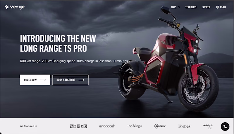
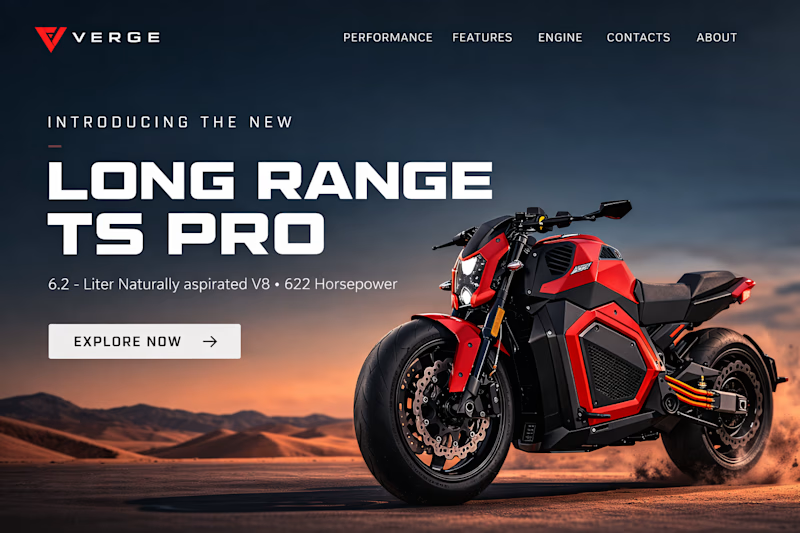
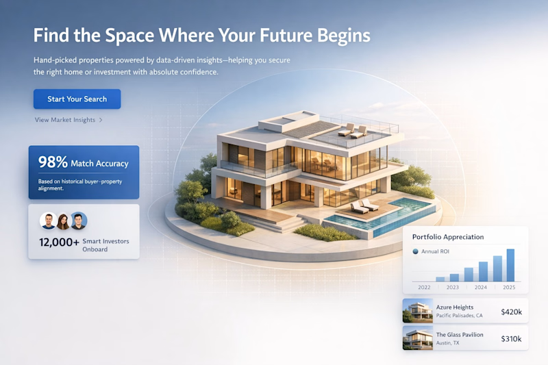
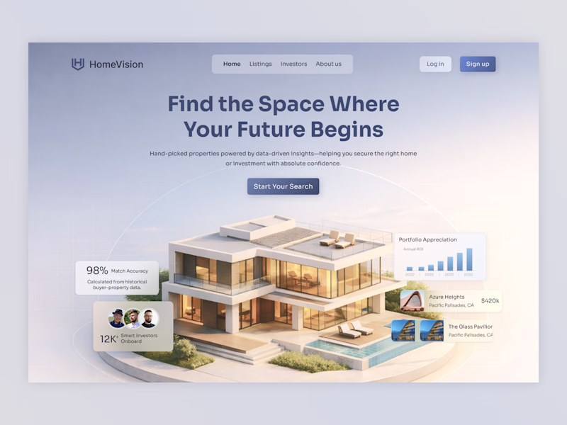
Sharing the original hero from the Verge Motorcycles website alongside my redesign.
Focused on stronger typography, larger bike scale, and a more cinematic layout to make the product the clear centerpiece. Curious which version feels more premium and engaging.
1 voted
10%
9 voted
90%
10 votes
Closed
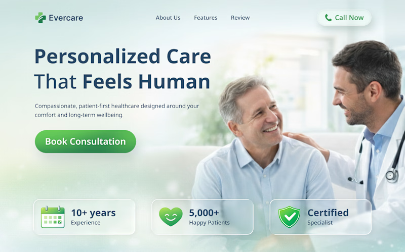
Here's the redesigned private clinic landing page, focusing on trust and improving appointment conversions. It features a clear visual hierarchy, calming colors, strong typography, and strategic CTAs for a professional yet approachable look.
What do you think? Any feedback?
0 voted
0%

2 voted
100%
2 votes
Closed
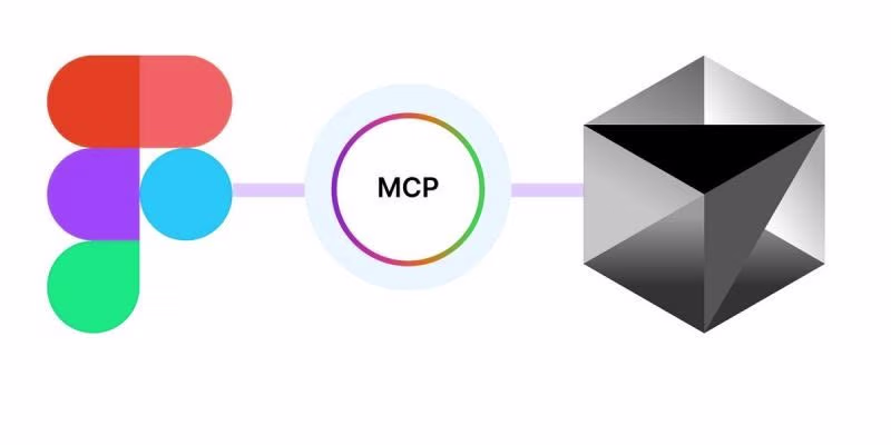
Design → development handoff is evolving, and Figma’s MCP Server is a strong signal of where things are headed.
Instead of AI guessing layouts from screenshots, MCP allows tools to access real, structured design data—components, layouts, variables, and hierarchy. This means...
🔥 My Top Design Lessons from 2025 🔥
2025 taught me this:
💡 Users > UI – beautiful screens don’t fix bad UX
🎯 Consistency wins – tiny misalignments frustrate users
🚀 Prototype early, test often – watch users, save hours
🤝 Collaboration = magic – designers + devs + PMs
✨...