
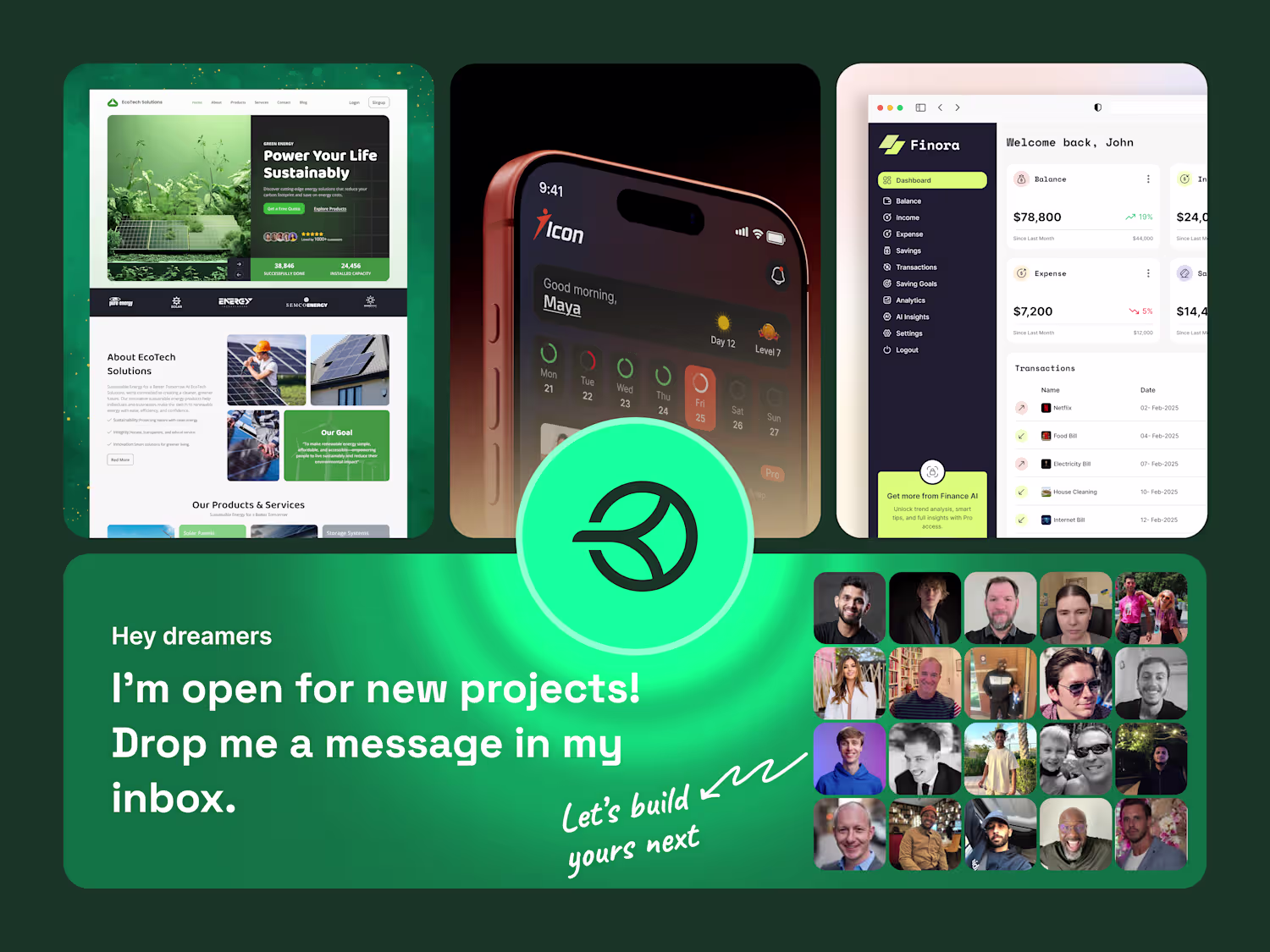
Mimi Akter
Grow my UX UI/web design abilities a little more each day
Ready for work
Mimi is ready for their next project!
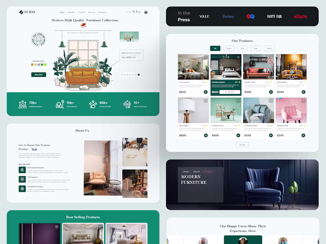
Minimal, Modern & Made to Last – Furniture UI Design
4
4
141
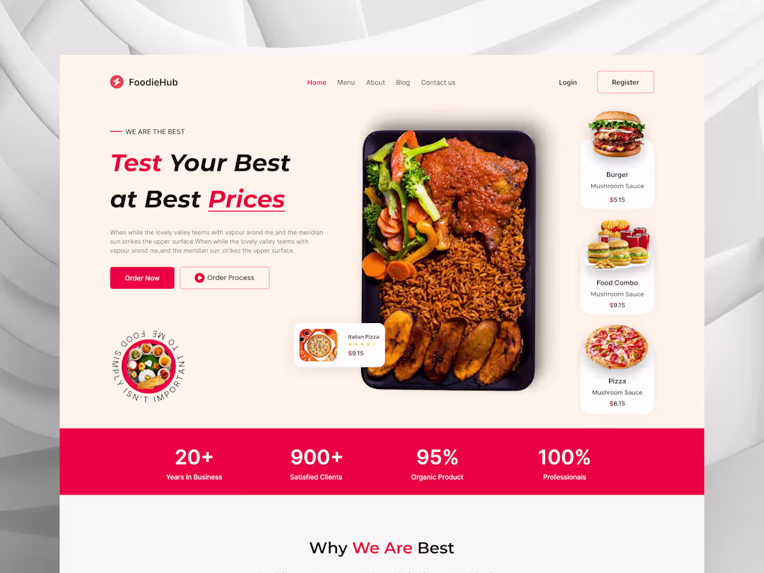
Full Restaurant Website UIUX Design
4
4
156
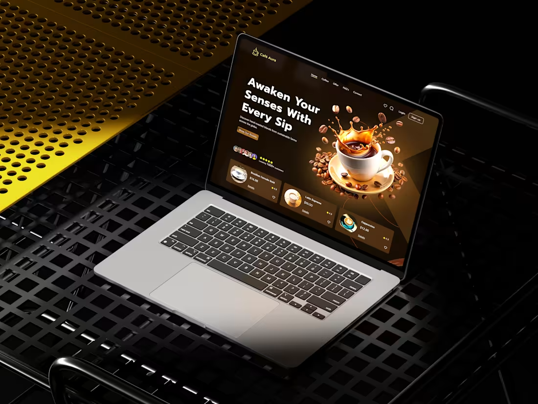
Coffee Website Design Concept
4
4
127
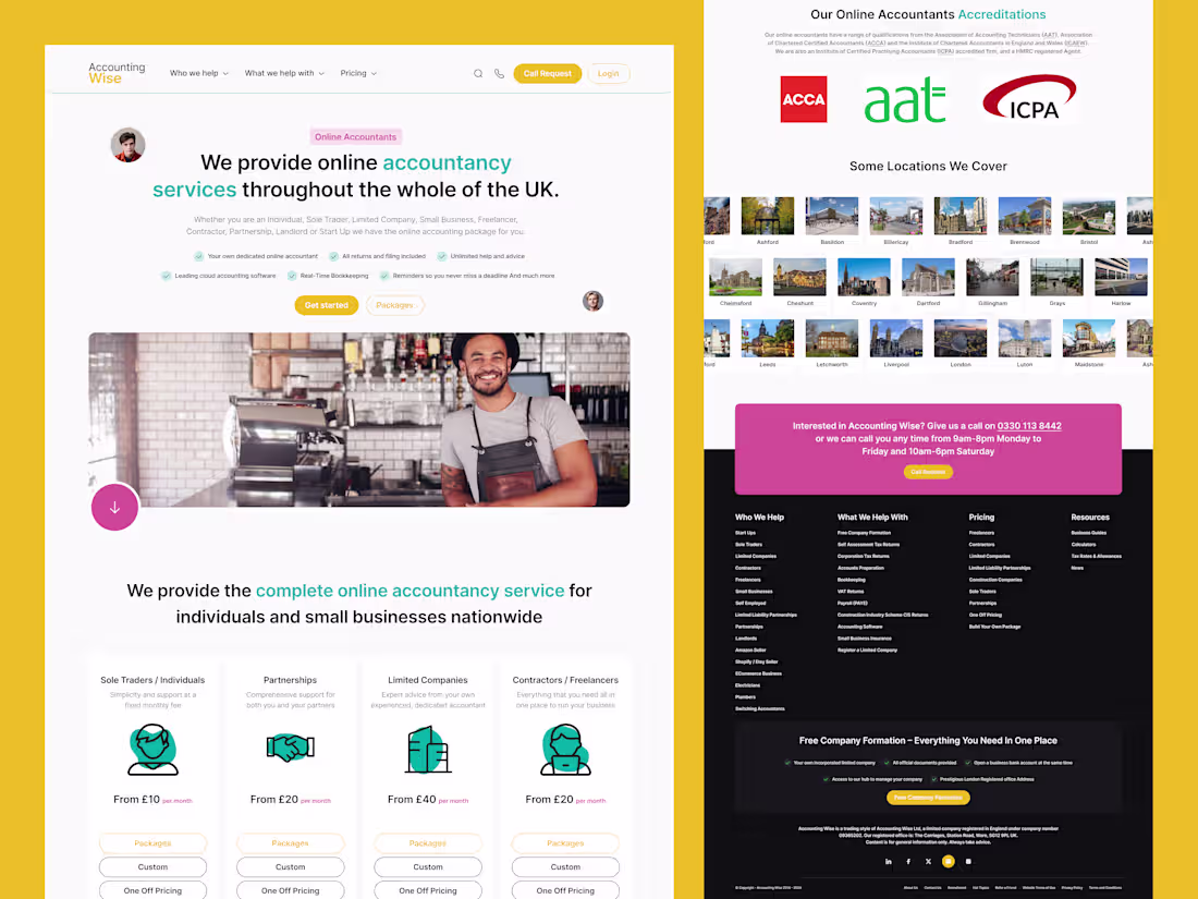
More Leads, Less Money Stress
Accounting Wise asked me to redesign their main landing page to bring in more qualified leads from across the UK.
Their challenge: many services, many audiences, but one crowded page. I simplified the story around three things who they help, what it costs, and why they’re trusted.
One UX choice I loved: colour‑coded service blocks so each audience can find their section fast. Curious how a clearer story can make your site sell more?
Message me and let’s explore your project.
3
108
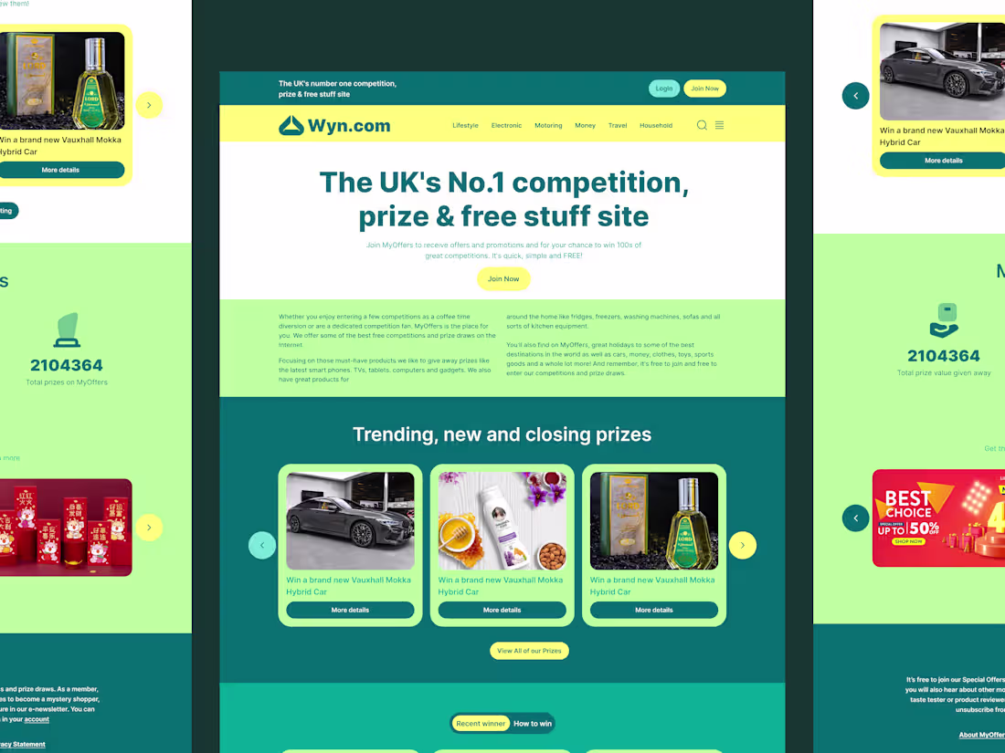
UI/UX Concept for Prize & Competition Site
Here is a concept exploration for Wyn.com (http://Wyn.com), the UK's premier destination for competitions and free product testing.
The Challenge: To move away from the "spammy" aesthetic often associated with sweepstakes sites and create a look that feels legitimate, modern, and exciting.
The Solution:
Color Blocking: We utilized a Deep Teal and Lemon Yellow palette to balance professional trust with the excitement of winning.
Clear Hierarchy: Large typography and distinct sections help users differentiate between entering competitions, viewing past winners, and signing up for product testing.
Card Architecture: A unified card system displays trending prizes and winners cleanly across different background environments.
Let me know what you think of the color contrast!
2
3
92
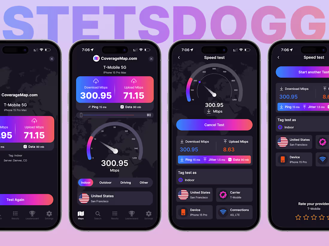
UX That Puts $ In Pocket
My client had a great speed-test tool, but confusing UI meant users were abandoning it early.
I stripped out clutter, so core test data is instantly visible as soon as loads finish.
👉 Check the live build: https://map.coveragemap.com/
Want to turn your underperforming page into a revenue driver?
Let's connect.
2
78
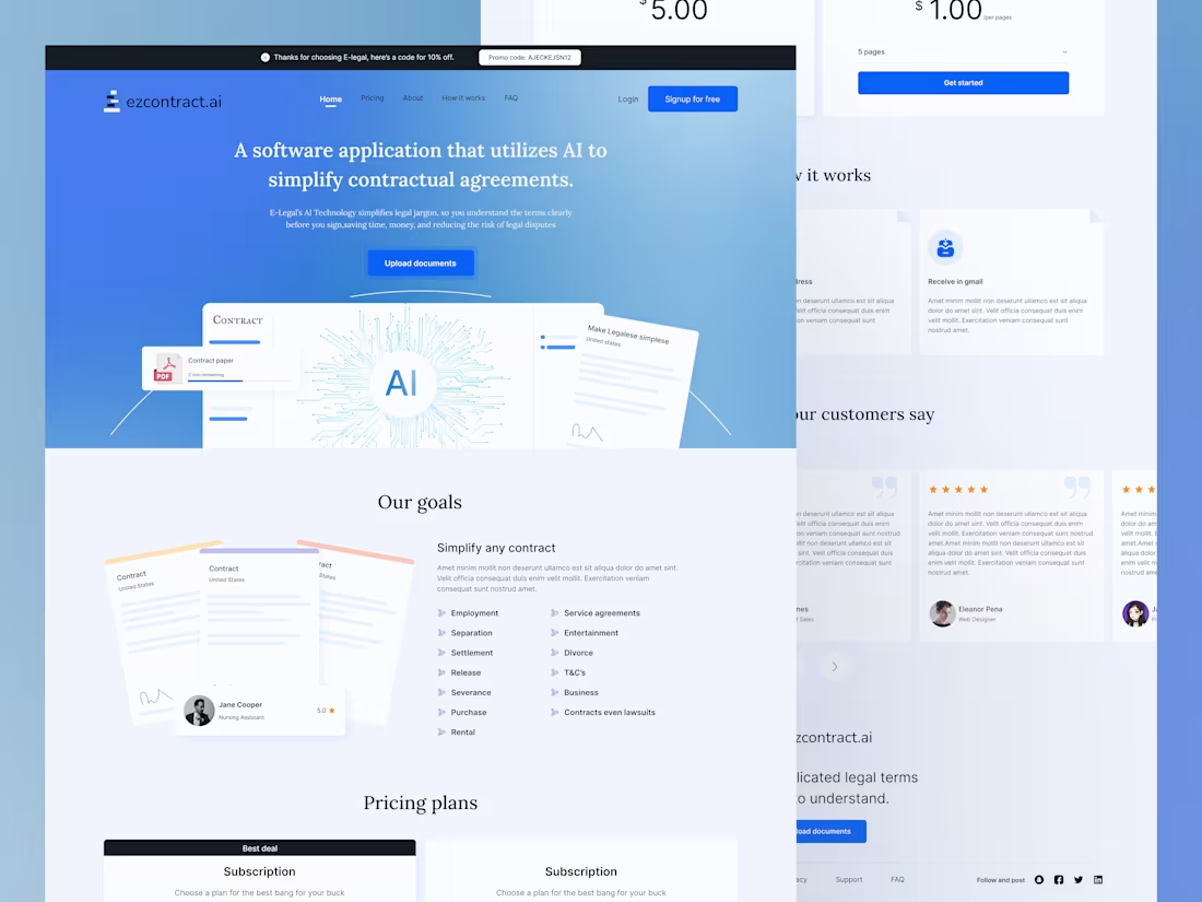
Save $2k on Legal Costs with This Landing Page
My client had a game-changing AI tool for contracts, but no landing page to sell it. I built one from scratch, focusing on:
✅ Instant clarity (hero section explains the product in 3 seconds)
✅ Trust-building visuals (AI-powered contract simplification demo)
✅ Frictionless pricing (transparent plans with a bold CTA)Result? $5K+ in monthly revenue within the first 30 days.Need a high-converting landing page for your SaaS? Let’s build yours!
2
3
74
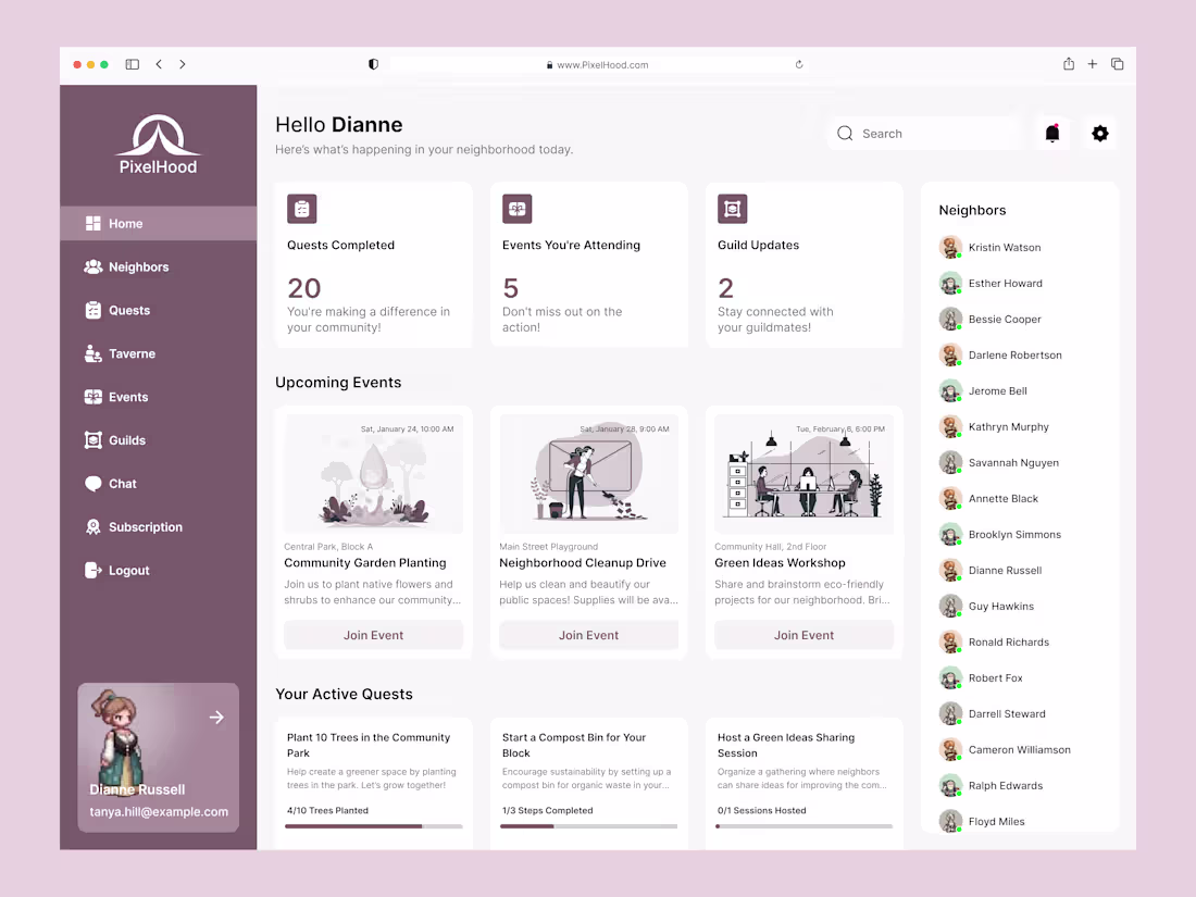
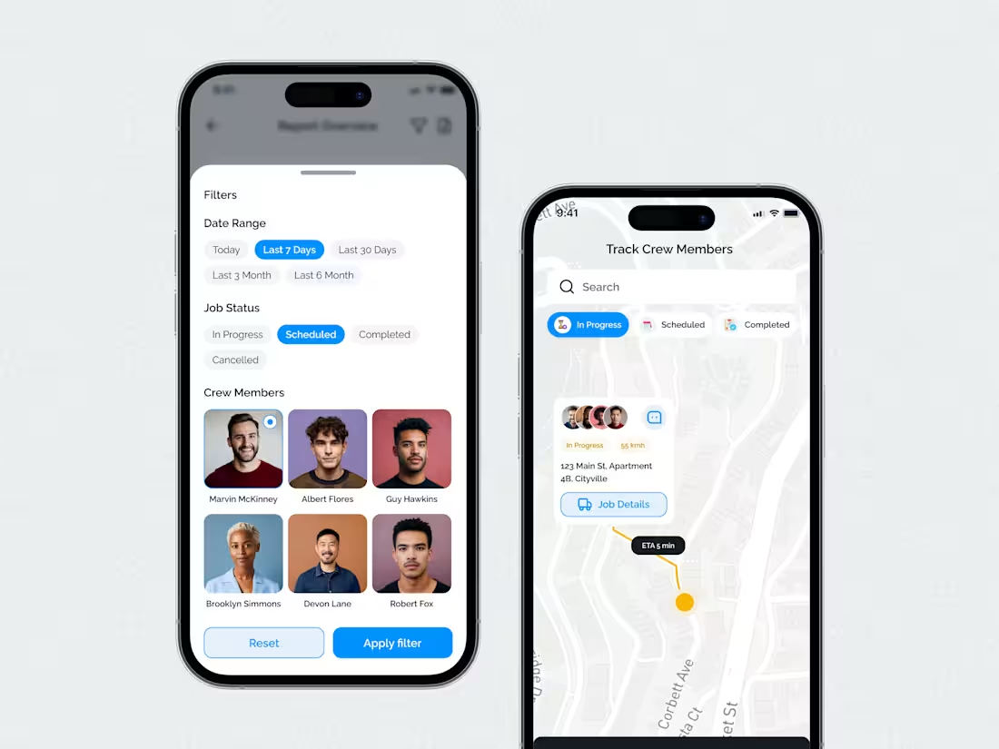
Quest Dashboard That Makes $
This client runs a gamified neighborhood app. When I joined the project, people loved the idea but skipped most events, so sponsor and ticket revenue stayed flat.
I began with a simple UX review of the sign‑in flow and first screen. The key issue: actions were hidden under icons.
I redesigned the layout with large event cards and direct “Join Event” buttons. UX point: clear visual hierarchy so eyes go from stats to events to chat. Early numbers show more event joins.
Need a dashboard like this? DM me.
4
3
103
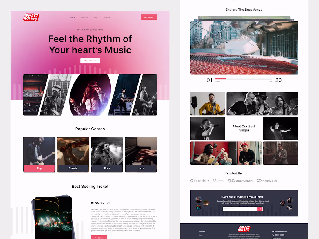
Vibrant Music Landing Page – Concert & Events Website UI
A vibrant and modern landing page design for a music event platform, blending bold typography with immersive imagery to bring the rhythm to life.Perfect for concert ticket booking, artist showcases, and genre discovery.
#musicui #landingpage #concert #eventwebsite #uiux #webdesign #figma #musicevent #ui
1
70
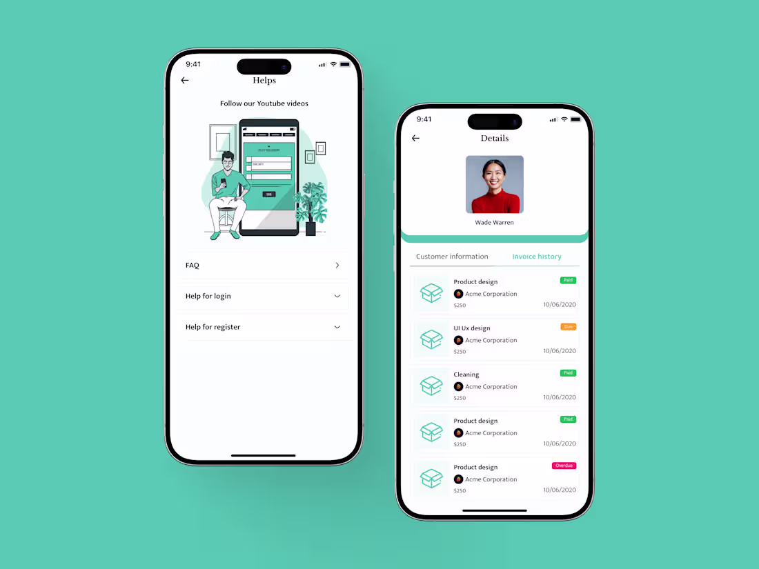
Smart Invoice Generator – Mobile App Concept
Invoice Generator App – A clean and intuitive mobile app designed to make creating, managing, and sending invoices effortless. Minimal design, smooth workflow, and user-friendly interface ensure fast and seamless invoice management for freelancers and small businesses.
6
4
122
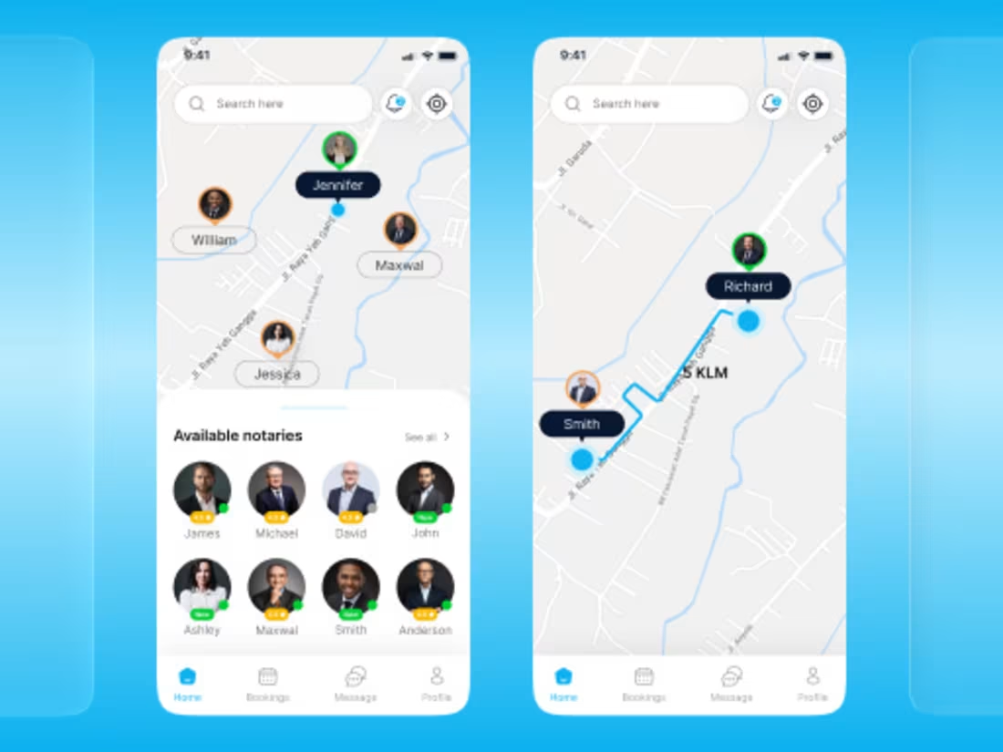
Notarix – Mobile App UI for Seamless Notary Booking
Notarix – Smart Notary Booking App UI
Here’s my latest UI/UX design for Notarix, a mobile app that helps users book notary services, upload documents, and track appointments easily.
✨ Key Features:
• Easy booking
• Secure uploads
• Appointment tracking
• Clean light & dark mode UI
Designed in Figma. Let me know your thoughts! 💬❤️
#uiuxdesign #appdesign #figma #notaryapp
#bookingapp #cleanui #darkmode #uxuidesign
6
8
193
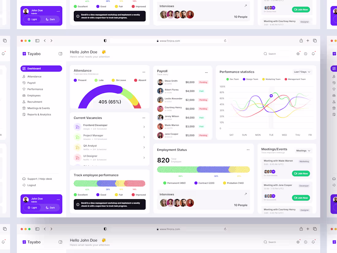
UI UX Design for HR Management Dashboard /Saas/ Admin panel
Hold on! We have something game-changing to share.
Managing your workforce shouldn’t be complicated, but most HR dashboards overwhelm users with scattered data and confusing workflows. Sound familiar?
That’s exactly why we designed this Modern HR Management Dashboard—to make people management simple, clear, and efficient. From streamlined recruitment and onboarding to real-time performance tracking and employee analytics, our intuitive interface puts everything HR teams need right at their fingertips.
No clutter, no confusion—just a smarter, more human way to manage your organization.
4
1
113
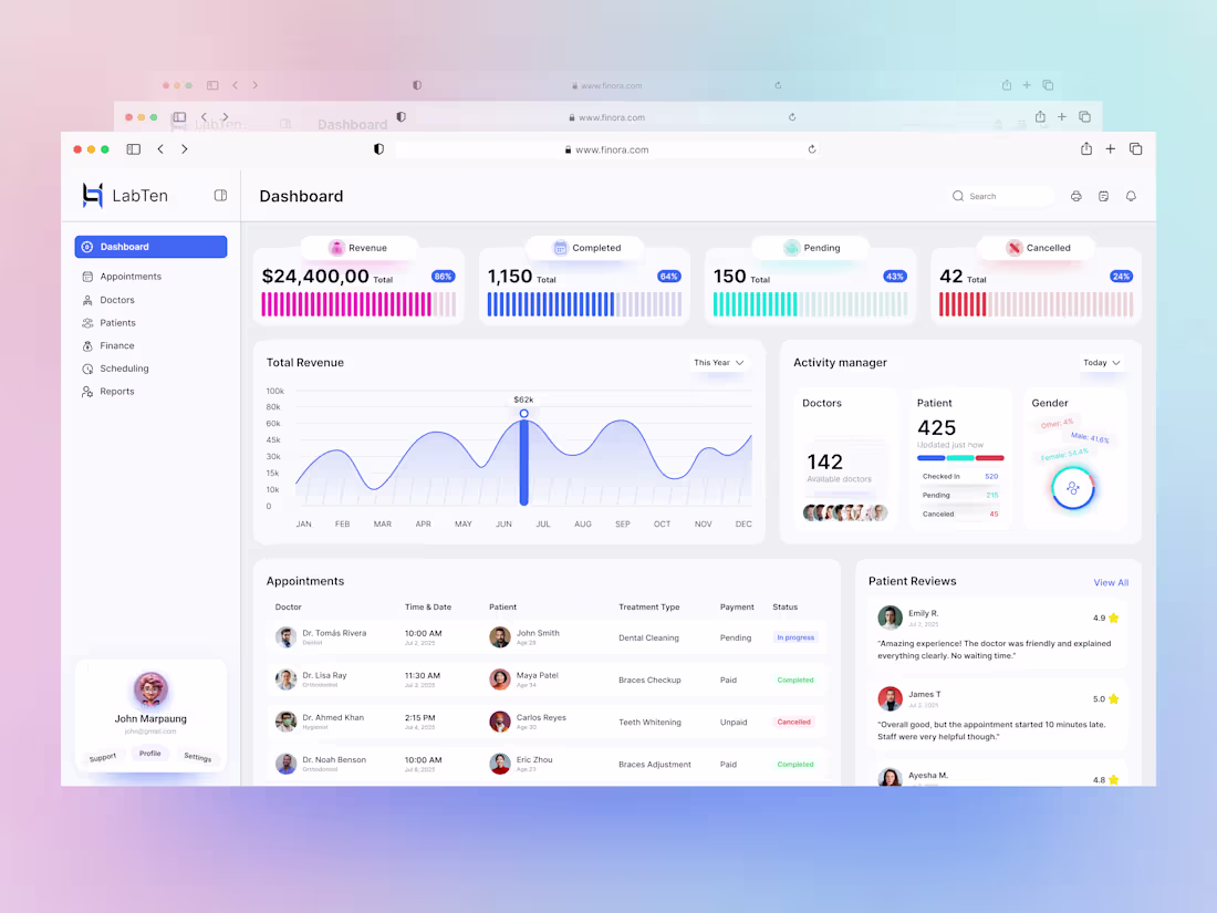
Doctor Appointment Tracking – Smart Admin Dashboard UI
Healthcare Admin Dashboard – Doctor Appointment Management UI Design
Introducing a modern and intuitive Admin Dashboard UI designed specifically for tracking and managing doctor appointments in healthcare systems and medical clinics.
The dashboard offers a clean layout, real-time appointment updates, doctor schedules, and quick analytics for healthcare administrators—optimized for better decision-making and smooth day-to-day operations.
✨ Key Features:
Daily, weekly & monthly appointment tracking
Doctor status & availability overview
Responsive charts & KPIs
Patient summary section
Light & clean UI for easy navigation
🎨 Designed in: Figma
🧠 Goal: Simplify healthcare operations with an efficient, user-focused admin interface.
2
3
98
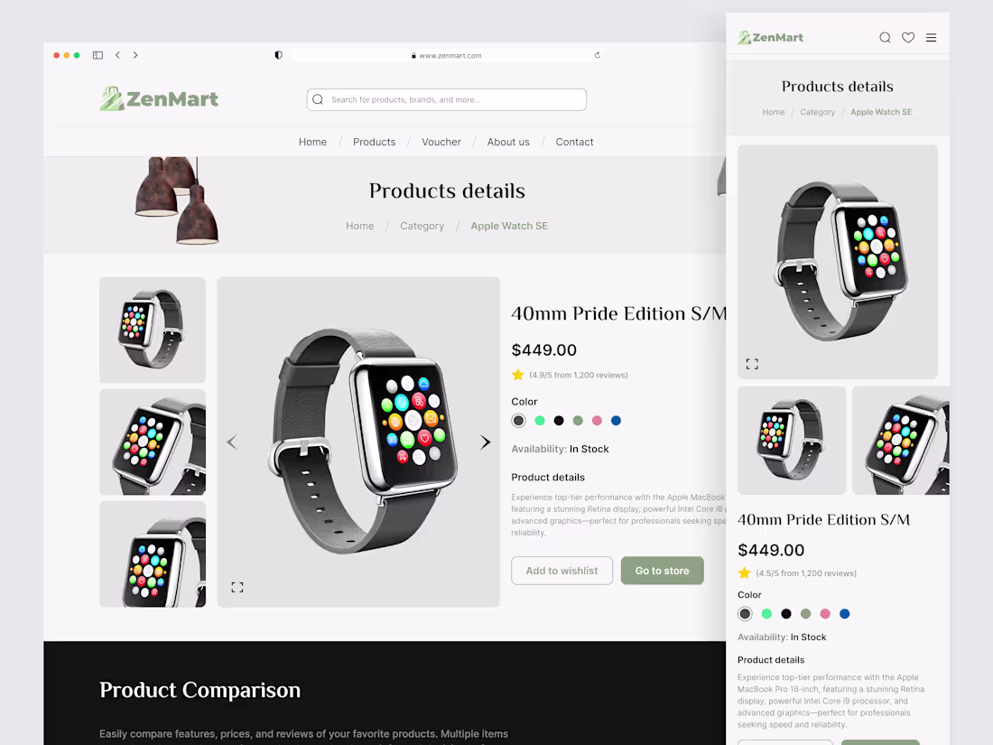
ZenMart – Clean, Conversion-Focused eCommerce Website Design
4
2
80
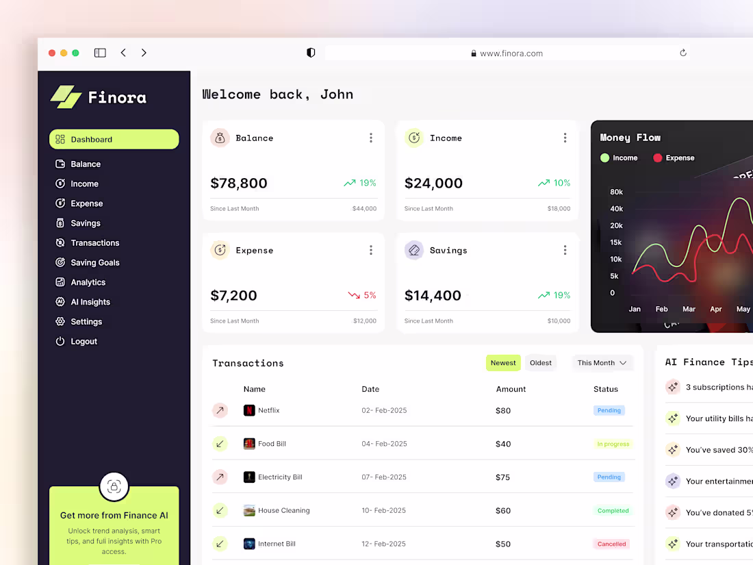
Smart Finance Dashboard UI – Modern Personal Budget
Take control of your finances with this modern Finance Management Dashboard UI!
Designed for seamless personal budgeting and expense tracking, this dashboard features intuitive navigation, real-time data visualization, and customizable analytics.
The clean, minimal interface ensures users can easily monitor spending, set savings goals, and analyze financial trends at a glance. I focused on a user-centric design process, prioritizing accessibility and clarity to empower users of all backgrounds.
Interactive charts, smart notifications, and a responsive layout make this dashboard perfect for both web and mobile platforms.
Whether you’re a fintech startup or a solo saver, this design delivers both style and substance.
Drop your thoughts below!
2
3
116
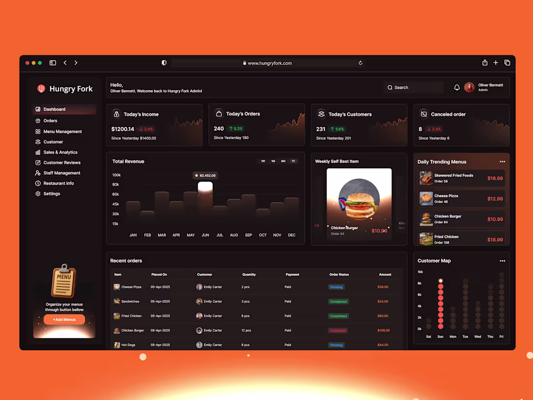
Hungry Fork Dashboard – A Fresh Take on Restaurant Management UX
2
83
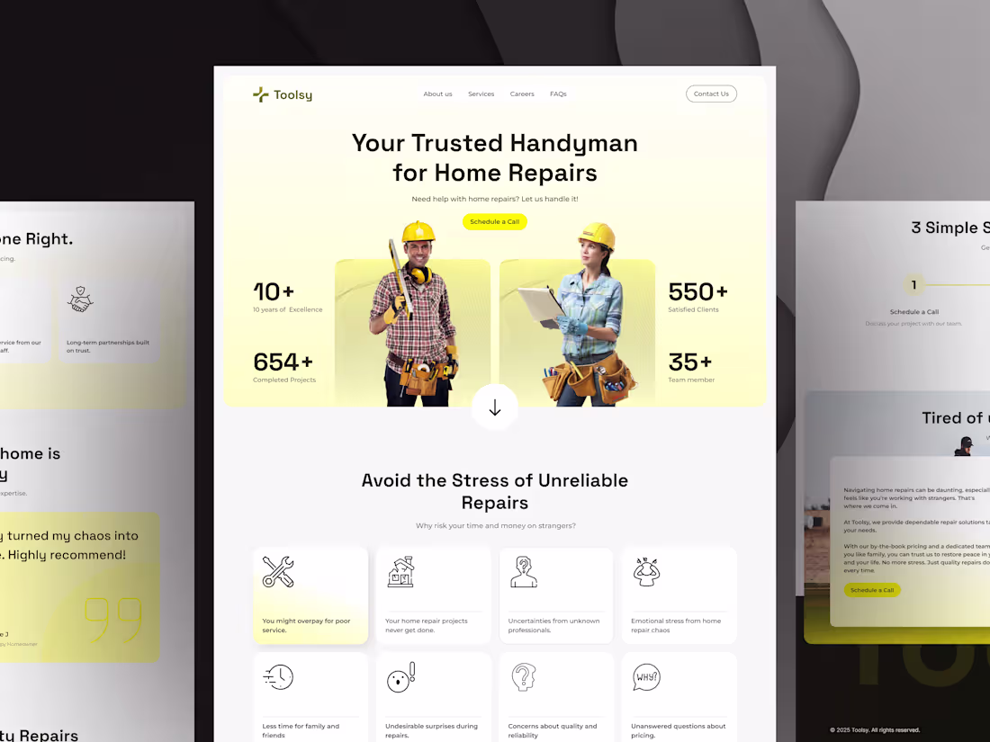
Handyman website ui design
1
66
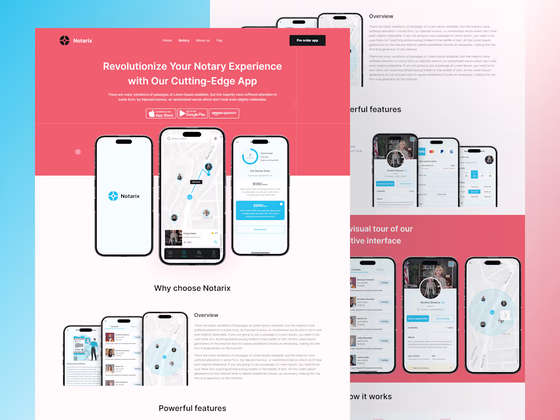
Notarix landing page ui design
2
64
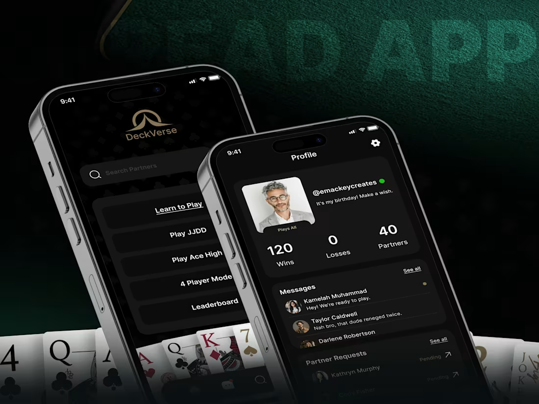
Designing for Play: The UX Behind a Card Game That Feels Instant
1
64
A Revenue-Focused Mobile App UI for the Moving Industry
his mobile app project started with one challenge: moving is stressful and confusing for users.
For Move.me (http://Move.me), I designed a clean mobile customer dashboard that lets users track their move, view job details, and chat with movers—all in one place.
The focus was on simple navigation, clear actions, and a smooth mobile experience that builds trust and keeps users engaged.
Good mobile UX helps users stay, convert, and pay.
If you need a mobile app design that supports real business growth,
let’s talk 👋
1
60
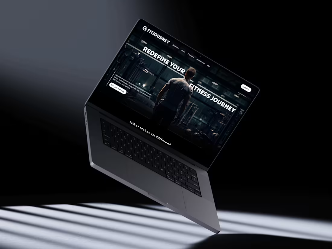
FitJourney Landing Page Redesign | UI/UX for Fitness Brands
I found this client on social media after they posted: “Our website looks good, but sign‑ups are low.”
I jumped in with a quick audit, reviewed competitors, and mapped a clearer user flow. Then I designed a bold, high‑energy landing page with stronger messaging, trust sections, and clean CTAs to guide visitors to join.
Want a landing page that turns visits into leads?
DM me—happy to help.
2
80
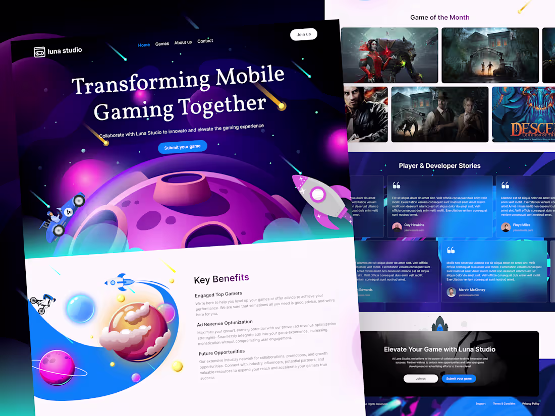
Luna Studio Landing Page — Problem to Solution UI/UX
Luna Studio came to me with a clear problem:
the page looked fun, but new visitors did not quickly understand the offer or what to do next.
The solution was a simple, guided story. First, we made the main message clear:
mobile gaming, together. Next, we focused on two actions only: “Join us” and “Submit your game.”
Then we added quick value blocks (engaged gamers, ad revenue help, future opportunities) and trust sections (about, featured games, stories).
This way, people can understand, trust, and take action fast.
If you need a landing page like this for your studio or business,If you want a landing page that does the same, DM me for UI/UX.
1
89
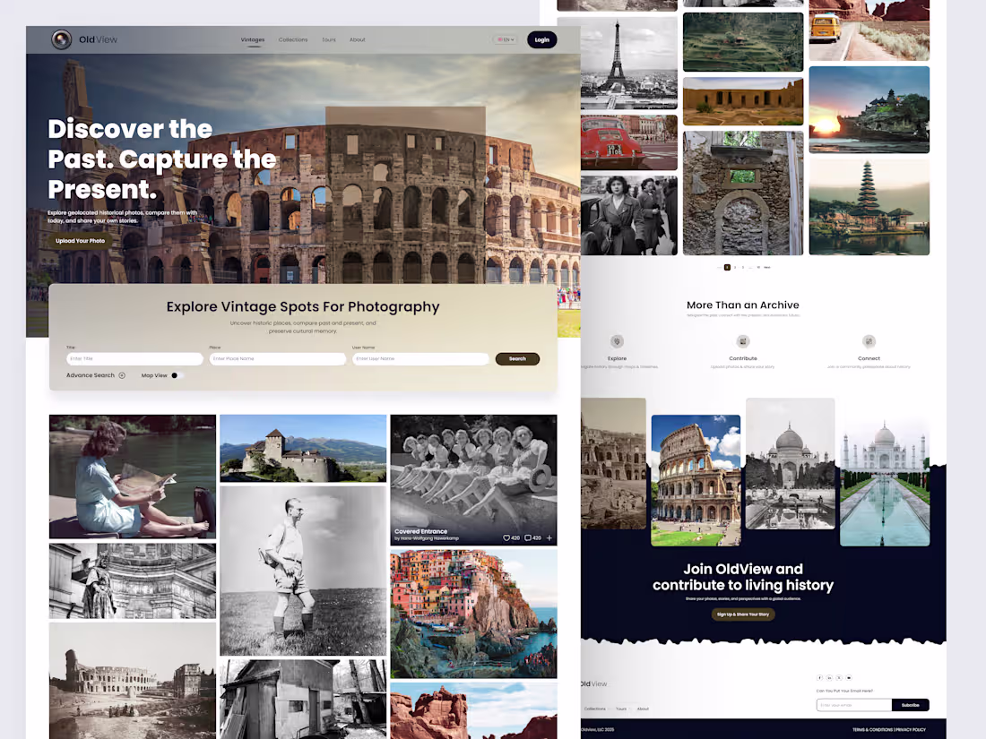
OldView – Vintage Photography UI/UX for History Lovers
As a UI/UX designer, I was asked a simple question:
“How can we turn people who love old photos into real revenue?”
OldView was my answer.
This concept starts as a visual gallery for history fans, then quietly turns engagement into income through premium search tools, map view, upload limits, tours, sponsored spots, and photo licensing.
Curious how UI/UX like this can turn your product into a real revenue stream?
let’s talk
1
63
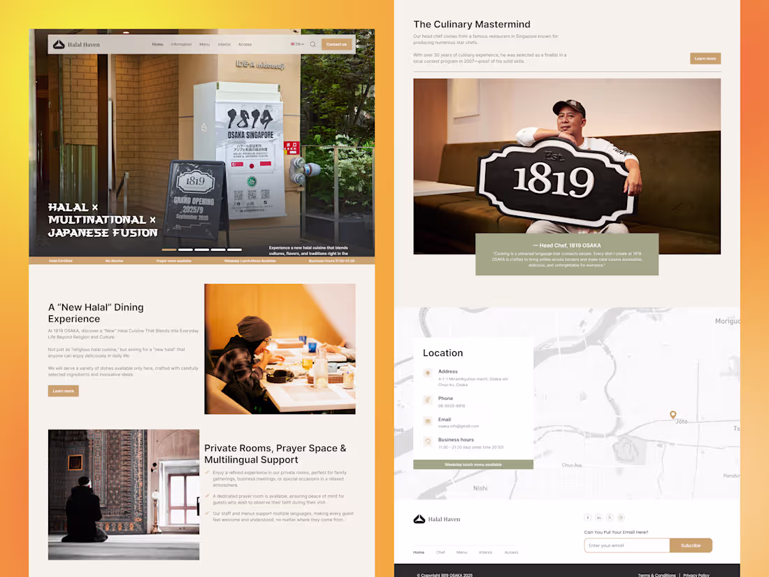
Halal Haven – Multinational Japanese Fusion Restaurant Website UI/UX
Halal Haven is a clean, conversion‑focused website I designed for a halal Japanese fusion restaurant in Osaka. The UI balances warm, restaurant photography with simple navigation so visitors can quickly explore the concept, browse the menu, and reserve a table. I focused on clear hierarchy, mobile‑first layouts, and trust elements like halal certification, prayer space info, and multilingual support.
I’m open to new projects in restaurant, food & beverage, and hospitality web UI/UX.
1
93
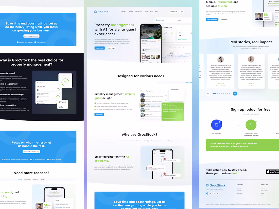
More Bookings, Less Work, More $
I kicked off this project by digging into analytics for GrocStock, an AI property‑management SaaS: lots of traffic from property managers, not many trial sign‑ups.
The problem was clarity, too many messages, no clear path to “start for free.”
I created a focused landing page that speaks separately to managers, owners, and hosts, using tabs so each group sees only what matters to them (strong UX for busy users).
Social proof, pricing, and mobile apps are now only a scroll away. Want a landing page that turns visitors into paying customers?
Reach out and let’s chat about your product.
2
1
85