
Milica Lazic
Figma UI Designer Landing Pages & Websites
New to Contra
Milica is ready for their next project!
When users customize a product, every extra click adds friction. This exploration compares two common UI patterns for color selection visible swatches and dropdown menus to understand their impact on usability and decision speed.
Key questions explored:
How can we reduce interaction cost?
Which pattern improves option discoverability?
How does selection visibility influence user confidence?
When should simplicity be prioritized over scalability?
This concept focuses on creating a balance between efficiency, clarity, and a premium visual experience through strong hierarchy, thoughtful spacing, and clear interaction feedback.
Focus: Interaction design, visual hierarchy, usability
What would you choose color swatches or a dropdown?
0
42
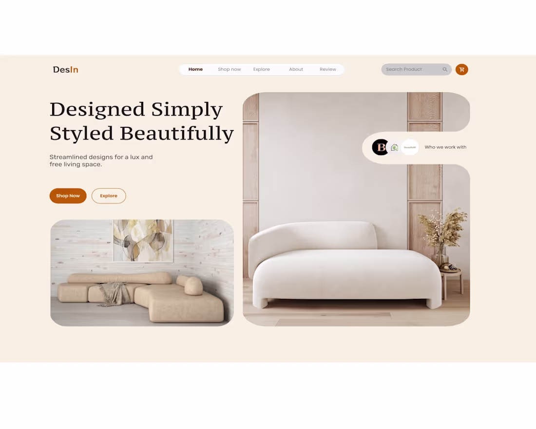
Minimalist UI/UX Website Design
A modern web design concept crafted to elevate everyday living through clean layouts, soft visuals, and a refined user experience.🔥
0
71
Website Design – Pet Center Platform
Client request:
The client wanted a detailed and well-organized website that clearly presents all available services and makes it easy for users to search, compare, and book pet-related services.
My role & design process:
I focused on defining key sections, organizing content logically, and designing smooth user flows to ensure an intuitive experience.
Key design decisions:
Chose a friendly and trustworthy color palette suitable for pet owners
Emphasized key sections such as services, reviews, and booking
Balanced visuals and text to keep the interface approachable and easy to use
Result:
A well structured and informative website that clearly communicates the platform’s purpose and helps pet owners quickly find and book the right service for their pets.
0
142
:Web Design Redesign – Gaming Website
Project overview:
This project is a redesign of an existing gaming website. The main goal was to make the site more visually engaging and better suited for a gaming audience.
Design approach:
I used stronger colors, high contrast, and bold visuals because gamers are naturally attracted to dynamic and graphic-driven designs. The layout was redesigned to feel more energetic while still remaining clear and easy to navigate.
What was improved:
Updated color palette with more vibrant tones
Cleaner layout with better visual hierarchy
More engaging hero section
Improved sections for game content and features
Modern UI elements that match gaming aesthetics
Result:
A more modern and visually attractive website that better reflects the gaming atmosphere and grabs the attention of players.
0
141