


Final brand book for Auren.
A document where we bring together the visual identity and explain how to apply it: which version of the logo to use, how to combine colors and typefaces, and how to apply all of that to different materials
Creating 2 concepts for a project, this is the first one.
I’m really enjoying the process!
Right now, we’re defining the strategy and visual direction, which will later serve as the foundation for developing the final brand identity.
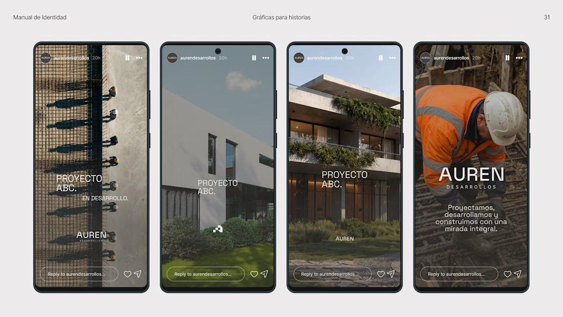
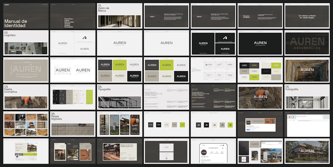
Branding for a construction company ✨
Inspired by the volumetric grids used in architecture, the symbol is built on a 4×3 modular grid, where different shapes come together to form a single structure.
A simple geometric system that connects the identity to the way Auren approaches architecture and development.


