Hunain K.
Strategic brand identities for SaaS, B2B & tech companies.



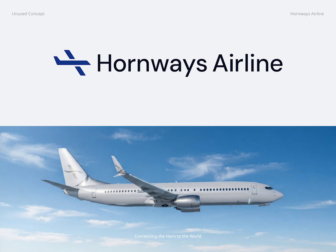
Hornways Airlines — Unused Logo Concept ✈️
An early logo exploration for Hornways Airlines, designed around the idea of connection, movement, and taking the Horn of Africa to the world.
This concept didn't make the final cut, but I'm curious:
Would you have explored this direction further for an airline brand? Why or why not? 👀
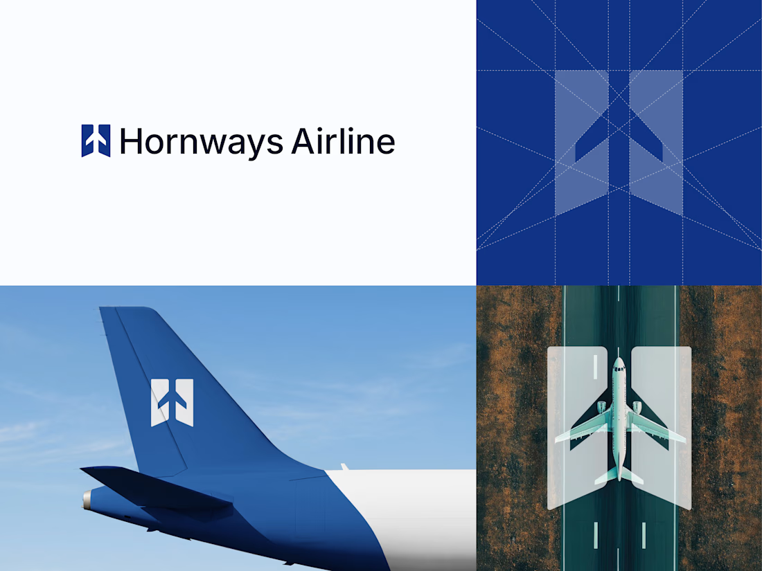
Hornways Airlines, Unused Logo Concept ✈️
An early logo exploration for Hornways Airlines, designed around the idea of connection, movement, and taking the Horn of Africa to the world.
This concept didn't make the final cut, but I'm curious:
Would you have explored this direction further for an airline brand? Why or why not? 👀
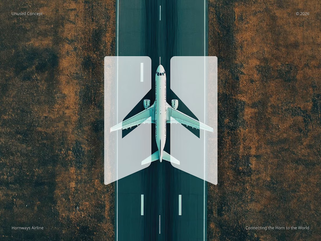
Hornways Airlines — Unused Logo Concept ✈️
An early logo exploration for Hornways Airlines, designed around the idea of connection, movement, and taking the Horn of Africa to the world.
This concept didn't make the final cut, but I'm curious:
Would you have explored this direction further for an airline brand? Why or why not? 👀