
Mehedi Islam
Branding & Logo Designer | Visual Identity Specialist
- $1k+
- Earned
- 1x
- Hired
- 5.00
- Rating
- 26
- Followers
Not reference Norway. Feel like it.
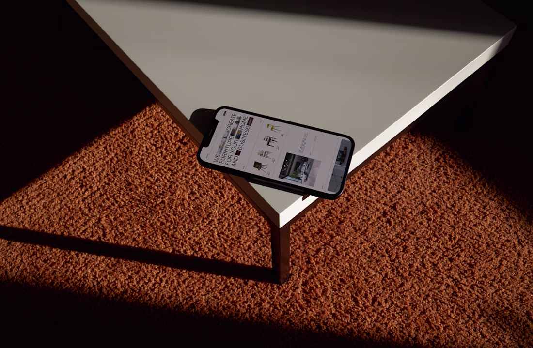
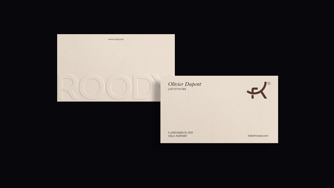
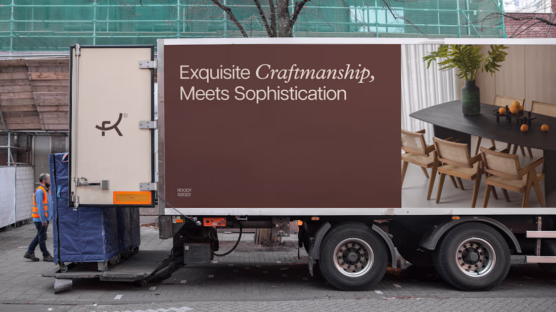
ROODY finds its inspiration in the timeless beauty stretching from the fjords to the mountains, and the brand identity had to carry that without a single photograph doing the work. Just mark, type, color, and the right amount of restraint.
This...

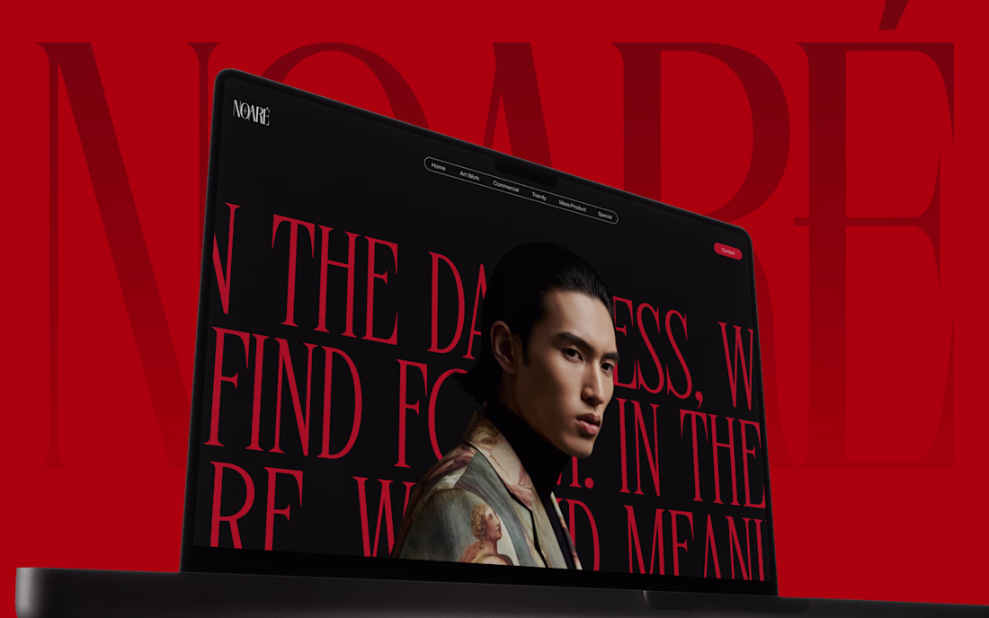
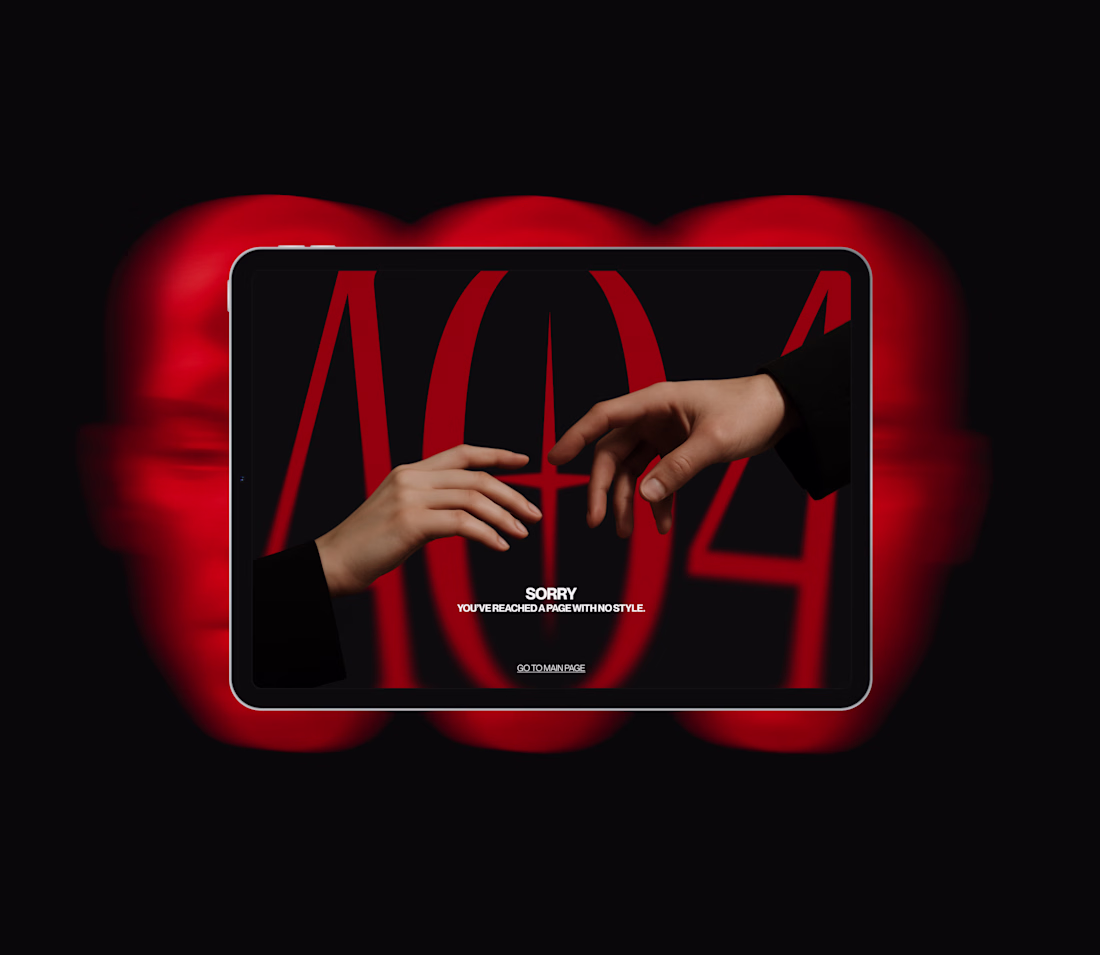
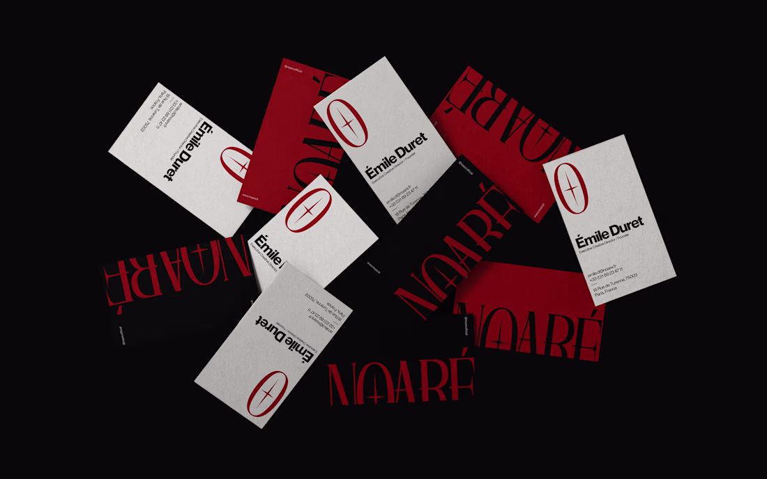
NOARÉ came to me as a brand-new client last year with a clear idea of a luxury fashion identity built around quiet authority. No excess. No noise. Just the kind of design that makes you stop and look twice.
The name itself says everything: noir meets rare. Dark, deliberate,...
First $1K on Contra. 🎉
Quiet milestone, but it counts. Started the month onboarding a new hire. Ended it here.
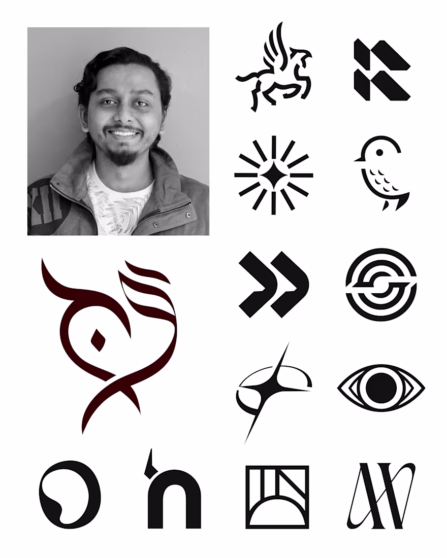
Joined the Logo Archive trend with a set of marks from last year.
These are the ones that held up; built on structure, nothing added that didn't need to be there. Quiet marks that do their job without asking for attention.
The grid has always been my starting point. It still is.
Open to brand identity projects. Let's work. →
Been sitting on this one for a bit.
Gryphon is a financial intelligence platform built around the idea that your capital deserves something that actually watches over it. The Griffin felt like the only honest answer.
Case study goes up on Behance soon. Follow there to see the...