
Md. Golam Kader
UX/UI Product Designer | Top-Tier Product & Web Designer
New to Contra
Md. Golam is ready for their next project!
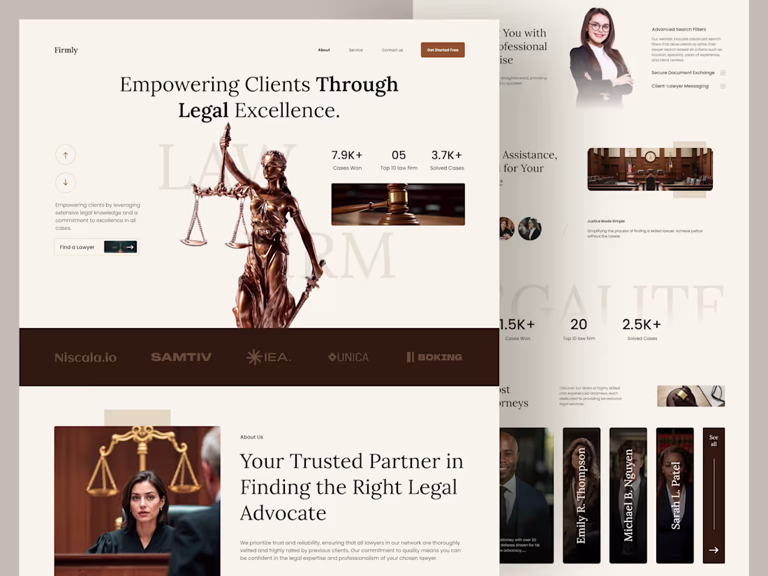
Firmly — Lawyer & Attorney Website | UX/UI Case Study
0
2
Why play it cool when you can set the world on fire? 🔥
I recently wrapped up the landing page design for Saucypop, an e-commerce brand that's all about bold flavors and high energy.
I’d love your thoughts on a few things:
>> Does the bold typography feel balanced against the product sections?
>> How is the visual hierarchy working for you as you scroll?
>> Is the "Spicy Goodness" CTA section hitting the right note?
1
156
Finding focus through design 🍵
I recently wrapped up the Website design for Maxon, a premium matcha brand. The goal was to balance a bold, modern aesthetic with an intuitive shopping experience that reflects the purity of the product.
Key design highlights:
Bold Visual Hierarchy: Using oversized, high-contrast typography to immediately establish the brand’s "focus" mission.
Earth-Driven Palette: A monochromatic green scale to evoke freshness and organic quality.
Conversion-First Layout: Streamlined product grids and clear social proof sections to build trust quickly.
What do you think of the color story here? I’m also curious to hear your thoughts on the custom iconography and the flow from the educational content to the shop section.
Drop a comment below! 👇
2
1
142
Managing complex data shouldn’t feel like a chore. For my latest project, Bondly, I wanted to bridge the gap between high-level promotion analysis and personal financial goal tracking within a single CRM ecosystem.
I focused on:
1. Visual Hierarchy: Using a dark sidebar to anchor the navigation while keeping the data workspace light and breathable.
2.Actionable Insights: Prioritizing "Sales Target" and "Saving Goals" to give users an immediate sense of progress.
3.Modern Data Viz: Experimenting with softer, rounded shapes for bar and bubble charts to make "Store Order Analysis" feel more approachable.
I’m looking to refine this further! I’d love your thoughts on:
1.Does the color contrast between the lime green and soft pinks work for you?
2.Is the "My Saving Goals" widget too prominent for a CRM dashboard, or does it add value?
4
3
194
Enargix — Reimagining the Energy Drink Experience ⚡
I recently worked on a landing page for Enargix, focusing on creating a high-converting digital storefront for a modern energy drink brand. My goal was to balance bold, high-energy aesthetics with a functional layout that drives business growth.
Key Focus Areas:
Visual Impact: Using a vibrant, high-contrast palette to capture immediate attention.
Segmented User Experience: Categorizing products by use case (Work, Play, Sleep) to simplify the decision-making process.
Conversion Hooks: Strategic CTA placement and benefit-driven copy to encourage engagement.
I’m currently looking for feedback on the information architecture and visual hierarchy. Does the "Work/Play/Sleep" section feel intuitive, or could the navigation be even smoother?
1
179
Gamifying Education: Designing Quizé 🧠✨
I’ve been working on Quizé, a mobile app designed to make daily mental exercises feel less like a chore and more like a game. The goal was to balance a "fun" aesthetic with a clean, high-conversion UI.
Key features I focused on:
- The Onboarding: Using custom illustrations to set a friendly, low-pressure tone.
- Gamification: A prominent leaderboard and coin system to drive daily retention.
- Visual Hierarchy: Using bold gradients and soft shadows to make the "Social Science" card pop.
I’d love to hear your thoughts on the Leaderboard layout—does the podium design feel intuitive for mobile?
2
2
179
ABIRE Real Estate Website Design
0
4
Toplyze Analytics Web App Design
0
2
Urban Nest Mobile App Design
0
4
LuxeSmile Dental Clinic Landing Page Design
0
10