
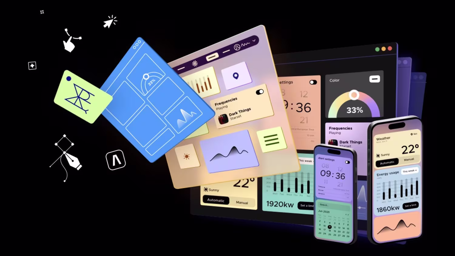
Max Snitser
Designer (UX, UI, Web, Mobile, SaaS)
Ready for work
Max is ready for their next project!
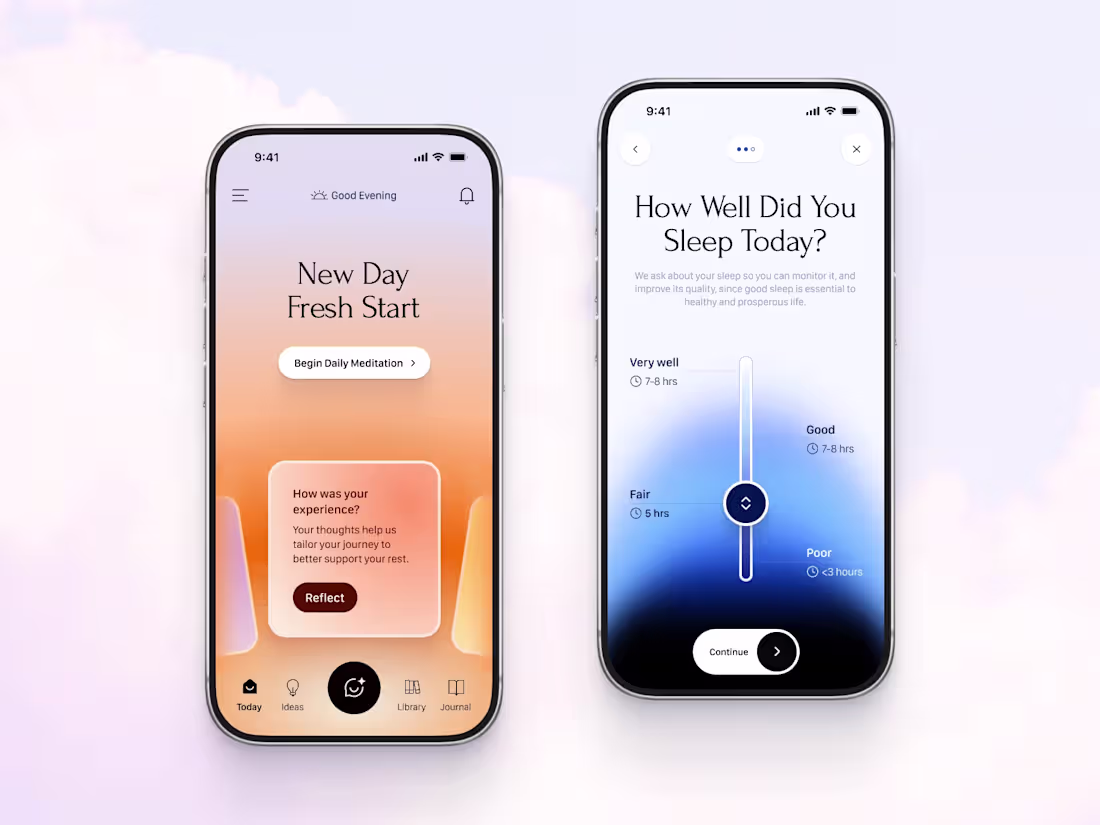
Hey guys, — I'm designing iOS app concept for digital wellness experience and sharing some views here.
This design explores how a sleep tracking and meditation platform can guide users from their evening wind-down to a fresh start the next morning, blending intuitive iOS architecture with a deeply calming atmosphere.
Designed with native iOS patterns in mind, featuring fluid transitions, intuitive gestures.
Soft, adaptive gradients and refined typography work together to reduce cognitive load, ensuring the interface itself promotes relaxation.
💬 DM me for inquiries or to start your project.
4
13
119
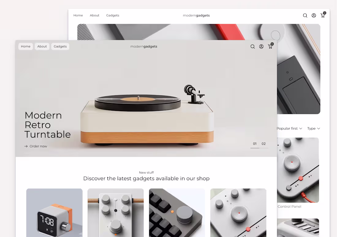
Wow! Designed my first eCommerce site in Framer with Frameship. I had a tight timeline so came up only with the Homepage, Catalog, and Product page.
Everything inside is responsive and with some effects to make it lively. Of course, it can be improved further.
Link: https://moderngadgets.framer.website
(https://moderngadgets.framer.website/)Remix: https://framer.com/remix/eUyRhxFuOxyG2ySwCdvj
6
9
157
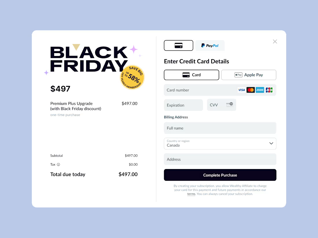
A checkout modal designed for a Black Friday campaign, featuring a split-view layout that highlights offer details and purchase options side by side.
The interface uses custom typography, a clean layout, and well-considered spacing to create visual hierarchy and clarity.
The form is tailored to the platform, making interactions intuitive and frictionless.
Thoughtful element distribution ensures that users can quickly scan, understand the offer, and complete the checkout seamlessly, even during high-traffic campaigns.
20
132
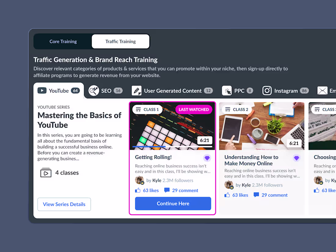
I've designed a training module interface featuring interactive video series organized into categories such as YouTube, SEO, User-Generated Content, PPC, Instagram, and Email.
Each category tab includes a counter indicating the number of video classes, offering instant insight into available content.
The design features a high-contrast color ratio for optimal readability and accessibility, paired with a clear, deliberate use of spacing that enhances focus and flow.
Clean layouts, consistent visual rhythm, and smooth interactions make learning structured, intuitive, and visually rewarding.
16
119
Building cohesive, conversion-ready interactions across the brand experience.
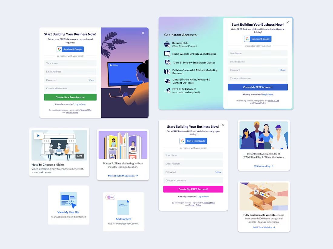
A curated set of supplemental UI components designed to enhance interaction and visual consistency across website and landing page experiences. I've designed and tested these components to support guest-to-user conversion flows, the collection includes cards, modals, and sign-up forms, all crafted to maintain brand coherence and usability. Each element reflects the same design language — clean typography, balanced spacing, and approachable visuals — ensuring a seamless transition from browsing to engagement while strengthening the overall brand identity.
2
23
158
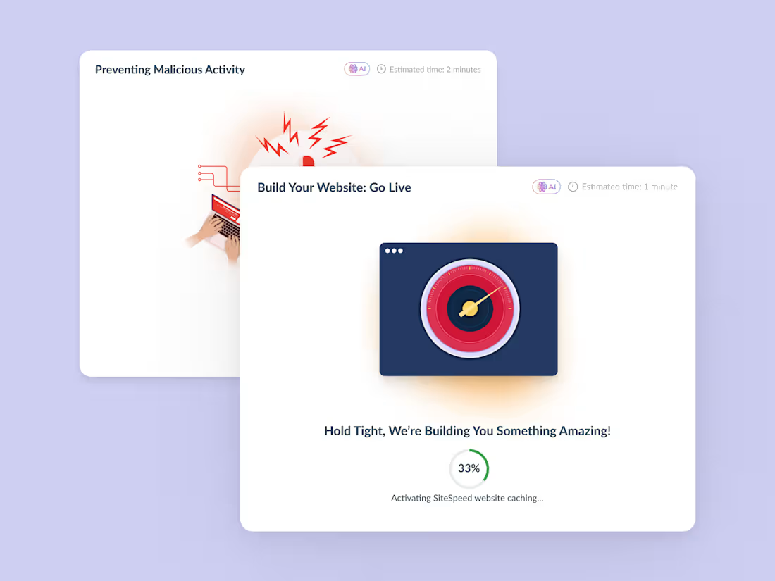
Sharing some of the UI I did recently for Loading Modals with an interactive step-by-step process. Each step is visually represented by a unique custom illustration infused with a cutting-edge tech aesthetic, creating a dynamic and engaging user experience.
3
20
153
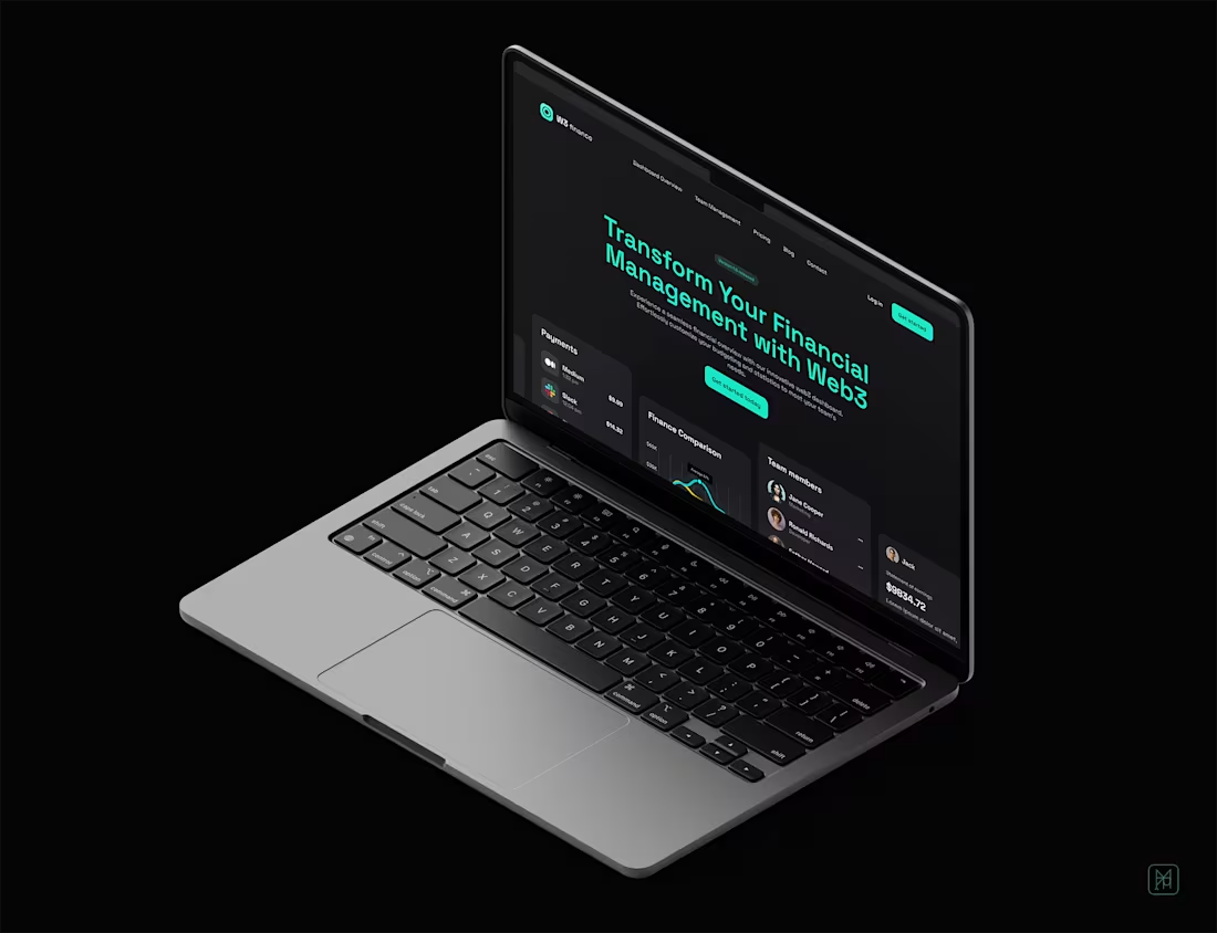
Web3 Finance Website Design
0
0
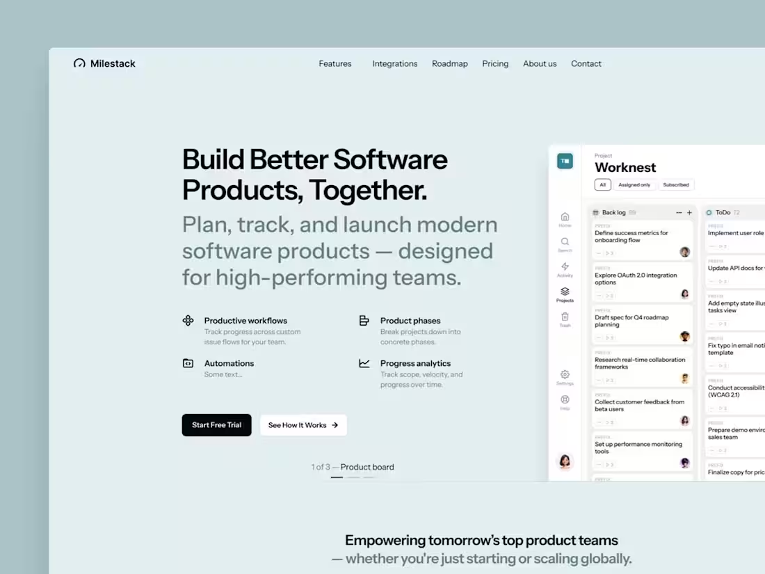
SaaS Landing Page Design
0
0
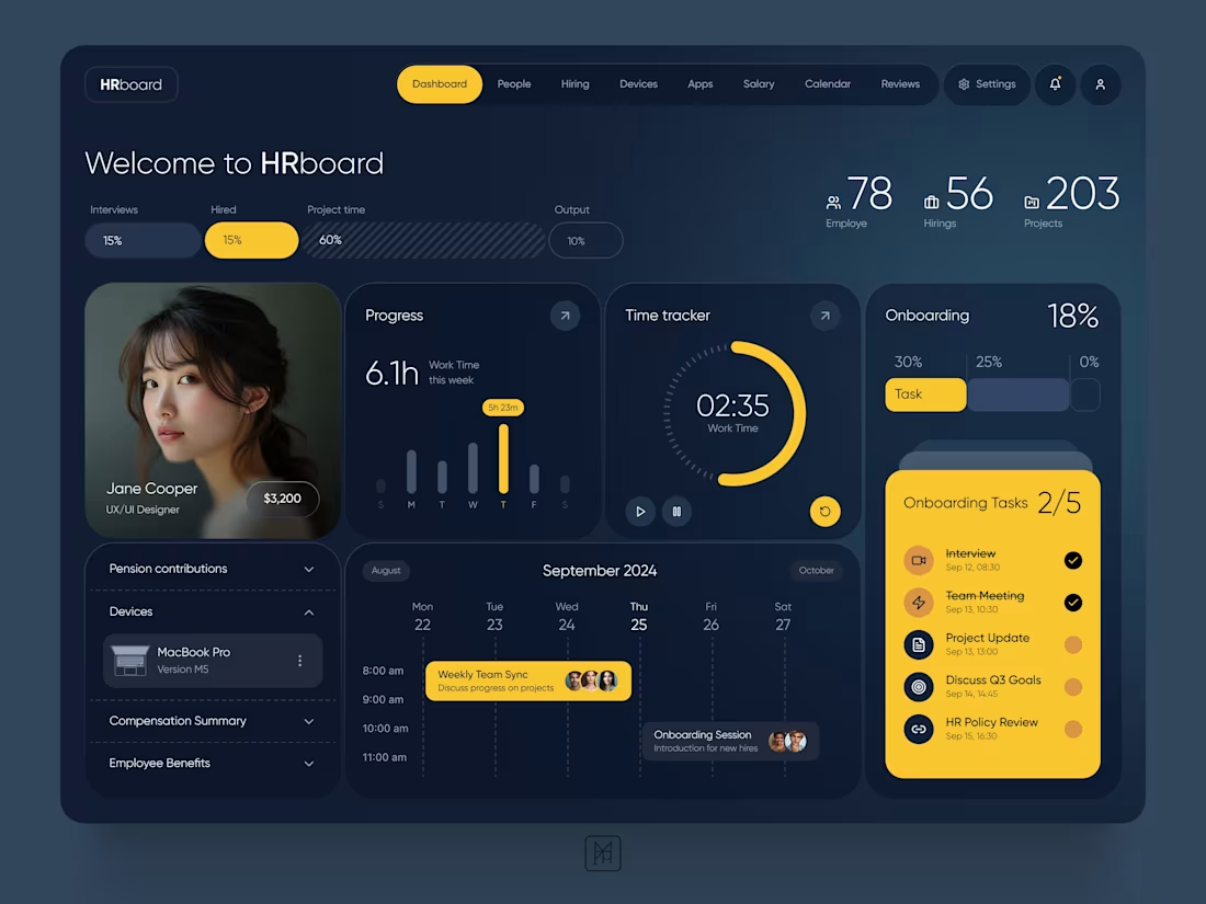
I designed a clean, modern HR SaaS dashboard UI aimed to attract users with a minimal, high-trust interface — the kind that feels intuitive, polished, and scalable.
The goal was to make a product that looks premium and performs effortlessly across key HR tasks.
I focused on turning design skills into real product value — creating reusable components, responsive layouts, and developer-ready Figma files that speed up projects and reduce rework.
The visual system was intentionally minimal — dark glowing base with subtle accents — giving it a wealthy, confident tone.
18
199
SaaS UI/UX Design
0
0