Ultratech+ (https://www.behance.net/gallery/247352677/Ultratech-Brand-Identity) was designed around clarity, accessibility, and forward momentum, positioned to make financial technology feel simple, reliable, and inclusive.
2
69
Coffee is already a performance. The pull of an espresso, the pour, the steam. First Sip (https://verymary.work/projects/first-sip-coffee) Coffee is a specialty coffee shop built on that idea of showmanship, treating every cup as something worth watching.
#coffeebranding #brandidentity #packagingdesign #brandillustrations
1
3
211
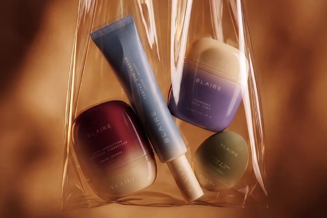
Skincare and makeup have always been sold as two separate things. Blaire (https://verymary.work/projects/blaire)doesn't see it that way. Every product in the range does both at once. The concept is a brand for skin that wants to be seen, not corrected.
0
184
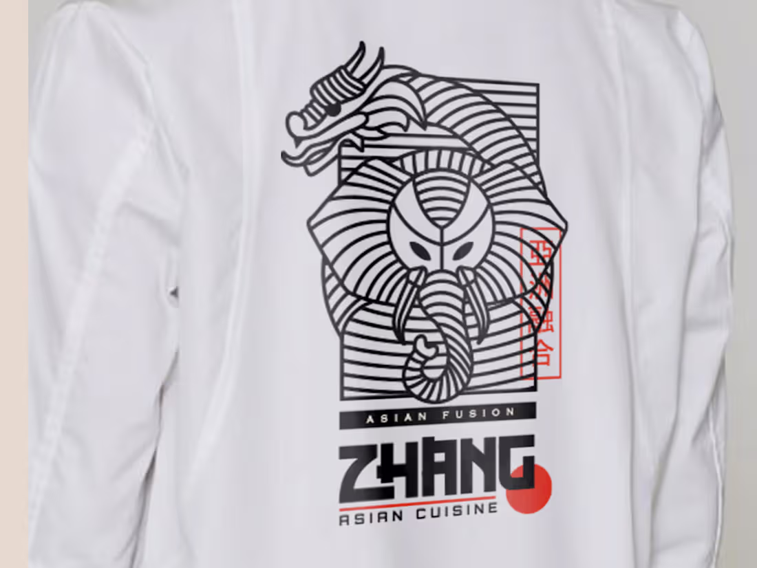
Zhang (https://verymary.work/projects/zhang)is an Asian fusion restaurant that needed an identity with real edge to it. The mark is the hero of the brand, a custom illustration of a dragon coiled around an elephant, representing the fusion at the heart of the brand: Asian and Indian cuisine brought together.
1
1
316
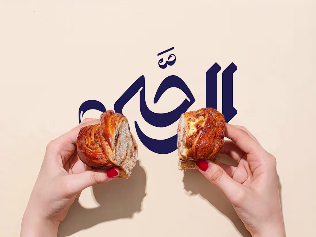
A bakery that has been around long enough to have earned its warmth. Al Raha Bakery (https://verymary.work/projects/alraha)'s identity was built around custom Arabic calligraphy, drawn to balance sharp and soft edges. The goal was a mark that felt established, the kind of brand that looks like it was always there. Packaging followed the same restraint.
2
209