Marijus Buivydas
Designing conversion-first websites for B2B and SaaS
Ready for work
Marijus is ready for their next project!

Hey fam, I'm new here!
I mean I had Contra for a while but never took it seriously. Now it's the time to do so.
Fellow designers, creators, and freelancers, what are your best strategies to get clients on here? Any insights, feedback, or what's worked for you would be appreciated!
Let's get connected!
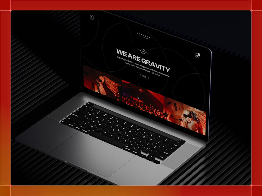
Gravity Copenhagen hosts electronic music events with international DJ line-ups. The redesign called for a minimal, spacious layout with room to breathe. We built the visual identity around rings and circles to suggest orbit and motion. The forms show movement, unity, and the pull that draws people to the dancefloor.


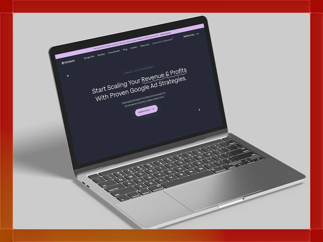
A sleek and modern design that balances elegance with friendliness. The new Echelonn website combines bold aesthetics with a refined, high-converting user experience.
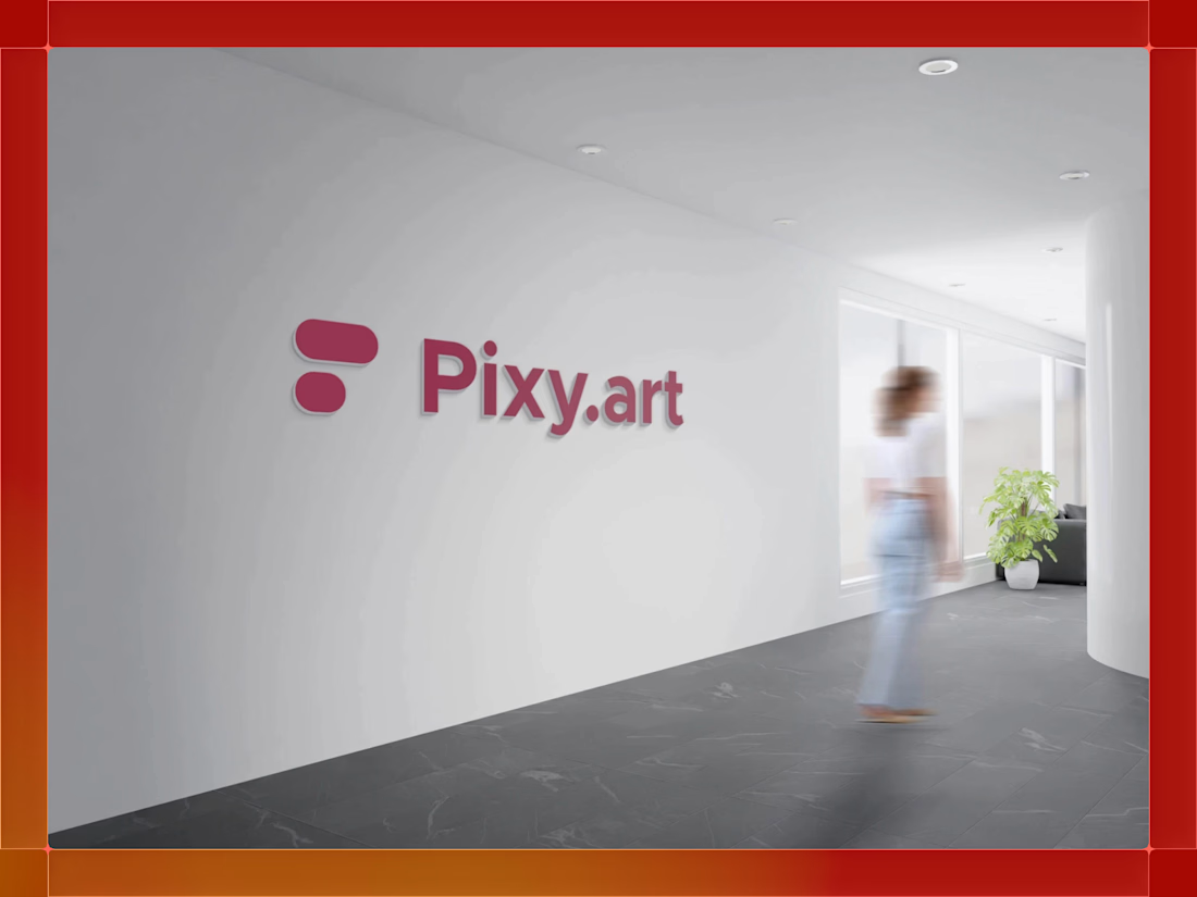
Pixy Art needed a mark that felt both creative and technical. We reduced it to simple, rounded forms that work as building blocks. The shapes suggest structure and flow without overcomplicating things. Paired with a bold, friendly typeface, the result balances technology and human creativity.
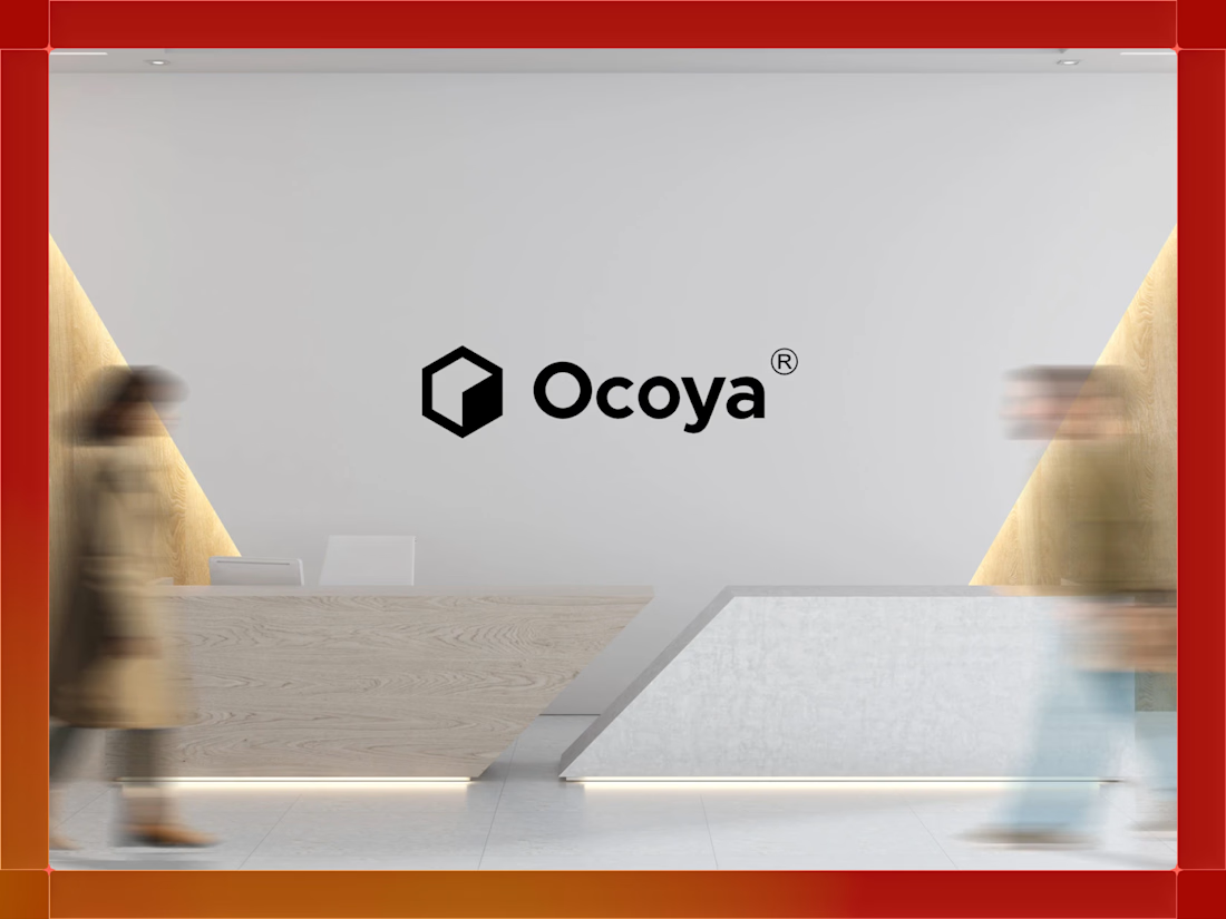
Ocoya needed a logo that could grow with the brand. We stripped it back to simple forms and strong structure, focusing on balance, spacing, and proportion. The result is a mark that stays clear at any size and works in any context. Easy to recognize. Hard to forget.