


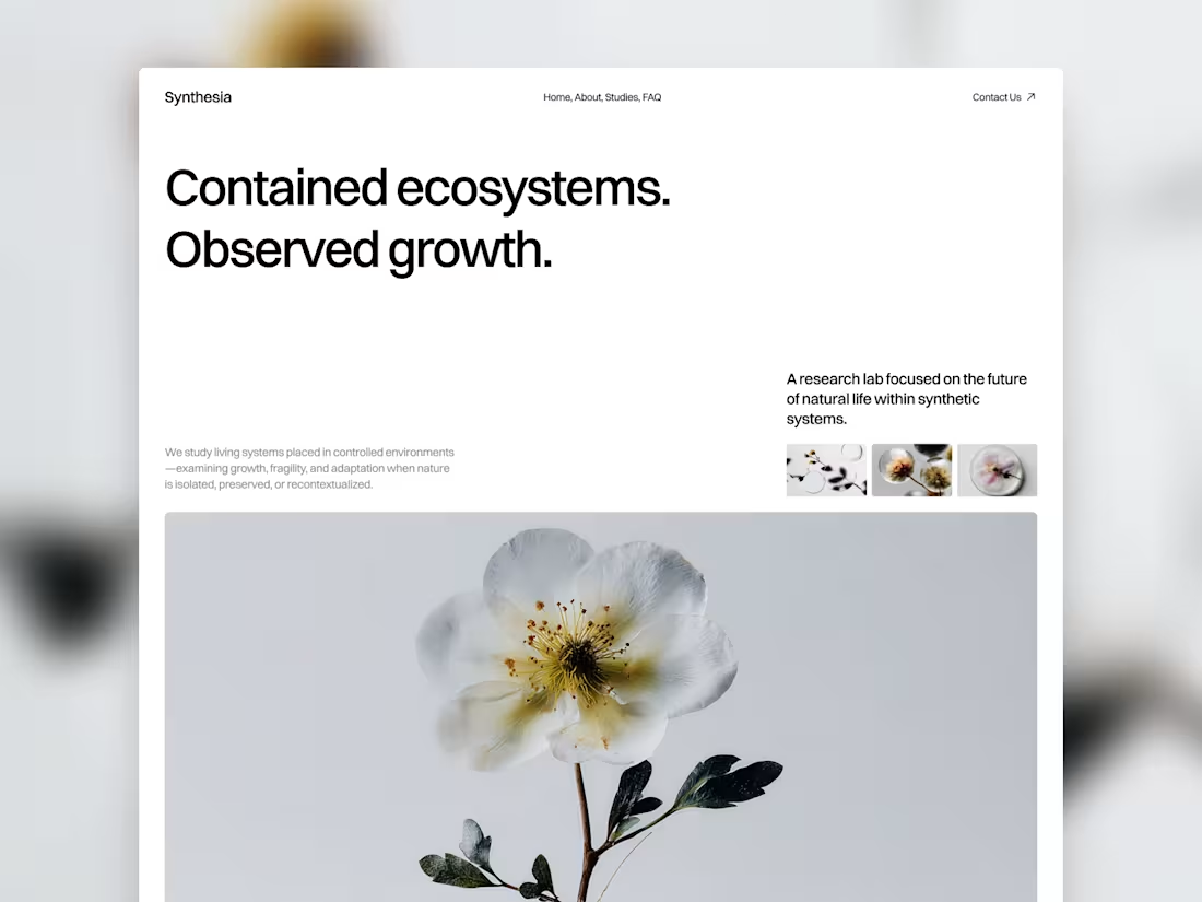
A look at the hero section from Synthesia (https://synthesia.framer.website/), my Framer template for research teams, studios, agencies, and startups working around science, nature, and emerging ideas.
For this one, I wanted to move away from the usual SaaS layout and build something with a more editorial feel. The structure is mostly about the grid, spacing, and how the different content blocks sit together, with the imagery bringing in most of the visual character.
Built in Framer and designed to be easy to adapt to your own content and visual direction.
You can check out the full template here: Synthesia (https://synthesia.framer.website/)
2
1
55
A retreat is made up of moments, not just destinations.
The gallery of past retreats in Namaste Studios treats each one like a small chapter in a larger story. A mix of image sizes, dates, and compositions gives the section an editorial rhythm and makes exploring it feel a little less expected.
Opening a card brings one retreat into focus, so you can spend a moment with it before moving on to the next.
The interaction stays quiet and simple, which felt important here. The gallery should encourage curiosity without turning into the loudest part of the page.
More like a collection of memories than a catalogue of places.
Built for my Namaste Studios Framer template. 🌿
4
251
A loading screen is a tiny moment, but it still gets to set the mood.
This intro for Namaste Studios (https://namaste-studios.framer.website/) is meant to feel like the first little breath before the whole experience begins.
The name slowly comes into focus, using blur and subtle movement to build a bit of anticipation before the page reveals itself.
It’s a simple interaction, but it gives the site a more intentional entrance and makes the transition feel connected to the rest of the visual language.
A tiny breath before you step inside.
Built for my Namaste Studios (https://www.framer.com/community/marketplace/templates/namaste-studios/) Framer template. 🌿
12
446
What if a gallery felt like scrolling through someone’s feed?
For Namaste Studios, I wanted the gallery section to have a bit more personality than the usual collection of neatly arranged images.
So I borrowed a visual language we already know instinctively: Instagram posts.
The cards sit around the main content and stay sticky as you scroll, creating this playful, layered composition that slowly unfolds with the page.
It makes the section feel less like “here are some photos from our studio” and more like you’re getting little glimpses into the world of Namaste.
Sometimes a familiar interaction, used in a slightly unexpected way, is all a section needs.
Built for my Namaste Studios (https://www.framer.com/community/marketplace/templates/namaste-studios/) Framer template. 🌿
55
76
2.5K