
maria camila cuervo lopez
Senior Art Director, B2B and consumer brand strategy
New to Contra
maria camila is building their profile!
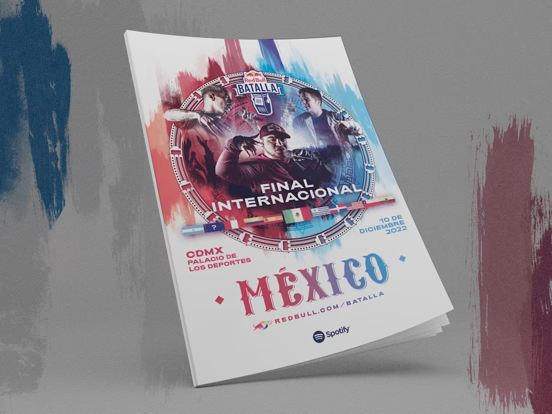
Press and artist guide brochure design for the Red Bull Batalla 2022 International Final, held at Mexico City's Palacio de los Deportes. I developed an editorial piece with the brand's signature urban aesthetic — paint-stroke textures, street typography, and live battle photography — organizing key information like the qualifying tournament, runner-up profiles, DJs, and hosts, so press and talent had full event context in one place. The design balances freestyle energy with a clear, easy-to-navigate structure.
0
5
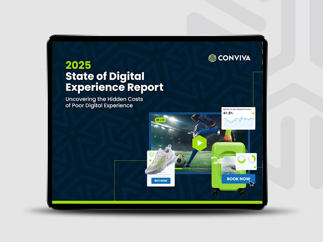
eBook design for Conviva's "2025 State of Digital Experience Report," a data-driven report focused on the hidden costs of poor digital experience. I developed a data storytelling system — iconography, infographics, charts, and highlighted statistics — that makes dense findings, like "91% of consumers encountered digital experience issues," read clearly and with impact across a long document. The project also included the accompanying social media ad campaign, keeping visual consistency between the report and its promotional pieces.
0
13
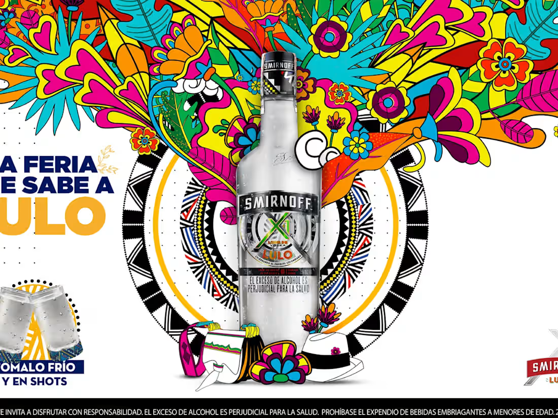
Campaign and limited-edition bottle design for Smirnoff Lulo, created for Medellín's Feria de las Flores. I developed a maximalist illustration inspired by flowers and iconic elements of the festival — silletas, hats, bandanas — wrapping the bottle and extending into the campaign's key visual, connecting the product's flavor with the event's cultural identity. The piece was built to live both at the point of sale and across campaign media, positioning Smirnoff Lulo as "the fair that tastes like Lulo."
0
21
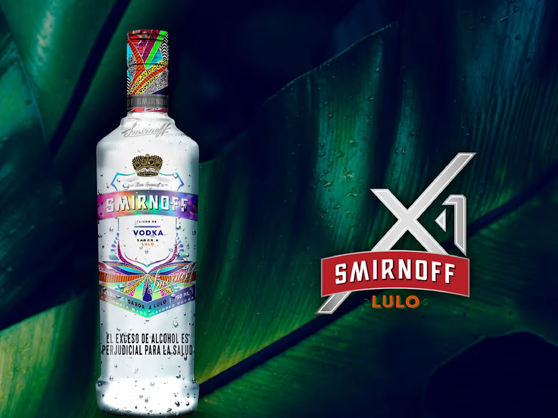
Packaging design for the launch of Smirnoff Lulo, an edition inspired by the Colombian fruit. The challenge was shelf visibility in a saturated category, so I developed a vibrant, multicolor graphic pattern for the label and cap, contrasting against the bottle's clear glass to make the product stand out immediately at the point of sale. The result connects the product's local flavor with a bold, memorable visual identity built for instant shelf impact.
0
27