Marharyta Koshliak
Senior Brand & UX/UI Designer building scalable systems
- 1x
- Hired
- 29
- Followers


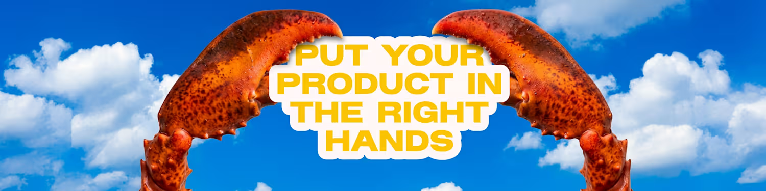

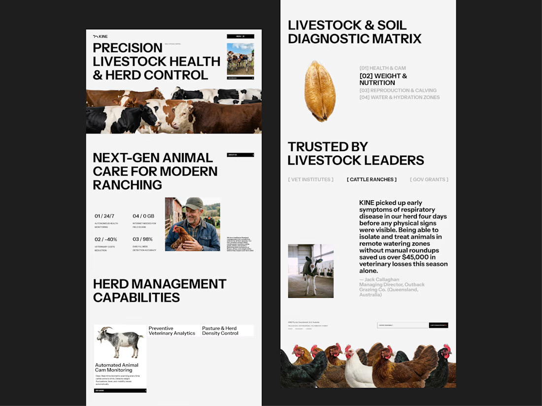
KNITE Digital Farming Redefined
Do websites need to be complex to be beautiful?


I created Menmi a while ago as a brand mascot for a ramen bar, and it quickly became a client favorite. Eventually, I archived the project from my public showcase.
Recently, while scrolling through Pinterest, I stumbled upon a logo design with a remarkably similar character...


Which of these icons do you think will perform better on Pinterest?
I’ve been testing different visual styles lately to see what catches the eye in the feed and actually drives clicks.
Honestly, keeping up with regular posting used to take so much time and effort, but I recently...
2 voted
100%
0 voted
0%
2 votes
Closed
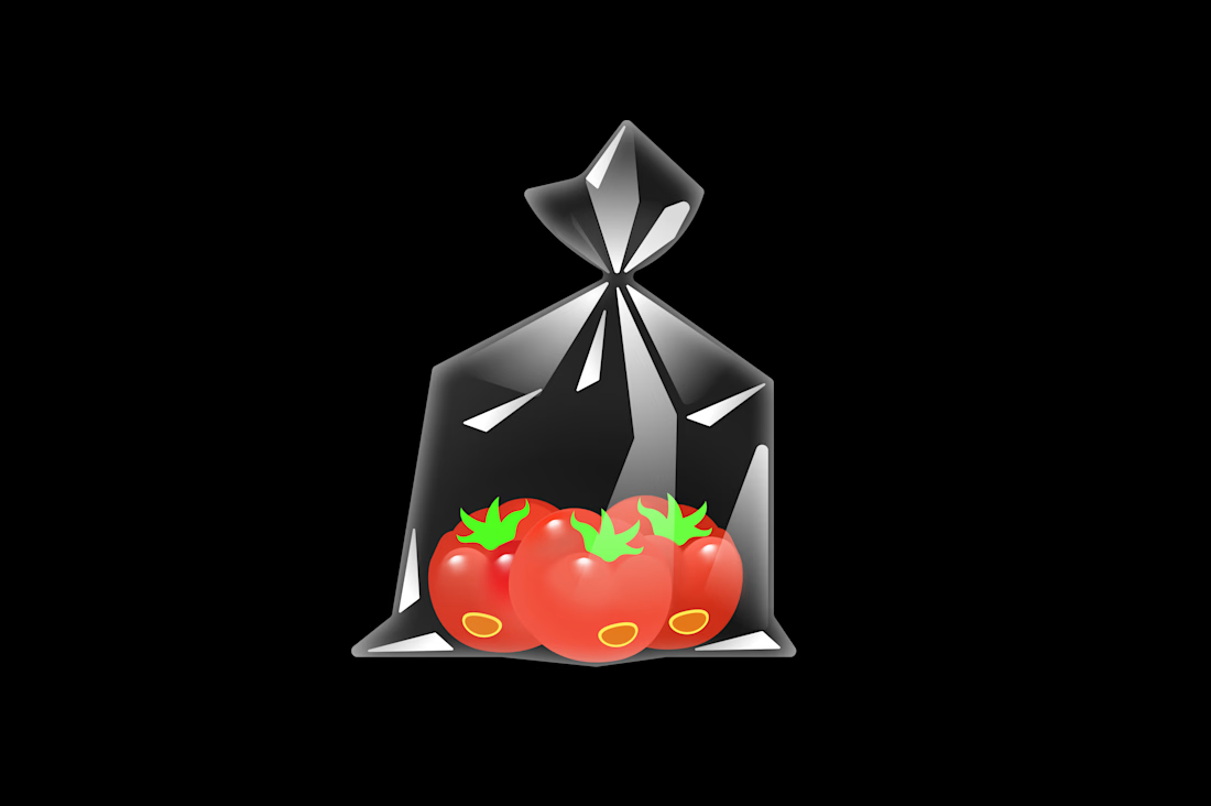
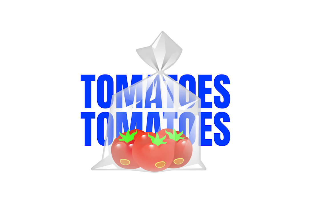
Vector icon of fresh tomatoes in a clear plastic bag. Created with pure SVG paths, focusing on realistic transparency, highlights, and subtle layer interactions.
Watch the process video to see how this icon was built from scratch.
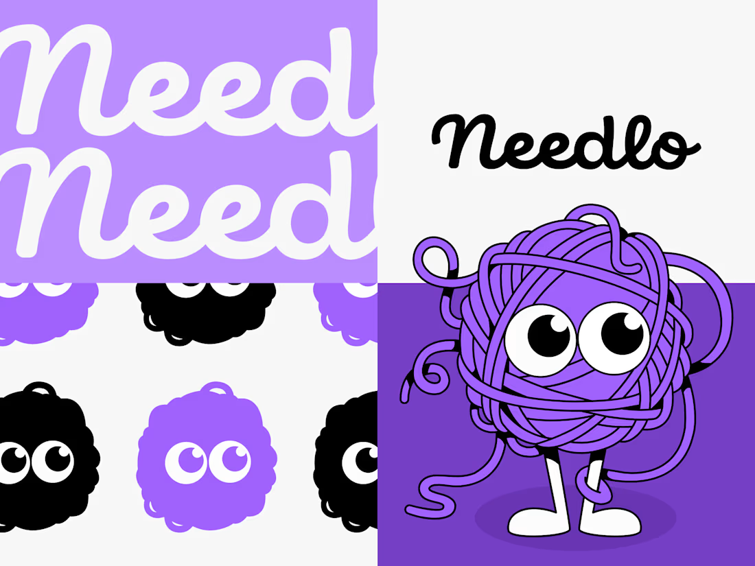
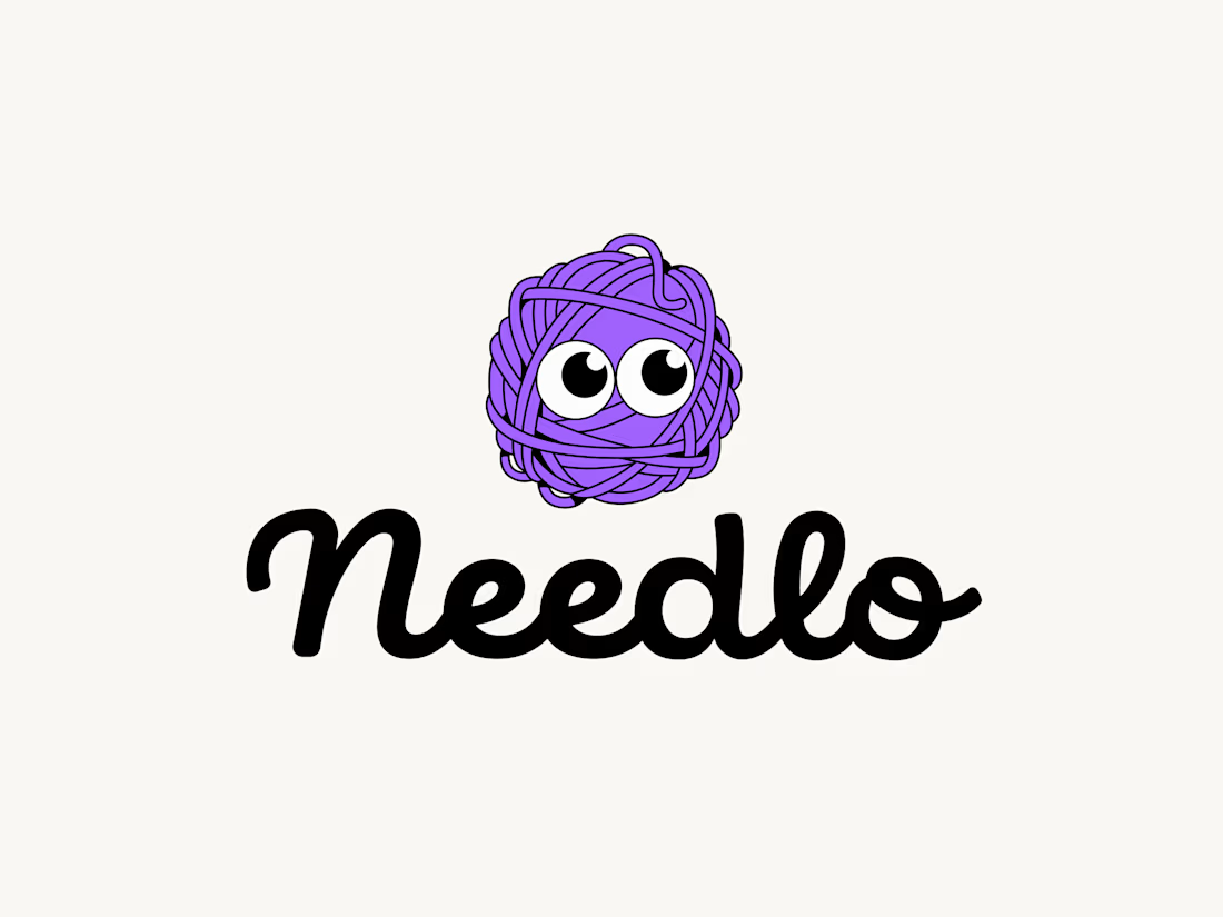
Based on the vote results, Mascot B won with a 72% margin! So I decided to give him a name and his own mini-branding so he wouldn't remain just a conceptual mascot.
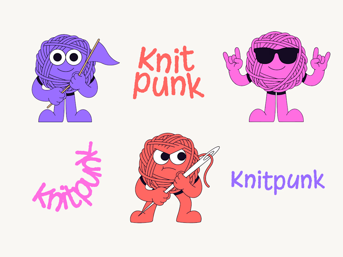
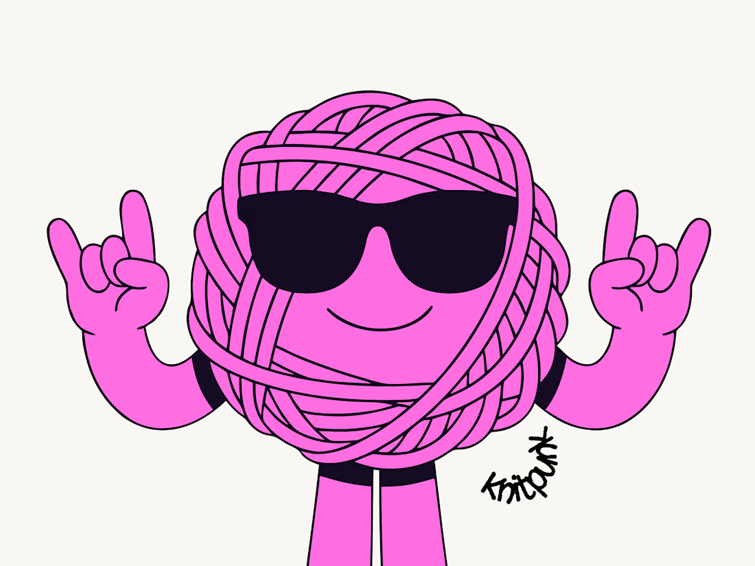
I also want to tell you about the runner-up. This mascot was designed for a custom patch company. I love every...