
pro
Manuel Duboe
Investor Pitch Deck & Brand Strategist for Tech Companies



Sui. Enterprise Software Brand Strategy & Visual Identity
Description
Sui needed to communicate the sophistication of its technology without forcing audiences to understand the complexity behind it.
We developed a strategic identity built around clarity, confidence and scalability — positioning the platform as a credible long-term technology foundation rather than another emerging infrastructure product.
Minimal typography, structured layouts and a disciplined visual system simplify how the business is perceived while allowing the technology itself to remain the hero.
The resulting identity was designed to scale across digital products, developer communications, marketing, events and the wider ecosystem.
1
41
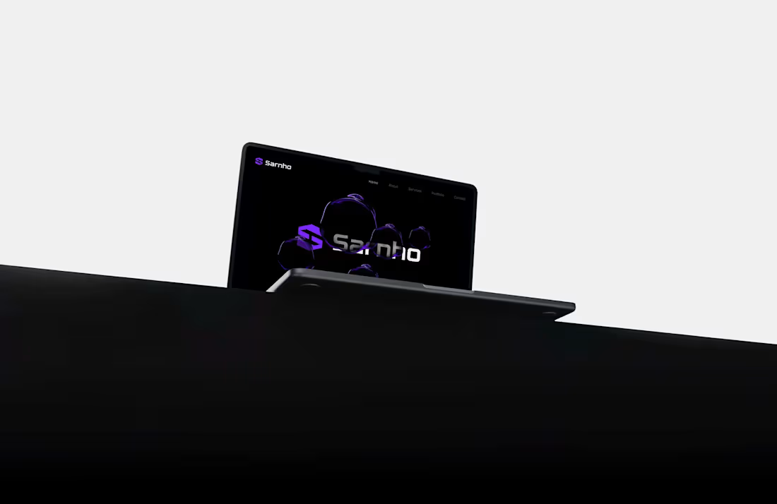
Sarnho. Cybersecurity Brand Strategy & Visual Identity
Description
Sarnho needed its brand to project the same level of maturity and confidence as the technology business behind it.
We repositioned the identity around authority, precision and trust — helping Sarnho present itself as a credible technology partner for enterprise buyers rather than simply another cybersecurity provider.
Bold geometry, disciplined typography and a restrained visual language created a contemporary identity without sacrificing the reliability expected in enterprise technology.
The resulting brand system was built to scale across digital platforms, presentations, marketing and customer communications as the company grows.
1
45

Birth. Startup Brand Strategy & Visual Identity
Description
Birth needed to turn an ambitious idea into a brand that felt credible and commercially ready from day one.
We developed the identity around the idea of new beginnings, momentum and possibility — avoiding predictable startup aesthetics in favour of a distinctive system built to grow with the business.
Bold typography, dynamic graphic elements and a confident visual language give the brand energy without sacrificing clarity or credibility.
The resulting system was designed to work from launch across digital products, campaigns, presentations, merchandise and future customer touchpoints.
1
53
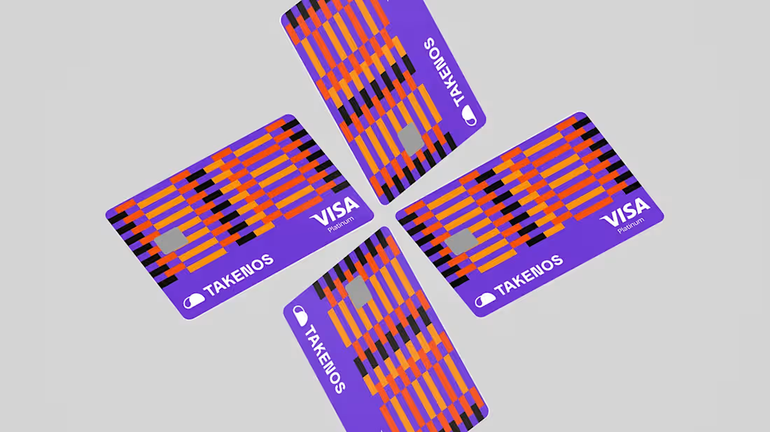
Takenos . Fintech Brand Strategy & Visual Identity
Description
Takenos needed to build trust in one of technology’s most competitive categories without looking like every other fintech brand.
We developed a strategic identity around confidence, accessibility and commercial credibility — positioning the company as an established financial platform while retaining the energy of a modern technology business.
The resulting system combines confident typography, expressive graphic elements and a distinctive visual language designed to make the business easier to understand, recognise and trust.
Built to scale, the identity works across product marketing, campaigns, presentations and digital experiences as Takenos continues to grow.
1
57