
Manigandan Acharya
Data Specialist for Clean, Organized & Smart Reports
New to Contra
Manigandan is ready for their next project!
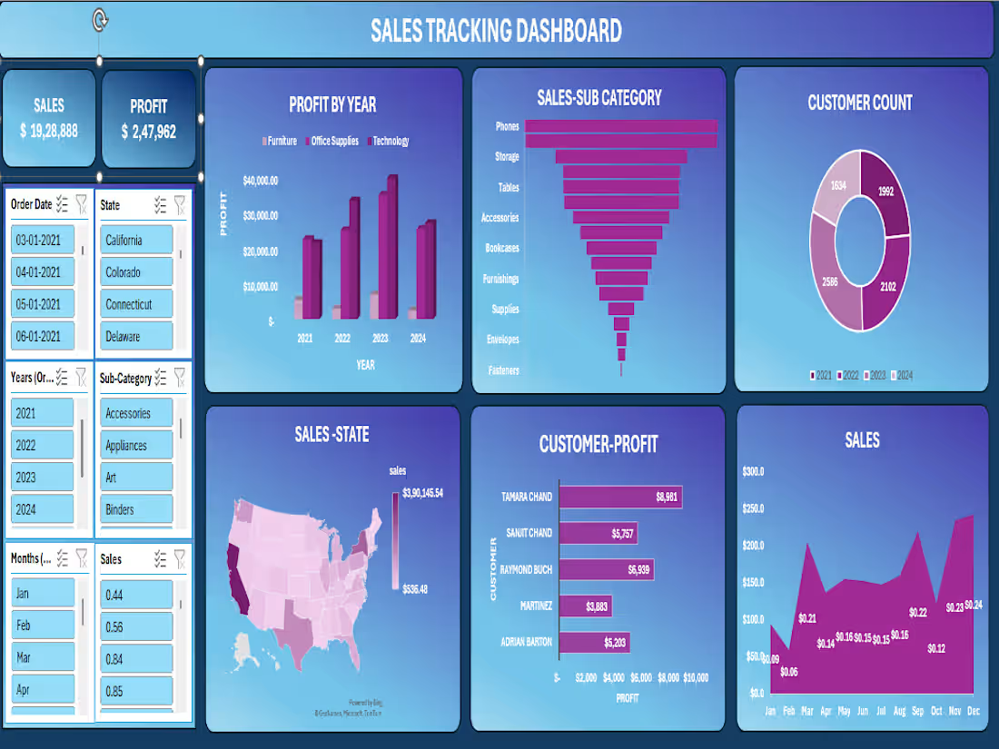
📊 Sales Tracking Dashboard | Excel + Power BI Project
Built an end-to-end interactive Sales Tracking Dashboard covering 2021–2024 across the entire US market.
Top-Line Numbers:
💰 Total Sales: $19,28,888
📈 Total Profit: $2,47,962
👥 Total Customers: 8,314 across all years
What the dashboard reveals:
🏆 Best-selling sub-categories: Phones ($2,79,464) and Chairs ($2,77,058) lead the pack — together accounting for nearly 29% of all sales
📅 Profit growth year-on-year:
→ 2021: $49,556 → 2022: $61,618 → 2023: $81,786 — consistent upward trajectory across Furniture, Office Supplies & Technology
🗺️ Geographic concentration: California dominates at $3,90,145 in sales. New York ($2,46,517) and Texas ($1,51,436) follow. West Virginia sits at the bottom with just $536 — a clear signal for regional strategy review.
📦 Technology drives profit — highest-margin category across all 4 years, despite Furniture holding significant volume
🧾 Seasonal trends: Q4 is king — November ($2,34,013) and December ($2,41,464) are the strongest months. February dips to just $59,640 — opportunity for targeted campaigns.
👤 Top customer by profit: Tamara Chand at $8,981, followed by Raymond Buch ($6,939) and Sanjit Chand ($5,757)
Tools used: Microsoft Excel · Pivot Tables · Power Query · Charts & Slicers · Dashboard Design
This project sharpened my ability to turn raw transactional data into a clean, decision-ready visual — with filters for state, date, year, sub-category, and month.
Open to feedback! 👇
#Excel #DataAnalytics #SalesDashboard #DataVisualization #BusinessIntelligence #MicrosoftExcel #DashboardDesign
0
30
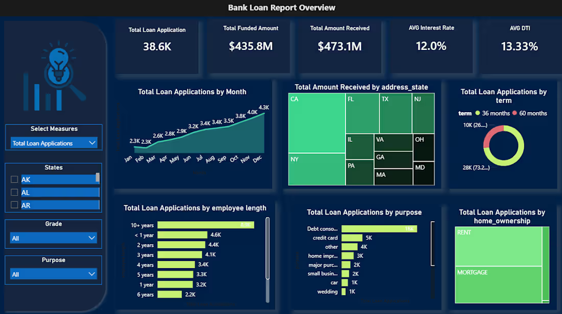
🏦 Bank Loan Portfolio Analysis | Power BI Dashboard Project
Analyzed 38,576 loan records across 50 states to give a bank's lending division a unified view of portfolio health — something they simply didn't have before.
What the data revealed:
✅ Net-positive portfolio: $435.8M disbursed, $473.1M recovered
⚠️ 13.8% bad loan rate = $28.25M net capital loss
📊 Debt consolidation drives nearly half of all loan applications
⏳ 73% of borrowers chose 60-month terms over 36-month
📍 60%+ of repayments concentrated in just 5 states (CA, NY, FL, TX, NJ)
Tools used: PostgreSQL → Excel → Power Query → Power BI + DAX
Built two interactive dashboards:
→ Summary: KPI cards, good vs. bad loan segmentation, loan status grid
→ Overview: Trends, geographic maps, term/purpose/employment breakdowns
The next phase? Building a predictive risk scoring layer using DTI, interest rate, and employment length to flag at-risk loans before they default.
Open to feedback from data folks in the community 👇
#PowerBI #DataAnalytics #SQL #DAX #BankingAnalytics #PortfolioAnalysis #DataVisualization
0
41
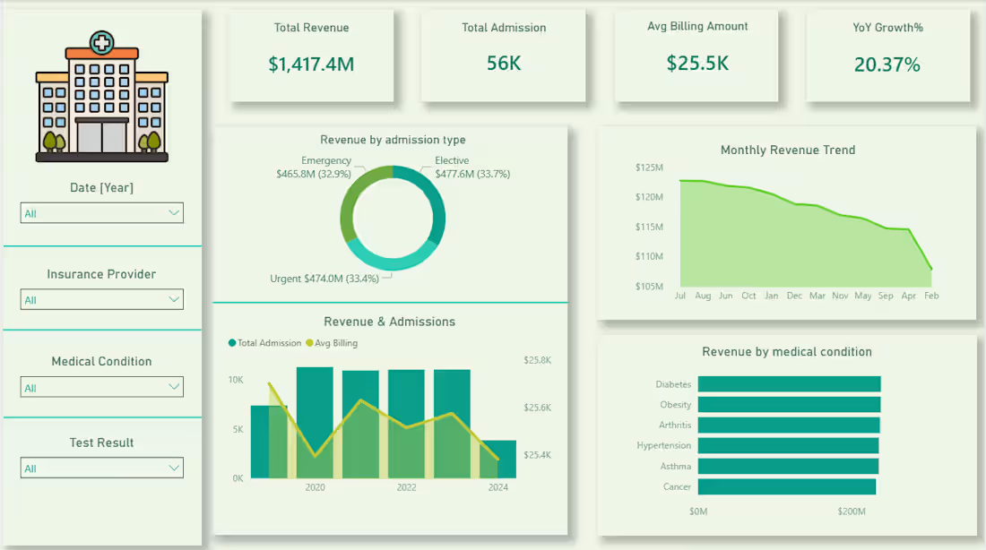
Every hospital generates thousands of data points daily but without the right lens, it's just noise.
Built this Healthcare Analytics Dashboard to turn patient records into decisions. From tracking $1.4B in revenue across admission types to spotting a consistent dip in monthly billing trends the numbers tell a story most teams never get to read.
The insight that stood out? Diabetes and Obesity quietly lead revenue by medical condition which says a lot about where healthcare demand is heading.
This is what data visualization is actually for not prettier reports, but faster, clearer thinking.
Tools: Power BI · DAX · PostgreSQL · Power Query
0
66
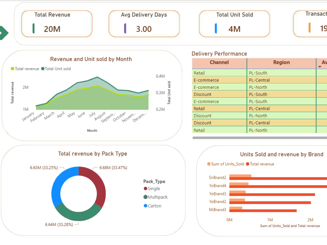
I Built a two-page Power BI dashboard on 190K+ FMCG transactions — tracking revenue, SKU performance, promotional impact, and delivery across 3 channels and 3 regions. Uncovered a balanced 33% revenue split across all channels and identified the top 3 revenue-driving SKUs for smarter inventory decisions.
Tools: Power BI · DAX · Excel
0
80