
Maliha Akhtar
UI/UX Designer | SaaS & Service Businesses
Ready for work
Maliha Akhtar is ready for their next project!

Project Overview
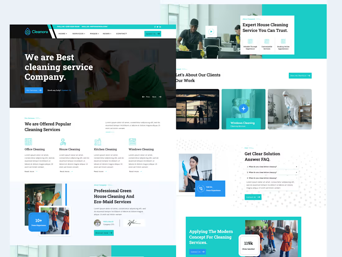
Cleanora is a modern cleaning service website designed to present cleaning services clearly and create a simple, trustworthy experience for potential customers. The goal was to help visitors quickly understand the services, explore the offering, and take the next step.
Design Approach
I focused on creating a clean and professional interface with clear visual hierarchy, easy navigation, and service-focused content. The layout was structured to make important information easy to find while keeping the overall experience welcoming and approachable.
Key considerations included:
→ Clear service presentation
→ Strong visual hierarchy
→ Simple and intuitive navigation
→ Clear calls-to-action
→ Trust-focused design
→ Responsive layout
→ Consistent typography and UI elements
→ Easy-to-scan content structure
Tools
Figma was used for UI design, layout exploration, component creation, and prototyping.
UX Focus
The experience was designed to help users quickly understand Cleanora's services, find relevant information, and move naturally toward booking or contacting the business.
Deliverables
→ Cleaning Service Website UI
→ Responsive Web Design
→ UI Components
→ User Flow
→ Interactive Prototype
0
10
Project Overview
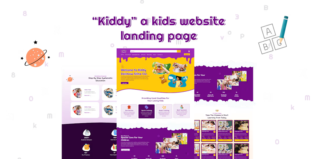
Kiddy is a kids' learning platform designed to make online education more engaging, approachable, and easy to explore. The goal was to create a friendly digital experience that helps parents and young learners understand the platform, discover its learning features, and navigate the experience with ease.
Design Approach
I focused on combining a playful visual style with a clear and structured interface. The design uses engaging visuals, readable typography, consistent UI elements, and a simple content hierarchy to make the platform feel both fun and easy to use.
Key considerations included:
→ Child-friendly visual direction
→ Clear information hierarchy
→ Simple and intuitive navigation
→ Engaging learning-focused visuals
→ Consistent UI components
→ Clear calls-to-action
→ Responsive interface
→ User-friendly interaction flow
Tools
Figma was used for UI design, layout exploration, component creation, and prototyping.
UX Focus
The experience was designed to make educational content easy to discover while keeping the interface engaging for young learners and informative for parents.
Deliverables
→ UI/UX Design
→ Responsive Interface
→ User Flows
→ UI Components
→ Interactive Prototype
0
13
Project Overview
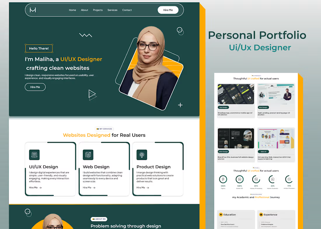
A modern personal portfolio website designed to showcase a UI/UX designer’s work, skills, experience, and design approach in a clear and engaging way. The goal was to create a professional digital presence that helps visitors quickly understand the designer’s expertise and explore selected projects.
Design Approach
I focused on creating a clean, minimal interface with strong visual hierarchy and an easy-to-follow structure. The portfolio was designed to keep the work at the center while making navigation simple and encouraging visitors to explore projects and get in touch.
Key considerations included:
→ Clear personal branding
→ Strong project presentation
→ Simple and intuitive navigation
→ Clear visual hierarchy
→ Responsive layout
→ Consistent typography and UI elements
→ Easy-to-scan content structure
→ Clear contact call-to-action
Tools
Figma was used for UI design, layout exploration, components, and prototyping.
UX Focus
The experience was designed to help recruiters and potential clients quickly understand the designer’s skills, explore relevant work, and find a clear path to connect.
0
15
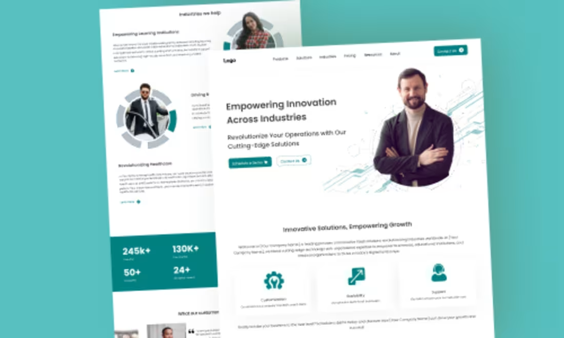
Project Overview
A modern SaaS landing page designed to communicate a digital product clearly and guide visitors toward taking action. The goal was to create a professional and scalable interface that makes complex product information easy to understand while maintaining a clean and engaging visual experience.
Design Approach
I focused on clear messaging, strong visual hierarchy, structured content sections, and intuitive navigation. The layout was designed to help users quickly understand the product, explore its key features, and move naturally toward the next step.
Key considerations included:
→ Clear value proposition
→ Strong visual hierarchy
→ Feature-focused content structure
→ Clear calls-to-action
→ Intuitive navigation
→ Responsive layout
→ Consistent typography and UI components
→ User-focused information flow
Tools
Figma was used for UI design, layout exploration, component creation, and prototyping.
UX Focus
The experience was designed to reduce cognitive load and make the product easier to understand, helping visitors quickly identify its value and explore the relevant features.
Deliverables
→ SaaS Landing Page UI
→ Responsive Design
→ UI Components
→ Interactive Prototype
0
21