
EcoInkaShop — Shopify E-commerce UX/UI
Shopify · UX/UI Design · E-commerce · Responsive Web Design · Product Design
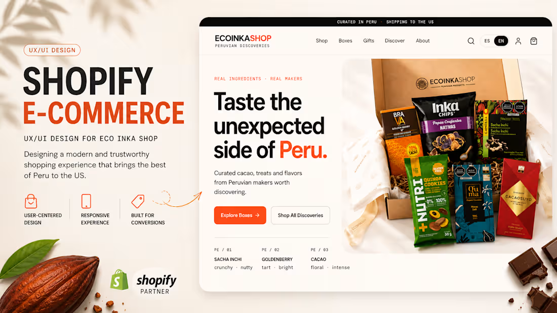
EcoInkaShop is a Shopify e-commerce experience designed for selling curated Peruvian products to customers in the US.
I designed the UX/UI of the storefront with a focus on product discovery, clear navigation, conversion, trust, and an easy shopping experience.
The experience includes:
Homepage and e-commerce navigation
Product discovery by collections
Search, filters and sorting
Product listing pages
Product detail experience
Shopping cart UX
Gift options
Shopify checkout flow
Payment gateway configuration, including card payments and PayPal
Shipping destinations and delivery configuration
Responsive desktop and mobile experience
The visual direction combines a clean contemporary e-commerce interface with the origin and personality of Peruvian products, helping users understand what they are buying while keeping the purchase journey simple.
My role: UX/UI Design · E-commerce Design · Shopify Design · Responsive Design
0
17
Health Group — Healthcare Website Design
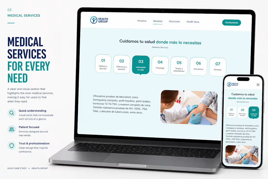
Health Group is a modern healthcare platform designed to simplify access to home medical services and corporate healthcare solutions through a clean, trustworthy, and conversion-focused digital experience.
Over a three-week timeline, I led the complete UX/UI design process—from the initial kickoff and discovery sessions to information architecture, wireframing, high-fidelity interfaces, responsive design, validation, and final implementation. The goal was to transform a wide range of medical services into an intuitive experience that helps users quickly understand the offering, navigate effortlessly, and request care with confidence.
The website was designed with a strong emphasis on usability, accessibility, and visual hierarchy, ensuring that patients and businesses can easily find the right service across desktop and mobile devices. Every interaction was carefully crafted to reduce friction, improve readability, and reinforce trust through a modern healthcare aesthetic.
Project Highlights
• End-to-end UX/UI Design
• Discovery Workshop & Kickoff Sessions
• User Flows & Information Architecture
• Low & High Fidelity Wireframes
• Responsive Design (Desktop & Mobile)
• Design System & UI Components
• Landing Page & Multi-page Website Design
• Figma Make Implementation
• UX Validation & Design Iterations
Outcome
The final product delivers a scalable healthcare website capable of presenting multiple service categories—from home medical visits and laboratory testing to occupational health and corporate solutions—within a cohesive, easy-to-navigate experience.
By combining strategic UX thinking with polished UI design, the platform improves information discoverability, strengthens brand credibility, and creates a seamless journey that encourages users to explore services and contact the healthcare team.
Timeline: 3 Weeks
Role: UX/UI Designer
Tools: Figma · Figma Make
Deliverables: UX Research · Information Architecture · Wireframes · Responsive UI · Design System · Interactive Prototype · Implementation
0
38
Welcome to the Club
UX/UI Design · Shopify Ecommerce
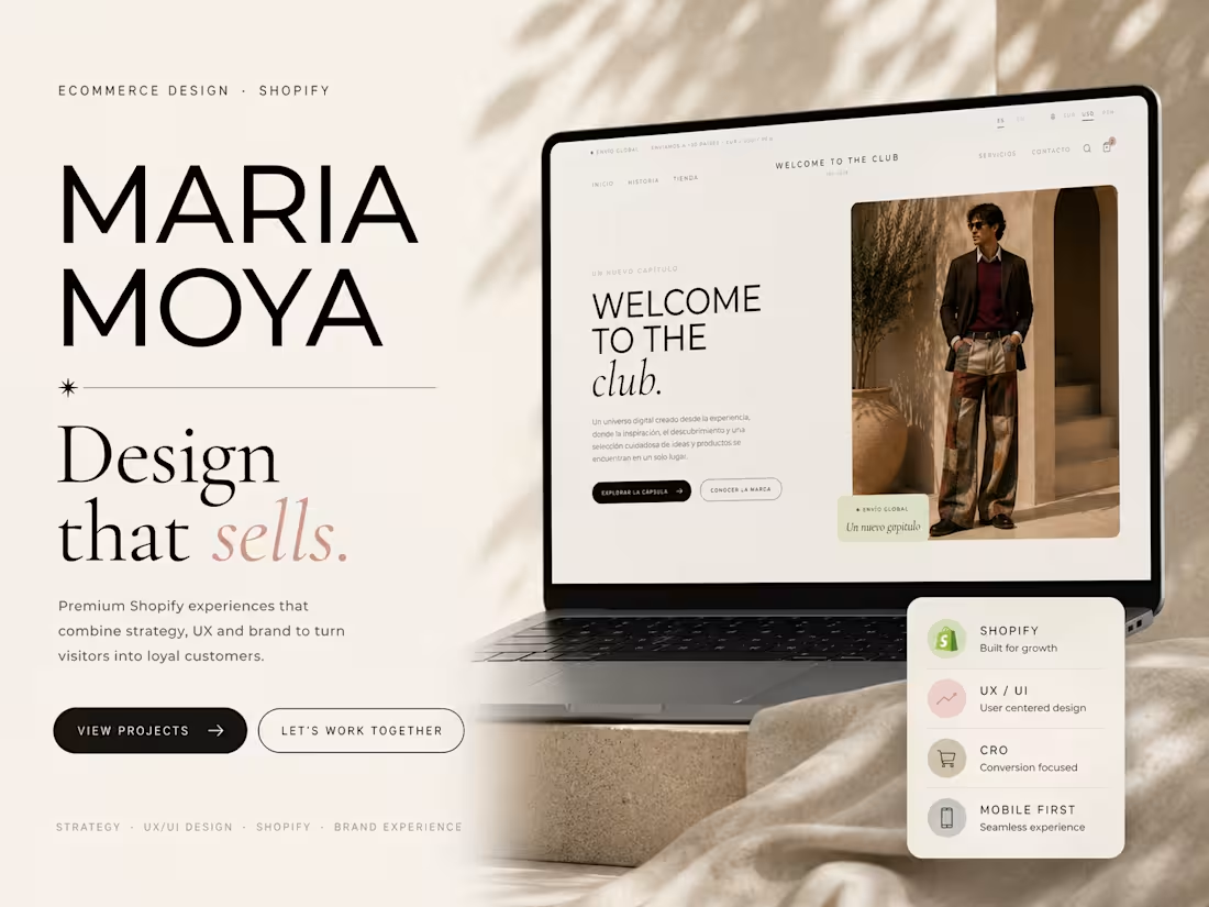
Welcome to the Club is a premium Shopify ecommerce designed for a fashion brand looking to create a refined online shopping experience that reflects its identity while remaining intuitive, responsive, and conversion-focused.
The project covered the complete design and implementation process—from initial discovery sessions to a fully functional Shopify storefront—delivered in approximately three weeks.
Every interaction was designed to balance editorial aesthetics with usability, ensuring customers could browse collections, explore products, and complete purchases effortlessly across desktop and mobile devices.
The Challenge
The goal was to transform the brand into a premium digital shopping experience without relying on generic ecommerce templates.
The website needed to communicate the brand's personality while providing a seamless customer journey, scalable architecture, and an optimized shopping experience.
My Role
I was responsible for the project from end to end, including:
Discovery & Kick-off Workshops
UX Strategy
Information Architecture
User Flows
Wireframes
UI Design
Responsive Design
Shopify Store Implementation
Design Validation
Quality Assurance before Launch
Design Process
Discovery
Understanding the business, target audience, product catalog, and brand positioning.
UX Strategy
Defining navigation, collections, shopping flow, and the overall customer journey.
UI Design
Designing a clean editorial interface focused on usability, readability, and premium visual storytelling.
Validation
Reviewing prototypes with the client, gathering feedback, and refining the experience before development.
Development
Building the ecommerce using Shopify, ensuring responsiveness, accessibility, and performance across devices.
Deliverables
Responsive Ecommerce Website
UX Research
Information Architecture
Wireframes
High-Fidelity UI
Shopify Development
Product Pages
Collection Pages
Cart & Checkout Experience
Mobile Optimization
Launch-ready Website
Tools
Figma
Shopify
Lovable AI (to accelerate frontend implementation while maintaining design consistency)
Timeline
3 Weeks
Week 1 — Discovery & UX Strategy
Week 2 — UX/UI Design & Validation
Week 3 — Shopify Development & Launch
Live Project
welcometotheclub.online (http://welcometotheclub.online)
0
46
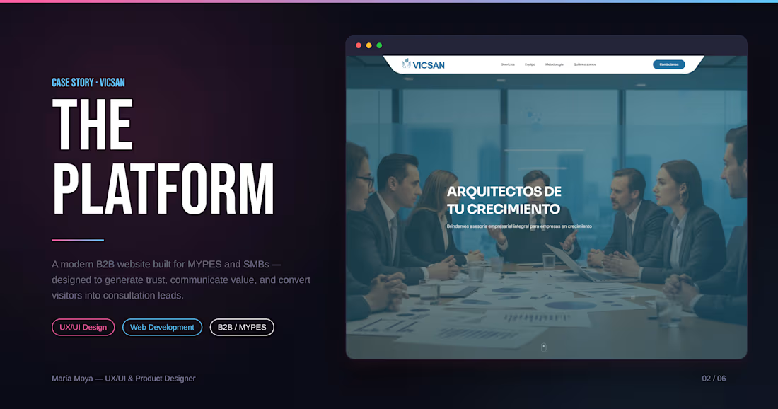
Project title: VICSAN — Corporate Website for Business Consulting
Description:
Designed and developed the website for VICSAN Consultores, a Peruvian business consulting firm specializing in management, regulatory compliance, and digital transformation for small and medium-sized businesses.
The site needed to position a team of 7 specialists as a credible, multidisciplinary partner — without feeling like a generic "services" page.
My role: UX/UI Design + full website development.
What I did:
Structured the site around a clear conversion path (Hero → Services → Team → Methodology → Contact)
Designed a scannable services grid instead of long paragraphs of text
Highlighted the team's credentials to build trust and authority
Built a lead capture form with a clear CTA to lower the barrier to first contact
Result: A polished, professional site that reflects VICSAN's expertise and makes it easy for potential clients to reach out.
0
71