
Mahin Rahman
Product Design | Website design
Ready for work
Mahin is ready for their next project!
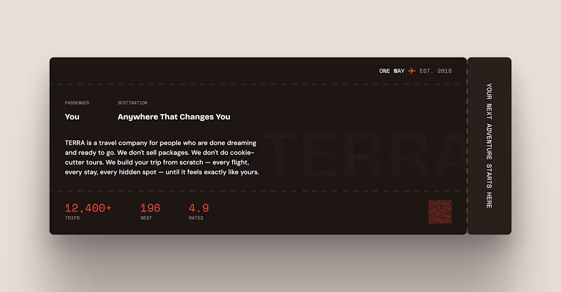
TERRA — Boarding Pass About Section (Framer Component)
DESCRIPTION:
Every landing page has an about section.
Most of them look exactly the same.
A headline. A paragraph. Maybe a photo. Nobody reads it.
TERRA's about section is a boarding pass.
PASSENGER: You
DESTINATION: Anywhere That Changes You
That one reframe changes everything.
Instead of telling users about the company — it puts the user inside the experience before they've even booked. You're already the passenger. The destination is already yours.
0
46
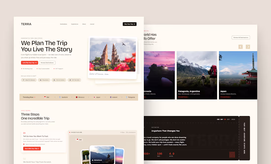
TERRA — Travel Agency Landing Page (Framer Template)
DESCRIPTION
Most travel websites look the same.
Hero image. Search bar. "Book Now" button. Users freeze. Users leave.
TERRA was designed around one question — why do people abandon travel agency websites? Then built to solve every single one of those reasons.
What's inside:
A full landing page Framer template built for modern travel agencies. Every section has a concept. Every word solves a problem. Every design decision has a reason.
1
3
77
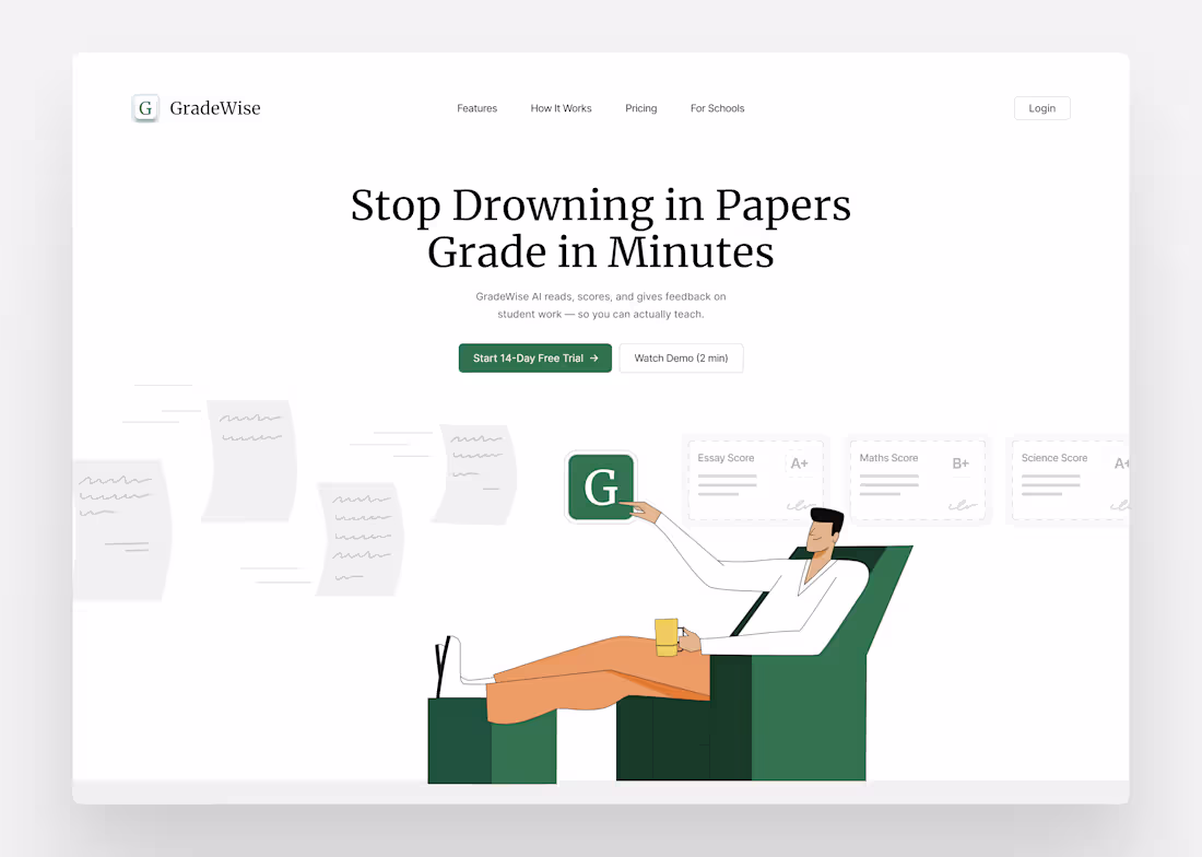
This is what grading should feel like. 😌
Feet up. Drink in hand. AI handling the stack.
GradeWise reads, scores, and gives feedback on student work — so you can actually teach.
Stop drowning in papers. Grade in minutes. 📄✅
Try free for 14 days
#EdTech #Teachers #AI #ProductDesign #BuildInPublic
0
56
Day 14 🪶
Zenny doing her 5-5 breathing session. 🧘🩷
In for 5. Out for 5. Couch mode activated.
Just her, the lamp, and a floating feather reminding you — slow down, you're doing great.
Built in @rive_app ✨
wellobit.com (http://wellobit.com)
#BuildInPublic #RiveAnimation #BreathingExercise #Wellness #Day14
0
51
Zenny picked up the guitar and she's feeling every note. 🩷
Heart eyes. Big smile. Full send.
This is what it looks like when your wellness app has main character energy.
Built in @rive_app ✨
👉 wellobit.com (http://wellobit.com)
#BuildInPublic #RiveAnimation #Wellness
0
34
Zenny is DANCING and honestly same energy. 🩷🕺
She just finished her session and she's not holding back — glasses on, mouth wide open, music notes flying.
This is what hitting your wellness streak feels like.
Built in @rive_app ✨
👉 wellobit.com (http://wellobit.com)
#BuildInPublic #RiveAnimation #Wellness
0
40
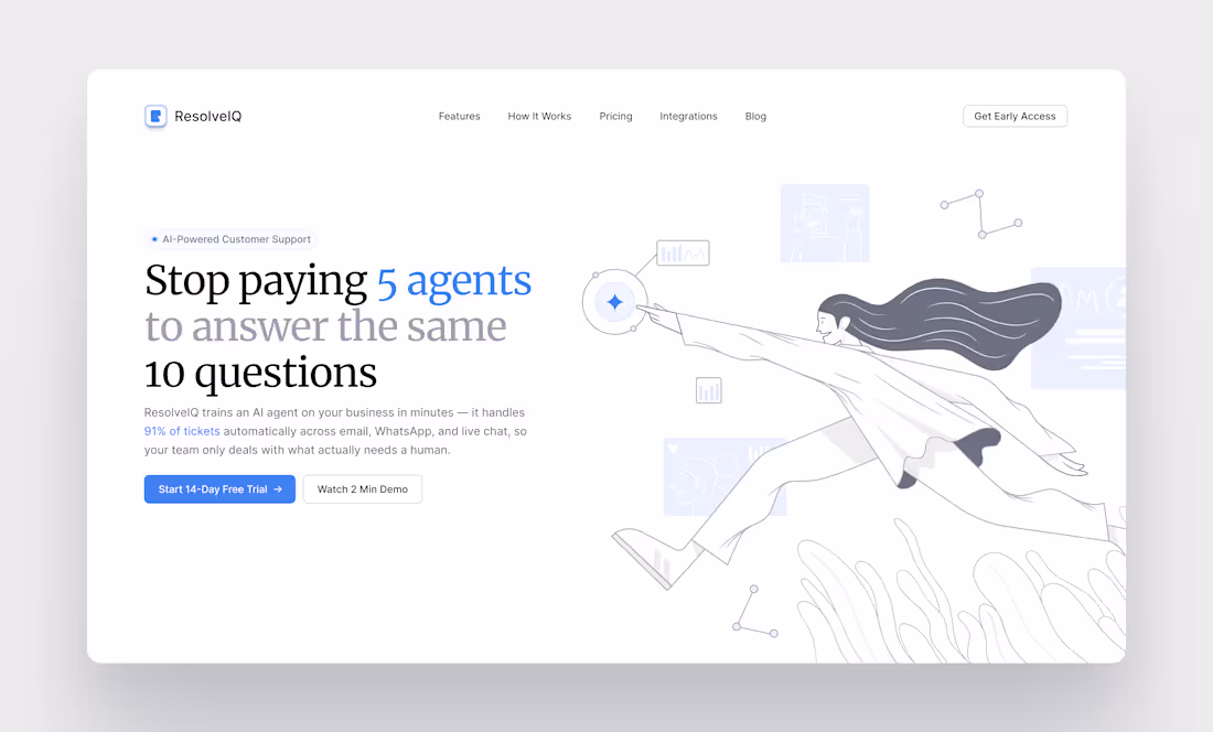
Day 10 of posting my design process on Contra
Hero section for ResolveIQ is done.
Used Merriweather for the heading — serif fonts just hit different on SaaS landing pages.
Brand blue #3B82F6 on key words only. Less is more with color.
Illustration strokes softened so the typography leads 👇
#uidesign #figma #saas #designinspiration
1
36
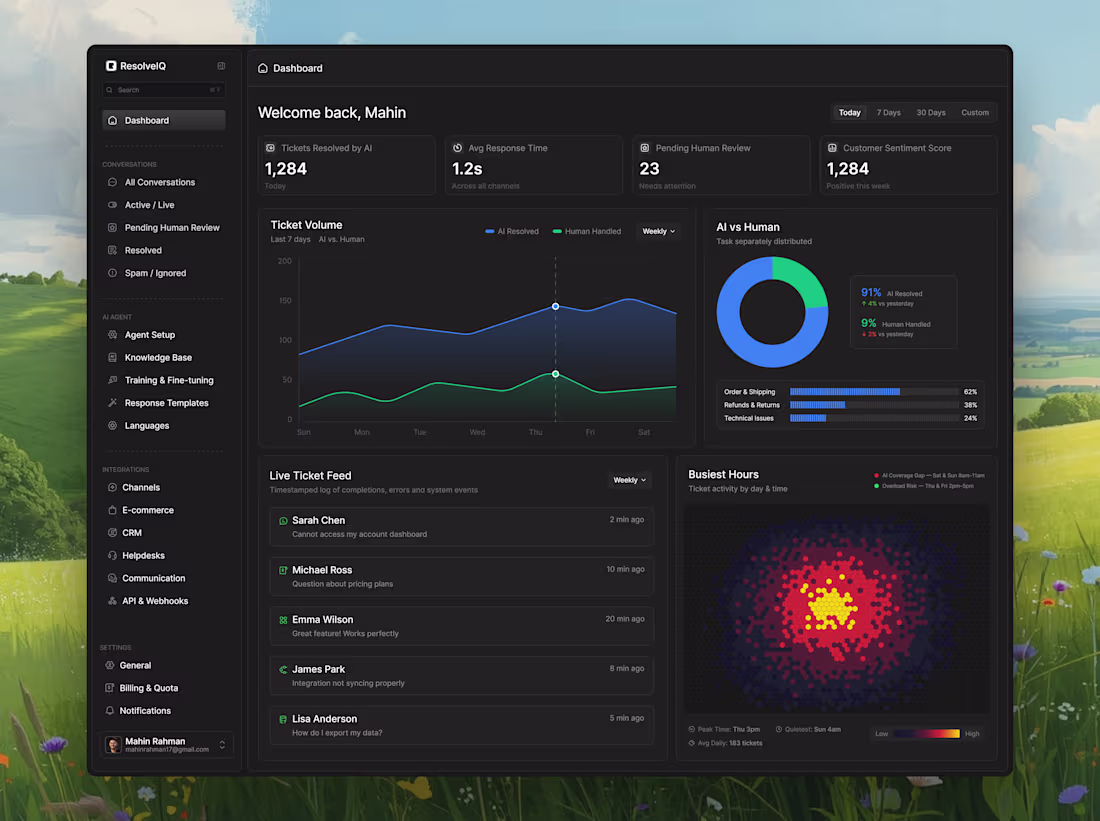
An AI customer support dashboard that handles 91% of tickets automatically.
Spent today nailing the dashboard layout — heatmap, live feed, charts, and the key metrics a support team actually cares about.
Dark mode only. Clean data. No clutter.
More screens coming tomorrow 👇
#uidesign #figma #saas #productdesign
1
2
82
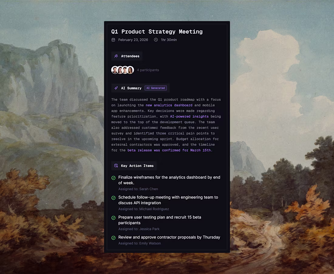
A fully color-corrected dark mode card component designed for a SaaS productivity tool. The goal was to create a UI that feels premium and readable while handling multiple types of content — metadata, AI-generated summaries, and task lists — all in one compact card.
Font: Geist Mono, Inter.
This is the type of component work I bring to SaaS and AI product teams — thoughtful, systematic, and production-ready.
Tools: Figma · UI Design · Color Systems · Dark Mode Design
1
1
47
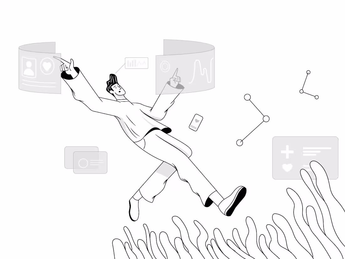
Floating Through Interfaces — UI Illustration.
A hand-drawn vector illustration exploring the feeling of a designer immersed in the digital world — floating through UI cards, data charts, and mobile screens, carried forward by momentum and community.
Created entirely with a drawing tablet, this piece blends technical design elements (dashboards, profile cards, health UI) with a weightless, expressive character to tell a story about what it feels like to work in the digital space.
Tools: Drawing Tablet · Vector Illustration · Adobe Illustrator
5
4
135
The hardest thing to design in any SaaS landing page is the How it Works section.
It needs to make a complex product feel simple. It needs to remove fear. And it needs to make the visitor believe they can actually set this up without a developer.
For Swiftly I designed a 3 step flow that takes the visitor from zero to running AI support — Connect Your Tools, Train Your AI Assistant, and Go Live and Monitor.
Each card was designed to do two jobs at once. The top half explains the step in plain simple language. The bottom half shows it visually — a tool integration diagram, an AI learning progress bar, and a live dashboard preview — so the visitor can see exactly what they are getting before they sign up.
4
3
66
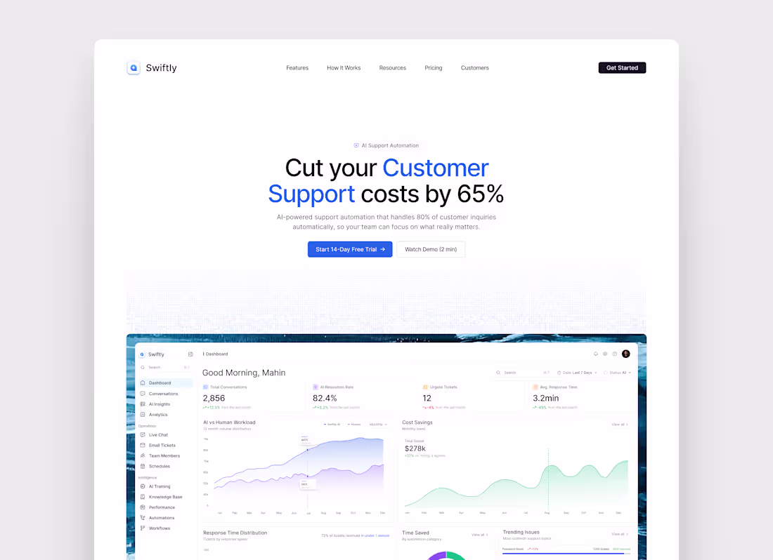
Every customer support team has the same problem — too many tickets, not enough time, and a team burned out from answering the same questions over and over again.
For Swiftly I designed an AI customer support SaaS landing page that communicates one thing immediately — you can cut your support costs by 65% while your AI handles 80% of inquiries automatically.
The blue brand color was chosen deliberately to feel trustworthy and professional — exactly what a business needs to feel before handing their customer support over to an AI.
The result is a landing page that doesn't just look good — it sells the product before the user reads a single word of the pricing page.
Built entirely in Figma 🧡
5
3
70

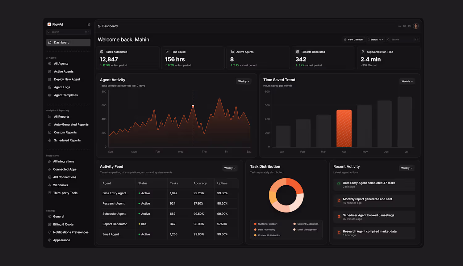
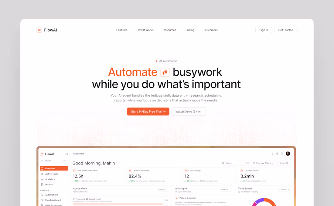
Most AI dashboards look powerful on paper but feel overwhelming the moment you open them.
For FlowAI I designed a dark mode AI agent dashboard that gives users complete visibility.
The biggest challenge was information density. This dashboard carries a lot of data — stat cards, two charts, an activity feed table, a donut chart, and a live activity log. The goal was to make all of it feel calm and easy to scan.
The dark background does the heavy lifting by naturally separating cards without heavy borders. Orange #F97316 is used sparingly — only on the most important data points — so the user's eye always knows where to go first. The sidebar is clean and hierarchical so users always know where they are and where to go next.
The result is a dashboard that feels like a control center — not a data dump.
Built entirely in Figma 🧡
1
3
93
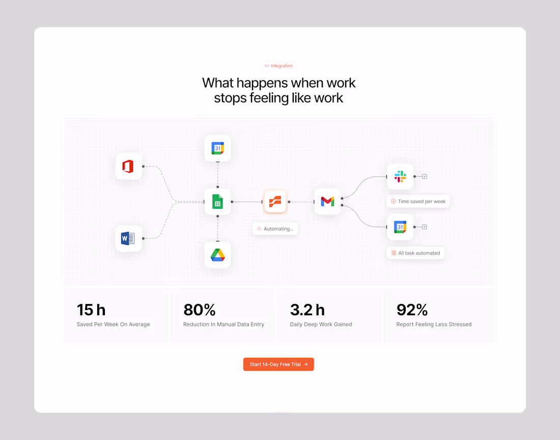
Numbers tell the story better than any copy can.
When I designed this integration section for FlowAI the goal was simple — don't just show how the product works, show what life looks like after using it.
15 hours saved per week.
80% reduction in manual data entry.
3.2 hours of deep work gained every single day.
92% of users reporting they feel less stressed.
The flow diagram in the center was designed to show how FlowAI sits at the middle of your entire tool stack — connecting Office, Google Drive, Word, Sheets, Gmail, Slack, and Calendar — automating the handoffs between all of them so nothing falls through the cracks.
The stat cards at the bottom weren't an afterthought. They were the whole point. Every number was chosen to hit a specific pain point that the target user feels every single day.
Built entirely in Figma 🧡
3
5
74
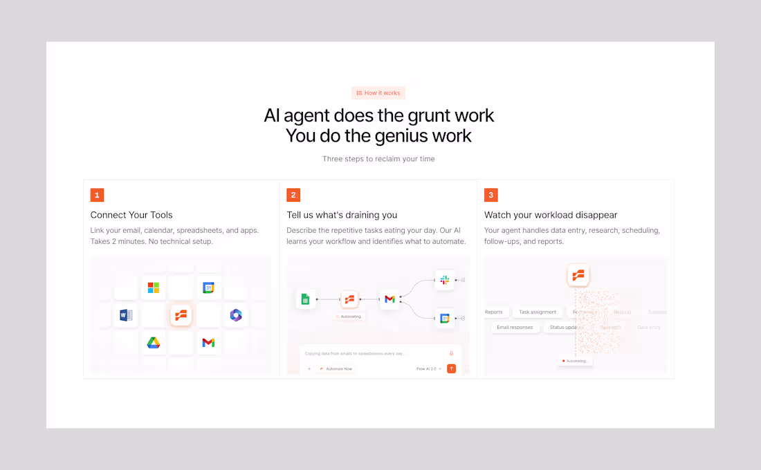
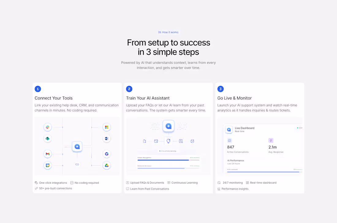
For FlowAI I designed a "How it Works" section
that breaks the entire product down into 3 simple steps.
No jargon. No confusion.
Just a clear visual story that takes the visitor from problem to solution in seconds.
The goal was to make AI feel simple, approachable, and worth trying.
This is what good SaaS design does — it sells the product before the user even signs up.
9
11
274
Designed this AI SaaS landing page in Figma and I'm obsessed with how it turned out 🔥
Drop a 🧡 if you want a breakdown
1
2
52
Minimal widget practice
2
1
74
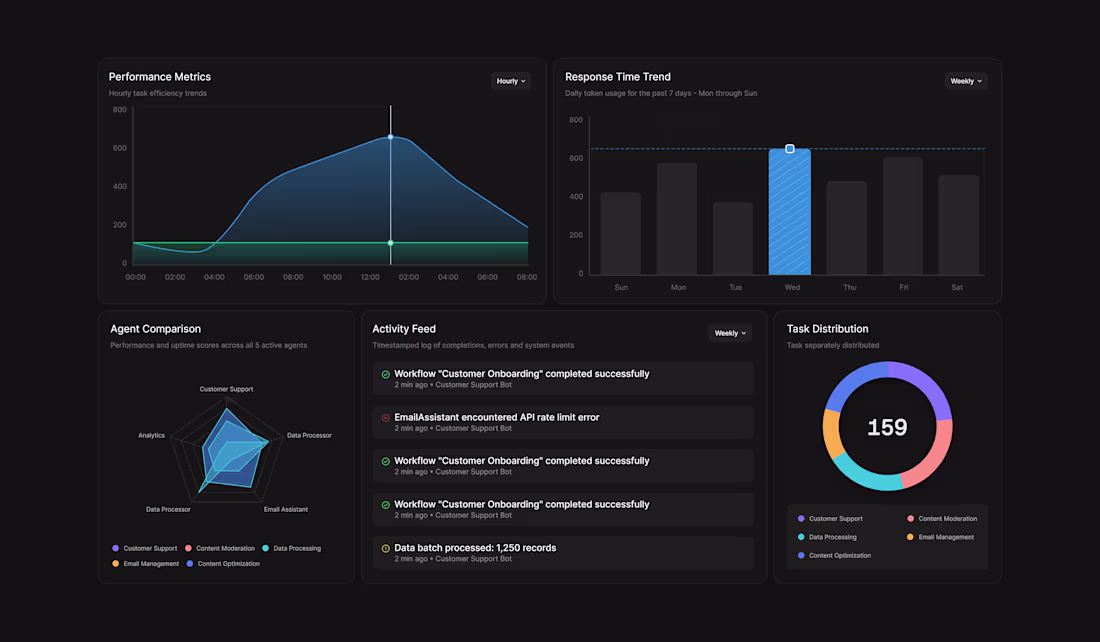
AI Agent Analytics Dashboard — The Cards
Sometimes the most interesting part of a dashboard is not the layout, it is the individual cards.
Performance Metrics — Hourly task efficiency trends across the day
Response Time Trend — Weekly latency tracked with a threshold line so spikes are impossible to miss
Agent Comparison — Radar chart benchmarking performance and uptime across all 5 active agents
Activity Feed — Timestamped log of completions, errors and system events in real time
Task Distribution — 159 tasks broken down across Customer Support, Data Processing, Content Moderation and Email Management
1
74
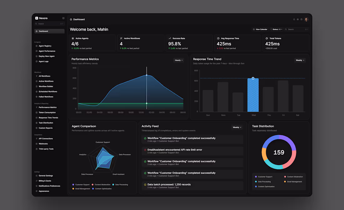
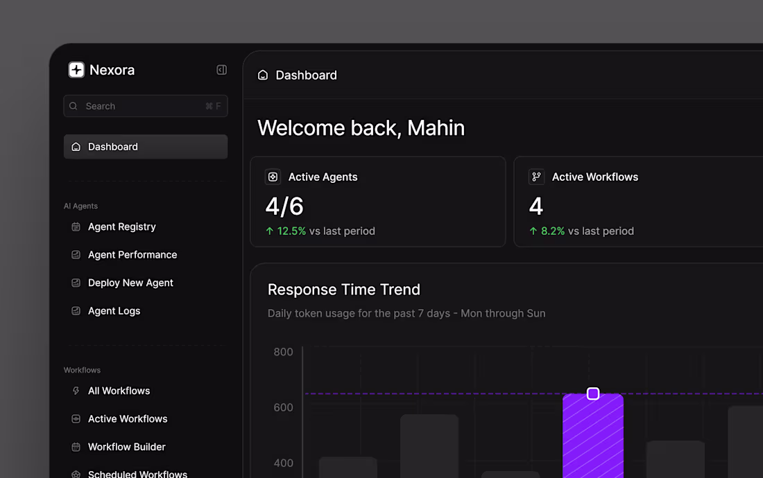
AI Agent Analytics Dashboard — Nexora
Day 6 of posting my designs and this is the one I'm most proud of.
A full AI Agent Analytics Dashboard built for teams managing multiple AI workflows in one place.
Dark mode, clean sidebar navigation, real-time KPI cards, performance charts, agent comparison, activity feed and task distribution — all designed with clarity and hierarchy in mind.
Icons by @hugeicons
Available for freelance work and collaborations — drop me a message.
2
2
82
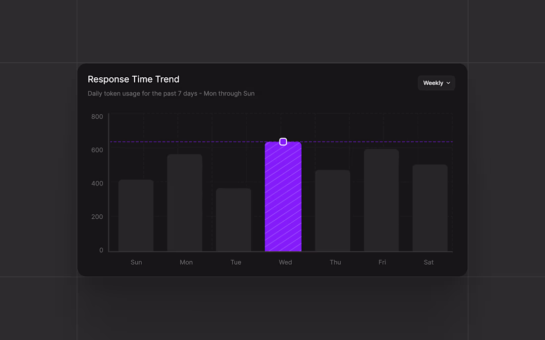
Small detail, big impact.
This is the Response Time Trend card from my AI Agent Analytics Dashboard.
Hover state on Wednesday showing a spike
The dashed threshold line tells you instantly when you're in the danger zone.
Dark mode. Clean bars. Zero noise.
1
59
AI Agent Analytics Dashboard - A Workflow Tracking System
Day 6 of posting my designs and this one pushed me creatively.
The brief I gave myself was simple — design a dashboard that gives AI teams complete visibility over their agents and workflows in one single view. No switching tabs. No hunting for data. Everything surfaced, everything readable.
The result is an AI Agent Analytics Dashboard with real-time monitoring across active agents, workflow pipelines, token consumption, response time trends and a live activity feed.
Icons sourced from @hugeicons - genuinely one of the cleanest icon libraries out there.
Open to freelance projects and collaborations. Let's build something great together.
1
58
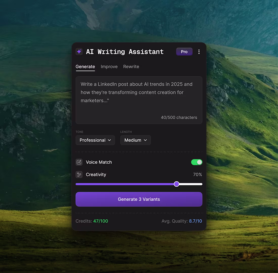
Designed an AI Writing Assistant card
Features:
→ Smart input with real-time character tracking
→ Tone & length controls (users need options, not magic boxes)
→ Voice Match toggle (sounds like YOU, not generic AI) → Creativity slider (transparency builds trust)
Dark mode. Clean tabs. No fluff.
0
53
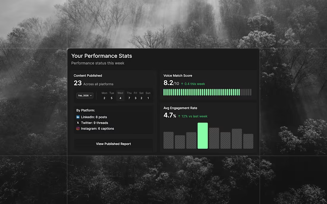
Your Performance Stats — Dark Mode
Same card, different vibe. Built for late-night content planning sessions.
Content Published (23): Weekly breakdown showing LinkedIn: 8, Twitter: 9, Instagram: 6 with daily activity visualization
Voice Match Score (8.2/10): Real-time AI quality tracking with progress indicator showing 0.4 improvement this week
Avg Engagement Rate (4.7%): Bar chart displaying weekly performance with 12% increase vs last week
Deep blacks. Subtle grays. High contrast where it matters.
Dark mode for focus. Same data-driven approach.
1
58
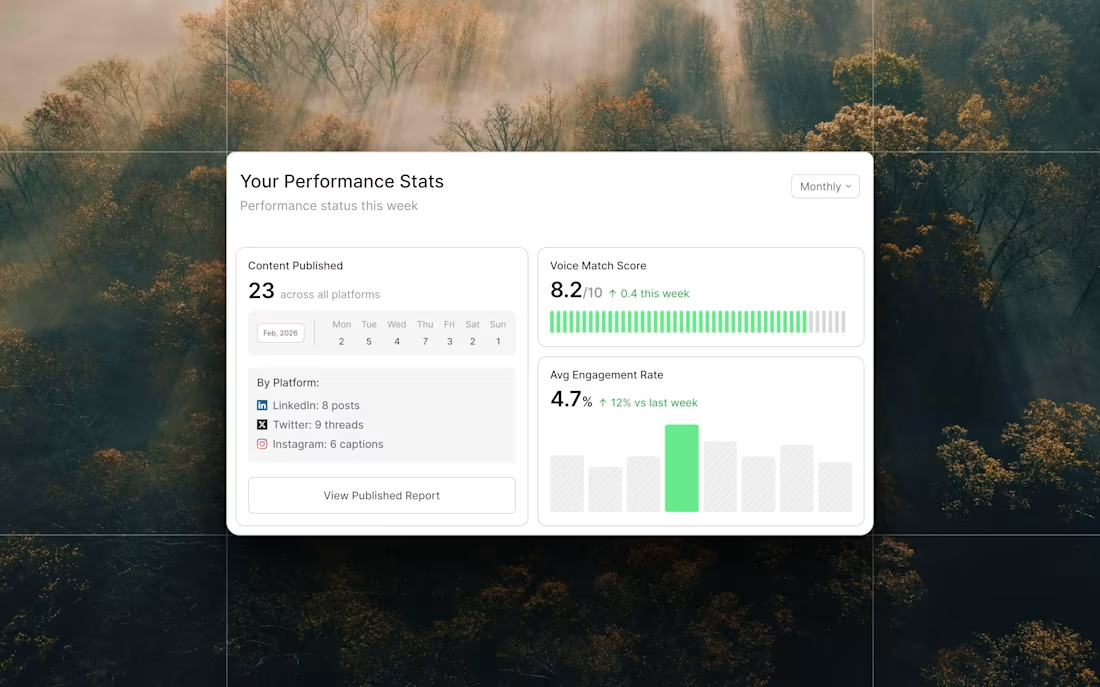
Your Performance Stats — Card Breakdown
Designed this card to answer 3 questions users check daily:
Content Published (23): Weekly breakdown by platform (LinkedIn: 8, Twitter: 9, Instagram: 6) with day-by-day activity chart
Voice Match Score (8.2/10): Is the AI actually sounding like me? Progress bar shows improvement over time
Avg Engagement Rate (4.7%): Is it working? Bar chart shows weekly trends with 12% increase vs last week
No vanity metrics. Just the data that tells you if your content strategy is working.
Light mode. Clean hierarchy. Actionable insights.
6
4
87
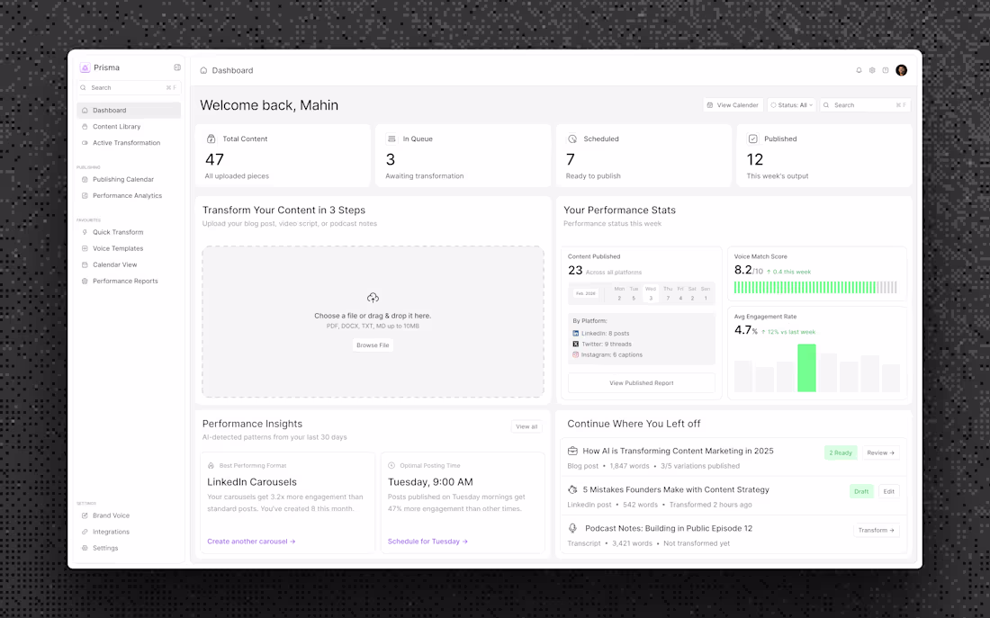
Prisma AI — Light Mode Dashboard Design ☀️
Designed a data-driven content repurposing dashboard that prevents churn through behavioral design, not just pretty UI.
What I built:
→ Pipeline status cards showing content workflow (47 total, 3 in queue, 7 scheduled, 12 published)
→ Voice Match Score tracker (8.2/10) addressing the #1 user complaint
→ Performance insights surfacing power features automatically
→ "Continue Where You Left Off" section eliminating lost work confusion
The impact:
42% reduction in first-session drop-off
28% fewer support tickets
Time-to-value cut from 18 min to under 5 min
Every card, every metric, every button solves a real retention problem.
Looking for a product designer who thinks like a PM? Let's talk.
3
3
91
Prisma AI — Content Repurposing Dashboard
A data-driven dashboard that prevents churn through behavioral design.
The Problem:
Users were abandoning because they couldn't find their content, didn't trust AI quality, and missed key features like scheduling.
The Solution:
Pipeline cards show content workflow at a glance
Voice Match Score (8.2/10) proves AI quality
Performance Insights surface power features automatically
"Continue Where You Left Off" prevents lost work
Impact:
Designed to reduce first-session drop-off by 42%, eliminate 28% of support tickets, and cut time-to-value from 18 min to under 5.
Every element solves a real user problem.
Dark mode. Built in Figma.
0
59
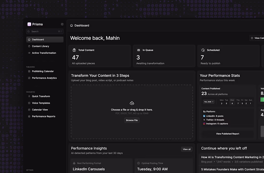
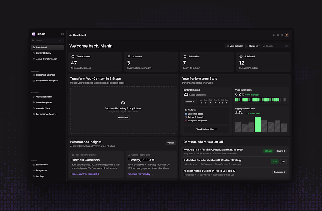
Dark mode for Prisma AI- Content Repurposing Dashboard
Every card still answers the 4 critical questions that prevent churn.
But now it's easy on the eyes for those late-night content planning sessions.
Light mode for clarity.
Dark mode for focus.
#UIDesign (https://x.com/hashtag/UIDesign?src=hashtag_click) #DarkMode (https://x.com/hashtag/DarkMode?src=hashtag_click) #ProductDesign (https://x.com/hashtag/ProductDesign?src=hashtag_click) #Figma (https://x.com/hashtag/Figma?src=hashtag_click) #SaaS (https://x.com/hashtag/SaaS?src=hashtag_click)
1
2
66