
pro
Mahima Mahajan
AI-Powered Product Designer · 100M+ users
Ready for work
Mahima is ready for their next project!
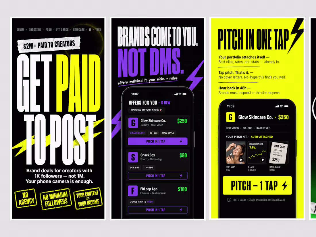
App Store Screenshots | Scout: Creator Marketplace App
0
3
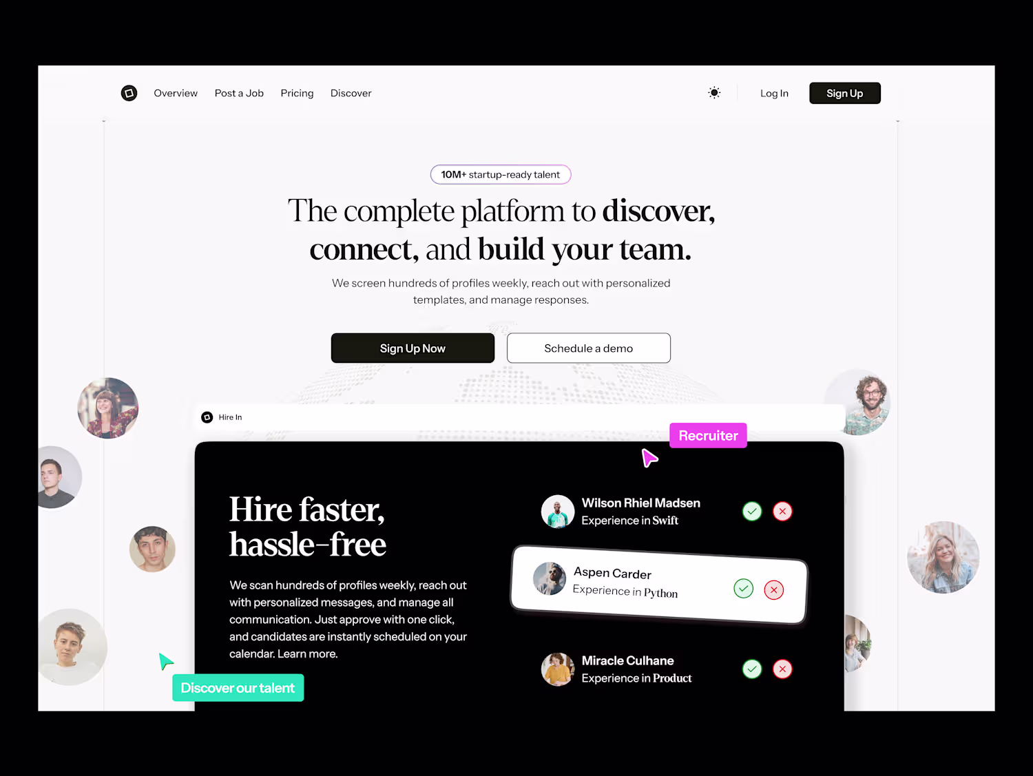
Introducing Met, a memory layer for Meetup that enhances event networking by capturing memories instead of just contacts. Traditional QR codes provide a list of names but fail to convey the context of who was who at the event.
To tackle this issue, I reverse-engineered Meetup's design system (Swarm), focusing on exact tokens, type scale, and component patterns. I then designed a tap-to-connect flow that integrates seamlessly with the app's existing experience.
This process included:
Problem framing
Flow design
Interactive prototype
Motion demo This approach reflects how I collaborate with product teams: by identifying the unowned moments in the user journey and crafting solutions that feel native to the platform. I am open to product design collaborations.
0
35
Lively Places a concept born from pure admiration.
Bump by amo made profiles feel alive, and I had so much fun imagining places getting the same magic: live vibes, confetti arrivals, supersend rain. I studied their design system from real screens and built the idea as a fully interactive prototype spring physics, live timers, sound design because the best way to evaluate playful design is to play with it.
This is how I love to work: fall in love with a product, learn its language, and bring it something new it would recognize as its own.
0
35
Life of a Designer - a tiny cozy sim
0
31
Landing Pages and Dashboards
0
38
Earn Rewards - Turning Everyday Receipts Into a Gamified Coin Economy
0
40
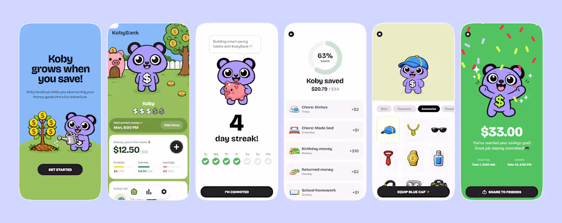
KobyBank - A Gamified Savings App That Makes Kids Want to Save
0
43
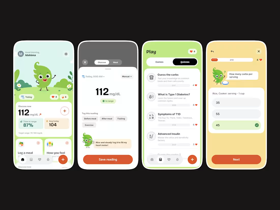
Diabetes Management App
A design concept, an all-in-one diabetes & endocrine care app built for kids and teens managing Type 1 Diabetes.
Managing T1D day-to-day means constant blood glucose tracking, carb logging, insulin awareness, and keeping time in range — all while trying to feel like a normal kid. Most diabetes management apps feel clinical and cold. This design's real superpower is that it doesn't.
This concept explores how to push that further: tightening up the glucose monitoring dashboard, making the A1C and time-in-range data feel more scannable, and building out a gamified learning experience that actually makes understanding T1D (carb counting, insulin basics, hypo awareness) feel rewarding rather than overwhelming.
Screens explored: → Home dashboard — real-time CGM glucose readings at a glance → Manual glucose log with smart meal tagging (before meal, fasting, exercise) → Play section — quizzes on carb counting, insulin ratios, and T1D symptoms → Interactive quiz flow with the eddii companion character
In a space dominated by tools like mySugr, Glooko, and Dexcom — this stands out for making continuous care feel human. This concept is about making that even more true.
Drop a ❤️ if you're passionate about health tech UX!
0
40