
macarena parravicini
Brand, packaging and presentation designer
New to Contra
macarena is ready for their next project!


A seven-slide presentation designed to communicate a large amount of information in a clear, concise, and visually engaging way. The project involved reorganizing and condensing the original content, establishing a strong visual hierarchy, and creating cohesive layouts throughout the deck. The design was developed in accordance with the brand guidelines, incorporating its established color palette, typography, and visual identity.
0
31
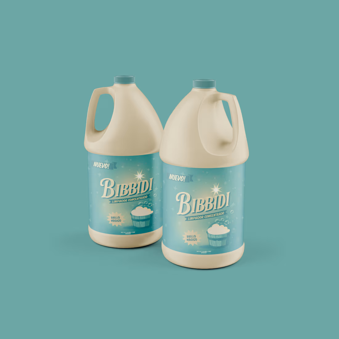
Drawing inspiration from the magical charm of classic 1950s animation, I designed the packaging for "Bibbidi", a cleaner that turns chores into a calming ritual. Inspired by a famous fairytale scene, the identity offers a peaceful escape from daily chaos. The elegant, wavy lettering is crowned with a star, capturing a magical essence. I used a soft aqua and cream palette with a dreamy gradient, accented by delicate bubbles and stars to evoke pristine cleanliness and nostalgic fantasy.
1
91
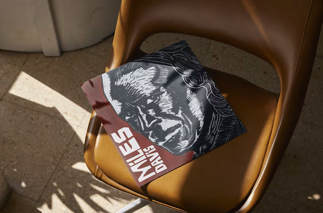
High-Impact Vintage Packaging | Miles Davis Record
Translating the raw, improvisational energy of jazz into a static visual is always a beautiful challenge. For this Miles Davis vinyl cover concept, I wanted to step away from clean digital vectors and embrace a highly tactile, analog aesthetic.
The illustration mimics a traditional woodcut technique, using high-contrast textures to capture the depth and intensity of his music. I paired this dramatic portrait with a bold, asymmetric typographic hierarchy that breaks the grid, giving the layout a dynamic rhythm that feels both classic and expressive.
Designed for the love of music, tactile packaging, and heavy ink.
1
140
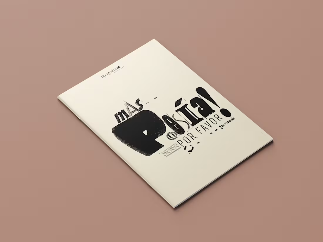
Art Nouveau Print Layout | Experimental Typography
For this editorial project, I was tasked with designing a foldable print piece. Rather than just playing with standard layouts, my goal was to visually narrate a deeply feminine poem that beautifully fuses the Guarani and Spanish languages.
To capture the organic, playful, and sensitive tone of the text, I stepped away from digital fonts. Instead, I spent hours diving into library archives and personal collections, sourcing authentic vintage typography and Art Nouveau clippings. The fluid, ornamental nature of these historical letters perfectly matched the poem's voice.
Every single character and fragment was consciously curated. I learned that to truly tell this story, the rigorous curation of the letterforms was just as decisive as their grid-defying layout. The result is a highly tactile, expressive zine with a strong organic imprint.
1
113