
Marc Marriott
Top 1%| Helping Brands and Businesses with Creative Visuals
- $1k+
- Earned
- 3x
- Hired
- 5.00
- Rating
- 28
- Followers
After the feedback from my last post with the taste test between the two styles. I made a video
I updated the visuals to include both. Now, only the component being disassembled appears in color, while the rest of the assembly remains without.
It helps guide the eye specifically to the part in motion without losing the context of the whole unit.
This entire project was a stylistic experiment. It’s my first time tackling this specific look
0
208
SiC Crystal Growth Process Animation
1
7
Omega - Speedmaster Animation
1
27
Ete Leather Bags - Product Visualization
2
35
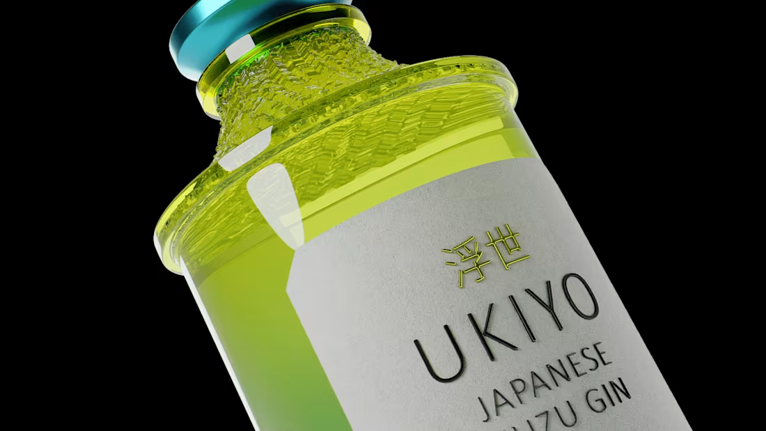
Ukiyo Spirits - Product Visualization
0
15
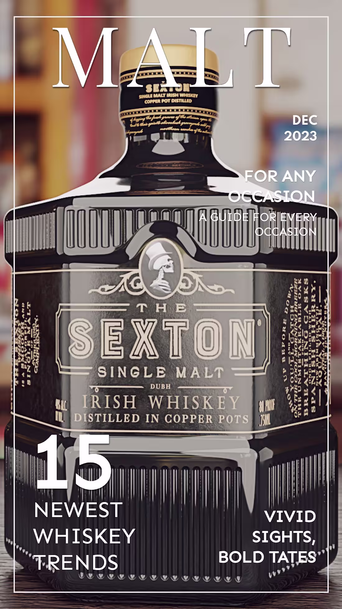
Sexton Malt Whiskey - Product Visualization
0
9
Calmo Wine - 3D Product Visualization
1
15
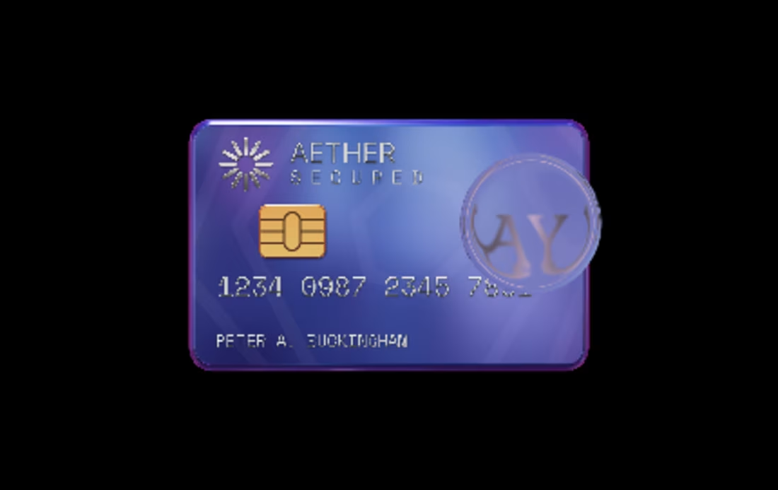
Here is my second submission,
This concept explores a floating physical credit card,
simulating a tap-to-pay transaction in a browser.
The design utilizes a deep violet-to-cyan gradient palette and
made it more authentic with the gold EMV chip, silver embossing, floating in a
void.
I imagine this functioning as the interaction for a checkout
instead of a Submit button. Maybe instead, they could physically drag the
floating the card to authorize transactions.
Interactive Viewer Link: https://app.spline.design/ui/51c93a1d-e710-4385-83b4-f42b46ff8fb7
4
20
320
IC Circuit - Spline 3D
0
11
Socials Keyboard - Spline 3D
1
19
Create Spline Elements for the Website
1
13
Michter's Whisky
1
13
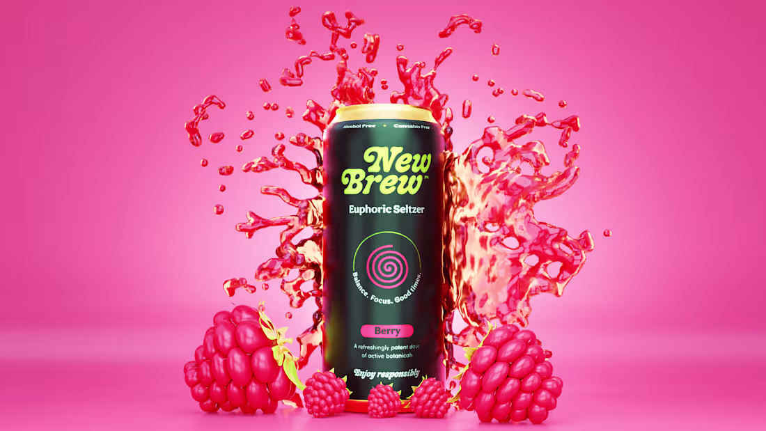
3D Product Visualization - New Brew
0
53
Floiré - Eau De Parfum
0
66
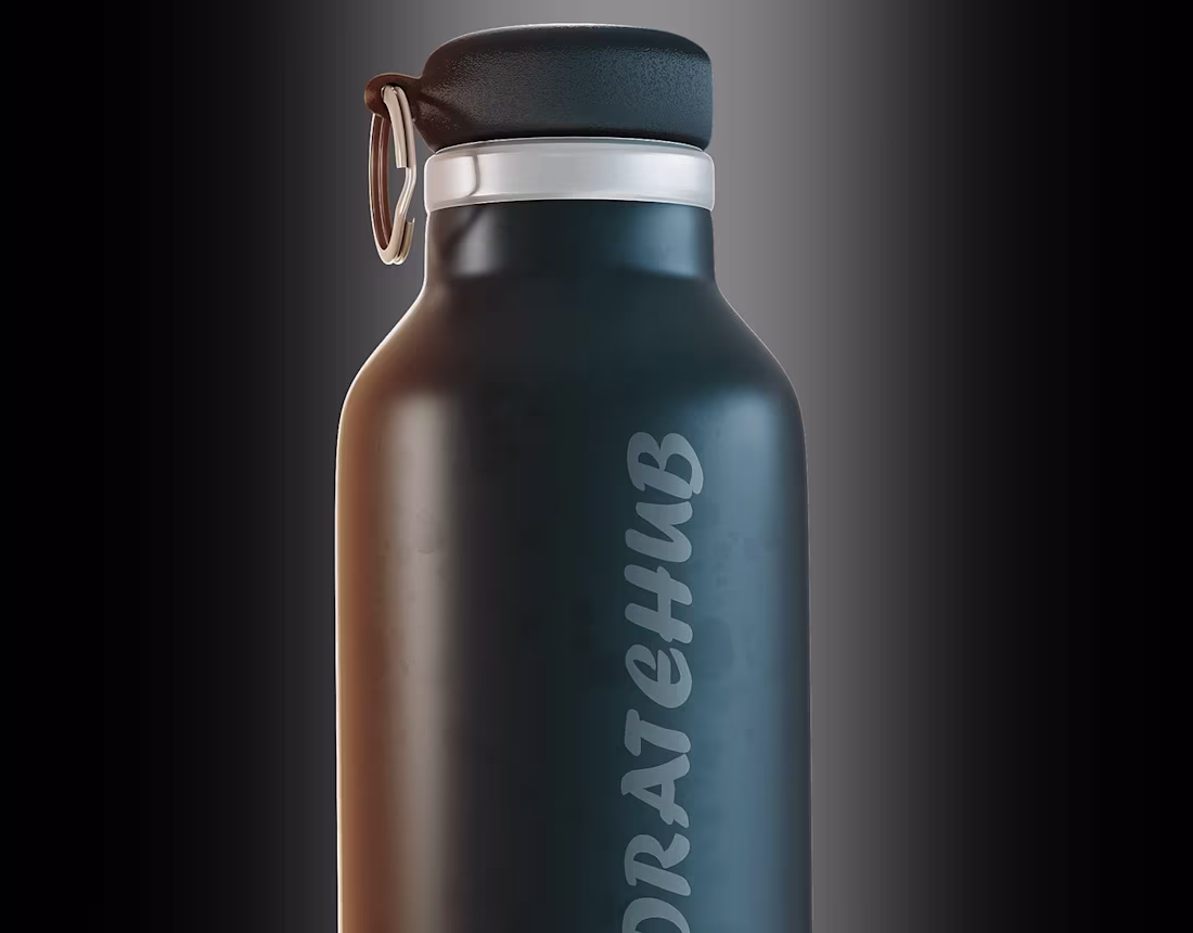
HydrateHub - Product Visualization
0
6
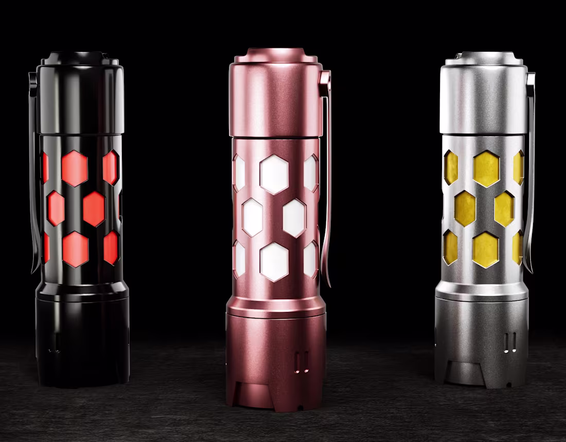
Torch Light
0
5
Neon BMW – Automotive
1
17
Fuz - Fruit Snacks Visualization
0
25