
Lucas Modesto
Brand Designer | Transforming vision into design that drives
Ready for work
Lucas is ready for their next project!
Hey Contra community.
Wanted to share another branding exploration I developed recently.
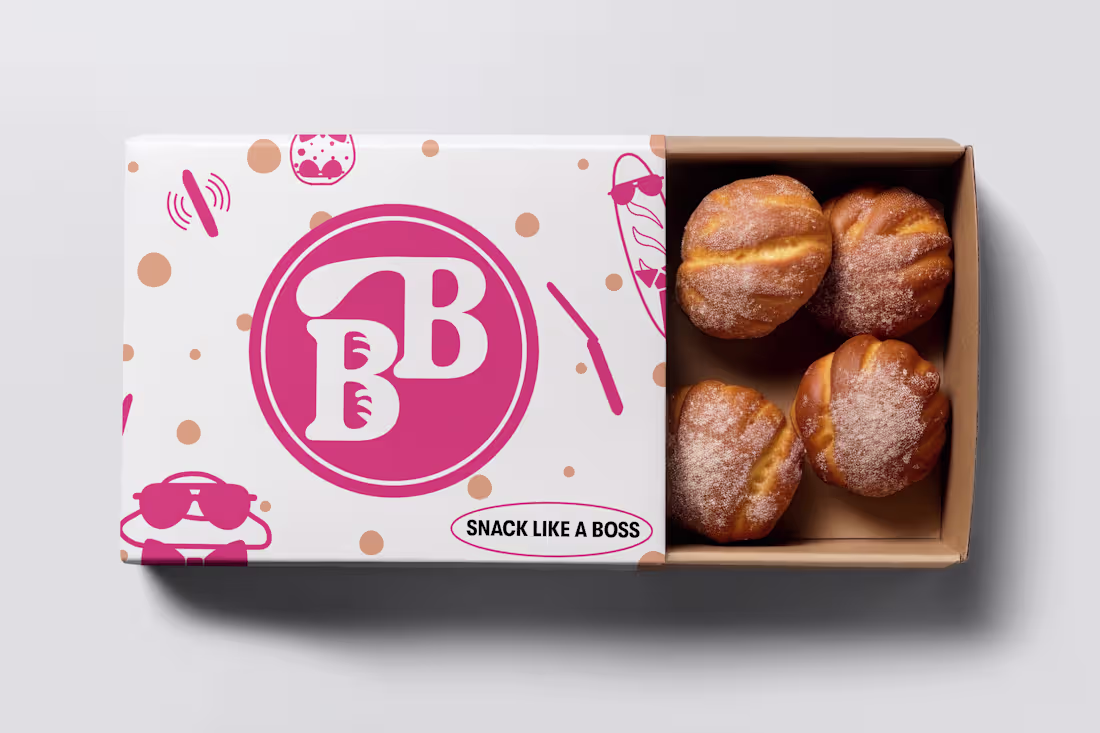
This one is Bake Boss, a bold and modern identity built for a bakery brand with attitude. The idea was to move away from the usual “cute bakery look” and create something with personality, clean, confident, and memorable.
I worked on a full visual direction: logo, colours, layout system and packaging feel. The goal was simple, make the brand look as professional as the products taste, while still keeping a fun, approachable energy.
Loved building this one and pushing a different kind of bakery aesthetic.
Excited to keep sharing more work with the community. Thanks for the space.
31
137
762
Hey Contra community, Lucas here.
First post on the platform, so I wanted to share something fun I’ve been working on.
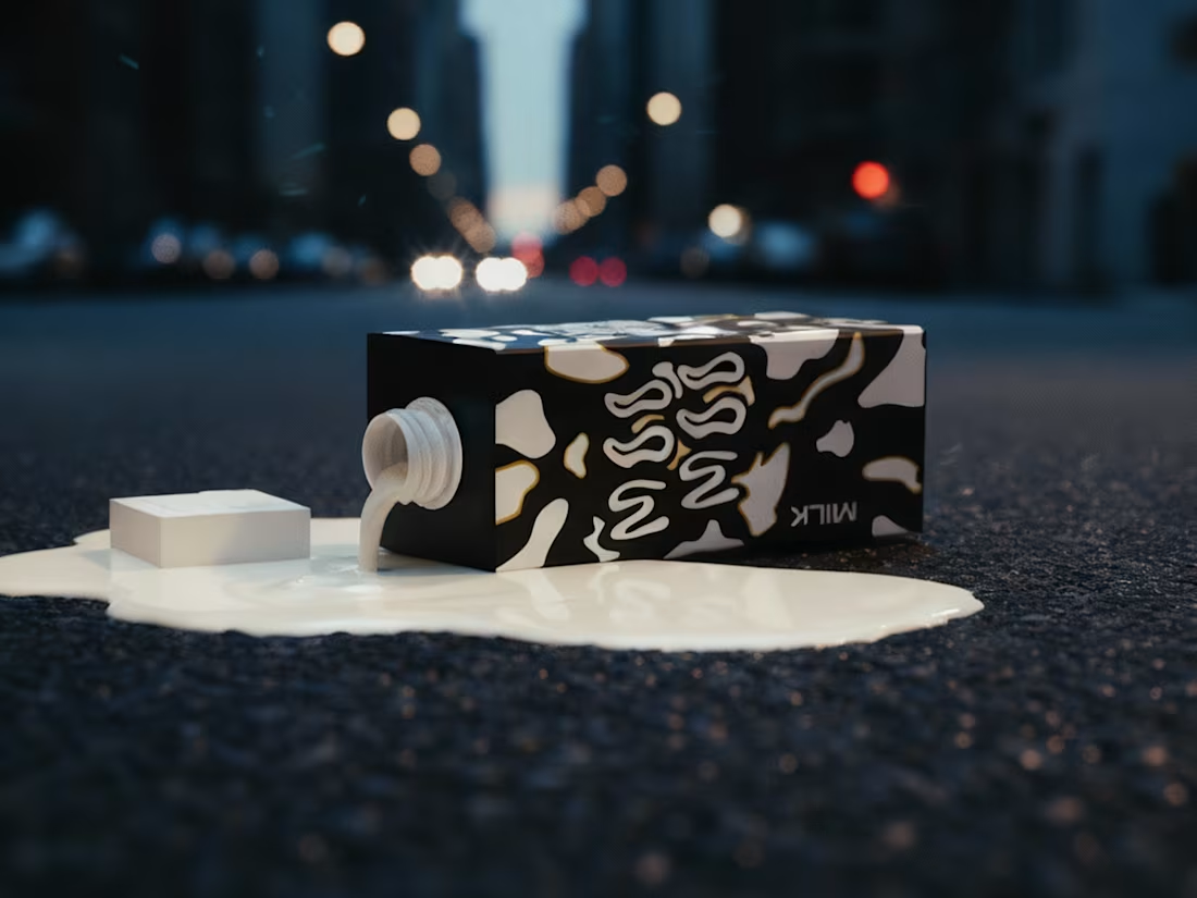
This is Moo Moo, a branding concept I created from scratch. The idea was simple: build a beverage brand that feels playful, bold and full of personality. I wanted it to look like something you’d spot on a shelf and instantly smile at.
I explored colour, typography and expressive illustrations to give the brand its own character. Nothing too serious, just honest design that feels alive and a bit chaotic in the best way.
Excited to share more work here and connect with other designers.
Thanks for having me.
10
22
199
Hey Contra community.
Wanted to share one of my favourite projects I’ve worked on recently.
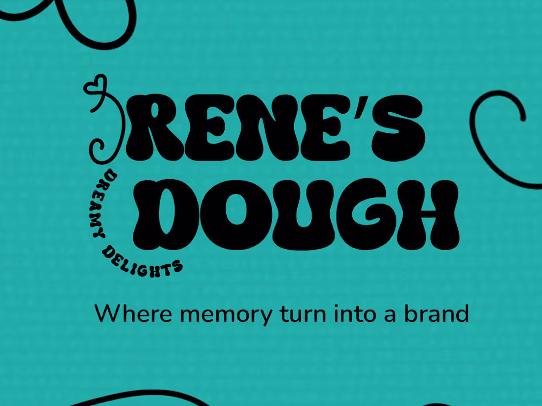
This is Irene’s Dough, a warm and nostalgic brand built around a single handwritten signature. The “I” comes from Irene’s actual writing, and turning it into the heart of the identity was what shaped the whole visual direction.
The goal was to create a brand that feels personal, handmade and full of comfort. Soft colours, rounded type, and a crest built from the signature help bring that emotion into the packaging and overall look.
Loved building this one. It’s one of those projects that remind me why I enjoy branding so much, taking something small and meaningful and turning it into a full visual world.
Excited to share more soon. Thanks for having me here.
1
87
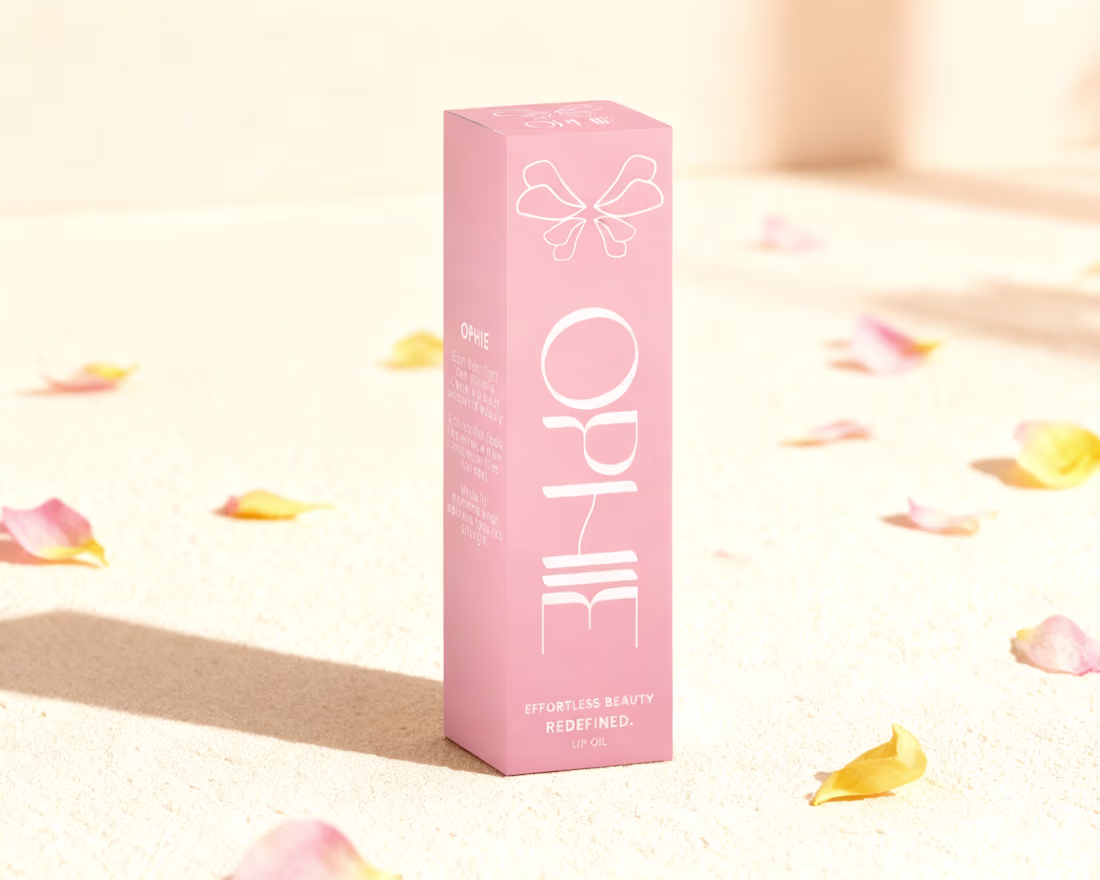
Hey Contra community.
Still getting used to the platform, so I wanted to share another project I’ve been building recently.
This is Ophie, a lip oil brand created around softness, femininity and effortless beauty.
The goal was to design something that feels delicate but still has presence, from the butterfly-inspired symbol to the sculpted metallic petals on the packaging.
I focused on creating a brand world that feels light, dewy and modern. Clean lines, soft tones, and a product experience that looks as smooth as it feels.
It was a fun challenge mixing elegance with a bit of fantasy, and I’m excited to finally put this one out there.
Looking forward to connecting with more creators here and sharing what’s next.
1
75