pro
Liliana Kecskés
Graphic Designer | Signage, Retail, Vehicle Graphics & Large


Who should decide what “good design” is – the designer or the client?
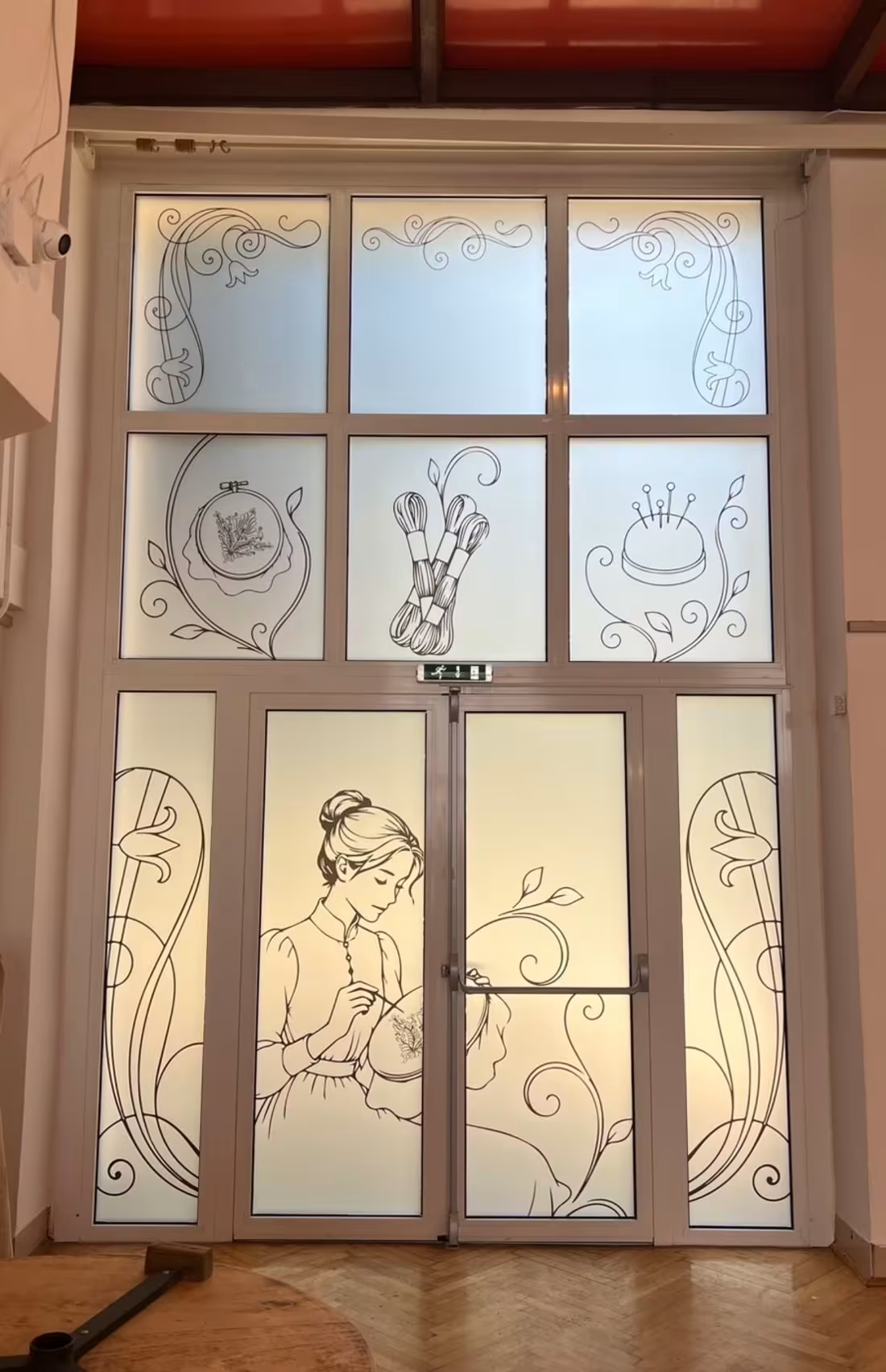
A few weeks ago, I shared the concepts for a window decoration project for a cultural center. Since then, we’ve created everything from art deco curtains and art nouveau frames to minimalist and thematic concepts.
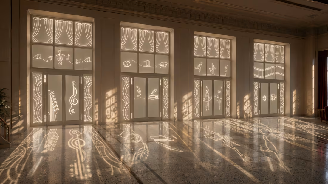
My favorite idea was to use cut matte foil so that sunlight would cast the pattern onto the floor. It didn’t win.
The approved solution is much simpler: printed matte foil with black line graphics.
Does it work? Yes.
Would I have chosen it? No.
So where do you draw the line? How much do you push your professional opinion before accepting: their project, their money, their decision?
Have you ever had a client you liked the least? Share your story. 🙌
1
3
148
A little behind the scenes from a project I’m currently working on.
I’m designing a series of glass decorations for a city cultural center, with a goal that sounded simple at first: keep it subtle and elegant, but make the final result feel monumental.
The challenge was to achieve that without relying on printed graphics — letting the material itself become part of the design.
After a lot of testing, I decided to work with plotter-cut frosted / dusted glass film. Instead of printing the artwork onto the glass, the graphic elements are cut out of the frosted surface, allowing natural light to pass through them.
I’m currently developing different visual themes around music, literature, dance, theatre and other areas of culture.
What I find most exciting is that the design won’t stop at the glass itself. As sunlight passes through the cut-outs, the graphics will continue inside the space as light and shadow — changing throughout the day.
Still very much a work in progress, and I’m testing a few different directions.
I’d love to hear your take: would you keep the whole system purely frosted and monochrome, or introduce a subtle second material — for example, a small amount of gold vinyl?
2
224
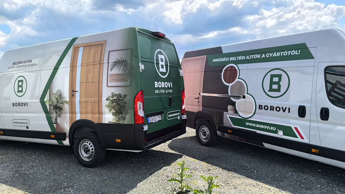
Borovi – Vehicle Fleet Graphics
I designed the graphics for three Peugeot Boxer vans for Borovi. My goal was to make all three vehicles instantly recognizable as part of the same brand, while giving each one its own distinct visual character.
I developed three different concepts, and all three designs were produced and installed. The shared visual language is built around Borovi’s green-and-white brand palette, large-scale product imagery, and interior scenes, while each van uses a different composition and visual emphasis.
A key objective was to make the product itself — the interior door — immediately recognizable, while keeping the logo, key message, and website easy to read even when the vehicle is in motion.
Rather than using a full vehicle wrap, I intentionally incorporated the vans’ original white bodywork into the design. This helped create a cleaner, more modern result while still making the three different graphics feel like one coherent fleet.
My role: concept development, visual design, graphic adaptation, and preparation for production.
1
153
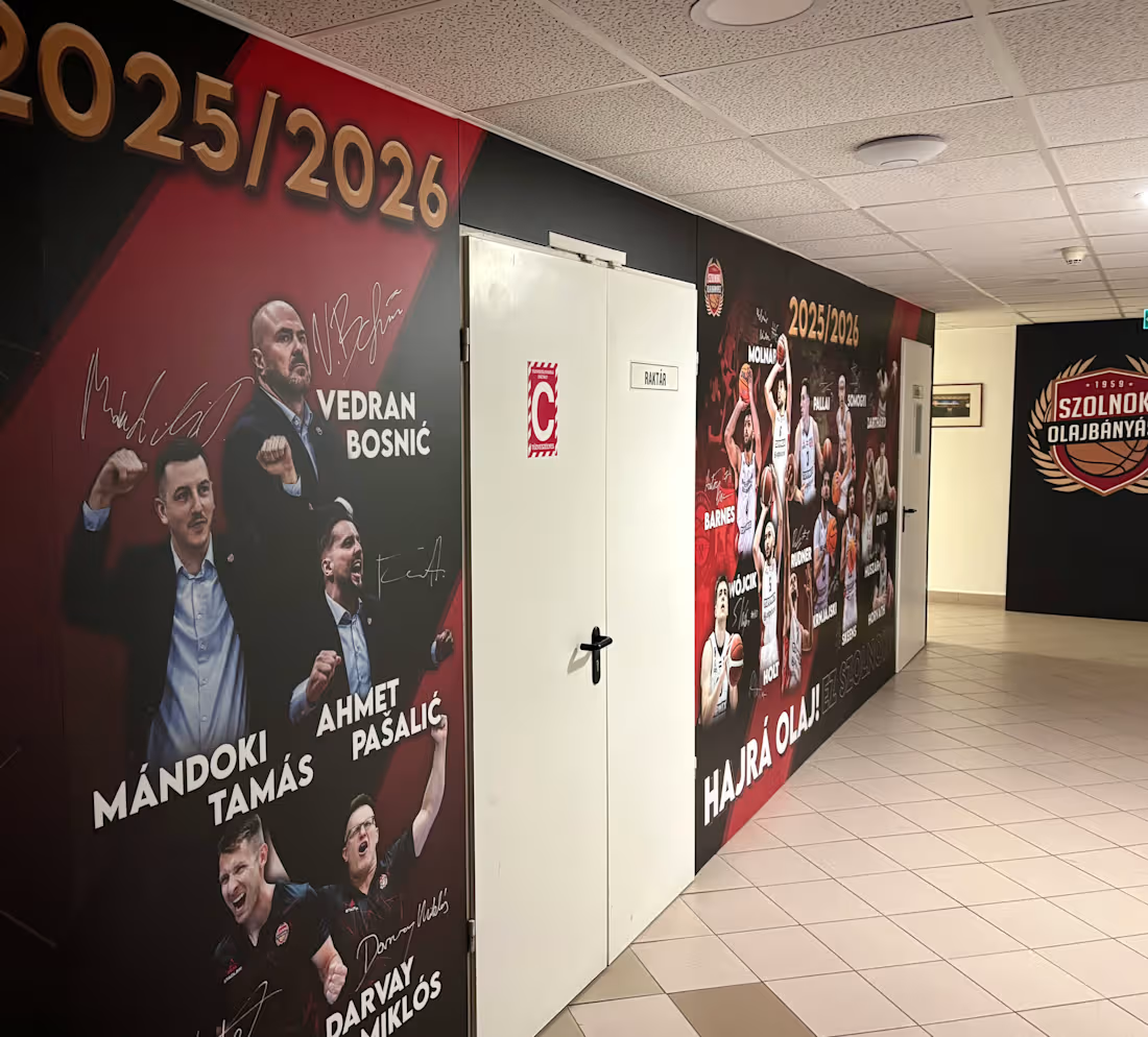
NHSZ Szolnoki Olajbányász – Locker Room Corridor Branding
Environmental Graphics / Sports Branding / Large-Format Design
The project focused on the complete visual transformation of the locker room corridor for NHSZ Szolnoki Olajbányász during the 2025/2026 season.
The brief called for a bold, dynamic and highly energetic environment that reflected the club’s existing identity while creating a much more intense physical experience inside the arena.
The Challenge
This was not simply a decorative project.
The corridor is used by both the home team and visiting players on their way to the court, so the space had to serve two purposes: strengthen the identity and confidence of the home team, while also creating a strong psychological first impression for opponents.
The goal was to make the feeling of home-court advantage begin before players even entered the arena.
The Approach
The visual concept was built around the club’s distinctive black, red and gold colour palette, combined with strong diagonal structures, dark backgrounds and large-scale player imagery.
Oversized cut-out portraits of players and coaching staff became the dominant visual elements, supported by signatures, seasonal typography and bold graphic details.
The visual language was intentionally more aggressive and dramatic than traditional corporate branding, creating a sense of energy, unity and competitive intensity.
Designing the Experience
Each wall was designed to work as an individual composition while still forming part of one continuous visual journey through the corridor.
Special attention was given to the integration of the sponsor wall, team and staff presentation, and key club messages such as “Hajrá Olaj! Ez Szolnok!”
The scale, composition and visual rhythm were designed specifically for the architecture of the corridor and for the way players experience the space while moving through it.
The Result
The finished environment functions as more than wall decoration.
It creates an immersive club space and a visual build-up to game time — reinforcing team identity, representing the club’s character and creating a strong psychological atmosphere before players reach the court.
My role: Creative concept, environmental graphic design, layout design and production preparation
Deliverables: Large-format wall graphics, player compositions, sponsor wall design, team and staff presentation graphics and production-ready artwork:
1
118