Leos dii
Graphics Designer


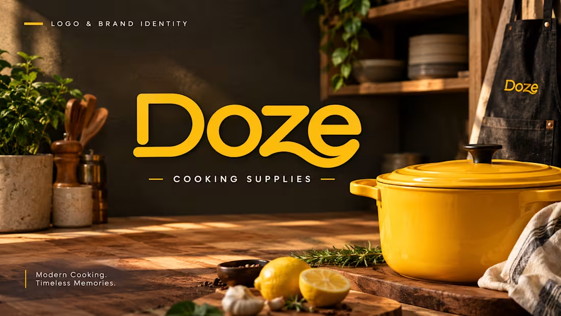
Doze — Logo & Brand Identity
A modern cooking supplies brand concept designed for young adults.
The goal was to combine nostalgia and modernity through a warm, polished, and approachable visual identity.
The project includes a custom wordmark, color palette, typography, logo variations, and brand applications designed to give Doze a distinctive and consistent presence.
Focus: Logo Design · Branding · Visual Identity · Packaging
0
11
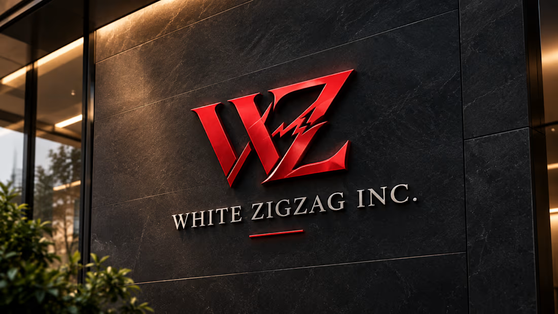
White Zigzag Inc. — Logo & Brand Identity
White Zigzag Inc. is a modern real estate company offering new condos with smart home automation, designed with college students and young residents in mind.
The visual identity explores the balance between mystery and modern living, combining architectural geometry with a classic visual character.
The core of the identity is a WZ lettermark, developed from the initials of the brand name and inspired by the distinctive zigzag idea within the name.
A bold red palette adds energy and confidence, while refined typography and geometric forms create a timeless, sophisticated character.
Services: Logo Design, Brand Identity, Art Direction
Industry: Real Estate / Smart Home Technology
Logo Type: Lettermark
0
32
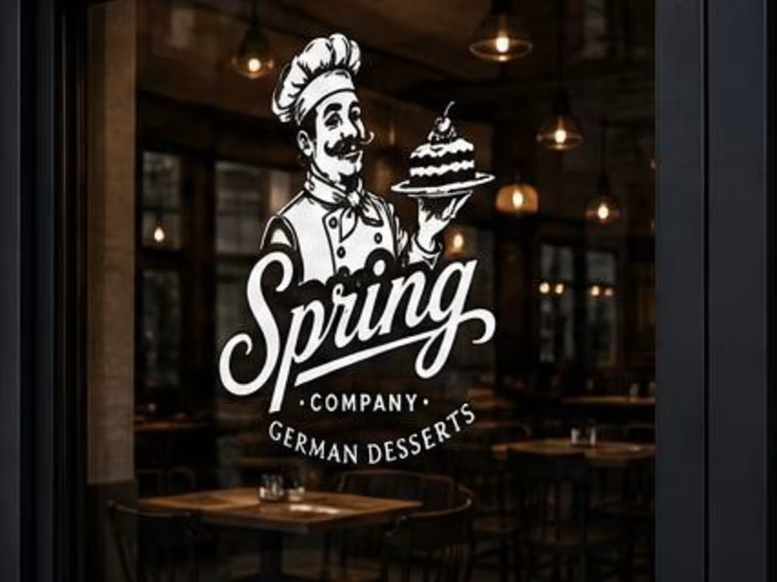
pring Company — Logo Description
Spring Company is a German dessert brand created to combine traditional craftsmanship with a fresh, modern feeling.
The logo features a chef mascot holding a dessert, representing the brand's connection to professional chefs, quality, and delicious desserts. The chef's vintage-inspired appearance creates a sense of nostalgia and tradition, while the clean black-and-white style keeps the identity simple, modern, and versatile.
The flowing “Spring” wordmark adds personality and gives the logo a warm, memorable character. The overall design is intended to feel authentic, confident, premium, and approachable.
The black-and-white color system also allows the logo to work easily across websites, packaging, signage, uniforms, and other brand applications.
0
60
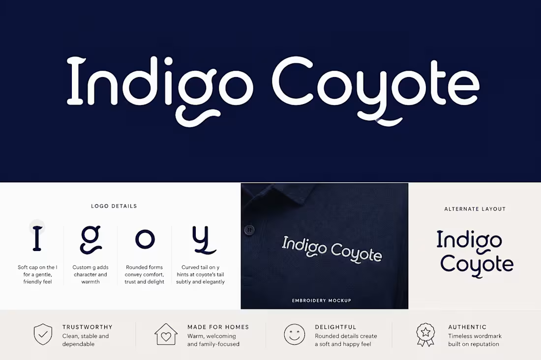
Indigo Coyote — Logo Design
Project Overview
Indigo Coyote is a furniture retail chain focused on quality, reputation, and authenticity. The brand is designed to connect with parents by creating a feeling of comfort, trust, and gentle delight.
Design Brief
The goal was to create a distinctive wordmark logo using the full company name, “Indigo Coyote.” The identity needed to feel welcoming and authentic while maintaining a clean and professional appearance.
Because the logo would be embroidered on staff uniforms, the design was developed with simple shapes, clear letterforms, and strong readability to ensure it works effectively at different sizes
0
49