
Leah W
Brand designer building intentional, clean, modern designs.
Ready for work
Leah is ready for their next project!
For the Dislotech Joint Reduction Trainer device, I created a visual identity that underscores precision, reliability, and performance in the world of medical simulation and sports medicine. The product provides anatomically accurate, hands-on training for diagnosing and managing joint dislocations.
At the heart of the brand is an iconic symbol representing the ball-and-socket joint, capturing the core function of the device in a visually direct and elegant way. The color palette is anchored in deep blue and gold.
18
109
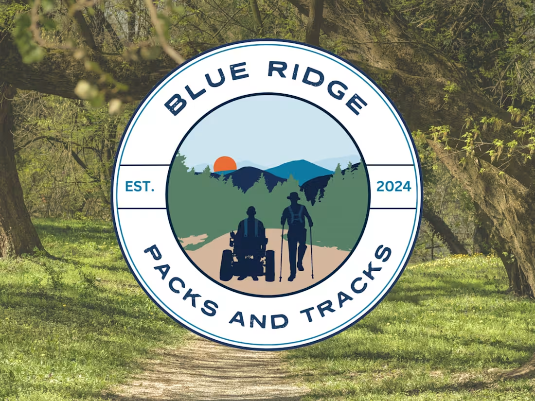
Blue Ridge Packs and Tracks is a nonprofit organization dedicated to making nature more accessible by providing track chairs on Shenandoah Valley trails so people with disabilities can fully experience the outdoors. The founder envisioned a badge-style logo that would feel rooted in nature and the local landscape.
0
45

For Acuity Corrosion Technology, developed by Luna Labs, I created a complete brand identity, solutions-based website, and supporting marketing collateral for the corrosion monitoring product line. The goal was to establish a strong, professional brand that communicates trust, innovation, and durability while clearly showcasing the solutions their products provide.
0
38

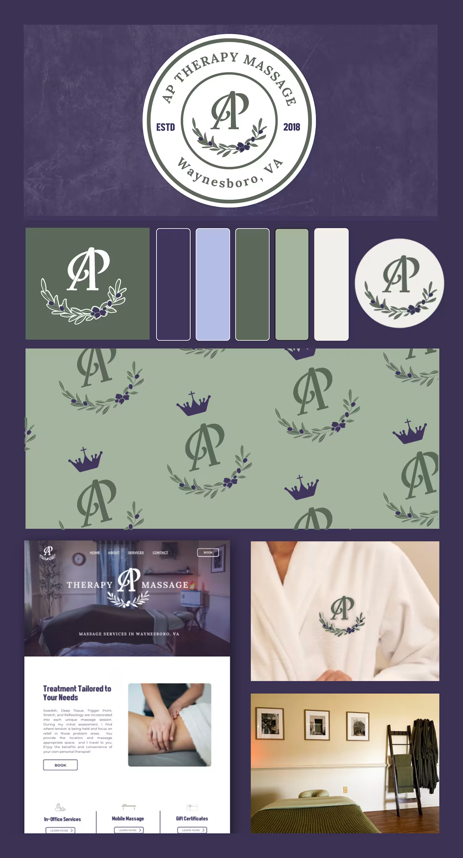
For AP Therapy Massage, I created a brand identity that blends peace and professionalism with a touch of personality. The design centers around the AP monogram paired with a hand-drawn olive branch illustration, a meaningful symbol of faith, peace, healing, and renewal.
0
33

I'm excited to share a recent passion project - the branding of Leaf & Lotus!
Leaf & Lotus is a playful mock brand I created to explore the intersection of wellness and food—a combination yoga studio and salad bar café built around the idea of nourishing the body and mind. With the tagline “Stretch. Savor. Repeat.”, the brand celebrates movement, mindfulness, and healthy balance.
What do you think?
0
28