

Workbook is a minimal notebook style workout tracker built for gym-goers who are tired of being overwhelmed by fitness apps. Most workout apps throw recovery scores, strain levels, and calorie targets at you before you even start lifting.
Workbook strips all of that back. You...
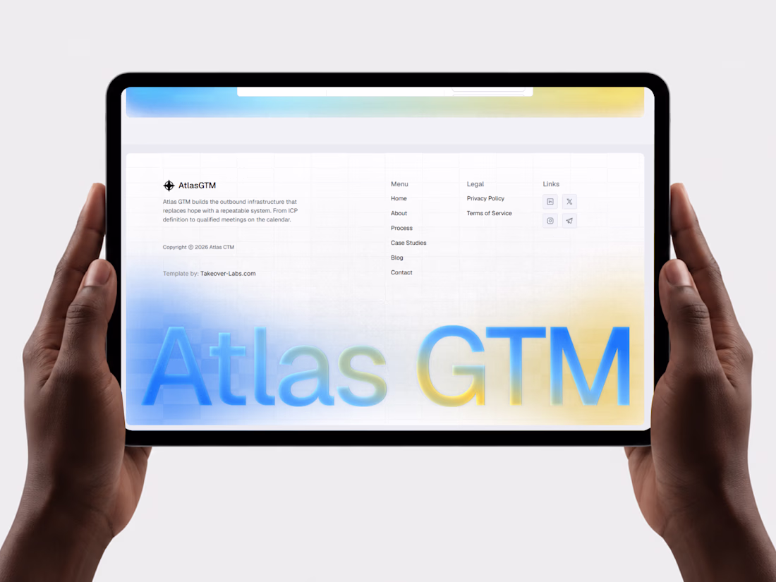
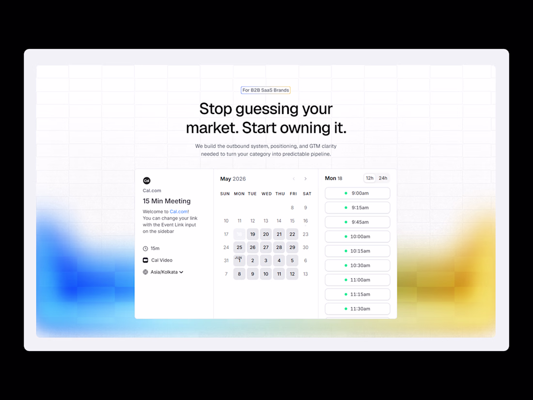
Atlas GTM is a premium Framer website template built specifically for GTM agencies, outbound consultants, B2B sales teams, and revenue-focused service businesses.
Most agency templates use placeholder copy that sounds like nothing. Atlas GTM ships with real, industry-specific...


Trying 2 different directions:
A: Standard video in hero
B: Before/After (With video as a popup element on video button next to get started)
7 voted
54%

6 voted
46%

13 votes
Closed