
Larissa Pitta
Packaging and Visual Identity designer. Let's work together?


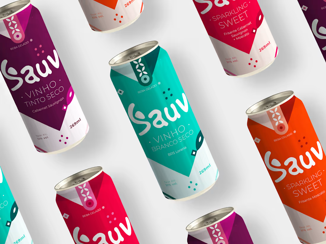
Young, modern and practical, are adjectives that very well describe the visual identity created for the NEW SAUV. With the use of vibrant and striking colors, which call to action, which make you want to dance, to jump, to want, to live EVERYTHING. EVERYTHING that NEW SAUV is and shows in its new packaging. The new visual identity brings joviality to the brand, making it modern and up-to-date, it is the brand that young people WANT to show, WANT to share in stories. When we talk about wine, we immediately think that it is a sophisticated drink, where we need to make correct pairings according to the grapes. But it doesn't necessarily have to be so refined and serious. Wine can be adaptable, appearing at different times and places. At the pool, at the club, at the bar, day or night, alone or with the crowd. You make your moment with Sauv. Sauv brings this contrast between the serious and the cool, and this was done in the visual identity of the brand, where we have the logo with an organic typography and with movement and the other (Montsserat), urban and with a slight touch inclined at the ends of the letters which makes it thinner. As well as the modern elements that make up the whole face of the brand, which give voice and feeling to it. Elements that have movement and impact on the look. Leaving the brand identity with a strong defined personality.
Check out the full project here: https://www.behance.net/gallery/161172297/Vinho-em-Lata-Sauv
1
132
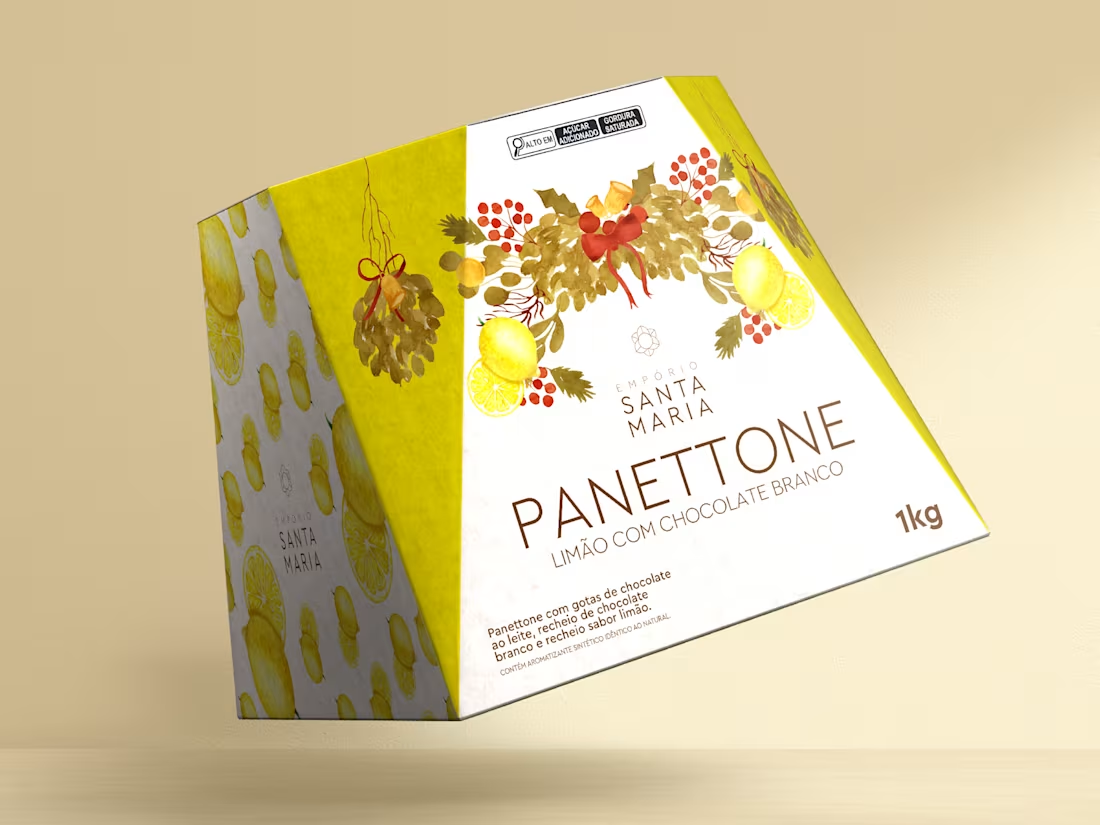
The objective of this project is to develop a packaging layout for Panettone that conveys the classic, traditional and vintage essence of the product. The packaging must evoke feelings of nostalgia, elegance and quality, providing consumers with a unique experience when purchasing and giving panettone. Use classic and sophisticated colors, such as shades of gold, brown, dark red and moss green, that refer to the Christmas season. Include vintage elements such as arabesques, ornaments, stars, pine branches, bows or satin ribbons that add a classic and traditional touch to the packaging. Consider including Christmas-related illustrations, such as Santa Claus, reindeer, bells, gifts, snowmen, to reinforce the festive and traditional atmosphere.
The main target audience is adult consumers, of both sexes, aged between 25 and 60, class A, who value tradition, quality and appreciate panettone as a special delicacy for the Christmas period.
0
74
A reference in good gastronomy, Empório Santa Maria offers a pleasant environment for shopping in São Paulo. A unique place that brings together harmony and satisfaction, a wide range of special imported products, as well as a bakery, rotisserie and confectionery with fresh products made in-house. Quality and service are our differentials! We believe that life should be celebrated every day!
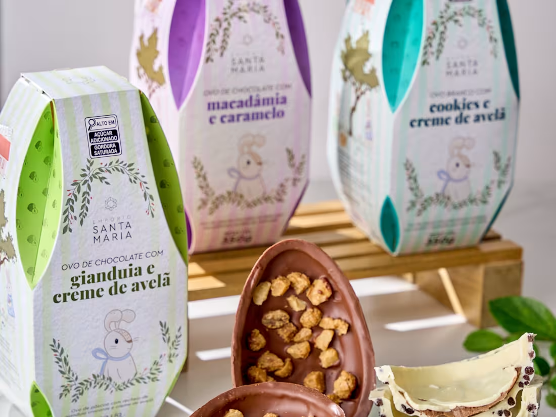
The idea for the layout of the packaging was to convey the classic, traditional and vintage essence of the product, with feelings of nostalgia, elegance and quality, providing consumers with a unique experience when buying and giving at Easter. Using fun and light colors reminiscent of Easter, including illustrations of rabbits and elements that have the specific trait of the artist Carol Coura, and that fit perfectly with the project.
0
84
The design I developed for Qualitá Nachos was recognized as the best packaging design of the year at the leading event in the Private Brands sector. This achievement highlights my ability to create visual solutions that balance aesthetics, functionality, and consumer impact, reinforcing the brand's positioning in retail.
It was a great honor to design the award-winning layout, and I hope many more awards will follow.
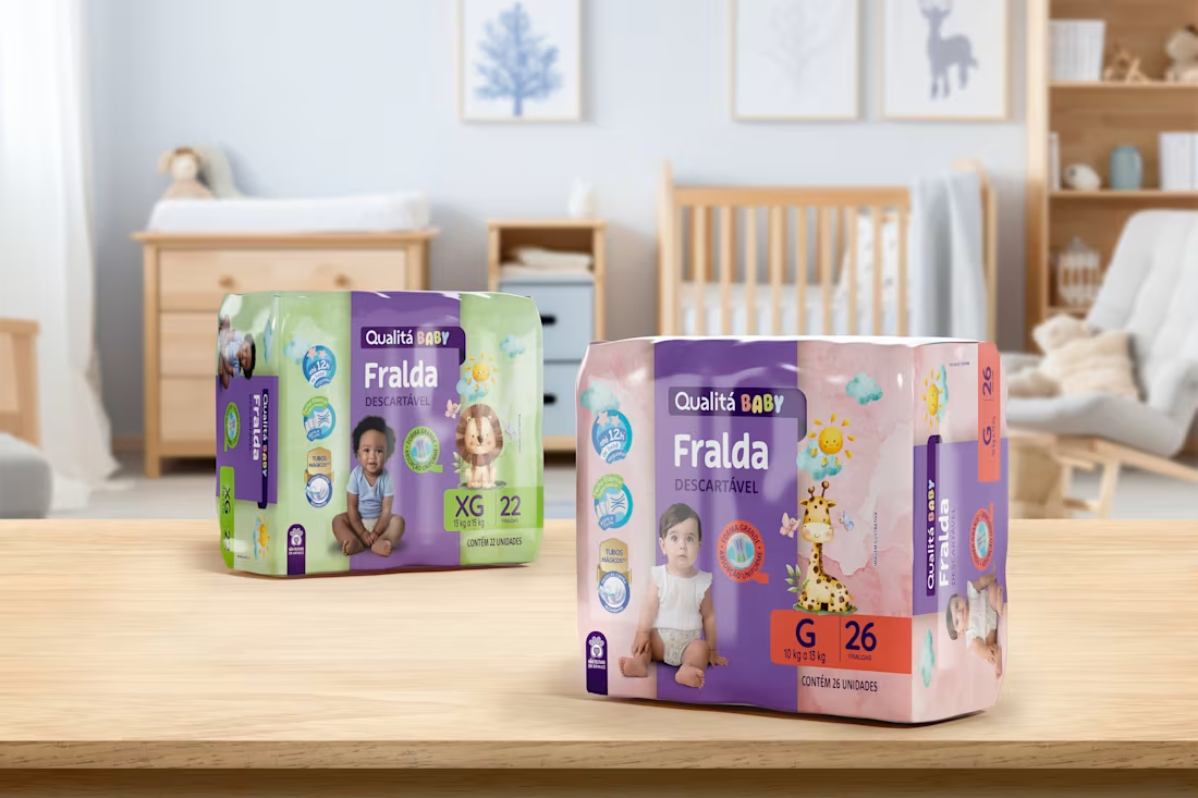
Since 2023, I have been part of the Private Brands team at Pande, a leading design and branding agency in Latin America. I work directly on the development of the visual identity for Qualitá, an exclusive brand of the Pão de Açúcar retail chain, collaborating closely with the coordination and creative direction teams. My experience ranges from concept creation to the implementation of packaging across various categories, including food, beverages, personal care, and cleaning products. Throughout this process, I have expanded my knowledge of the private label universe, developing a 360° perspective by working across multiple categories and understanding their specificities.
Qualitá's visual identity was redesigned by Pande, and my role has been essential in implementing this new design across all categories in the portfolio.
My role includes:
• Strategic selection of images and illustrations to maximize the perceived quality of products.
• Application of the visual identity, ensuring consistency and impact on store shelves.
• Development of graphic solutions aligned with the brand's positioning.
0
85