
Kübra
Turning ideas into visual experiences
New to Contra
Kübra is building their profile!
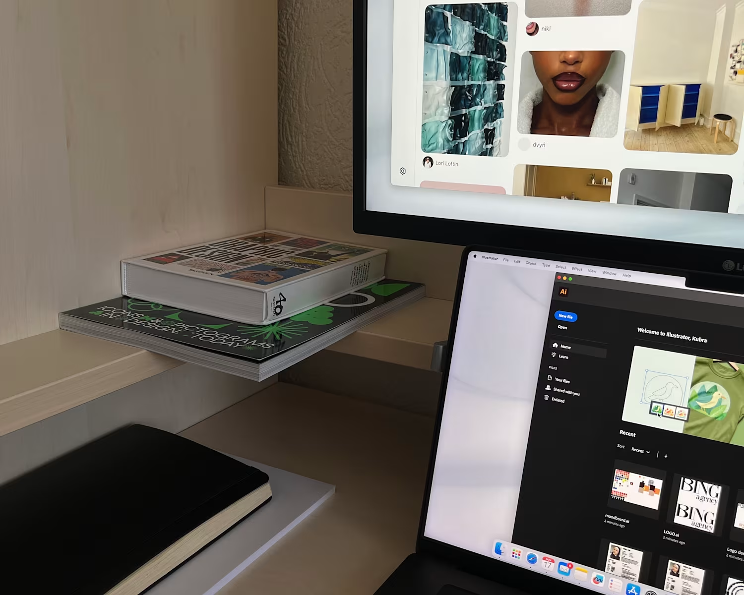
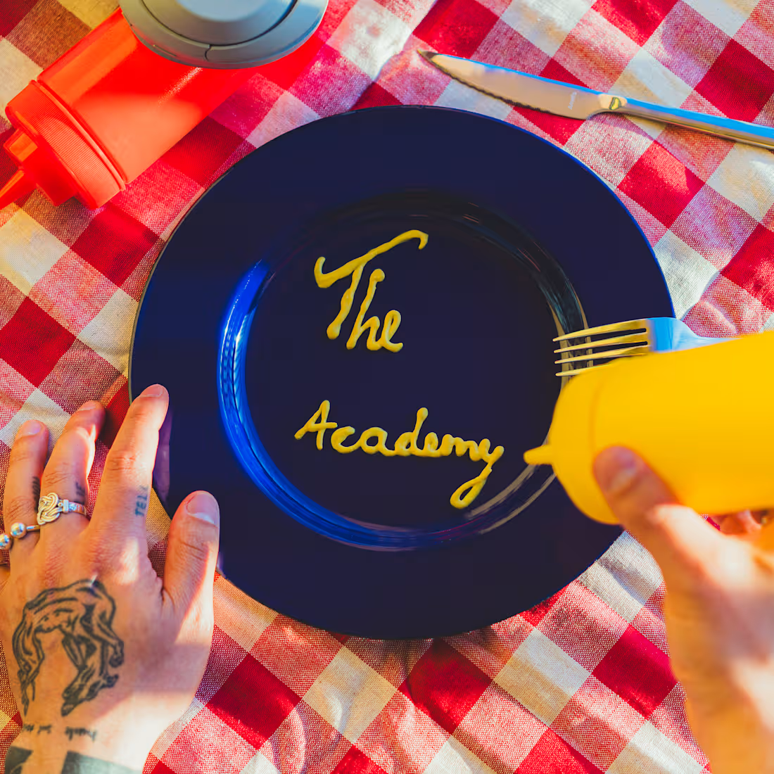
For Music Matters, I developed and designed the brand design for "The Academy", a program created by Shearey Pinas to support young, aspiring artists in the Dutch music industry.
Shearey trusted me to bring her vision to life, a brand that felt colorful, playful, and approachable, yet still clear and professional. I created a visual identity that reflected the energy and creativity of the program.
In addition to the branding, I was also involved in launching The Academy, co-producing the campaign shoot and creating content for social media, which was shared through the Music Matters channels.
1
12

Social media post designs for the collaboration events with Guardians of the Culture. The visuals translate the energy and theme of the events into engaging digital content, creating a cohesive and eye-catching presence across platforms.
0
9
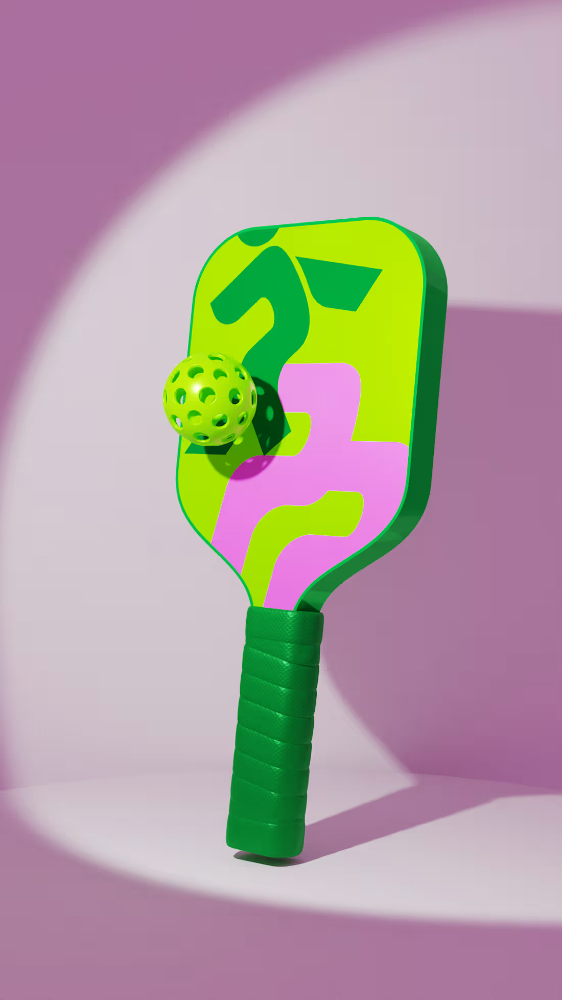
For the Pickleball Power rebranding, the goal was to transform the brand from a dynamic pickleball label into a full lifestyle brand. This involved exploring different directions, conducting research, and developing concepts to create a visual identity that felt energetic, modern, and approachable.
After several rounds of experimentation, a brand design emerged that perfectly captured the brand’s spirit. The combination of dark green, neon green, and pink was chosen not just for its vibrancy, but for the sense of energy, excitement, and community
To bring the identity to life, 3D mockup visuals were created, allowing the brand to be experienced in a tangible, playful, and engaging way, ready to move Pickleball Power from the court into everyday lifestyle spaces.
0
8
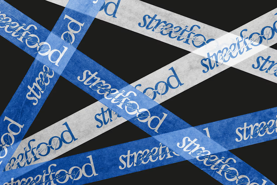
I was asked to develop the branding for a catering business. Together with the owner, Kimberley Durand, we explored different ideas, aiming to create an identity that felt both luxurious and playful.
After several rounds of sketching and conceptual exploration, one brand concept stood out, capturing the essence we were looking for.
The rich blue was chosen not only for its elegance, but also for the sense of trust, calm, and connection it brings to the Streetfood Gallery community.
2
11
80