Krithi B Rai's Work | Contra
Work by Krithi B Rai
Sign Up
Post a job
Sign Up
Log In
Krithi B Rai
Designing experiences people love to use
Message
Follow
New to Contra
Krithi is building their profile!
Bengaluru, India
Work
Posts
About
Bengaluru, India
2
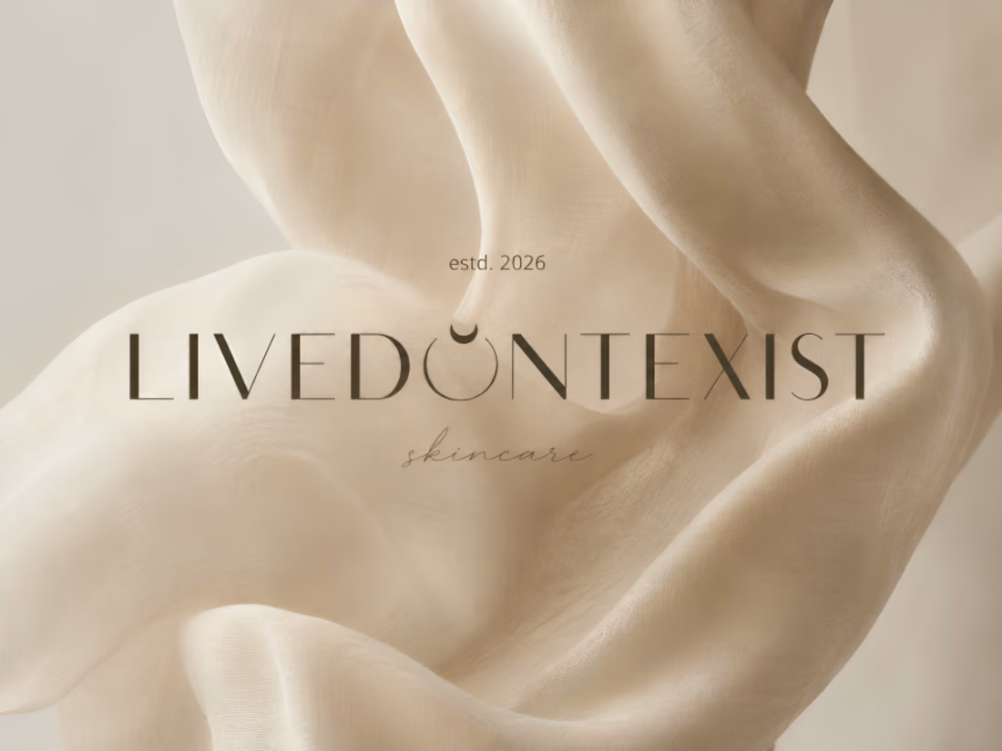
I've always been fascinated by how thoughtful design can shape the way people experience a brand. One thing I've learned is that a website doesn't need bold, vibrant colors to leave a lasting impression. Sometimes, a simple color palette, clean typography, and balanced spacing can create something that's just as engaging and if not more. For this luxury skincare website concept, I chose soft beige tones to reflect elegance, warmth, and sophistication. The goal was to show that minimalism, when used intentionally, can make a brand feel premium while keeping the user experience clean and inviting. I'd love to hear your thoughts on the design! If you have any suggestions or feedback, feel free to share them. I’m always looking to learn and improve. 🤍
2
68