
Koonj Imdad
UI/UX Designer · SaaS · Healthcare · Fintech · Ecommerce
- 5.00
- Rating
- 21
- Followers
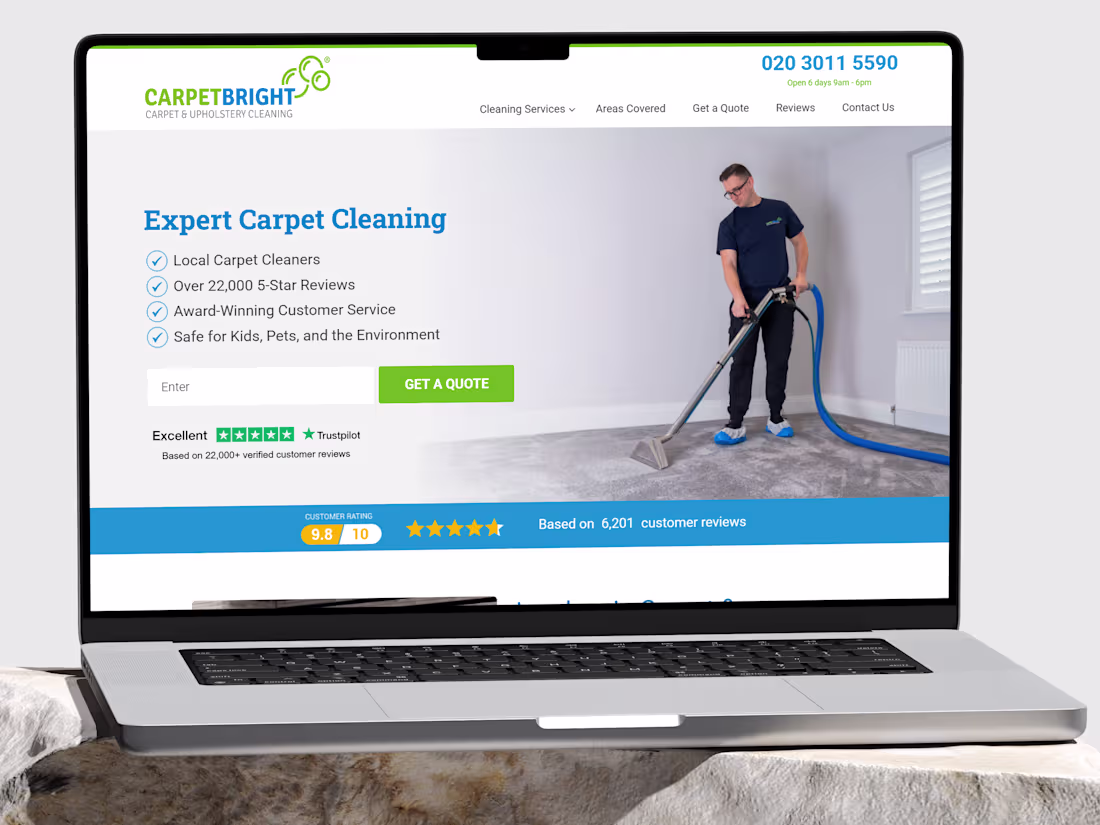
Website Redesign and Maintenance for Carpet Bright UK
0
6
LuxeGuide - Luxury Travel Platform
0
7
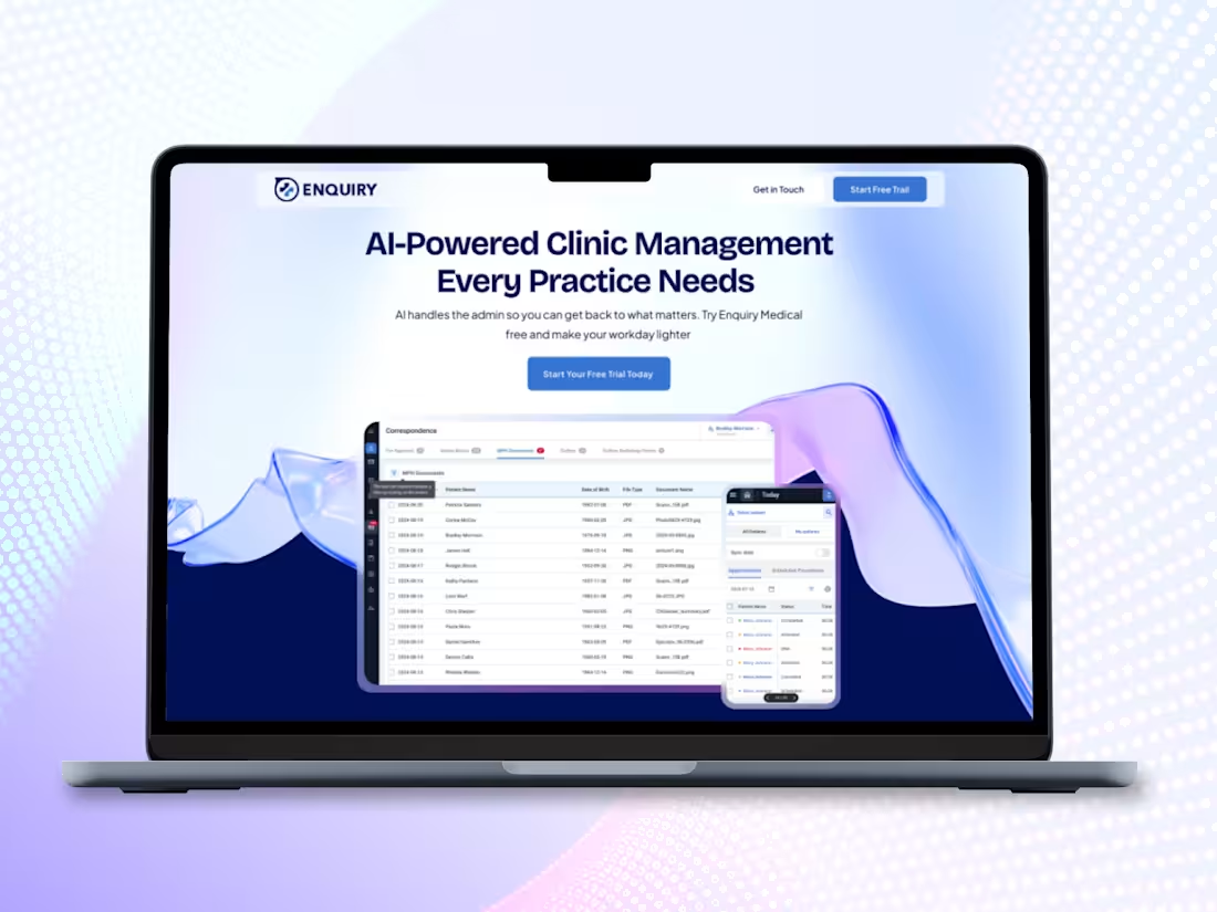
AI-Powered Clinic Management Landing Page
0
6
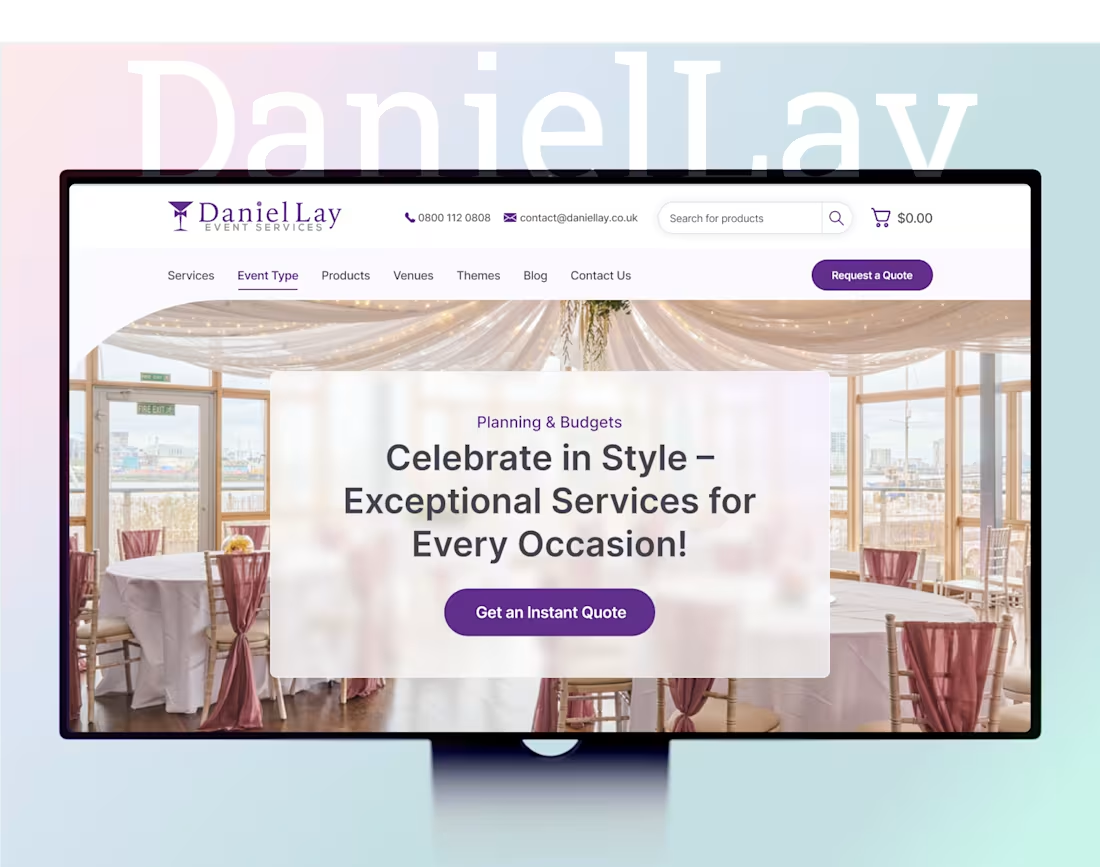
Daniel Lay Event Services Website Redesign
0
5
Express Estate Agency Website, CRM and Branding Design
0
5
Smart Pre-Ordering Mobile App for Restaurants
0
6
Fantasy Football Predictor App Design
0
4
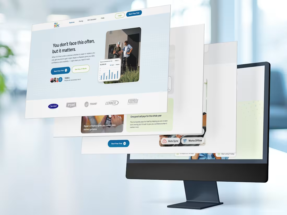
Repair vs Replace
Landing Page Design for P3 HVAC Software’s Standalone Decision
Tool
That single line, the hero headline of the Repair vs Replace landing page, does more work than most paragraphs. It names the emotional reality of the HVAC technician’s most difficult conversation: the one where a homeowner needs to decide whether to spend money repairing a system that might fail again, or invest in a replacement they’re not sure they can afford. My job was to build a page around that moment.
PROBLEM: The Rare Conversation That Has to Go Right
Repair vs Replace is not a decision that comes up on every job. It’s not even one that comes up every week. But when it does arise, when a homeowner’s 12-year-old unit stops working mid-July and a technician is standing in their living room with a diagnostic result in hand, that conversation is everything. Get it wrong and the technician looks like they’re upselling. Get it right and they become the most trusted person in the room.
The challenge the landing page had to solve was communicating all of that in a product that most technicians would need exactly once every few months.
SOLUTION: Every Section Answers a Question the Visitor Is Already Asking
The design philosophy for this landing page was built on a simple premise: a visitor reading down the page is having a silent conversation with the product. Each section needed to answer the next most likely question in their mind before they consciously formed it. The page was structured as a continuous argument, not a collection of sections.
MY IMPACT: What I Contributed to This Project
My work on this project spanned the full design lifecycle of the landing page, from initial layout strategy and content hierarchy through to the final, handoff-ready UI.
What this project taught me: Designing for a low-frequency, high-stakes use case is a genuinely different discipline from designing for a tool people use every day. When a visitor arrives knowing they won’t use the product often, every section of the page has to work harder to answer the implicit question: “is this really worth it for the three times a year I’ll need it?” The design answer is to make the value of those three moments feel so large that the monthly fee becomes irrelevant. That framing drove almost every layout decision I made on this project.
0
30
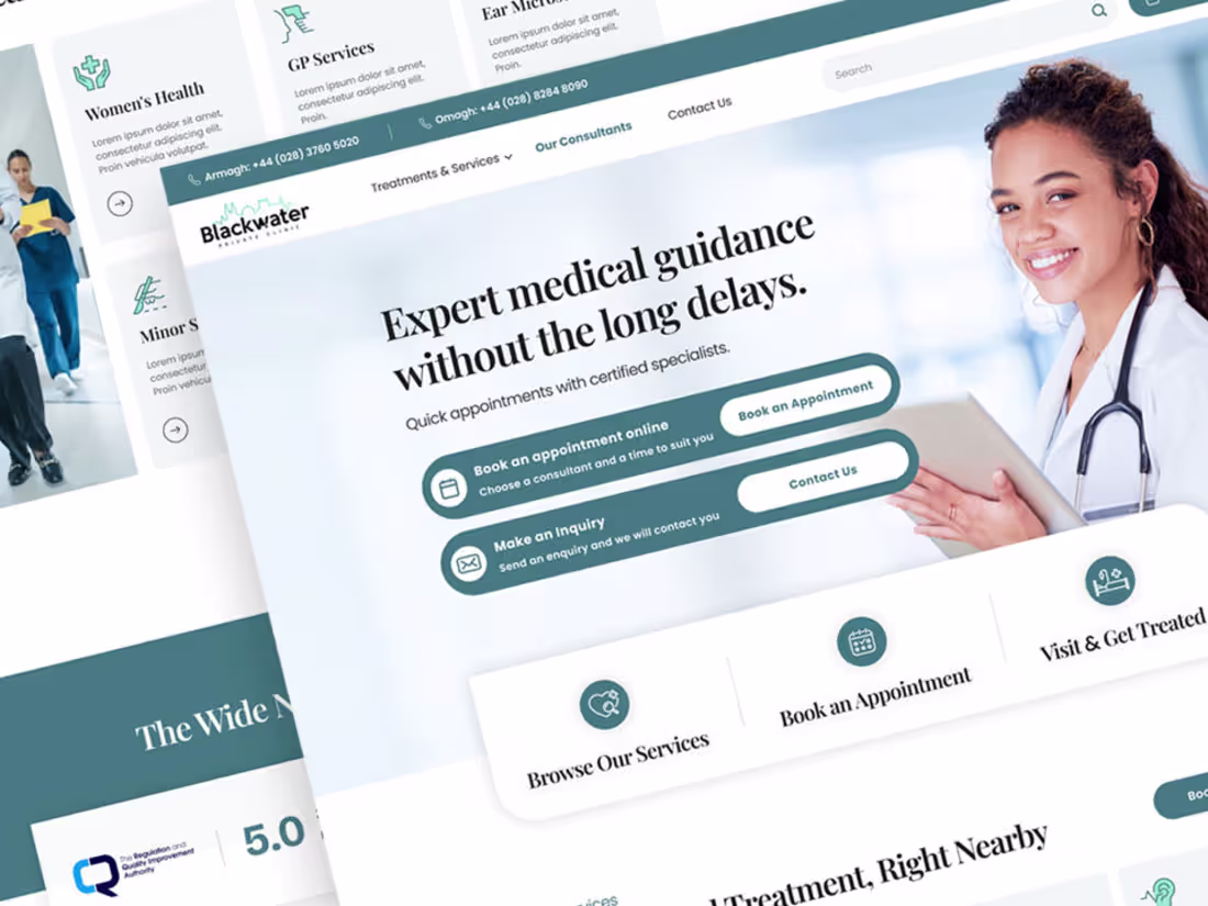
Private Healthcare Website Design for Blackwater Private Clinic
0
117
Automotive Marketplace Redesign
0
2
Porters Barbers Website Redesign
0
1
PropCert Fieldworker Mobile App Design
0
3
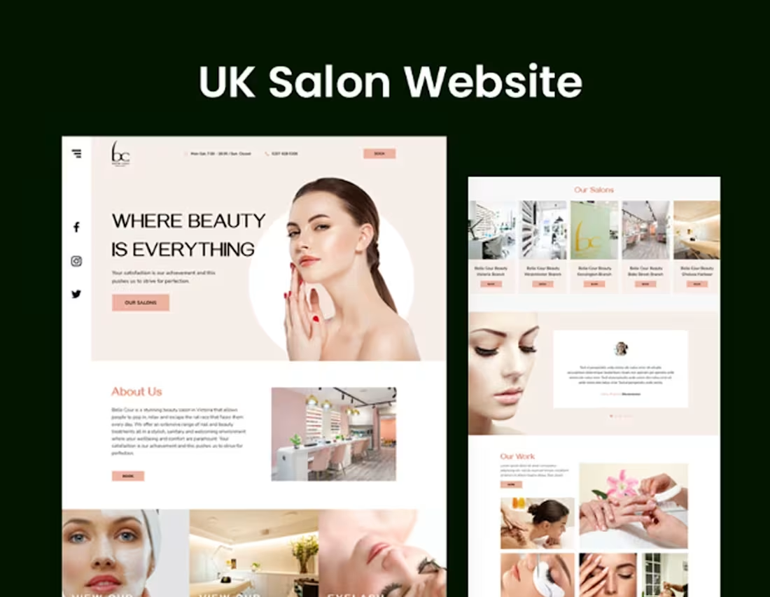
Belle Cour Beauty — Website Redesign
A UX & Visual Design Overhaul for a London Beauty Salon Brand
Overview
CLIENT
Belle Cour Beauty — a boutique beauty salon group based in London, with a location in Victoria/Pimlico offering services including nail treatments, facials, eyelash extensions, eyebrow threading, waxing, massage, and laser hair removal.
MY ROLE
UX Designer & Visual Designer — responsible for audit, strategy, and full redesign of the website.
PLATFORM
Web (desktop & mobile responsive)
The Problem
Belle Cour Beauty's existing website struggled to reflect the premium, personalised experience the brand delivers in person. Despite offering a broad and well-curated menu of beauty services across a central London location, the digital presence fell short of converting visitors into bookings.
Key Issues Identified
Cluttered navigation with an overly deep menu hierarchy — services were buried under multiple dropdown levels, making it difficult for users to find what they were looking for quickly.
Weak visual hierarchy and an inconsistent aesthetic that did not communicate the brand's upscale positioning or build trust with first-time visitors.
The homepage lacked a clear value proposition. The tagline 'Your satisfaction is our achievement' offered little differentiation or emotional resonance.
Critical information — such as location, hours, and booking options — was scattered and not immediately visible, creating friction at the most important decision point.
The booking call-to-action was present but not prominent or well-integrated into the user journey.
The site did not effectively communicate the salon's credentials, team expertise, or the personalised nature of their service — key trust signals for a beauty brand.
Mobile experience was not optimised, despite the majority of local search traffic arriving via mobile devices.
The Solution
The redesign focused on three core pillars: clarity, trust, and conversion. Every decision was made to reduce friction, communicate brand quality, and guide users toward booking.
Navigation & Information Architecture
The deep, multi-level dropdown navigation was restructured into a flatter, more intuitive hierarchy. Services were reorganised into clearly labelled categories so users could reach any treatment page in two clicks or fewer. A persistent booking button was introduced in the navigation bar on all pages.
Visual Identity & Tone
The visual language was elevated to match the salon's in-person experience — a refined, editorial aesthetic using a calm neutral palette, clean typography, and intentional white space. Photography guidelines and image treatments were standardised to create consistency across service pages.
Homepage Redesign
The homepage was restructured around a clear narrative flow: hero section with a compelling headline and immediate booking CTA, followed by service highlights, a trust-building section featuring credentials and testimonials, and a location module with practical visit information. The hero copy was rewritten to lead with outcome and emotion rather than a generic statement.
Trust & Credibility
Dedicated sections were designed to surface the salon's expertise — therapist qualifications, years of experience, and customer reviews. This content previously existed but was not strategically placed or visually prioritised.
Booking Flow
The booking experience was streamlined. The CTA was made persistent and consistent throughout the site — in the header, within service pages, and at natural decision points — reducing the number of steps between interest and action.
Mobile Optimisation
The layout was rebuilt with a mobile-first approach, ensuring that key information (hours, location, booking) and primary CTAs were immediately accessible on small screens without scrolling.
Outcome
The redesigned website presents Belle Cour Beauty as a credible, premium salon brand that is easy to navigate and easy to book. The cleaner structure reduces cognitive load for first-time visitors, while the stronger visual identity builds confidence and encourages return visits.
Design Improvements
Navigation depth reduced from 4 levels to 2, improving discoverability of all service pages.
Booking CTA made persistent and visible across all pages and screen sizes.
Homepage restructured around a clear user journey from awareness to conversion.
Visual consistency established across service pages, improving brand cohesion.
Trust signals — reviews, qualifications, personalisation messaging — surfaced prominently.
Mobile layout redesigned for thumb-friendly navigation and instant access to key information.
0
465