
Kethleen Holthausen Bruno
I help reduce friction and improve digital journeys.
New to Contra
Kethleen is building their profile!

English below
🇧🇷 Portfolio não é "versão final". Remontei o meu: visual mais UI friendly, refiz estrutura, publiquei no GitHub. Mas a mudança mais importante é porque não estava confortável mantendo projetos que eu tinha que "reescrever a origem" pra poder mostrar. Tinha cases que redesenhei visual, mudei labels, mudei contexto pra não expor NDA. Mas aquilo me incomodava... se eu precisava mascarar tanto sobre um projeto pra poder mostrá-lo, é porque não deveria estar mostrando mesmo.
Removi esses cases e o portfolio ficou consideravelmente menor, menos "impressionante". Mas agora quando falo sobre meu trabalho é sem carregar culpa. E fiquei super satisfeita com o resultado "final" (entre aspas porque é para ser atualizado sempre rsrs). O link está nos comentários.
------------------------------------------------------------------------------------
🇺🇸 A portfolio isn’t a “final version.” I revamped mine: made the design more UI-friendly, restructured it, and published it on GitHub. But the most important change is that I wasn’t comfortable keeping projects where I had to “rewrite the source code” just to be able to show them. There were cases where I redesigned the visuals, changed labels, and altered the context to avoid breaching NDAs. But that bothered me… if I had to mask so much about a project just to be able to show it, then I probably shouldn’t be showing it at all.
I removed those cases, and the portfolio became considerably smaller, less “impressive.” But now, when I talk about my work, I do so without feeling guilty. And I’m really happy with the “final” result (in quotes because it’s meant to be updated all the time, lol). The link is in the comments.
3
1
30
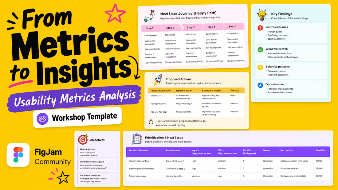
Usability metrics are often available. The harder part is turning them into decisions.
Teams may have task completion rates, drop-off data, session recordings, survey responses, usability test notes, dashboards, and support tickets. But when those signals live in different places, it becomes harder to answer the questions that matter:
• What is actually getting in the way of users completing a task?
• Which issues should be prioritized first?
• What evidence supports the proposed solution?
• Who owns the next step?
That's why I built the Usability Metrics Analysis Canvas, my first FigJam Community template.
It's designed to help UX, Product, Data, and Engineering teams move from scattered usability data to a clearer, shared view of what should happen next.
The canvas includes:
• Analysis goals and decisions to support
• Project team, success metrics, and initiative timeline
• Ideal user journey / happy path
• Key findings and supporting evidence
• Proposed actions
• Prioritization, ownership, and next steps
It can be used for usability testing reports, product audits, funnel analysis, dashboard reviews, UX research synthesis, stakeholder workshops, and post-launch reviews.
This is my first FigJam Community template, and I'd love feedback from anyone who works with UX research, product decisions, or usability metrics. The link is in the comments below.
What would make this more useful for your team?
hashtag#UXResearch (https://www.linkedin.com/search/results/all/?keywords=%23uxresearch&origin=HASH_TAG_FROM_FEED) hashtag#UsabilityTesting (https://www.linkedin.com/search/results/all/?keywords=%23usabilitytesting&origin=HASH_TAG_FROM_FEED) hashtag#ProductDesign (https://www.linkedin.com/search/results/all/?keywords=%23productdesign&origin=HASH_TAG_FROM_FEED)
0
18