Kelly Bosenko
Brand & Graphic Designer | Brand Identity, Packaging, Logo
New to Contra
Kelly is ready for their next project!

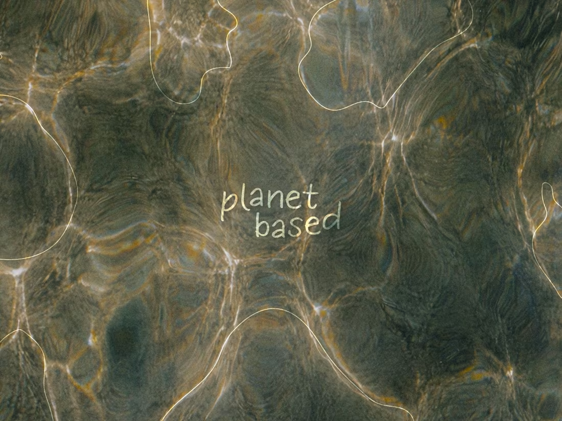
Planet Based — Premium Natural Skincare Brand Identity
0
0
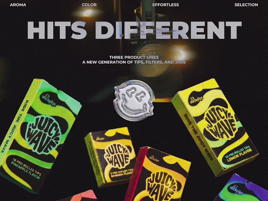
This project originally started as a redesign of an existing product — but quickly evolved into building a much larger visual system.
The main challenge was creating multiple product lines where every flavor felt unique and instantly recognizable, while still looking connected as one cohesive brand. The client wanted something acid-inspired, bold, and energetic — but still commercial enough to work on real shelves and across different markets.
I built the system around gradients, flowing wave-like graphics, and strong color coding to make each variation easy to scan while keeping the whole lineup visually unified. What started as a redesign eventually grew into a large product family distributed across Germany, Thailand, the US, and the Netherlands.
This project was a really interesting balance between experimental visuals and functional packaging design — making something expressive without losing clarity or scalability.
And honestly… this is the final story that came out of it.
Would love to hear what you think 👀
1
57
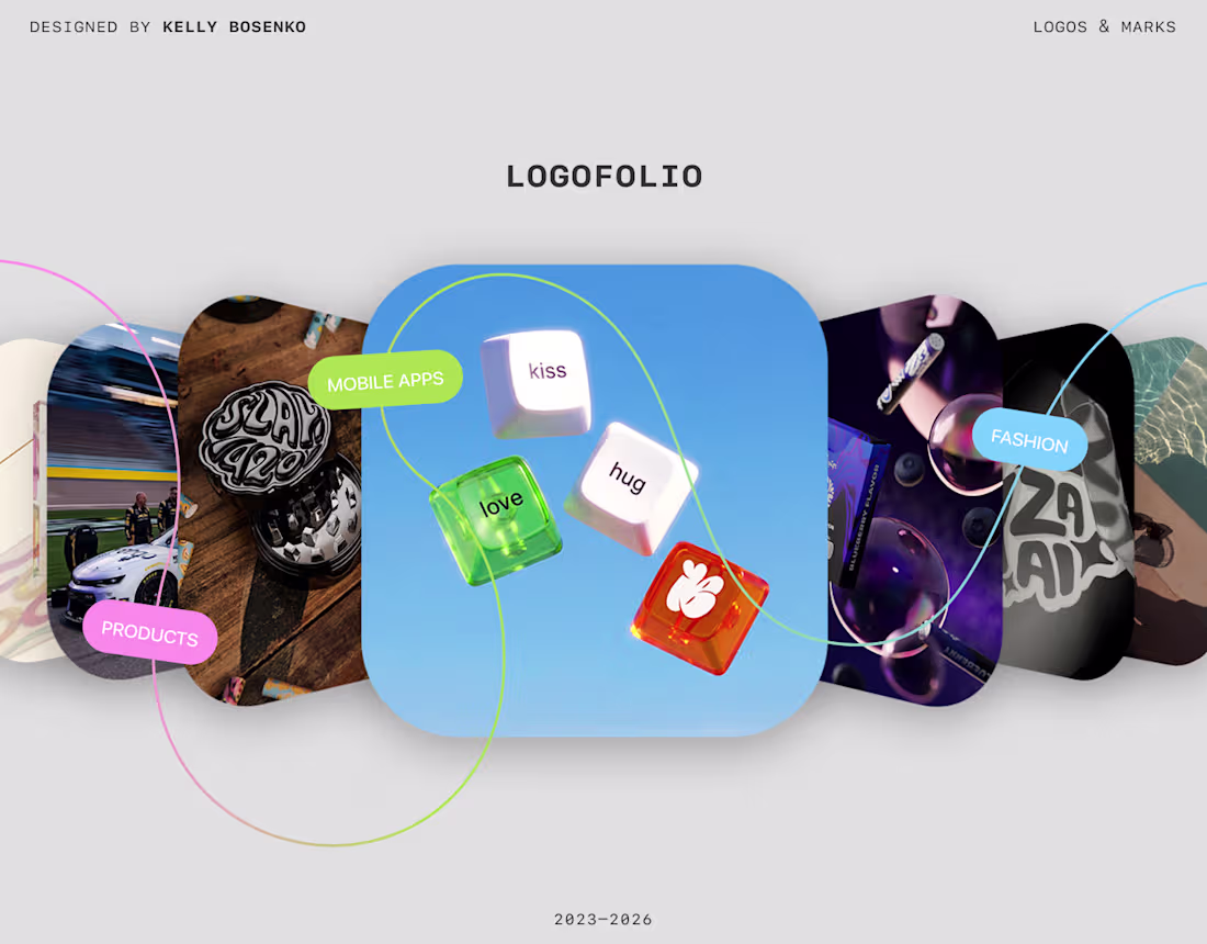
Logofolio | logos & marks
0
0
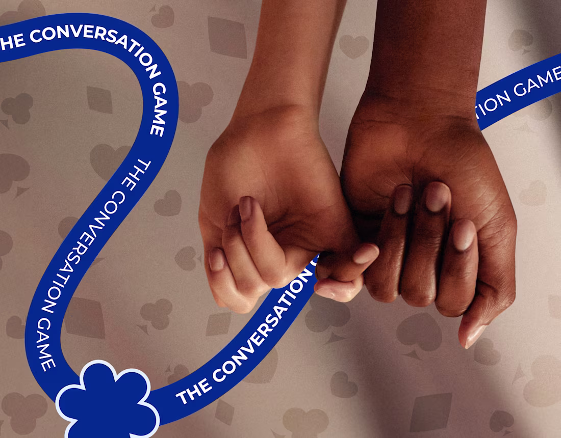
The Conversation Game
0
0
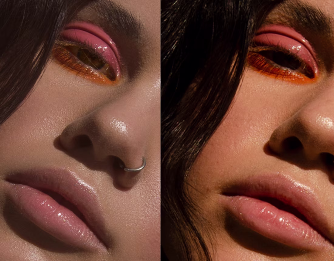
Retouch
0
0
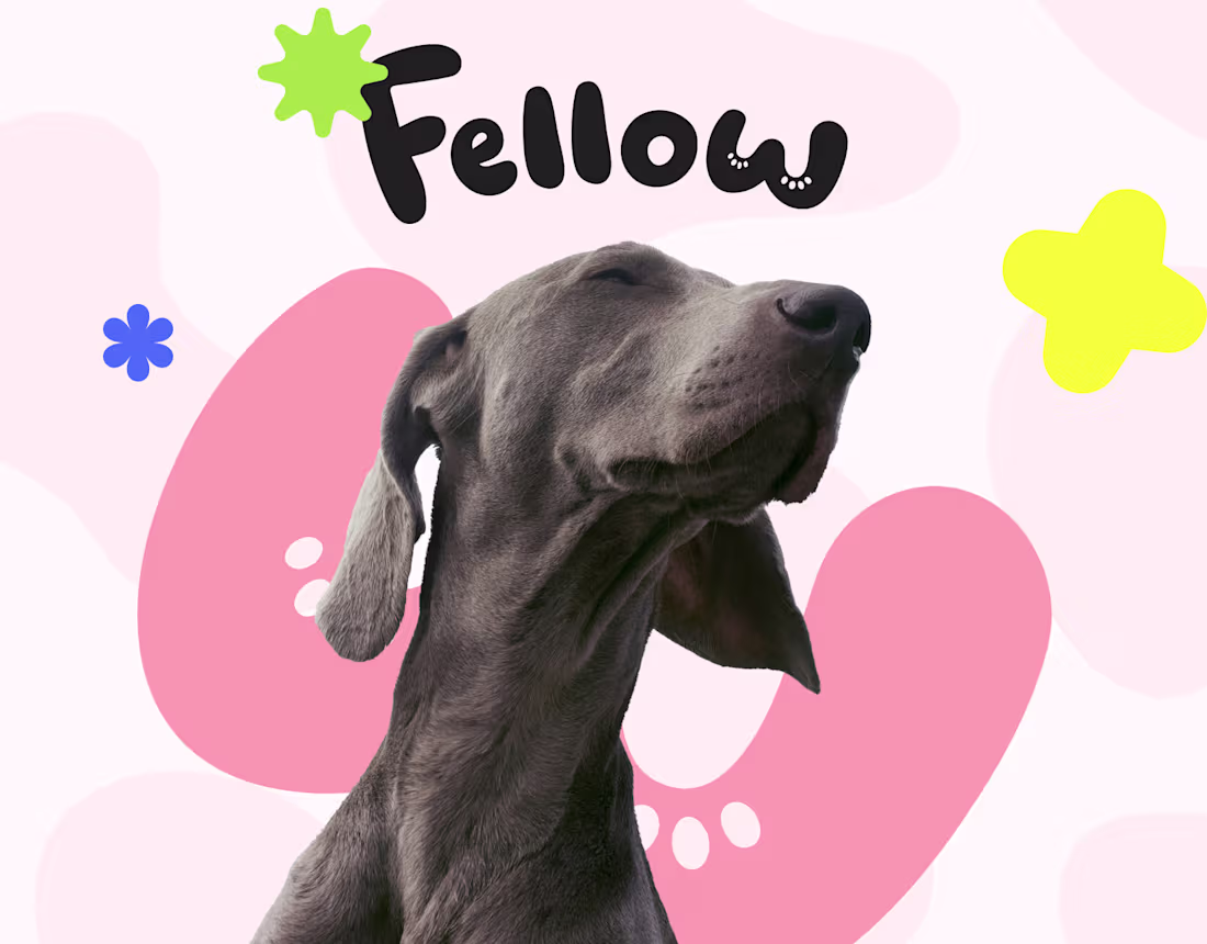
Fellow — Pet Accessories Brand Identity
0
0

KRYLAS Invitation – Fashion graphic design
0
0
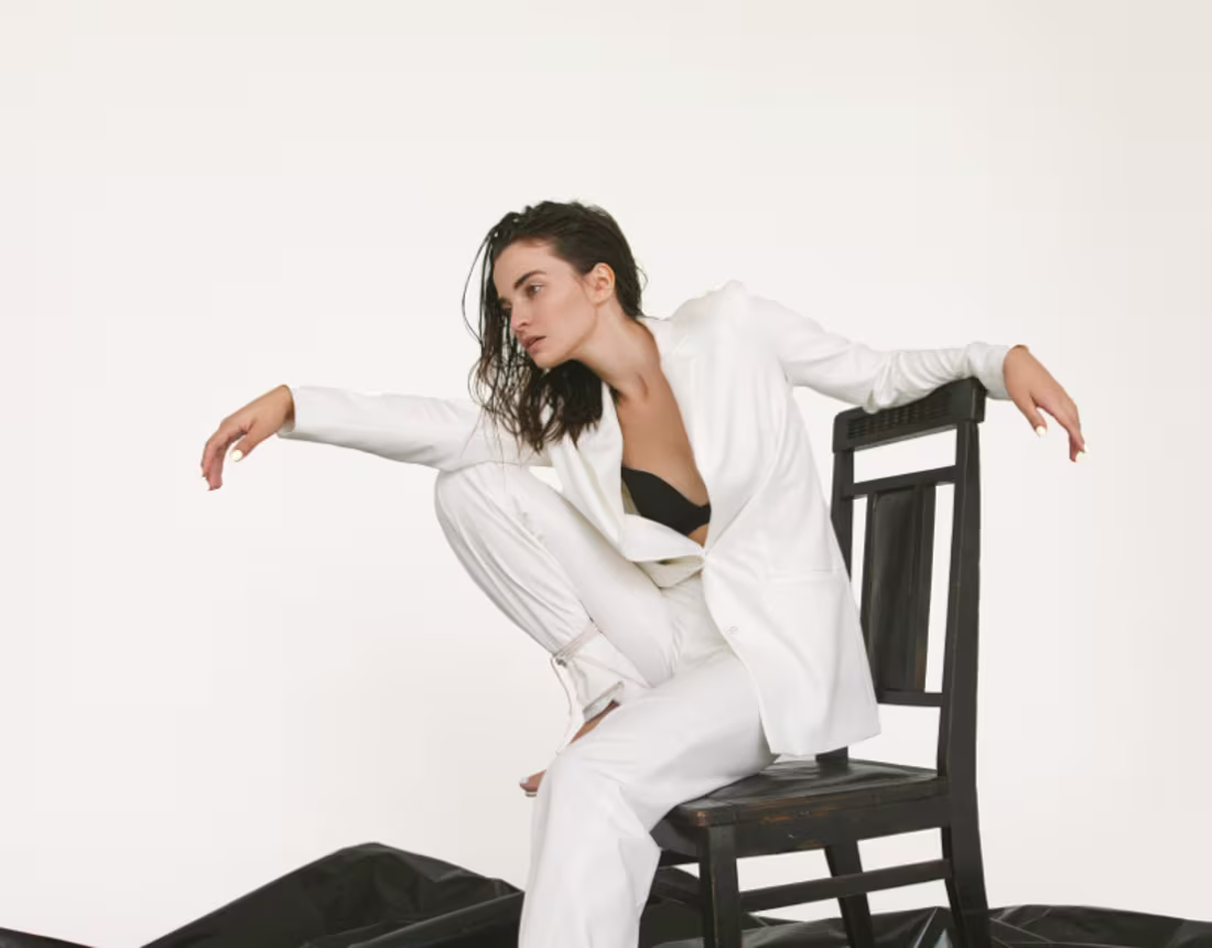
Model tests for Anastasia.
0
0