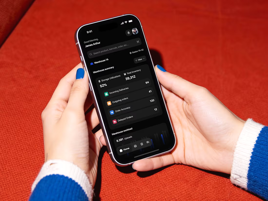
Who says enterprise fleet management has to look ancient and messy? For Karvio, we swapped chaotic data grids for a premium, low-latency dark canvas mixed with sharp corporate blue gradients. 📈🧬
We brought data precision to life by stacking high-fidelity UI elements on top of a beautiful deep slate backdrop. Swipe through the 4 attached images to check out the interface highlights:
📊 The 3D Hour Metrics Grid
💳 The Card Wallet Hub
⚙️ The Multi-Sector Stack
📱 The Live Landing Experience
We dropped out the noise so teams can finally get their fleet spending under control. Check out the mockups, let us know what you think! 💎✨👇
Tired of clinical, boring banking grids? We built Monetra to change that—an editorial, high-contrast mobile wealth companion designed to make every financial choice visually clear. 📱✨
Swipe through the 4 attached images to explore the detailed mobile interface layout:
📊 The Credit Surface: Track your long-term metrics with a clean, light-mode bar chart structure.
🎯 Micro-Budgeting Cards: Stay ahead with smart modular components featuring an explicit dark over-spending threshold bar.
📅 The Liability Layer: Say goodbye to payment friction using our sleek, horizontal calendar timeline.
🎨 Behavioral Analytics: Manage separate spending nodes instantly through a vibrant radial doughnut chart engine.
Drop your thoughts and feedback in the comments below! ❤️👇
1
30
Most sports tracking apps treat web interfaces like boring, static placeholders. We built Yogolf to change that—transforming an abstract AI analytics engine into an active, high-conversion discovery surface for modern athletes. 📱🟢
Slide through the 4 attached images to review the detailed UI up close—including our real-time posture overlays and sleek editorial component arrays. See how we engineered visual authority into every pixel.
If this sparks inspiration for your next project, go ahead and Like, Save it to your moodboard, or hit Repost today! 💎
Less decoration, more structural visual hierarchy. Inside the UI details of Finova. 🛡️✨
We bypassed flashy, gamified elements to build a high-fidelity dashboard built on premium clarity. Slide through to see the custom components we engineered for this workspace:
📊 Dual-axis portfolio balance graphs with clean hover tooltips.
📈 Minimalist modular cards featuring integrated sparklines.
🤖 A native AI panel utilizing functional, proportional color blocks instead of messy conversational fluff.
🧾 A border-free transaction ledger optimized for high-density legibility.
Check out the UI screens for the details 🚀
Feedback, thoughts, and support are always appreciated. ❤️
Crypto exchange UI is notoriously chaotic. Coinnexion proves that complex transaction parameters can live harmoniously inside a premium mobile interface. 🛡️🔥
Our design thesis was straightforward: remove the technical intimidation of Web3 trading by embedding execution tools inside an intuitive, social-financial canvas. Swipe through to see the layout balance—from the full immersive hand mockups to the isolated profile and asset ledger components.
If this inspires your current product workflow—Like, Save for your moodboard, or hit that Repost! 💎
Enterprise design doesn’t have to feel clinical. It can feel like art. Here is a sneak peek into the UI components of Vega. 🛡️💡
Instead of building a massive, overwhelming dashboard grid, we focused on perfecting one isolated card at a time. By combining crisp typography, a soft neutral background, and high-contrast accents, these components pull critical errors out of the noise and turn them into clear, beautiful, and actionable data stories.
Swipe through to see the interaction states—from the AI search input bar to the color-coded metric loops.
Do you think the contrast hierarchy hits the right balance for real-world enterprise operations? 💬👇
Feedback, thoughts, and support are always appreciated. ❤️
Turning sterile cryptographic data into a human-readable financial story. Neutra is engineered to bring elite financial intuition to the Web3 era. 🛡️✨
We completely bypassed raw developer-centric grids to build an intuitive dashboard tailored for institutional-grade asset tracking. By pairing an editorial layout with clear consumer pillars, we engineered boardroom trust across every interactive surface.
Look closely at the details:
🎯 Data Micro-Moments: A vibrant, color-coded "Spending Breakdown" donut chart designed to eliminate categorization guesswork.
📊 Data Density Without Fatigue: A clean transaction ledger that balances token operations on an ultra-focused tablet layout.
🛡️ Contextual Modals: Streamlined overlays isolating deep network telemetry natively within the viewport.
If this inspires your current product workflow—Like, Save for your moodboard, or hit that Repost! 💎
#ProductDesign #DashboardDesign #CryptoUI
How do you turn cold, sterile data grids into a visually stunning operation hub? Here is our team’s take on Vega — Enterprise AI Analytics Dashboard. ✨
When designing an enterprise-grade platform, balancing extreme data density with design aesthetics is always a tough tightrope to walk. Look at how we handled the visual breakdown:
📊 Modular Clarity: Clean, responsive UI elements built to isolate complex data without creating user fatigue.
🍊 Intentional Accents: A restrained dark canvas paired with strategic red and orange data bars to signal urgency instantly.
💬 The Narrative Layer: Blending real-time customer voices seamlessly next to complex technical charts.
Feedback, thoughts, and support are always appreciated. ❤️
First post on Contra! 👋 We’re officially here, and we’re kicking things off with a sneak peek into Lunex — a next-gen, self-custody crypto wallet.
The crypto space is flooded with overcomplicated tools. For Lunex, our goal was to replace that chaotic, overly futuristic Web3 aesthetic with sophisticated clarity. We built a restrained, editorial typography system paired with high-fidelity glassmorphism to anchor a truly premium interface.
From a unified multi-asset dashboard to interactive real-time market charts (1D to 1Y), every pixel is engineered for elite data legibility.
Check out the UI screens 🚀
Feedback, thoughts, and support are always appreciated. ❤️