
pro
Kehinde Aro
Wix Studio Designer for Startups & Tech Brands That Converts
- 5.00
- Rating
- 24
- Followers
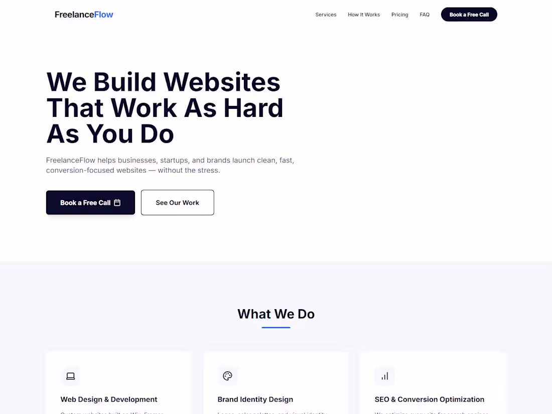
FreelanceFlow: Freelance Web Design Agency Landing Page
FreelanceFlow is a modern, conversion-focused landing page built for a fictional freelance web design agency designed and shipped entirely using Anything without writing a single line of code manually.
The brief simulated a real client scenario: a solo web designer rebranding as an agency, needing a site that communicates trust, showcases services clearly, and converts visitors into booked consultations.
The final site includes a bold hero section with a clear value proposition, a services section highlighting web design, branding, and SEO offerings, a three-step How It Works process, client testimonials with star ratings, a three-tier pricing section with a highlighted Growth plan, an accordion FAQ section, and a strong footer CTA driving visitors to book a discovery call.
The result is a clean, professional marketing site that looks and feels like a fully custom-coded product built entirely through AI-assisted development on Anything.
Built with: Anything
Focus: Landing Page Design, Conversion Optimization, AI-Assisted Development
The Challenge I Solved
The biggest challenge was getting the pricing section to display correctly across both mobile and desktop without the cards collapsing awkwardly. Anything's initial output stacked all three tiers into a single column on mobile, breaking the visual hierarchy. I resolved this by prompting Anything specifically to use a responsive grid with defined breakpoints and iterated on card spacing and typography until the layout held cleanly on all screen sizes.
My Top 3 Tips for Using Anything
Be specific with your prompts. Instead of "make a hero section," say "make a hero section with a bold H1, two-line subheadline, and a primary CTA button left-aligned on desktop and centered on mobile." Specificity reduces back-and-forth dramatically.
Build section by section. Prompting the entire page at once produces messy results. Build one section, review it, then move to the next for maximum control.
Use iteration prompts for polish. Once your layout is done, go back and prompt for fine details "add more whitespace between sections," "make the CTA button more prominent," "improve mobile typography." That's where real quality comes from.
0
58
Real Estate Law Firm Website Design
0
3
1
0
4
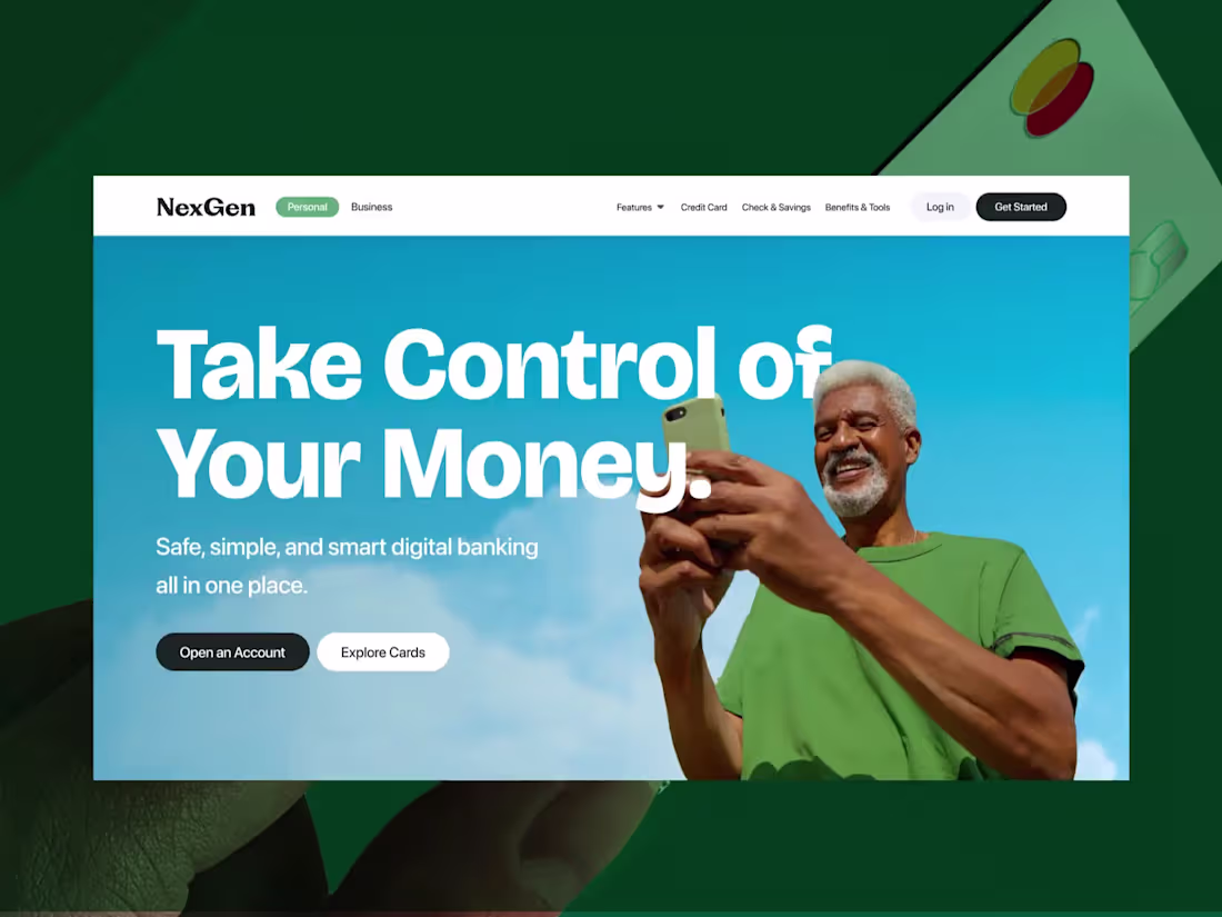
Fintech Digital Banking Website – Wix Website Design
0
2
Hey guys! 👋
Rebounding my previous shot — Rambu, Food AI Intelligence Platform. This time with animations and some new sections added. Rambu helps you explore ingredients, understand nutritional value, and make smarter decisions every day. From calories to vitamins, health impact to ingredient comparisons, everything explained clearly.
0
87
GreenWonder Toys is an eco-friendly and user-friendly toy sales platform that supports the individual development of children with special needs. The platform not only offers high-quality toys for purchase but also provides an community for parents to exchange their own experiences.
2
99
Forma: Modern Furniture E-commerce UI Design
0
8
Nextiss – Biotech Website Design
Designed a clean and modern website for Nextiss, a biotech company specializing in human tissue models for pharmaceutical, cosmetic, and Medtech industries. The layout prioritizes project content and scientific credibility through structured sections and clear information flow. The website communicates innovation and trust while guiding visitors through complex research-focused content with clarity. This project demonstrates how a wix website can support biotech communication using strategic wix web design, mobile-first layouts, and conversion-focused structure built
Wix Website Design | Wix Website | Wix Designer | Wix Seo | Wix
wix, wix expert, wix certified expert, wix website designer, wix web designer, wix website developer, wix developer, wix studio expert, wix studio designer
1
152
Medical Website Landing Page Design
1
5
Happi Loop – Kids Vitamin Landing Page – Wix Website Design
Designed a bright and conversion-focused landing page for Happi Loop, a kids’ vitamin brand created to make healthy habits fun and approachable. The layout uses playful visuals, friendly typography, and clear messaging to communicate product benefits while building trust with parents. Structured sections highlight ingredients, benefits, and safety, while strong calls to action guide users smoothly from discovery to purchase. The design balances fun and clarity to support both engagement and sales.
Wix Website Design | Wix Website | Wix Designer | Wix Seo | Wix
wix, wix expert, wix certified expert, wix website designer, wix web designer, wix website developer, wix developer, wix studio expert, wix studio designer, wix studio developer, wix website,
1
143
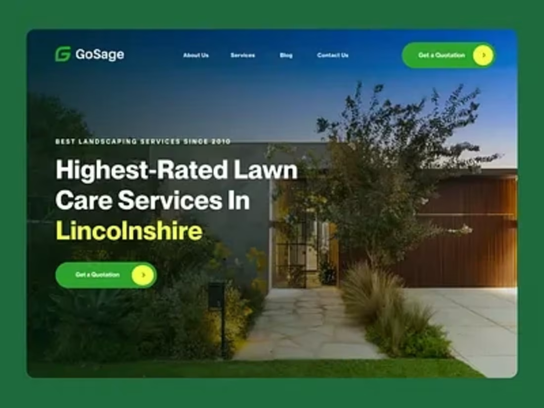
Crafted a lush, nature-inspired digital experience for a professional landscaping and lawn care brand turning outdoor dreams into reality with every scroll. 🌿
💚 Highlights:
– Modern, conversion-focused landscaping website design designed in Figma
– Clean layout showcasing lawn care, garden design, and property maintenance services
– High-impact visuals that bring nature, texture, and color to life
– Intuitive navigation for effortless service exploration
– Fully responsive and mobile-friendly for customers on the go
– Optimized content structure for SEO and lead generation
This concept blends modern design with organic warmth, helping homeowners visualize and connect with trusted landscaping professionals online.
0
147
Where high-end travellers go, for a clean, modern site that mirrors KG Travel's mission of turning tourists into travellers.
1
156
WIX STUDIO WEBSITE
0
3
Landing Page Design for Handyman Website
0
4
a client message me on whatsapp that he wants to build a wix website for his startup, and i love the fact i am coming up with ideas. when i am done, would let you guys see it.
0
95
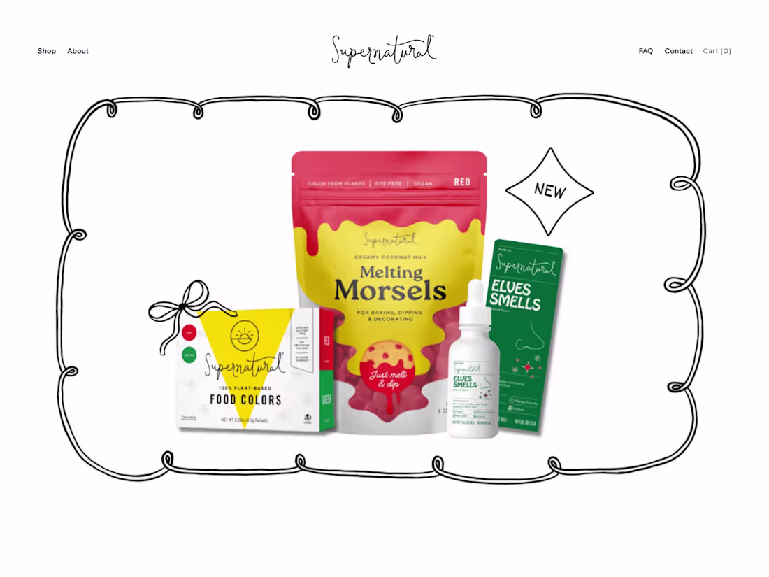
🌿 The Supernatural Kitchen — A Colorful, Plant-Based Creative Space
I built a bright and engaging website for Supernatural Kitchen, a brand that inspires people to get creative in the kitchen using plant-based, colorful, and better-for-you ingredients.
The site was built with Squarespace, designed to reflect the brand’s playful yet clean aesthetic — bringing out the vibrancy of their natural powders, recipes, and mission to make baking more fun and sustainable.
Every page celebrates color, wellness, and creativity, using design as a bridge between healthy eating and artistic expression.
🔗 Live Site: supernaturalkitchen.com (http://supernaturalkitchen.com)
2
2
264
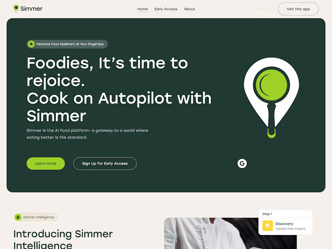
https://www.simmertech.com/
I designed and developed a Squarespace website for Simmer, an AI research studio exploring the future of food. The build merges deep, atmospheric color palettes with fluid motion and bold product visuals to capture the brand’s forward-thinking mission.
Beyond aesthetics, I extended Squarespace’s core functions by integrating smooth scroll animations, parallax interactions, and custom code blocks for 3D-like imagery transitions — transforming a simple template into an immersive experience. The site’s architecture balances scientific storytelling with visual intrigue, showing how no-code tools can power complex creative visions.
1
259
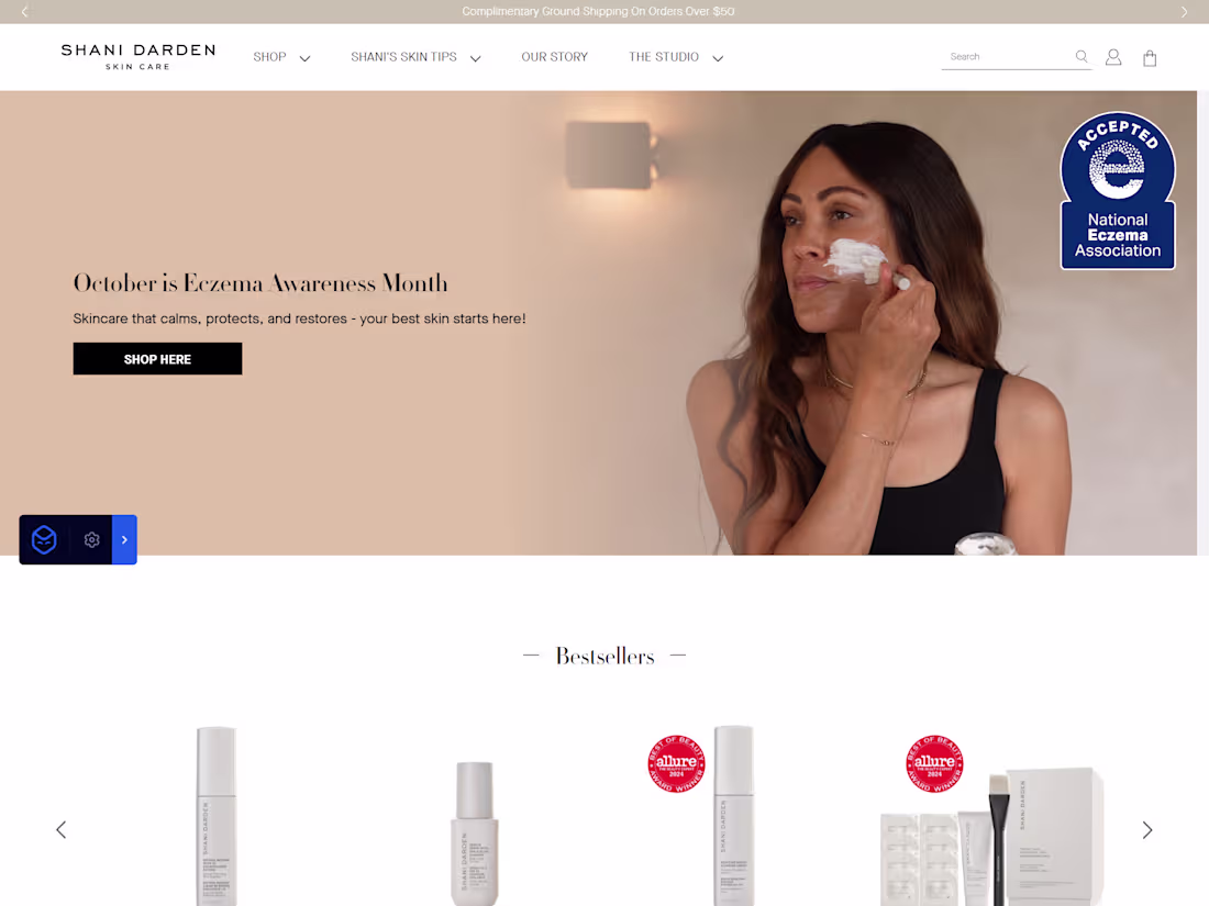
Shani Darden Skincare – Luxury Meets Simplicity in Beauty Design
Project Description:
Shani Darden, a celebrity facialist known for clients like Jessica Alba and Shay Mitchell, built her brand around helping people achieve glowing skin.
This Webflow site captures her brand’s calm luxury through warm neutrals, olive tones, and elegant imagery. Clear descriptions of treatments and an effortless booking flow make the user experience smooth and inviting.
“Shani’s Story” adds authenticity by sharing her journey from esthetician to skincare founder, building trust and connection with visitors.
https://www.shanidarden.com/
2
244
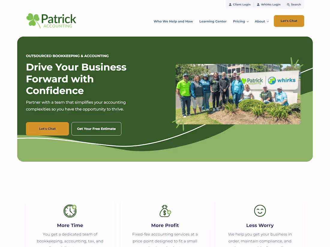
Patrick Accounting – Smart Accounting for Small Businesses
Project Description:
Patrick Accounting, a Memphis-based CPA firm founded in 2003, provides bookkeeping, tax planning, payroll, and advisory services tailored to small businesses.
This Webflow site highlights their approachable yet professional brand through structured layouts, clear service explanations, and confident typography. It builds trust and clarity for business owners seeking long-term financial partners.
The design focuses on usability, credibility, and conversion — reflecting the firm’s mission to simplify accounting for growing businesses.
https://patrickaccounting.com/
2
2
314
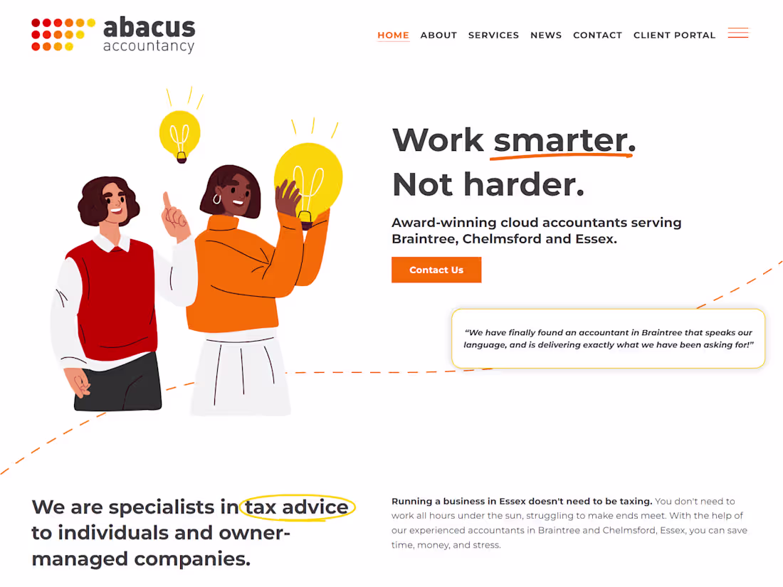
Abacus Accountancy, a small team based in Essex, helps business owners stay on top of accounting, tax, and cloud-based bookkeeping with clarity and confidence.
I wanted to reflect their professionalism and approachable nature through a clean, trustworthy web presence. Built with Squarespace, the design focuses on simplicity, easy navigation, and a calm color palette that conveys reliability.
Each section highlights their key services and expertise while keeping the experience intuitive and client-focused — helping visitors quickly understand who they are and how they can help.
💡 Built with: Squarespace ✨ Focus: Business Website Design & Professional Branding
https://www.abacus-accountancy.com/
0
202
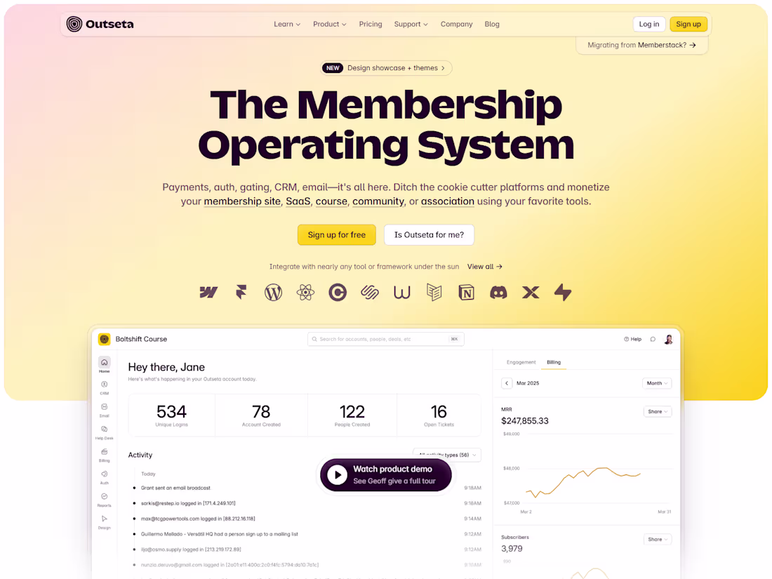
When I first discovered Outseta, I was inspired by how it unites tools founders need to run a SaaS or community — CRM, billing, email marketing, and support — all in one place.
I wanted to reimagine how that story is told visually — making their all-in-one system feel intuitive, modern, and approachable, while keeping a professional tone.
I focused on clarity and flow — bold headers, clean fonts, and a layout that guides users smoothly through each feature. Testimonials and visuals were refined to build trust and connection.
This project helped me blend UX thinking with Webflow development, proving that even complex platforms can feel simple, human, and conversion-driven.
💡 Built with: Webflow
✨ Focus: SaaS Web Design & Brand Experience
https://www.outseta.com/
2
199
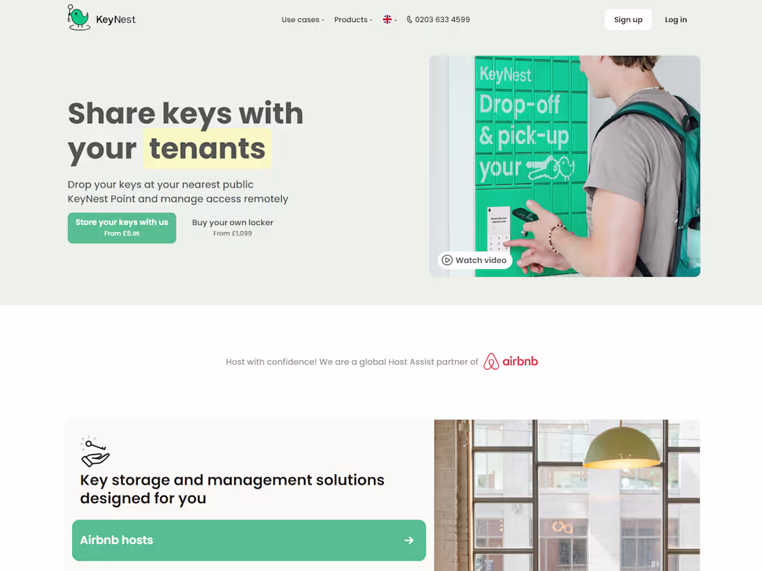
When I came across KeyNest, I was drawn to how it simplifies key exchange for Airbnb hosts, serviced apartment operators, and estate agents — a true global B2B SaaS success story. I wanted to capture that same clarity and trust in the website’s design. Built with Squarespace, the goal was to make every visitor’s question answered within seconds — from “What is KeyNest?” to “How much does it cost?” The result is a clean, structured site with bold hierarchy, smooth navigation, and human-centered design. Clear copy, testimonials, and a bright, consistent palette make it both professional and easy to use. 💡 Built with: Squarespace ✨ Focus: SaaS Web Design & UX Clarity
https://keynest.com/
1
176
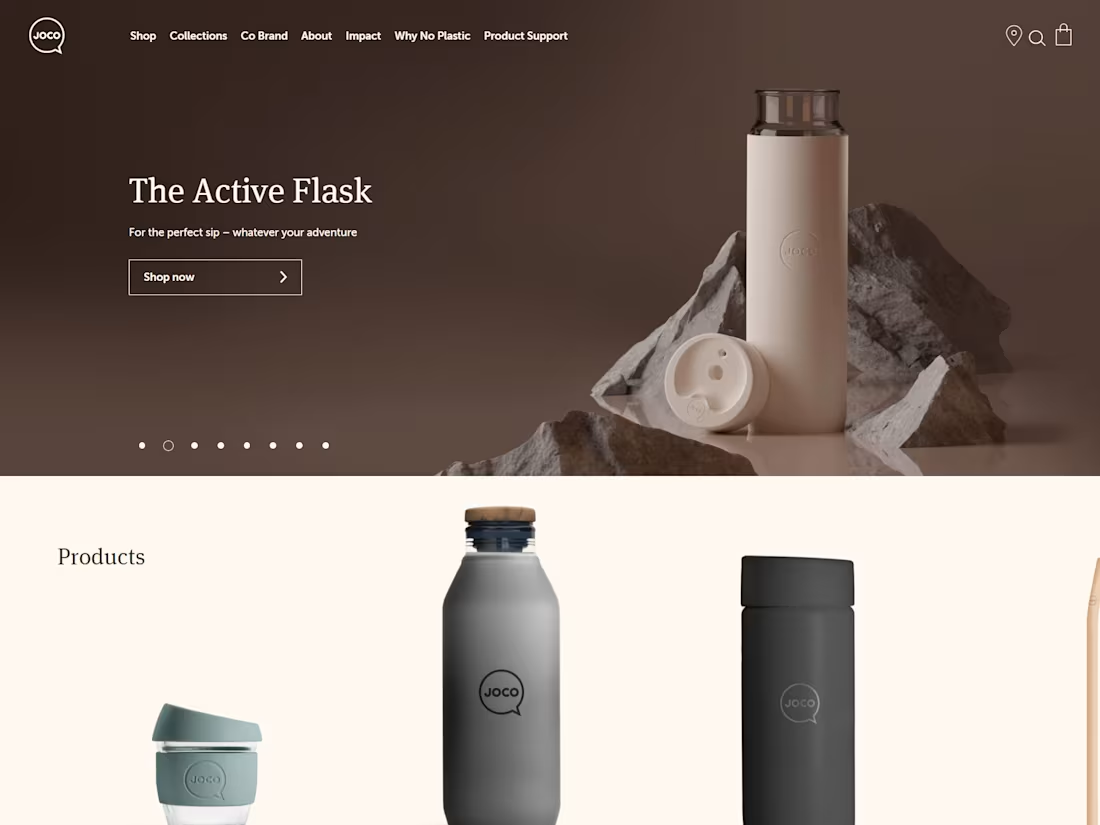
Selling water bottles is a competitive market — so design and presentation matter more than ever. I wanted to build a site that not only sells bottles but tells a lifestyle story through clean visuals and soft, inviting product imagery.
Built with Shopify, the website focuses on simplicity and elegance — clear navigation, minimalist layouts, and smooth transitions that let the products shine. The use of soft product photos and whitespace creates a calm, premium feel that builds trust and elevates the brand.
💡 Built with: Shopify ✨ Focus: E-commerce Design & Product Presentation
https://jococups.com/usa/
2
167
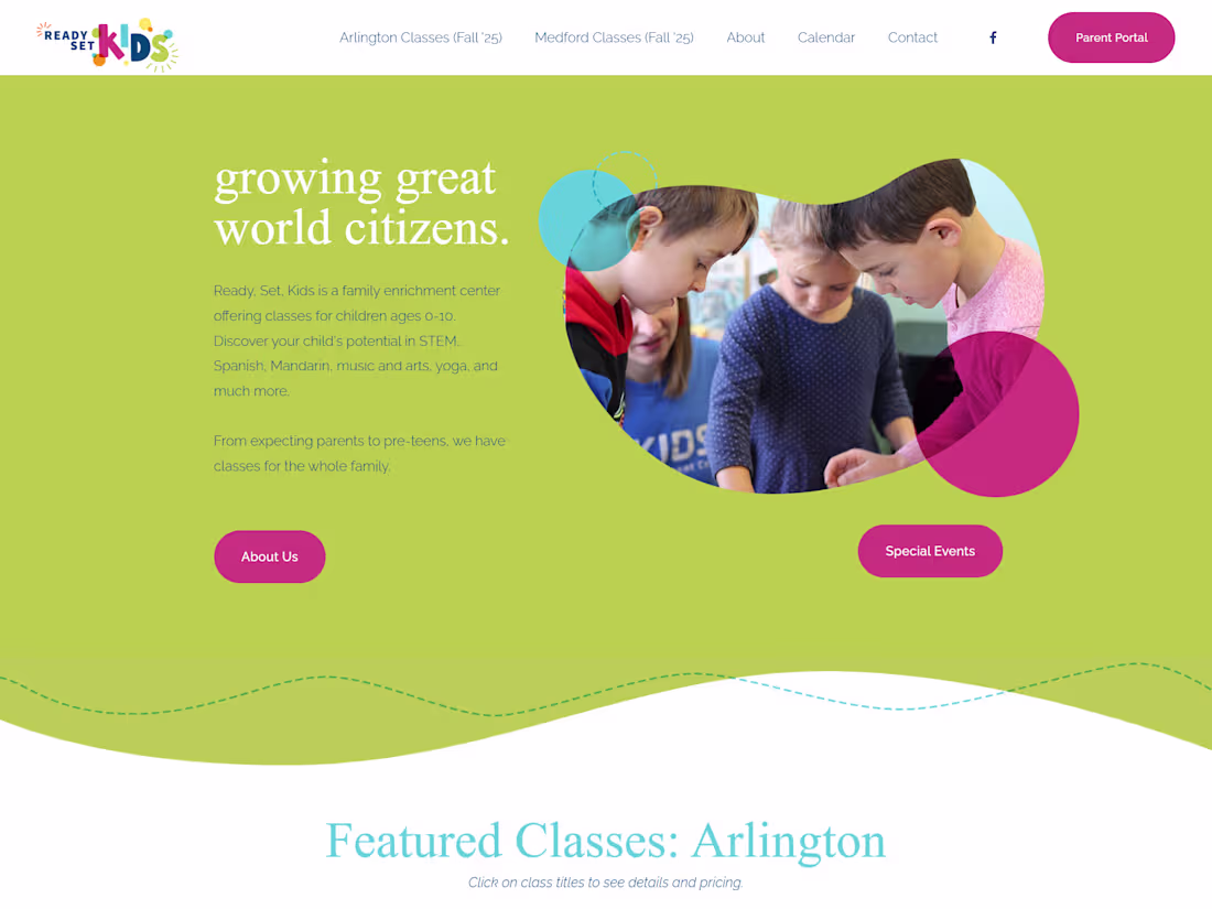
Ready-Set-Kids is an enrichment center that helps children explore creativity, confidence, and curiosity through classes in art, science, languages, and theater.
I wanted to design a website that captures that same energy and joy of learning while staying simple for parents to navigate. Built with Squarespace, the site features quick links for easy class enrollment and a bright, welcoming color palette that reflects the brand’s playful personality.
The design also highlights their year-round programs, including summer courses that mix fun with academics — ensuring every season sparks growth and discovery.
💡 Built with: Squarespace ✨ Focus: Education Web Design & User-Friendly Experience
https://www.ready-set-kids.com/
2
3
166