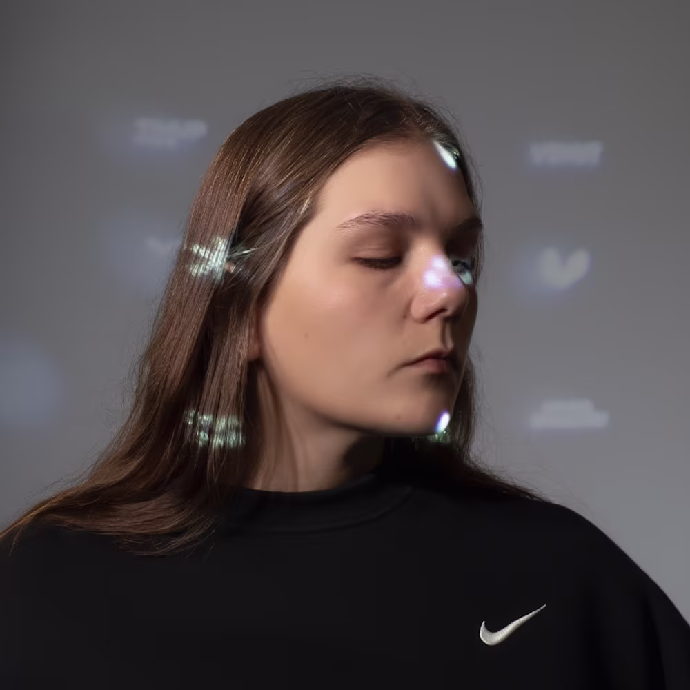
Katya Neray
Clear & Emotional Brand design.
New to Contra
Katya is building their profile!
CIRCLE® — Brand Identity
Hookah lounge · USA, Los Angeles · 2025
The pattern isn't decoration — it's the desert, the smoke, the atmosphere of the space. Animated, it comes alive.
Motion turns a visual system into an experience.
Full case study → (https://dribbble.com/shots/26510727-CIRCLE-Hookah-lounge-LA)
0
7
A logo isn't just a shape.
For CIRCLE®, it had to feel like something — a ring of smoke, a social circle, a moment of connection.
Full case study → (https://dribbble.com/shots/26510727-CIRCLE-Hookah-lounge-LA)
0
11
Grid is not a cage — it's the frame that gives freedom.
Structure brings consistency. Consistency builds trust.
On Dribbble, I shared a few spreads from the EKZO brand book — how geometry, rhythm and rules shape a system that works across all touchpoints.
Full case study → (https://dribbble.com/shots/27103988-EKZO-Nicotine-pouches)
0
17
EKZO® — Package design
Nicotine Pouches · European Market · 2026
The visual system is built on acid accents, dynamic compositions, and structured hype aesthetics designed to own shelf space and stop the scroll.
Full case study → (https://dribbble.com/shots/27103988-EKZO-Nicotine-pouches)
0
20
EKZO® — Brand Identity
Nicotine Pouches · European Market · 2026
One exotic letterform. Everything else grew from it — design language, packaging, website, brand voice.
Full case study → (https://dribbble.com/shots/27103988-EKZO-Nicotine-pouches)
0
23